Android Tips, Techniques and Theory
PART 2: Creating Content with Java with Android Studio (Programming required)
With Simple Recipes
Design For Multiple Screens
Unlike the Apple’s OS’s and devices (e.g., only iPhones and iPads) which can be upgraded readily because of a SINGLE vendor, Android has a multitude of OS’s and devices to contend with which makes it a challenge for developers because of this fragmentation. It is up to the Android device manufacturers and phone carriers to provide OS updates in a timely manner.
Nexus devices are designed for developers because it is easy to unlock their bootloaders and install a variety of Android versions on them. However, they represent only a small fraction of the Android market. So, it is best to test on other physical devices if you can (e.g., Motorola, Samung, HTC) and use the Android emulator to test on virtual devices if you have to.
To find out the most current versions of Android in use, go to http://developer.android.com/about/dashboards.
You have to take into consideration many factors when designing for multiple screens (small phones to large tablets):
- Device Resolutions (e.g. 640px by 480px)
- Device Sizes (Dimensions: 320w x 480h)
- Device Pixel Densities (dp / sp)
- Device Orientation (Portrait/Landscape)
A tablet size is different from a phone so you have to employ different techniques to take advantage of more real estate:
- Adaptive UI: match_parent and wrap_content are used to create flexible layout of objects:
- match_parent—expand view to match the size of its parent container view.
- wrap_content—set width of height of the view to the minimum size needed to fit content within a component.
- Different UI components for different screen sizes or even different UI components on the same device with a different orientation.
- Reorder UI components for different screen sizes or even reorder UI components on the same device with a different orientation.
- Nine-patch image—use nine-patch method to scale image with distortion on different device sizes.
Orientation changes
- Static orientation regardless of device orientation (not recommended)
- Different UI layouts based on orientation (1 column of 4 buttons on a phone or 2 columns of 2 rows of button on a tablet:
[SHOW EXAMPLE HERE….]
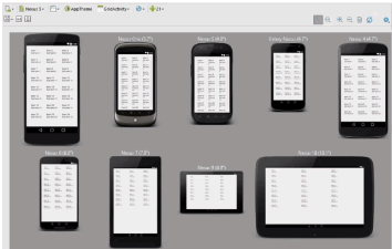
Device preview: Android Studio provides a way to preview various devices at the same time in Design View.
- Select device from list (e.g., Nexus)
- Select Preview All screen sizes
- To remove previews, select drop-down again and select remove previews
Alternative Layout Resources
One of the first thing you want to address is how to handle a layout if the device is rotated from portrait to landscape and back again. To accommodate orientation changes, you can create a separate alternative layout for the landscape mode.
EXAMPLE: Creating Alternative Layout
- Create a new project using the Empty Template and name it Alternative Layout App.
- In the main_activity.xml file, from the Palette panel, drag-and-drop within the screen:
- a ImageView to the top/center of the screen and add a src attribute to an image (e.g., @android:drawable/sym_def_app_icon)
- a TextView below the ImageView and center it and change the TextSize of 24sp.
- a ScrollView below the TextView
- Drag-and-drop a TextView INSIDE the LayoutView of the ScrollView WITHIN the Component Tree instead of the screen.
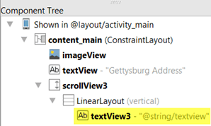
- In the Text view, CTRL+CLICK on the last TextView text attribute Text to open the strings.xml resource file.
- Copy and paste a large amount of text (e.g., Gettysbury Address).
- CHECK POINT: If you preview the app in portrait mode, it looks great. However, if you press the rotate button to rotate the app to landscape mode, the layout is unacceptable. The components are stacked the SAME and the ScrollView has been compressed vertically and expanded horizontally too much. This can be resolved by creating an alternative layout for the landscape mode. You could create a copy of the content_main.xml and place it in a new directory name layout-land and when the device is changed to the landscape mode, the app framework will automatically choose the layout from the layout-land directory. However, Android Studio can do these steps for you as will be shown in the upcoming steps.
- In the Design mode, at the top of the screen, select Create Landscape Variation from the drop-down menu.
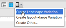
- CHECK POINT: By clicking on the Create Landscape Variation option, Android Studio created another layout file. To see this in action:
- A new version of the file is shown as a new tab with a directory of land.
- If you hover over the tab, you will see the actual location.
- If you view the Andriod scope view, you see both version.
- If you open the Project view, you will see that there is actually a directory named layout-land.
- Rearrange the layout to have the ImageView on the left of the screen and the TextView and ScrollView aligned to the right of the ImageView.
- CHECK POINT: Preview the app in an emulator and then click on the rotate button to see it changes to the landscape mode. Notice how the landscape automatically changed to reflect the layout you created in the layout-land directory.
NOTE: You can use any resource directory (e.g., layout or values) and append -land and the app framework will use this directory instead of the default directory.
Alternative Dimension
Like creating an alternative layout for a different orientation, you can also create a special named resource directory (e.g., dimens (w820dp)) for dimensions on large screen devices. Unlike the layout directory, there are two files with the SAME name of dimens.xml in the Android scope view:
- The no named default file has attributes values of activity_horizontal_margin and activity_vertical_margin of 16dp depending on the template. It might also have a fab_margin of 16dp.
- The alternative file (e.g., dimens (w820dp)) has an alternative setting for the activity_horizontal_margin of 64dp which will override the settings on a screen with a width of 820dp or more for both landscape and portrait.
- Continue from the previous example.
- In the content_main.xml file in protrait mode, select the first TextView and then press ALT+ENTER and set the string resrouce to headline_size and then press the OK button and then copy the resource value.
- Go to the land/content_main.xml file and paste the result of the previous step into the textSize attribute.
- Go back to the default portrait view and add a textSize attribute of 14sp to the second TextView and then press ALT+ENTER and set the string resrouce to content_size and then press the OK button and then copy the resource value.
- Go to the land/content_main.xml file and paste the result of the previous step into the textSize attribute.
- Create a large virtual device (e.g., Nexus 9).
- CHECK POINT: Click the Run button and select a small device and the large device by SHIFT+CLICKING and then click the OK button to both of them. Notice that on the large device the font is too small. This will be resolved in the next step.
- Open the dimens.xml file and copy the two size settings.
- Open the w820dp dimens.xml file and paste the two values.
- Change the headline_size to 48sp and the content_size to 24sp.
- CHECK POINT: Run the app on both devices again. Notice that the text on the large device is better. However, when you go back to the portrait mode on the large device, the text is still small because it no longer satisfies the requirements. Youl will need to create another directory to handle this and other issues.
Alternative Images
Like creating an alternative layout or alternative dimension, you can also create alternative images in Android Studio to create icons for:
- The Launcher icons
- The Action Bar and Tab icons
- The Notification icons
Using File > New > New Assets automatically created folders for the various pixel densities. Then, it is up to the Android framework to determine which icon version to use at runtime depending on the device pixel density. But all of these approaches are for icons not regular images.
To create regular images you have to use another tool like the Final Android Resizer.
- Go to https://github.com/asystat/Final-Android-Resizer and click the Clone in Desktop button for the Final Android Resizer or download it using Git.
- Ensure that Java Runtime is installed on your computer.
- If you download the jar file, double-click on it to run the application.
- Create a new folder on your desktop and name it Android images.
- In the Final Android Resizer app, click on the Browser button and navigate to the new Android images folder and then click the Open button.
- In the Input density down-down menu, select xxhdpi.
NOTE: This is based on the image density not the image size.
- Select the pixel density checkbox options you want to create. In our example we selected all of them except ldpi because we don’t want to target older devices and tvdpi because we don’t plan to develop for a TV.
- Drag-and-drop an image you want to use onto the screen.
- CHECK POINT: If you open the Android images folder, you will see a host of folders for each pixel density.
- Select all of the drawable folders and copy them.
- Go back to Android Studio and select the res folder and right-click and paste the images into it. In the Copy dialog box that appears, click the OK button.
- Open the folder that has those images pasted into it and then click on the original version that does not have a pixel density next to it and then in Safe Delete dialog box that appears, select Delete from the menu with both options deselected and then click the OK button. On Windows, if you see any thumbs.db files, delete them as well.
- CHECK POINT: Run the app on a large and small device in the emulator at the same time. Notice how they look basically the same even though the image density is differnet on both devices.
Alternative Fragments
Yet another way of dealing with multiple screens is to use fragments. Fragments were first introduced in Honeycomb for tablets only but have since been integrated into the newer versions of Android for both phones and tablets.
- It allows you to build for multiple devices (small phones to large tablets).
- It was created so that UI components can be REUSED in different parts of an app's UI
- It is backward compatible with android.support.v4.app.Fragment Support Library.
- It has its own Lifecycle.
- It acts as a "mini-activity" that in embed in other activities.
- The ViewPage component is typically used to implement fragments which allows a user to swipe to change views (pages). Each page would be its own fragment.
[REPLACE WITH MY OWN GRAPHICS USING ANDROID STUDIO PREVIEW WINDOW] AFTER CREATE DEMO.]
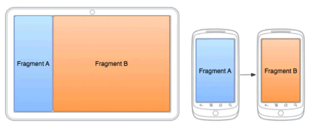
On a tablet, Fragment A and Fragment B fix well together. However, this layout would not work well on a phone with limited real estate. As a result on a phone Fragment A would be one screen that would display fragment B on another screen after some user interaction (e.g., button, menu).
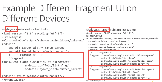
Example: XML layout
Fragment LifeCycle
[USE MY OWN CODE ONCE I HAVE FINISH DEMO]
- Create a new project using the Master/Detail Flow and name it Fragment App and accept all defaults.
- CHECK POINT: The Master/Detail Flow Template create five XML files:
- activity_item_list—contains a reference to a fragment
- activity_item_list (sw600dp)—contains a reference to a fragment
- activity_item_detail
- activity_item_app_bar
- fragment_item_detail
NOTE: When the app opens, the item_ListActivity launcher class starts up and it looks for a particular view (item_detail_container). If it finds this view, the app goes into a two pane mode (Master/Detail); otherwise, the app goes into a one pane mode.
- CHECK POINT: Run the app on a small device in portrait mode and large device in landscape mode using the emulator. You should see that on a small device, if you select an item, it opens a different activity. You can also click and drag the divider up and down which is managed by the coordinator layout control. If you click the Back button, the app returns to a list view. However, on the larger device, when you click an item, you should still see the list but a detail view will be displayed on the right side of the screen. The fragment is used by both devices but is seen differentlyS depending on the screen size.