Android Tips, Techniques and Theory
PART 1: Creating Content with XML with Android Studio (No programming required)
With Simple Recipes
Layout Editor and Types
Layout Editor
The Layout Editor allows you to type or drag-and-drop UI components from the Palette panel to create XML code that can then be edited either in Design (Graphical) or Text (XML) that can be previewed on multiple screen sizes and devices. It also offers localization support by changing the locale property in the Preview panel (e.g., Left-to-right (LTR) or Right-to-left (RTL)).
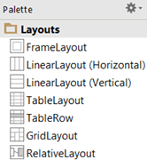
Layout Types
Layouts are top-level containers for components or other layouts that are available in two main types (Linear and Relative). However, there a few other layouts that are used.
TIP: Look at the icons in the screenshot below to “see” how components are layout.
Relative
RelativeLayout is the most versatile layout type. It is where children components are aligned “RELATIVE” to its parent’s center or edge, other sibling components or both that allows more freedom to where components can be positioned based on attributes:
- layout_centerHorizontal / layout_centerVertical to align components to the center
- layout_alignParent (Top, Bottom, Left and Right, End and Start) to align and anchor components to an edge (true or false)
NOTE: alignParentEnd use to support Right-to-Left rendering for the right side of the screen and alignParentStart for the left side of the screen. - layout_margin (Top, Bottom, Left and Right) to space components a specific amount from an edge to control distance between components
- layout_align (Top, Bottom, Left and Right) to space components a specific amount from an edge of another component via its id.
- layout_toRightOf / layout_toLeftOf / layout_above / layout_below will also position a component to another component
NOTE: It is common practice to NEST layout to get the desired layout you wanted. (e.g., Vertical and Horizontal layouts WITHIN a parent Linear layout). - When you are laying out components horizontally, you typically want to start with the one that is the tallest to serve as the anchor and give it an id name (e.g., android:id= “@+id/myButton”). Then, add an attribute called android:layout_alignBaseline to the other components and give them the same id name (e.g., android:layout_alignBaseline = “@+id/myButton”) given to the tallest component.
Design View:
XML View:
NOTES:
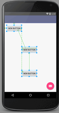
- It is important to note in a relative layout that all components have to be ANCHORED or PINNED to its parent layout, other components, or both.
- The advantage of using a relative views is that it eliminates that need for nested view groups and may improve efficiency.
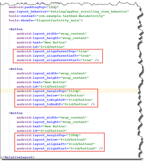
- Notice the green arrows that denotes how button components are aligned RELATIVE to its parent Relative Layout container (Top/Left) and to another components (Below/Right Of and Below/Left Of). Also notice the margins for the last two buttons with EndOf and StartOf.
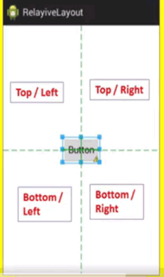
The relative is divided into four quadrants. Components can be aligned within one of these quadrants:
- Top / Left
- Top / Right
- Bottom / Left
- Bottom / Right
[UPDATE FOUR SCREENSHOTS BELOW WITH MY OWN]:
Any components can be pinned directly to any one of these quadrant’s corner. These have NO margin attributes:
In the example below, the component is being pinned to the top and left. It could be pinned to any one of the other three "corners" as well.
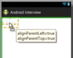
If you look at the xml file you see:
android:alignParentTop="true"
android:alignParentLeft="true"
If you drag a component away from a corner, you can unpin it from one or both quadrant side. In which case, you will have additional margin attributes applied.
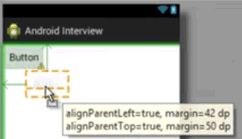
If you look at the xml file you see:
android:alignParentTop="true"
android:alignParentLeft="true"
android:alignMarginTop="50dp"
android:alignMarginLeft="42dp"
You can also align a component to the horizontal or vertical center.

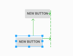
If you create one component and then create another component and align it below the first one and then move the first one, they both will move in unison. But if you move the second component the first one doesn't move because it was not tied to the first.
Linear
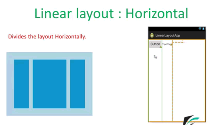
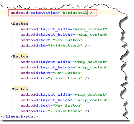
The next important type of layout is the LineareLayout. LinearLayout is where children components are aligned in a “LINE” either horizontally or vertically after the previous component in a SINGLE row or SINGLE column. In the absent of an orientation attribute, a linear layout will default to horizontal. To make the orientation vertical set the orientation to vertical (e.g., android:orientation: “vertical”). The Linear Layout is best used when you want to layout your components as mentioned earlier in a SINGLE row or a SINGLE column.
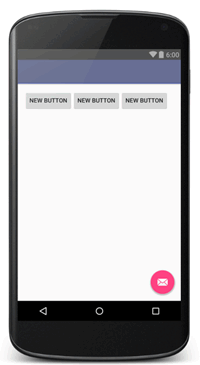
Horizontal—Components are positioned from left-to-right in the order they are written in the *.xml file. Another way of stating this is that sections are divided into horizontal PANES and you CANNOT place components BELOW each other.
[REPLACE IMAGE BELOW WITH MY OWN SCREENSHOTS]
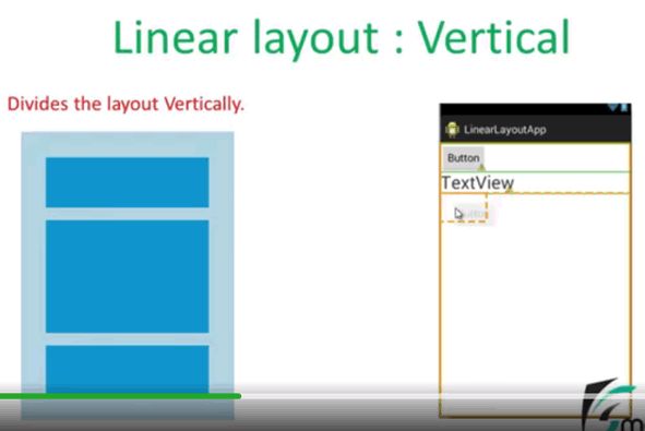
Vertical—Components are positioned from top-to-bottom in the order they are written in the *.xml file. Another way of stating this is that the sections are divided into vertical PANES and you CANNOT place components BESIDES each other.
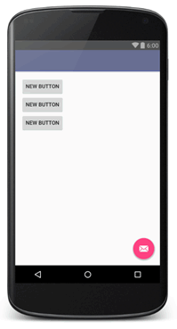
NOTE: Same as above except orientation is changed to vertical (e.g., android:orientation="vertical">)
NOTE: For either horizontal or vertical layout, the order can be changed by dragging the component in the Design View or rearranging the component elements in the Text View.
In the Linear Layout, there are four attributes that can be used:
android: gravity layout
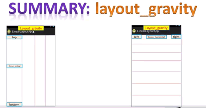
Within a screen, if it is a horizontal layout, the gravity attribute will align a component left, center or right horizontal within a given section.
Within a screen, if it is a vertical layout, the gravity attribute will align a component top, center or bottom vertical within a given section.
android: gravity
Android Studio does not have a border property and padding and margin are exactly the same as CSS so they will not be discussed. (See online resources like w3school for detail). However, it is important to remember that if you add padding around a component, it will increase that size of the component bounding box which will make it clickable if you add a click handler or click listener to it. This is a great way to increase the area of a component to make it more clickable.
The concept of gravity is unique to Android Studio. Gravity is an attribute that is used to define an object PLACEMENT INSIDE of its parent container. While padding and margin work with an object bounding area, gravity determines how objects “float” INSIDE the bounding area of its parent container. This is somewhat similar to the float attribute in HTML where you can float an element to the left or right. Gravity is typically used with another attribute called layout_gravity in a child View of a LinearLayout. Most values are self-explanatory:
- Top / Right / Bottom / Left
- Center / Center_Horizontal / Center_Vertical
- End—PUSH object to x-axis position at the end of its parent container.
- Fill—GROW object horizontally or vertically to fill its parent container.
- You can also use a combination of layout_gravity properties like top and center at the SAME time.
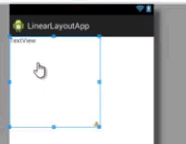
While the android:layout_gravity attribute is used for the entire screen, the android:gravity attribute is used to layout content with a component dimension (height and width) not the screen. For example, if you create a Text View with a height and width of 200dp, you can then align the Text View content (text) WITHIN the Text View bounding area of its height and width. It does matter if its parent layout is horizontal or vertical, it will still be based on the component gravity not the screen gravity. To align to any corner (e.g., top/right), use multiple attributes separated by the pipe symbol (|): Gravity: top | right, bottom | left, center | right.
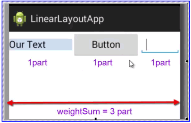
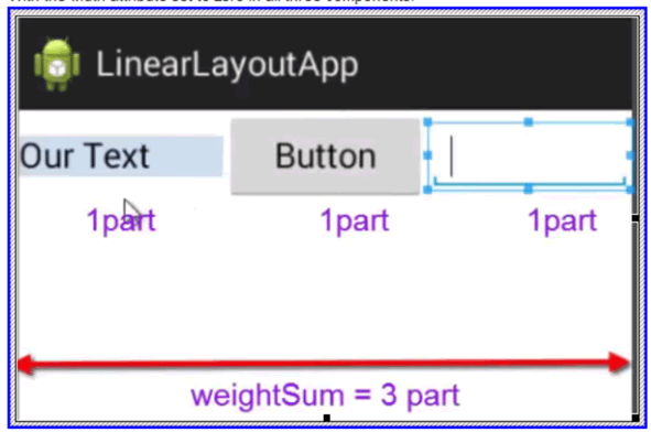
android: weight
Another property of the LinearLayout is the weight property is used to assign a "weight" percentage to a layout. It determines how the space is SHARED between components and the SIZE of the components.
- If each component is given the SAME amount of weight (e.g., 1,1,1 for three buttons) the space and the size will be distributed EQUALLY among all components.
- If each component is NOT given the SAME amount of weight (e.g., 1,.5,1 for three buttons) the space and size will be distributed based on the RATIO of the weights among all components.
- If the linear layout orientation is vertical, the FREE space is shared vertically.
- If the linear layout orientation is horizontal, the FREE space is shared horizontally.
android: weightSum
android: weightSum—When using weightSum, you don't want to use a height or width property, so you need to set the height or width to zero depending on whether the layout is horizontal or vertical. The sum of the parts should add to 1 (e.g., .25, .25, .5).
weightSum: 3 (in Linear Layout element)
layout_weight:1 (for 1st component)
layout_weight:1 (for 2nd component)
layout_weight:1 (for 3rd component)
Without width attribute NOT CHANGED in all three components, there is no different.
With the width attribute set to zero in all three components:
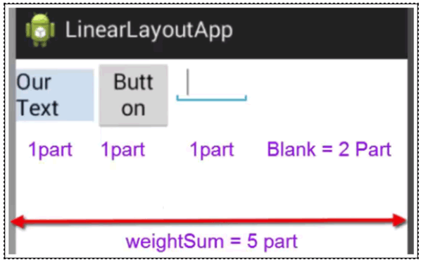
If you change the weightSum to 5:
Frame
Frame layout is the easiest of all of the layout. It can hold a SINGLE view. However, other component can be overlaid on top of it. It is best used for images with caption text.
FrameLayout is where children components are “STACKED” relative to the top-left corner. The order of the children components are important when using the gravity settings and UI components may overlap. It is typically used to block out an area of the screen so that a single object can be displayed.
Table / Row
Table layout uses a grid-based layout of rows and columns similar to an HTML or MS Word table.
TableLayout is where children components are “PLACED” in table-like rows or columns with each row requiring a TableRow element.
Grid
GridLayout is where children components are placed in a 2-D rectangular “GRID.” This is not to be confused with the GridView which will be discussed later.
Nested Layouts
You can also “nest” one or more layouts inside of a main layout to obtain that overall desired layout you wish.
EXAMPLE: Nested Layout:
Add First Layout:
- In a new project, started with a RelativeLayout as the main layout.
- In the Text View, delete the bottom margin attribute:
android:layout_marginBottom="41dp"
Add Second Layout: - Drag-and-drop another LinearLayout (Horizontal) component inside the main Relative Layout at the bottom/center of the layout.
- Drag-and-drop two Button components inside the LinearLayout component you just added.
- Give both buttons a label (e.g., About, Info).
- Select the LinearLayout in the Component Tree Panel with the buttons and then set the height property in the Properties panel to wrap_content.
- Select each button and give a weight property of .5 to both buttons so that they span equal space and equal size at the bottom of the screen.
Add Third Layout:- Drag-and-drop a ScrollView component to the middle of the window and set both the width and height to the match parent.
- Drag-and-drop a Text View inside of the ScrollView.
- Copy a lot of text in the TextView that is large that the view area.
- Resize the ScrollView so that you have space for a Title and it is slightly above the buttons.
NOTE: Notice it is best to select a layout component from the Component Tree panel.
Add Fourth Layout: - Drag-and-drop a LinearLayout (Horizontal) component inside the main Relative Layout at the top/center of the layout.
- Drag-and-drop a Large Text component inside the LinearLayout you just added and then add a title (e.g., Photoshop Made Easy). Optionally, add other styles if you want (bold, textSize, etc.)
- Select the LinearLayout in the Component Tree Panel with the buttons and then set the height property in the Properties panel to wrap_content.
- CHECK POINT: Run app in an emulator. You should be able to scroll the text.
Layout with XML
While you probably will want to use the Layout Editor, there may be times when you want to write your own layout manually in the Text View.
Below is a list of things that you need to pay attention to:
- The root element (e.g., View or View Group must have a namespace, width and height. Padding is optional but highly recommended.
EXAMPLE:
<RelativeLayout xmlns:android=http://schemas.android.com/apk/res/android
Add here…
- Most attributes will have a namespace of android followed by a colon.
android:layout_width=”100dp”
- Both the width and height are REQUIRED properties for any view; otherwise, the app will crash because Android will be looking for them properties to draw the component. To test this, remove one or both of these properties and run the app in an emulator. You will see that it will crash. (e.g., Unfortunately, Width and Height has stopped.).
- Studio has some unique property values for width and height:
- match_parent—will match the width or height of the parent minus any parent’s padding.
NOTE: If you look at the XML for the main layout, you see that it has paddings attributes. - wrap_content—will match the component width or height with a little padding.
- Fixed width or fixed height—will use the device independent pixels (dp) for most components and scalable independence pixels (sp) for text components. (e.g., 24sp for text or 100dp for an image).
- It is important to give all elements an ID property that:
- Will be reference in the Java code.
- Will be reference by another component when using RelativeLayout for alignment.
- View Groups have children components so they must have an opening and closing tag:
EXAMPLE:
<LinearLayout>
android:loayout_width=”match_parent”
android”layout_height=”wrap_content”
…
</LinearLayout>
- Regular Views cannot have other Views inside of them, so they are self-closing (meaning they one have one tag instead of two and it closes itself with a back slash at the end of the tag):
EXAMPLE:
<EditText
android:loayout_width=”match_parent”
android”layout_height=”wrap_content”
…/> - It is help to use the AutoComplete keyboard shortcut (CTRL+SPACE) will prompt you for options you can choose from. This works with PC, Mac and Linux.