STYLING LIST: A SIMPLE CSS-BASED HORIZONTAL NAVIGATIONAL MENU
Download Horizontal_Nav_Menu.zip
A basic navigational menu can be created from a list (ordered or unordered) by making each list item a link and then "stylize" the whole list to make it behave like a menu.
There are two ways to create a horizontal navigation bar:
- Using inline list items
- Using floating list items
Notice the systematic steps in the accordion below:
- Create (1)
- Convert (2)
- Style (4)
- Add (6)
- Create a simple list of paragraphs by typing a list (e.g., Home, Products, etc.) in Design View. In this case, between the body element:
- CHECK POINT: Save file and preview it in a browser.
Code View:
<body>
<p>Home</p>
<p>Products</p>
<p>Services</p>
<p>Contact Us</p>
</body>
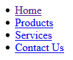
Design View:
Home
Products
Services
Contact Us
- Convert list of paragraphs to a simple unordered (bullet) list by selecting all of the paragraphs and click the bullet list button in the Property Panel.
- CHECK POINT: Save file and preview it in a browser.
Code View
<ul>
<li>Home</li>
<li>Products</li>
<li>Services</li>
<li>Contact Us</li>
</ul>
NOTE: Notice how the "p" elements were converted to "li" elements and wrapped within a "ul" element.
Design View:
- Home
- Products
- Services
- Contact Us
Next, let's convert the list to a list of links by applying an anchor tag <a> to the text in each of the list item (highlighted in bold).
NOTE: We could have named the first line home.html; however, it is best practice to name the "home page" index.html.
- Click the word Home to select it and then in the Properties panel type index.html in the Link text field.
- Repeat the previous step for the other three words but add products.html, services.html, and contact_us.html in the Link text field.
- CHECK POINT: Save file and preview it in a browser.
Code View:
<ul>
<li><a href="index.html">Home</a></li>
<li><a href="products.html">Products</a></li>
<li><a href="services.html">Services</a></li>
<li><a href="contact_us.html">Contact Us</a></li>
</ul>
NOTE: Notice how each word got wrapped within an "a" element with an "href" attribute.
Design View:
However, the list still looks more like a bullet list with links associated with it. Let's correct this problem.
- Give the opening "ul" element an id name of "nav":
NOTE: IDs and classes provide "hooks" so that they can be targeted via CSS and told what they need to do via selectors. This technique follows our general principle:
- Create an object (or use an existing object)—In this case, the "ul" object.
- Give the object a name (either via a class or id attribute)—In this case, the name is #nav.
- Tell the object what to do (either via CSS or JavaScript)—In this case, remove bullets, margins, and paddings, hide overflow, and add a background color)
<body>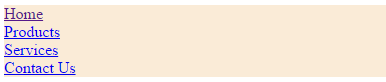
<ul id="nav"> - Add the following CSS code in the "style" element:
TIP: After creating the #nav selector shell (i.e., #nav{ }), add ONE rule at a time to see the effect take place one at a time. You will have a better appreciation of the CSS code if you do so. Do this for the other sections as well.Code View (Style Element):
<style>
/*----- Style List ------- */
#nav {
list-style-type: none;
margin: 0;
padding: 0;
overflow: hidden;
background-color: antiquewhite; }
</style>
NOTE: The #nav CSS rule performed the following tasks:
- list-style-type: none; - Remove bullets because they are not needed.
NOTE: Notice that even though the ul element is targeted, the "li" elements are the ones affected because they are children of the ul element. - margin: 0; padding: 0; - Set margin/padding to remove browser default settings
- background-color: antiquewhite; - Add background color to ul element
Design View:
- list-style-type: none; - Remove bullets because they are not needed.
- CHECK POINT: Save file and preview it in a browser.
- (Optional) Temporarily added a height="40px" to the #nav selector:
Code View:
<style>
/*----- Style List ------- */
#nav {
height: 40px;
list-style-type: none;
margin: 0;
padding: 0;
overflow: hidden;
background-color: antiquewhite; }
</style>
Design View:
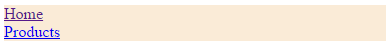
- CHECK POINT: Save the file and preview it in a browser. You should see only 2 of the 4 menu items shown because the height property was set to 40 px to "hide" the other two menu items (e.g., Services and Contact Us).
- Delete the height:40px rule as it was only used to show how the overflow:hidden rule works.
By default, "li" elements are block elements. There are two ways to force them to display as inline so they can display side-by-side:
- Use an display property with a value of inline (e.g., li {display: inline;})
- Use a float property with a value of left (e.g., li {float:left:}) This method will be used.
Now, let's address the list Items so that they sit side-by-side instead on top of one another
- Add the following CSS rule to the style element
Code View:
/*------ STYLE LIST ITEM -----*/
#nav li {float: left;}
</style>
Design View:

- CHECK POINT: Save file and preview it in a browser. You should see the each menu item sit tightly next to one another.
Now, let's style the "a" element: to look like menu items instead of links:
- Add the following CSS rules to the style element:
Code View:
/*------ STYLE LINKS -----*/
#nav li a {
  display: block;
  color: white;
  text-decoration: none;
  padding: 14px 16px;
  text-align: center;
  font-family:Arial;
  font-weight: bold; }
</style>
NOTE: The "li a" CSS rules performed the following tasks:
- display: block; - Display the links as block elements to make the whole link area clickable (not just the text), and allows padding, height, width, and margins, etc.) to be specified.
- color: white; - Change the text color to white
- text-decoration: none; - Remove link underlines because they are not needed
- padding: 14px 16px - Add 14px padding top and bottom and 16px left and right to each link
- text-align: center; - Center the text within the links
- font-family:Arial; - Change font to Arial.
- font-weight: bold - make font bold.
Change the background color in the #nav from antiquewhite to #333 so that the text can be seen better:
#nav {
  list-style-type: none;
  margin: 0;
  padding: 0;
  overflow: hidden;
 background-color:#333;
}
Design View:

- CHECK POINT: Save the file and preview it in a browser. You should see that the list now looks like a real menu bar.
- Add the following CSS rule to the style element:
Code View:
/* -------- STYLE MENU HOVER --------*/
#nav li a:hover {background-color: black;}
</style>
Design View:

- CHECK POINT: Save the file and preview it in a browser. You should see that when you hover over a menu the hover color is displayed.
Add an "active" id to the current link to let the user know which page he or she is on:
- Add the "active" id to the current page.
Code View:
<li><a id="active" href="index.html">Home</a></li>
NOTE: Notice again, how an object is used (<li> element), given a name (class="active") and will be told to do something (change background color for current page) in the next step
Add the following CSS rule to the style element:Code View:
/* --------- ACTIVE MENU ITEM ---------*/
#active { background-color: green; }
</style>
Design View:

- CHECK POINT: Save the file and preview it in a browser. You should see the current page menu highlighted in green.
A menu item can be right-align links by floating a list item to the right:
- Add the following "right" class to provide a "hook" for the "li" element for the Contact Us menu.
Code View:
<li class="right"><a href="contact_us.html">Contact Us</a></li>
Add the following class to the style element:
Code View:
/* --------- RIGHT ALIGN MENU ITEM  -------*/
#nav li.right{float:right;}
</style>
Design View:

- (Optional) Temporarily MOVE the class="right" attribute from the Contact Us "li" element to the Services "li" element.
Code View:
<li class="right"><a href="services.html">Services</a></li>
<li><a href="contact_us.html">Contact Us</a></li>
Design View:

- CHECK POINT: Save the file and preview it in a browser. You should see that the Services menu item is now floated to the far right.
- Undo the previous step as it was only used to show that any of the menu items could be floated right not just the last one.
To make it obvious the the menu items are separate, dividers are added.
- Add the following CSS to the style element.
Code View:
/* -------- MENU DIVIDERS --------*/
NOTE: The second selector is used to prevent the last menu item (Contact Us) that has already been floated to the right to have a right border on it. While this is not a big problem if the current background color is white, if the divider color or background color was changed it would become obvious.
#nav li {border-right: 1px solid white;}
#nav li:last-child {border-right: none;} </style>
Design View:

- CHECK POINT: Save the file and preview it in a browser. You should see the dividers on all of the menu items except the last one.
The menu can be fixed to the top or bottom of the page.
-
In Code View, BELOW the closing tag (</ul>), type p>Lorem800 and then press the tab key in Dreamweaver to add some Lorem Ipsum placeholder text.
</ul>
<p>Lorem ipsum dolor sit amet, consectetur adipisicing elit. Quos vel ut corporis assumenda consectetur at possimus tenetur quo adipisci corrupti, temporibus perferendis reiciendis, provident fuga quam amet quas iste quisquam? Magnam facere fuga vitae reiciendis nihil tempora delectus maxime, porro perferendis dolorem doloribus quia debitis eius deserunt qui, amet explicabo quaerat blanditiis necessitatibus dicta hic totam officiis perspiciatis? Totam q dignissimos dolorem voluptas... - CHECK POINT: Save the file and preview it in a browser and then scroll the text. You should see that the menu scroll along with the text.
- Add the following CSS rule to the style element:
Code View:
/* -------- FIXED NAVIGATION BAR  --------*/
ul {position:fixed; top:0; width:100%;}
</style> - CHECK POINT: Save the file and preview it in a browser and then scroll the text. You should see that the menu STAYS FIXED but the text scroll..
NOTE: If you want to fix the menu to the bottom,change the top:0; to bottom:0 . See next step. - Temporarily, change the following CSS rule to the style element from top to bottom:
#nav ul {position:fixed; bottom:0; width:100%;}
</style> - CHECK POINT: Save the file and preview it in a browser. You should see that the menu is now fixed to the bottom of the page.
NOTE: Fixed position might not work properly on mobile devices. - Change the CSS value back to top:
/* -------- FIXED NAVIGATION BAR  --------*/
#nav ul {position:fixed; top:0; width:100%;}
A sticky element toggles between relative and fixed, depending on the scroll position. It is positioned relative until a given offset position is met in the viewport, then it is positioned fixed (e.g., position:fixed).
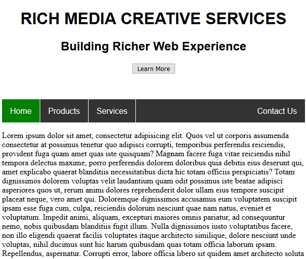
- Add the following HTML elements above the unordered list:
Code View:
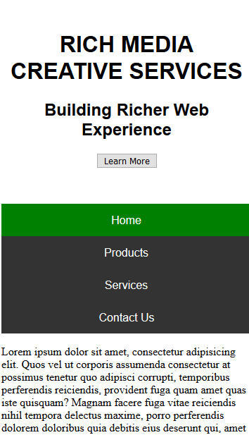
<div style="margin:50px 0;text-align:center;font-family:Arial">
    <h1> RICH MEDIA CREATIVE SERVICES</h1>
    <h2>Building Richer Web Experience</h2>
    <button>Learn More</button>
</div>
<ul id="nav"> - CHECK POINT: Save the file and preview it in a browser. You should see that the regardless of the amount of HTML elements that you add ABOVE the "ul" element, it will always be ABOVE THEM ALL because the following CSS selector (e.g., #nav ul {position:fixed; top:0; width:100%;}) is still in force. We will resolved this problem in the next step by commenting this selector out.
-
Comment out the previous CSS and add the following CSS rules to the style element:
Code View:
/* -------- FIXED NAVIGATION BAR  --------*/
/* ul {position:fixed; top:0; width:100%;}   */

/* -------- STICKY MENU  --------*/
ul {
position: -webkit-sticky; /* Safari */
position: sticky;
top: 0;}
</style>
CAUTION: Internet Explorer, Edge 15 and earlier versions do not support sticky positioning. Safari requires a -webkit- prefix (see example above). You must also specify at least one of top, right, bottom or left for sticky positioning to work.
TIP: Check the caniuse website and do a search on "Sticky" to find the current standards.Deign View:
- CHECK POINT: Save the file and preview it in a browser. You should see that when you scroll the page that the header and menu move until the header is "out of sight" and then the menu "stick" in place at the top of the page.
CSS media queries can be used to create a responsive design for mobile and tablets.
- Add the following meta element above the open style tag:
Code View:
<meta name="viewport" content="width=device-width, initial-scale=1.0">
<style>
Add the following media query within the style element
Code View:
/* ----- Responsive Design ----- */
@media screen and (max-width: 600px) {ul#nav li.right, ul#nav li {float: none;}}
</style>
Design View
- CHECK POINT: Save the file and preview it in a browser. Then, resize the browser to see how the menu collapse to a vertical menu.
Bonus
- Exernalize CSS.
- Save index.html as products.html, services.html, and contact_us.html.
- Edit CSS file to your liking (e.g., <h1>Home Page</h1>)
- Edit CSS file to your liking. (e.g., h1{color:green; font-family:Arial; margin-left:30px})
- Test pages in browser.