USING LESS PRE-PROCESSOR IN DREAMWEAVER
Video: Enhance your CSS with preprocessors
IMPORTANT NOTE: You have to define a web site and it has to be the active site in order for the CSS preprocessor to work.
Advantages of using CSS Preprocessors with Dreamweaver:
- Create cleaner CSS code
- Easier to maintain CSS code
- Reduce reducancy of CSS code
- Improve workflow of writing CSS code
CSS preprocessors (LESS, SASS, and STYLUS) extend the functionalities of CSS by adding new "programatic" features:
- Variables
- Nested Selectors
- Mixins
- Mixins with Parameters
Like traditional CSS, CSS preprocessors makes CSS easier to update and is akin to adding programming functionalities (variables, arrays, objects, or functions) to CSS.
Also, like traditional programming languages, there are two types of comments that can be used:
- The slash asterisk and asterisk slash: (/* Comment goes here */)
- The double slash: (// Comment goes here) but will not compile in the *.css file.
Also, like traditional programming, the preprocessor files have to be converted or compiled into CSS files using a compiler. The good new is that the current version of Dreamweaver (CC 2017 and above) has built-in compilers so there is no need to download and install them. Simply press CTRL + S to auto-compile the CSS or select Tools > Compile (or press F9) to manually compile individual CSS files.
LESS, SASS or STYLUS
Because both LESS (JavaScript based) and SASS (Ruby based) are backwards compatible, existing CSS can be converted into them by simply renaming the .css file extension to .less or .scss, respectively. Less uses the @ symbol and Sass uses the $ symbol to define a variable. Only the Less example will be shown here since they are so similar.
Do More With LESS
Variables
ADVANTAGE: Like all programming languages, variables are used to store a reference of longer code so that it can be used later in the code as a shortcut code that refers to the longer code but with a more meaningful name. For example, instead of having to remember a hexadecimal value for a color, that value could be stored into a variable for easier use and recognition.
Another advantage of using a variable is that if a value needs to be changed that has been declared in multiple places throughout the code, only the variable declaration needs to be updated and all instances in the code will reflect that change when the CSS is re-compiled.
It is important to note that variable declarations do not get compiled only the CSS instances of the variables. Variables are defined (assigned or declared) at the top of the code so that they can be loaded into memory and used later.
body {
  font-size: 16px;
}
header {
  border: 2px solid #cccccc;
  color: #ff0000;
  padding: 5px;
  height: 100px;
}
h1,
h2,
h3 {
  color: #ff0000;
}
This will compile to standard CSS syntax:
body {
  font-size: 16px;
}
header {
  border: 2px solid #cccccc;
  color: #ff0000;
  padding: 5px;
  height: 100px;
}
h1,
h2,
h3 {
  color: #ff0000;
}
Nesting Selectors
ADVANTAGE: It makes more sense to group together (nest) elements that are related to reduce that amount of code that you have to write. For example, most web site header will have a header, logo and navigation bar in it so it makes sense to have that as one group of code instead of three.
CAUTION: Avoid nesting more than four level deep which may make it harder to read and may affect speed.
header{
          color: black;
.logo {
       width:  300px;
      }

.navigation {
      font-size:  12px;
      }
}
This will compile to standard CSS syntax where the the main selector will compile to a tag selector and the others will compile to contextual selectors based off of the first selector:
header {
  color: black;
}
header .logo {
  width: 300px;
}
header .navigation {
  font-size: 12px;
}
Mixins: Mix It Up With Mixins
ADVANTAGE: Like traditional programming where variables hold a SINGLE value, arrays can hold multiple values in a single variable (container). Using mixins allow for multiple CSS declarations to be used.
Mixins is similar to Object Oriented Programming (OOP) where you can extend the functionality of one object based on the properties of another object. For example, let's say you want to make all button have rounded border but can have different color for each button that is created. Mixins is a great candidate for do this.
.rounded-border {
     border-radius: 5px;
     border: 1px solid black;
	 padding: 3px;
	 width: 150px;
	 margin-bottom: 3px;
	 color: white;
	 font-weight: bold;
     }

.button-red {
    .rounded-border();
     background: red;
     }

.button-green {
    .rounded-border();
     background: green;
     }

.button-blue {
    .rounded-border();
     background:  blue;
}
The above CSS will be "pre-processed" and EXPANDED to the following standard CSS syntax:
.rounded-border {
  border-radius: 5px;
  border: 1px solid black;
  padding: 3px;
  width: 150px;
  margin-bottom: 3px;
  color: white;
  font-weight: bold;
}
.button-red {
  border-radius: 5px;
  border: 1px solid black;
  padding: 3px;
  width: 150px;
  margin-bottom: 3px;
  color: white;
  font-weight: bold;
  background: red;
}
.button-green {
  border-radius: 5px;
  border: 1px solid black;
  padding: 3px;
  width: 150px;
  margin-bottom: 3px;
  color: white;
  font-weight: bold;
  background: green;
}
.button-blue {
  border-radius: 5px;
  border: 1px solid black;
  padding: 3px;
  width: 150px;
  margin-bottom: 3px;
  color: white;
  font-weight: bold;
  background: blue;
}
If you want to create the same mixin that will only be compiled when used, add a set of parentheses ( ):
.rounded-border() {
     border-radius: 5px;
     border: 1px solid black;
	 padding: 3px;
	 width: 150px;
	 margin-bottom: 3px;
	 color: white;
	 font-weight: bold;
     }

.button-red {
    .rounded-border();
     background: red;
     }

.button-green {
    .rounded-border();
     background: green;
     }

.button-blue {
    .rounded-border();
     background:  blue;
}
The above CSS will be "pre-processed" and EXPANDED to the following standard CSS syntax:
.button-red {
  border-radius: 5px;
  border: 1px solid black;
  padding: 3px;
  width: 150px;
  margin-bottom: 3px;
  color: white;
  font-weight: bold;
  background: red;
}
.button-green {
  border-radius: 5px;
  border: 1px solid black;
  padding: 3px;
  width: 150px;
  margin-bottom: 3px;
  color: white;
  font-weight: bold;
  background: green;
}
.button-blue {
  border-radius: 5px;
  border: 1px solid black;
  padding: 3px;
  width: 150px;
  margin-bottom: 3px;
  color: white;
  font-weight: bold;
  background: blue;
}
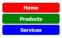
So, if you wrote the following HTML code:
<button class="button-red">Home</button><br/>
<button class="button-green">Products</button><br/>
<button class="button-blue">Services</button>
You would see the following displayed on the page:
Mixins and Parameters
ADVANTAGE: Like traditional function in programming, mixins can also be used with parameters to create functions for CSS code to make them more flexible. For example, if you wanted the border radius to be the same or different on multiple elements (headings, buttons, etc.) you could create a mixins with parameters to accomplish this task:
.border-radius(@radius) {
  -webkit-border-radius: @radius;
  -moz-border-radius: @radius;
  border-radius: @radius;
  border: 1px solid black;
  background-color: blue;
  display: inline;
  padding: 4px;
  font-family: Arial;
}

#header {
  .border-radius(6px);
}

.myButton {
  .border-radius(12px);
}
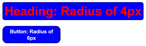
The CSS code will be "pre-processed" and EXPANDED to the following standard CSS syntax:
#header {
  -webkit-border-radius: 6px;
  -moz-border-radius: 6px;
  border-radius: 6px;
  border: 1px solid black;
  background-color: blue;
  display: inline;
  padding: 4px;
  font-family: Arial;
}
.myButton {
  -webkit-border-radius: 12px;
  -moz-border-radius: 12px;
  border-radius: 12px;
  border: 1px solid black;
  background-color: blue;
  display: inline;
  padding: 4px;
  font-family: Arial;
}
So if you wrote the following HTML code:
<h1 id="header">Heading of 4px</h1><br/>
<button class="rounded-border myButton">Button: Radius of 6px</button>
You would see the following displayed on the page: