CREATING A 2-COLUMN WEB SITE USING CSS
In this tutorial we will be creating a 2-column web site using CSS.
First, we need to create the four (4) main containers that will be used as the "framework" for our web page.
- Select File > New... from the menu (or press CTRL + N) and in the dialog box that appears, select or type the following options and then click the Create button:
- New Document as the type
- <HTML> as the document type
- NONE as the Framework
- Title as [YourName's Portfolio]
- Save file as index.html.
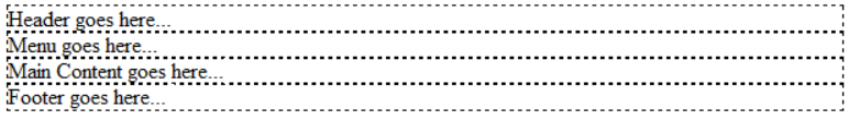
- Write the following four tags between the body tags:
<body>
	<header>Header goes here...</header>
	<div id="sidebar">Menu goes here...</div>
	<div id="main_content">Main Content goes here...</div>
	<footer>Footer goes here...</footer>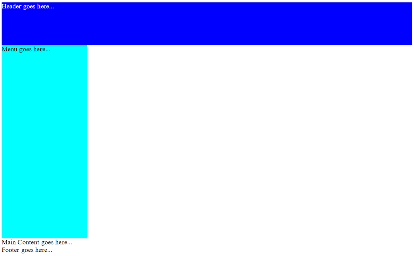
</body> - CHECK POINT: Because the four elements are block level elements, you should see them take up 100% of its parent container (the body element) and that they stack on top of one another. Note also that they appear on the page in the ORDER in which they were written in the HTML code which is the default STATIC positioning.
Now that we have created the four main containers, let's turn our attention on styling these containers with CSS using a style element.
SPECIAL NOTE: The background color for the sidebar and main_content divs are TEMPORARY. They are used so that you can SEE the structure of these div elements better.
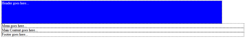
- Create a set of style elements above the closing head tag (</head>) and then write the following rules to style the header element:
<style>
header{
width: 960px;
height: 100px;
background-color: blue;
color: white;}
</style>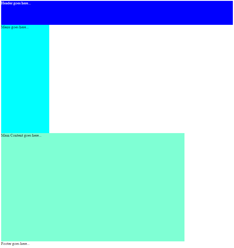
</head> - CHECK POINT: You should see that the header has been styled based on the CSS rules and that it has a FIXED width of 960px and a FIXED height of 100px. However, notice that the other three elements still EXTEND pass the header because they are not fixed so they will continue to strength to 100% of their parent container (that is the body element).
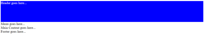
- CHECK POINT: Save the file and preview the page in a browser. You should see the header styled and the other three tags displayed similar to the Design view in Dreamweaver.
- Write the following rules to style the sidebar container below the header rules:
header{
width: 960px;
height: 100px;
background-color: blue;
color: white;}

#sidebar{
width: 200px;
height: 450px;
background-color:aqua;} - CHECK POINT: You should see the sidebar container expanded based on the CSS rules that were applied.
- CHECK POINT: Save the file and preview the page in a browser. You should see the sidebar container displayed and the other two elements displayed below it.
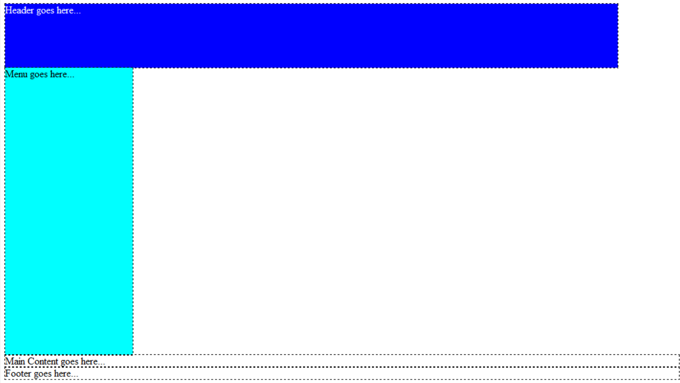
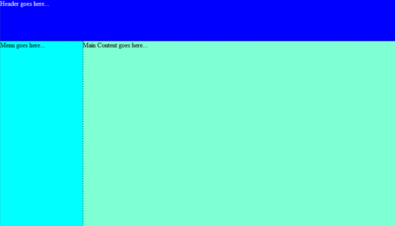
- Write the following rules to style the main_content container below the sidebar rules:
#sidebar{
width: 200px;
height: 450px;
background-color:aqua;}

#main_content{
width: 760px;
height: 450px;
background-color:aquamarine;} - CHECK POINT: Save the file and preview the page in a browser. You should see the main_content div expanded based on the CSS rules that were applied. However, it is below the sidebar container. This will be resolved shortly.
- Write the following rules to style the footer tag below the main_content rules:
TIP: Copy the header rule and paste it below the main_content rules and make the necessary changes.
#main_content{
width: 760px;
height: 450px;
background-color:aquamarine;}

footer{
width: 960px;
height: 50px;
background-color: blue;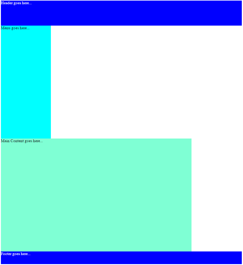
color: white;} - CHECK POINT: Save the file and preview the page in a browser. You should see the footer div expanded based on the CSS rules that were applied.
Currently, the sidebar and main_content containers are not positioned as we would like it. We will float them so that they "RISE to the occasion" in the Design View.
- Write the following float rule in the #sidebar CSS code block:
#sidebar{
width: 200px;
height: 450px;
background-color:aqua;
float: left;} - CHECK POINT: It is important to note:
SIDEBAR:
- Since the sidebar is already on the left, giving it a float property of left does not do make it float any more to the left.
- Giving it a float property cause it to "float" ABOVE any content on the page.
MAIN_CONTENT:
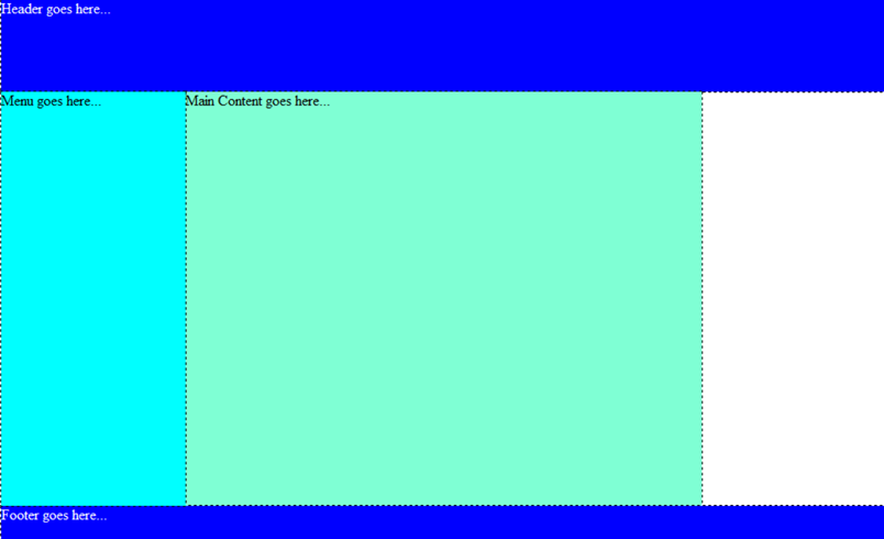
- It is floated left shown by the white space on the right side of it because the sidebar is "floated" above SO the main_content rises up and takes it rightful position below the header. However, the sidebar is hiding a portion of the main_content.
- While the main_content did moved up, notice that the phrase "Main Content goes here..." WRAPPED to the right so that it can be seen. This is because even though the sidebar is floated, it can still be seen by the text in the main_content container so move to "recapture attention" to itself so that it can be seen.
FOOTER:
The footer still sits below both the side_bar and main_content containers.
- OPTIONAL: To prove that the sidebar is hiding a portion of the main_content container, add a absolute property to the #sidebar ID selector:
#sidebar{
width: 200px;
height: 450px;
background-color: aqua;
float: left;
position: absolute;} - Now that the sidebar is "floating" because it has been given an absolute position, grab it by the top/left corner and drag it to the bottom right corner so that you can see the main_content container that is below it. Also, note the phrase "Main Content goes here..." moved back to its original position.
- Delete the position, top, and left properties from the code as it was only used to show the side_bar container was hiding a portion of the main_content container. The top and left properties were automatically created when you moved the side bar in the previous step.
#sidebar{
width: 200px;
height: 450px;
background-color: aqua;
float: left;position: absolute;left: 618px;top: 411px;}
- Write the same float rule in the #main_content CSS code block:
#main_content{
width: 760px;
height: 450px;
background-color:aquamarine;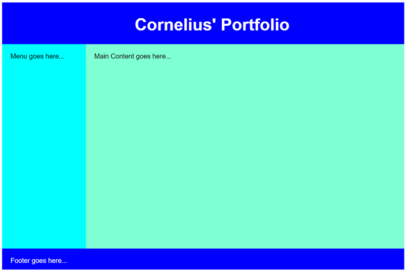
float:left;} - CHECK POINT: You should see the main_content container slided to the left of the sidebar. However, because both the sidebar and the main_content are floated, they both are taken out the the normal flow of the document and as a result the footer "rises" up and sits below the header. However, the footer can not be seen because it is hidden by both the sidebar and main_content containers. This will be resolved shortly.
- OPTIONAL: To prove that the footer is indeed behind the side_bar and main_content, add the position:absolute to both of the ID selectors for these containers and then move both containers out of the way to "see" the footer below. Then, delete the position, top, and left properties once finished from both of them once finished.
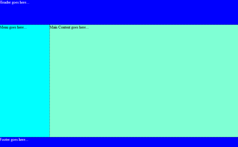
Because the footer is hidden behind the sidebar and the main_content containers, we need to bring it back down to the bottom of the page. To do this, we will use the clear property which allows you to "clear" one or more columns that has been taken out of the normal flow of the document.
- Write the following clear property in the footer container:
footer{width: 960px;
	height: 50px;
	background-color: blue;
	color: white;
clear: both;} - CHECK POINT: You should see the footer moves back down the page where it should be. Now the page looks more like an actual page structure.
Let's style the containers farther and add style rules for the text containers as well.
- Replace the text "Header goes here..." with [YourName's Portfolio] and then wrap it with an h1 tag.
- Write the following rules to style add margin and format text containers:
<style>
body{
	font-family:Arial;
}
header h1{
	margin-left: 33%;
	font-size: 40px;
	padding-top: 30px;
}
#sidebar, #main_content, footer{
	padding: 20px;
} - CHECK POINT: You should see that the text in the sidebar and main_content container has changed to Arial and they have been "pushed" off the edge of their respective containers because margins have been applied to them. However, because these padding were applied to these container, it increased the width and height of these containers causing them to EXPAND pass the 960px width and the height by 40px in both directions. Notice the main_content has rested below the sidebar and the footer has rested below the main_content (see screenshot below).
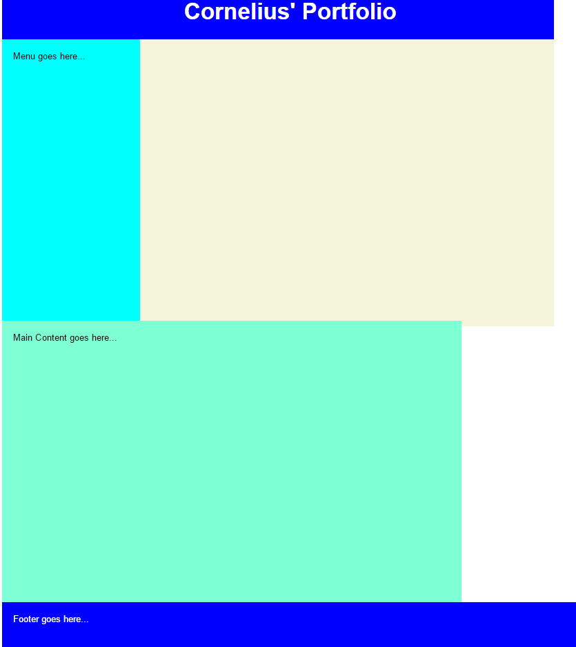
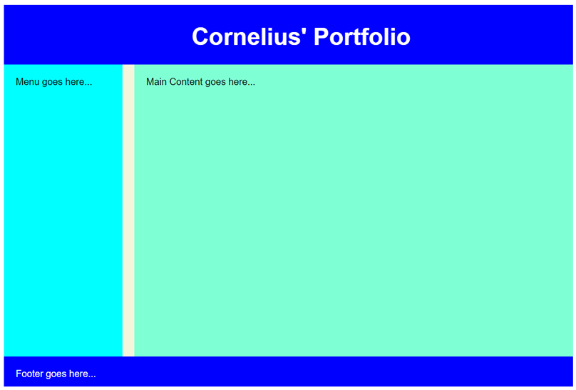
Let's see how we can "contain" the four (4) major containers by wrapping them with a div tag and giving it an ID of container.
- In the body of the page, wrap all four containers with another div tag and give it an id of container:
<body>
<div id="container">
<header>
	<h1>Cornelius' Portfolio</h1>
</header>
<div id="sidebar">Menu goes here...</div>
<div id="main_content">Main Content goes here...</div>
<footer>Footer goes here...</footer>
</div>
</body> - Write the following CSS rules to style the "container" container above the closing style tag (</style>):
#container {width: 960px;
	height: 600px;
	background-color:beige;}
</style> - CHECK POINT: You should see that attempting to "contain" the container caused some of them to wrap to the bottom. This is because the padding has increased the size of these containers and they have become "too big for their britches" (too large to contain).
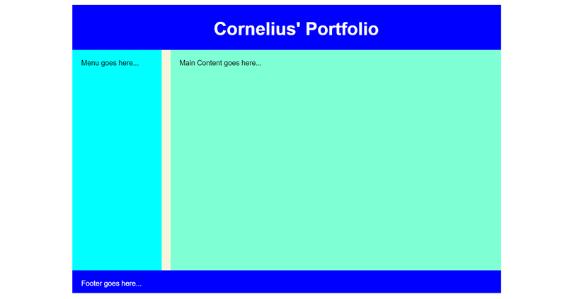
Because the padding increased the containers width and height, the corresponding containers have to be "adjusted" to compensate for the extra "padding."
- Adjust the CSS code to compensate for adding 40px to the width and height of some of the containers:
#sidebar{width: 160px; // 40px subtracted
	height: 450px;
	background-color:aqua;
	float: left;
	}

#main_content{width: 720px; // 40px subtracted
	height: 450px;
	background-color:aquamarine;
	float:left;
} - CHECK POINT: You should see that the sidebar and main_content width have been reduced to make it sit next to the sidebar neatly.
IMPORTANT NOTE: It is important to note that the width of the sidebar is STILL 200px. That's because the total width of the sidebar container includes the width of the sidebar PLUS the width of the padding that was added on both sides (40px). So the result is 200px (160px + 20px + 20px = 200px).
- Adjust the CSS code to compensate for adding 40px to the width and height of the footer container:
footer{width: 920px; // 40px subtracted
	height: 10px; // 40px subtracted
	background-color: blue;
	color: white;
clear: both;} - CHECK POINT: You should see that the footer now comes in line with the rest of the page.
IMPORTANT NOTE: It is important to note that the width of the main_content is STILL 960px. That's because the total width of the main_content container includes the width of the main_content PLUS the width of the padding that was added on both sides (40px). So the result is 200px (920px + 20px + 20px = 960px).
- OPTIONAL: Adjust the following CSS code to add a margin between the sidebar and main_content container:
#main_content{width: 700px; // Subtract 20 px
	height: 450px;
	background-color:aquamarine;
	float:left;
	margin-left: 20px; // Add a margin-left property to add 20 px to main_content container to push it off of the sidebar
} - CHECK POINT: You should see that the page now has a "gutter" between the sidebar and the main_content containers.
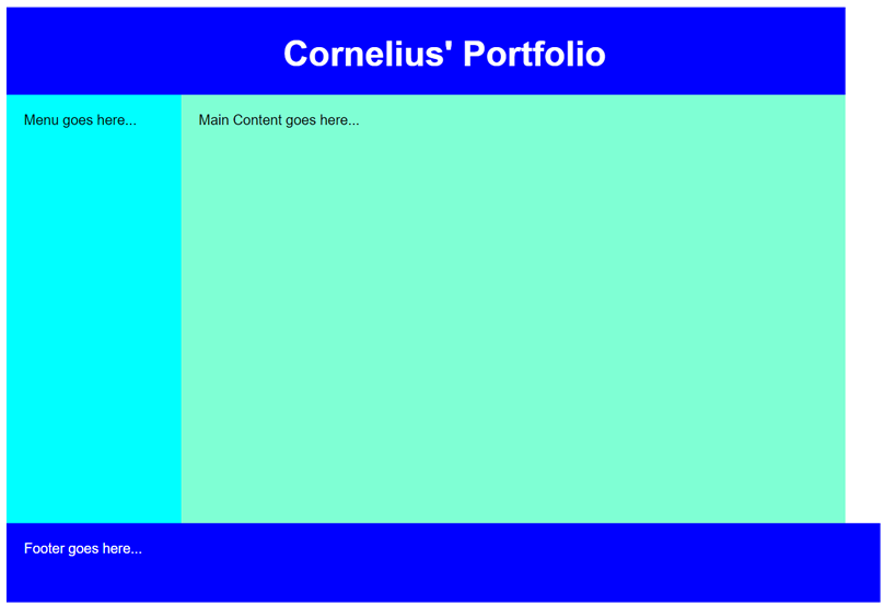
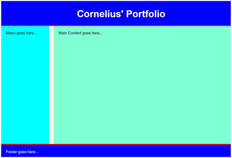
Currently, the page is positioned at the top-left corner of the browser. We would like to have it centered on the page at the top vertically.
- Write the following CSS margin property to the #container rule:
#container {width: 960px;
	height: 600px;
	background-color:beige;
margin: 0 auto;} - CHECK POINT: Save the file and preview it in a browser. You should see that it is now "centered" within the browser.
- (OPTIONAL) Write the following highlighted CSS to add a border to the bottom of the header and the top of the footer:
header{width: 960px;
	height: 100px;
	background-color: blue;
	color: white;
	border-bottom: 4px solid red;}

...

footer{width: 920px;
	height: 10px;
	background-color: blue;
	color: white;
	clear: both;
border-top: 4px solid red;} - CHECK POINT: You should see a 4px border on the header and footer.
- Remove background-color properties from the sidebar and main_content containers.
- Replace "Footer goes here..." with a copyright notice in the footer (e.g., Copyright 2020 by Cornelius Chopin. All rights reserved.)
- Optionally, add a text-align:center property to the footer selector:
footer{
width: 920px;
height: 10px;
background-color: blue;
color: white;
clear: both;
border-top: 4px solid red;
text-align:center;}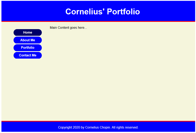
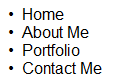
First, we will start by creating a simple list of paragraphs.
- Create a simple list of paragraphs by typing a list (e.g., Home, About Me, Portfolio, Contact Me) in Design View. In this case between the sidebar element:
- CHECK POINT: Save file and preview it in a browser.
Code View
<body>
   <p>Home</p>
   <p>About Me</p>
   <p>Portfolio</p>
   <p>Contact Me</p>
<body>
Design View:

- Convert list of paragraphs to a simple unordered (bullet) list by selecting all of the paragraphs and click the bullet list button in the Properties Panel.
Code View:
<ul>
NOTE: Notice how the "p" elements were converted to "li" elements and wrapped within a "ul" element.
<li>Home</li>
<li>About Me</li>
<li>Portfolio</li> <li>Contact Me</li>
</ul> - CHECK POINT: Save file as index.html and preview it in a browser. You should see a simple bullet list:
Next, let's convert the list to a list of links by applying an anchor tag <a> to the text in each of the list item (highlighted in bold).
NOTE: We could have named the first line home.html; however, it is best practice to name the "home page" index.html.
- Double-click the word Home to select it and then in the Properties panel type index.html in the Link text field.
- Repeat the previous step for the other three links but add about_me.html, portfolio.html, and contact_me.html in the Link text field.
Code View:
<ul>
  <li><a href="index.html">Home</a></li>
  <li><a href="about_me.html">Products</a></li>
  <li><a href="portfolio.html">Services</a></li>
  <li><a href="contact_me.html">Contact Us</a></li>
</ul> - CHECK POINT: Save file and preview it in a browser. You should see a list of links.
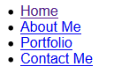
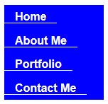
NOTE: Notice how each word got wrapped within an "a" element with an "href" attribute. - Add id to ul element to provide a "hook" for it when we style in the next section.
<ul id="nav">
Now, let's address the links themselves by creating a contextual selector (e.g., #nav li) to target the anchor element (<a>) and the style the link themselves:
- Add the following CSS selector to style the li element
/* ------ Style list items ----- */
#nav li{
background-color: blue;
list-style-type: none;}
</style> - CHECK POINT: This selector style the "li" elements with a blue background and remove the bullets. However, the text is hard to see. This will be resolved in the next step.
- Add the following CSS rules to style the links themselves
TIP: ADD ONE PROPERTY AT THE TIME SO THAT YOU CAN SEE THE CHANGES BETTER.
Code View:
/* ------ STLYLE LINKS ---------- */
#nav a {
text-decoration: none;
color:white;
padding: 0 15px;
line-height: 2.1;
font-weight:bold;
border-bottom: 1px solid white;
text-align:center;}
</style>
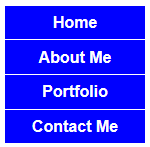
NOTE: The #nav a CSS rules performed the following tasks:
- Remove the underline on each link
- Change the text color to white
- Add padding to left and right of text to push them off the edges
- Increase the line-height to make menu items taller
- Add a white border to the bottom to divide menu items
- Align text to center
- CHECK POINT: Save the file and preview it in a browser. You should see the following changes:
NOTE: There is a problem with the current implementation. Because the above rules were applied to the "a" element, the padding will only be added to the right and left of the text – not across the width of its parent container (<ul>). Also, the white borders at the bottom will only extend to the end of the inline "a" elements. If you were to preview this in a browser, you would see that clickable area would only be over the text and the padding on both sides. There is a quick solution to this problem.
Remember from our discussion of inline vs block-level element that inline elements only consume only the amount of space they need. However, block-level elements consume the whole width of its parent container. So to fix this problem, all we have to do is convert the inline elements to block-level elements by adding the following rule (highlighted in bold) to the existing #nav a block in the next step.
- Add the following display:block rule to the existing #nav a selector:
Code View:
/* ------ STLYLE LINKS ---------- */
NOTES:
#nav a {
text-decoration: none;
color:white;
padding: 0 15px;
line-height: 2.1;
font-weight:bold;
border-bottom: 1px solid white;
text-align:center; display:block;}
</style>
- The display: block rule causes the links to displays as block elements which makes the whole link area clickable not just the text and it allows the width/height, padding/margin to be specified.
- Notice the padding values of 0 and 15px. When a value is zero, there is no need to specify a unit because it does not really matter if the unit is in pixels, inches, etc. since the value is zero. Also, when only two values instead of four are written for padding, the first value refers to top or bottom and the second value refers to left or right of the box element.
- Save the file and preview it in a browser, you should see that the clickable area extends across the whole width of each menu item.
Now, let's enhance our menu by creating a hover effect when the user moves the mouse of a menu item. To create a hover effect, we will apply a hover pseudo-class to the <a> tag inside the nav area
- Add the following selector to the style element:
Code View:
 /* --------- STLYLE LINKS HOVER ---------- */
#nav a:hover {
background-color: #006;}
</style> - CHECK POINT: Save the file and preview it in a browser. You should see the bullet list behave more like a menu now. To "see" the hover effect, preview in a browser and roll mouse over menu.
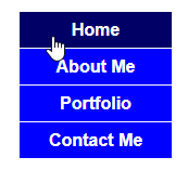
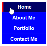
NOTE: You can also use a background image for the Active and Hover state as well as change the font color, etc. - OPTIONAL: Add a border to the left by adding the following highlighted rule to the existing selector:
 /* --------- STLYLE LINKS HOVER ---------- */
#nav a:hover {
background-color: #006;}
border-left: 5px solid red; }
</style> - CHECK POINT: Save the file and preview it in a browser. You should see when you roll your mouse over any menu item, a red border appears on the left.
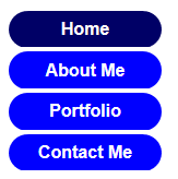
- (OPTIONAL) If you prefer to have rounded buttons with a space between them, modify the CSS as follow.
Add the following selector below the #nav a selector and temporarily change the border-bottom rule to red.
Code View:
/* ------ Style list items ----- */
 #nav li{background-color: blue;
list-style-type: none;
border-radius: 30px;
margin-bottom: 3px;} - Remove border-bottom: 1px solid white; from the #nav a selector as the border white border is no longer needed for the rounded menu buttons.
/* ------ STLYLE LINKS ---------- */
#nav a {
text-decoration: none;
color:white;
padding: 0 15px;
line-height: 2.1;
font-weight:bold;border-bottom: 1px solid white;
text-align:center;
display:block;} - CHECK POINT: Save the file and preview it in a browser. You should that the menu items now have rounded corner. However, if you hover over a menu it the hove state is still square. This will be resolved in the next step.
- Add the border-radius to the #nav a:hover selector and delete the border-left property.
/* --------- STLYLE LINKS HOVER ---------- */
#nav a:hover {
background-color: #006;border-left: 5px solid red;
border-radius: 30px;} - CHECK POINT: Save the file and preview it in a browser. The hover problem has been resolved.
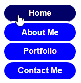
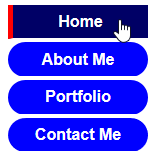
An "active" id can be add to a link to let the user know which page is currently active.
- Add the following active class to the style element.
/* ---------- ADD ACTIVE LINK ---------- */ .active {background-color: #006; color: white;} </style> - Add the id the the HOME link:
<li id="active"><a href="index.html">Home</a></li>
- CHECK POINT: Save the file and preview it in a browser. You should see the HOME menu is highlighted because of the active class.
Since the menu items will be shared by multiple pages in your site or used for another site, you can externalize it so that it can be shared among all of the other pages. In this way, if you need to make any changes, you would only have to update the external CSS file and the changes will be AUTOMATICALLY reflected. in all pages that it is attached to.
- .CUT only the Menu related CSS file from between the style element: See below:
/* ------ Style list items ----- */
#nav li{background-color: blue;
list-style-type: none;
border-radius: 30px;
margin-bottom: 3px;
}
/* ------ STLYLE LINKS ---------- */
#nav a {
text-decoration: none;
color:white;
padding: 0 15px;
line-height: 2.1;
font-weight:bold;
border-bottom: 1px solid white;
text-align:center;
display:block;}
/* --------- STLYLE LINKS HOVER ---------- */
#nav a:hover {
background-color: #006;
/* border-left: 5px solid red;*/
border-radius: 30px;
}
/* -----Stylize ul element ------- */
#nav{
width:140px;}
/* ---------- ADD ACTIVE LINK ---------- */
#nav #active {
background-color: #006;
}
/* ---------- ADD ACTIVE LINK ---------- */
.active {background-color: #006; color: white;} - Create a new CSS file and name it main.css and place it in a folder called css.
- Add the following link element above the style element.
<link href="css/main.css" rel="stylesheet"/>
<style> - CHECK POINT: You should see the page behave as before; however, this time the CSS is outside of the page and will be shared with the other pages in the next section.
Now that the first page has been created. We will use it to create the other pages.
- Save the index.html file as about_me.html, portfolio.html, and contact_me.html
- In each of the pages, change:
- the title tag
- the main container area.
- the active link to the current page li element.