STYLING LIST: A SIMPLE CSS-BASED VERTICAL NAVIGATIONAL MENU
Download Vertical_Nav_Menu.zip
A basic navigational menu can be created from a list (ordered or unordered) by making each list item a link and then "stylize" the whole list to make it behave like a menu.
Notice the systematic steps in the accordion below:
- Create (1)
- Convert (2)
- Style (3)
- Add (3)
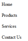
First, we will start by creating a simple list of paragraphs.
- Create a simple list of paragraphs by typing a list (e.g., Home, Products, etc.) in Design View. In this case between the body element:
- CHECK POINT: Save file and preview it in a browser.
Code View
<body>
   <p>Home</p>
   <p>Products</p>
   <p>Services</p>
   <p>Contact Us</p>
<body>
Design View:
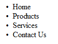
- Convert list of paragraphs to a simple unordered (bullet) list by selecting all of the paragraphs and click the bullet list button in the Property Panel.
Code View:
<ul>
NOTE: Notice how the "p" elements were converted to "li" elements and wrapped within a "ul" element.
<li>Home</li>
<li>Products</li>
<li>Services</li> <li>Contact Us</li>
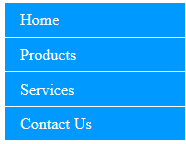
</ul> - CHECK POINT: Save file as index.html and preview it in a browser. You should see a simple bullet list:
Next, let's convert the list to a list of links by applying an anchor tag <a> to the text in each of the list item (highlighted in bold).
NOTE: We could have named the first line home.html; however, it is best practice to name the "home page" index.html.
- Double-click the word Home to select it and then in the Properties panel type index.html in the Link text field.
- Repeat the previous step for the other three links but add products.html, services.html, and contact_us.html in the Link text field.
Code View:
<ul>
  <li><a href="index.html">Home</a></li>
  <li><a href="product.html">Products</a></li>
  <li><a href="services.html">Services</a></li>
  <li><a href="contact_us.html">Contact Us</a></li>
</ul> - CHECK POINT: Save file and preview it in a browser. You should see a list of links.
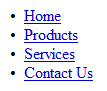
NOTE: Notice how each word got wrapped within an "a" element with an "href" attribute.
Now, let's address the links themselves by creating a contextual selector (e.g., #nav a) to target the anchor element (<a>):
- Add the following CSS rules to the "#nav a" selector in the style element
Code View:
/* ---------- STLYLE LINKS ---------- */
#nav a {
text-decoration: none;
color: white;
padding: 0 15px;
line-height: 2.1;
border-bottom: 1px solid white;}
</style>
NOTE: The #nav a CSS rules performed the following tasks:
- Remove the underline on each link so that they look like buttons
- Change text color to white
- Add padding to left and right of
text to push them off the edges - Increase the line-height to make
menu items taller - Add a white border to the bottom to
divide menu items
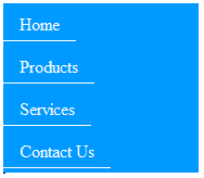
- CHECK POINT: Save the file and preview it in a browser. You should see the links changed to white.
NOTE: There is a problem with the current implementation. Because the above rules were applied to the "a" element, the padding will only be added to the right and left of the text – not across the width of its parent container (<ul>). Also, the white borders at the bottom will only extend to the end of the inline "a" elements. If you were to preview this in a browser, you would see that clickable area would only be over the text and the padding on both sides. There is a quick solution to this problem.
Remember from our discussion of inline vs block-level element that inline elements only consume only the amount of space they need. However, block-level elements consume the whole width of its parent container. So to fix this problem, all we have to do is convert the inline elements to block-level elements by adding the following rule (highlighted in bold) to the existing #nav a block in the next step.
- Add the following display:block rule to the existing #nav a selector:
Code View:
/* ---------- STLYLE LINKS ---------- */ #nav a {NOTES:
text-decoration: none;
color: white;
padding: 0 15px;
line-height: 2.1;
border-bottom: 1px solid white;
display:block; text-align:center;
}
- The display: block rule causes the links to displays as block elements which makes the whole link area clickable not just the text and it allows the width/height, padding/margin to be specified.
- You can add a text-align: center; rule to center the text if you want.
- Save the file and preview it in a browser, you should see that the clickable area extends across the whole width of each menu item.
NOTE: Notice the padding values of 0 and 15px. When a value is zero, there is no need to specify a unit because it does not really matter if the unit is in pixels, inches, etc. since the value is zero. Also, when only two values instead of four are written for padding, the first value refers to top or bottom and the second value refers to left or right of the box element.
Now, let's enhance our menu by creating a hover effect when the user moves the mouse of a menu item. To create a hover effect, we will apply a hover pseudo-class to the <a> tag inside the nav area
- Add the following selector to the style element:
Code View:
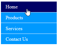
/* ---------- STLYLE LINKS HOVER ---------- */ #nav a:hover { background-color: #006;} </style> - CHECK POINT: Save the file and preview it in a browser. You should see the bullet list looks more like a menu now. To "see" the hover effect, preview in a browser and roll mouse over menu.
NOTE: You can also use a background image for the Active and Hover state as well as change the font color, etc. - OPTIONAL: Add a border to the left by adding the following highlighted rule to the existing selector:
/* ---------- STLYLE LINKS HOVER ---------- */
#nav a:hover { background: #006;
    border-left: 5px solid red; }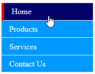
</style> - CHECK POINT: Save the file and preview it in a browser. You should see when you roll your mouse over any menu item, a red border appears on the left.
- (OPTIONAL) While not a major problem, it would be nice to have a border at the top of the menu as well so that it can be seen if the menu background color is not white. To include this in your menu for now or in the future, we will target the #nav selector and add a top border to it.
Add the following selector below the #nav a selector and temporarily change the border-bottom rule to red.
Code View:
/* ---------- STLYLE LINKS ---------- */
#nav a {
text-decoration: none;
color: #FFF;
padding: 0 15px;
line-height: 2.1;
border-bottom: 1px solid red;
display:block;
/*text-align:center;*/
}
#nav:first-child {
  border-top: 2px solid red;
} - CHECK POINT: Save the file and preview it in a browser. You should that the red border is between each menu item.
- Change the color to white instead of red as it was only use so that you could see the border.
/* ---------- STLYLE LINKS ---------- */
#nav a {
text-decoration: none;
color: #FFF;
padding: 0 15px;
line-height: 2.1;
border-bottom: 2px solid white;
display:block;
/*text-align:center;*/
}
#nav:first-child {
  border-top: 2px solid white;
} - CHECK POINT: Save the file and preview it in a browser. While not obvious the border is white at the top of the menu.
An "active" class can be add to a link to let the user know which page is currently active.
- Add the following active class to the style element.
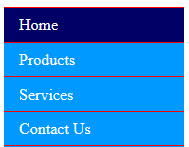
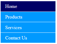
/* ---------- ADD ACTIVE LINK ---------- */ .active {background-color: #006; color: white;} </style> - Add the class the the HOME link:
<li class="active"><a href="index.html">Home</a></li>
- CHECK POINT: Save the file and preview it in a browser. You should see the HOME menu is highlighted because of the active class.
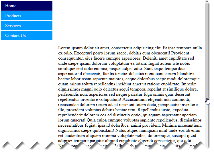
- Below the closing tag (</ul>) type p>Lorem800 and then press the TAB key.
- CHECK POINT: Save the file and preview it in a browser. If you scroll the page, you will see that the menu and text both scroll.
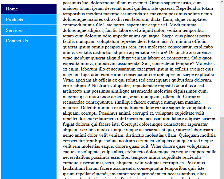
- Update the #nav selector with the following highlighted rules.
/*----- STYLE LIST ------- */
NOTES: The following rules do the following:
#nav {
list-style-type: none;
background-color: #09F;
width:180px;
padding:0; margin:0;
/*border: 1px solid black;*/
position: fixed;
height: 100%;
overflow: auto;
}
- height: 100%; - makes menu the full height of the page
- position: fixed; - Makes the menu stick to the top of the page even when page is scrolled
- overflow: auto; - Enable scrolling if the menu has too much content
- CHECK POINT: Save the file and preview it in a browser. If you scroll the page, only the text scroll and not the menu (it stays fixed to the side)
TIMESAVING TIP: Once you have some or all of the CSS rules you need to create a functional menu, you can create a snippet of the CSS code and then reuse the code again in a new web site or new web site file by simply inserting the snippet in the style element or an external style sheet or create a new style sheet altogether: The advantage of this is that once you have code that work you don't have to type it again or figure out how it was done again.
- Highlight the rules you want from the CSS code to make a functional menu
- Select Window > Snippets (SHIFT+F9) and then click on the New Snippet icon at the bottom of the Snippets panel.
- (Optional) Create your own folder if you like (e.g., MySnippets) by clicking on the New Snippet Folder icon at the bottom of the Snippets panel.
- Add the following in the Snippets dialog box:
- Name: Give the snippet a descriptive name (e.g., VerticalMenuUsingCSS).
- Description: Add a description and any comments on how to use or implement the snippet.
EXAMPLE:
- Create a list of links in the sidebar and then convert it to a bullet list and then add anchor links
- Insert this snippet by adding it the the style element or an external style sheet.
- Give the ul element an ID name of nav (e.g., <ul id="nav">
- Click the Insert Block radio button so that the code can be inserted as a complete code block.
NOTE: You should see the code you highlighted in the Insert Code text field (example below)
/*----- STYLE LIST ------- */
#nav {
   list-style-type: none;
   background-color: #09F;
   width:180px;
   padding:0; margin:0;
   /*border: 1px solid black;*/
     position: fixed;
     height: 100%;
     overflow: auto;
    }
/* ---------- STYLE LINKS ---------- */
#nav a {
text-decoration: none;
color: #FFF;
padding: 0 15px;
line-height: 2.1;
border-bottom: 1px solid white;
display:block;
/*text-align:center;*/
}
#nav:first-child {
border-top: 1px solid white;
}
/* ---------- STLYLE LINKS HOVER ---------- */
#nav a:hover { background: #006;
/*border-left: 5px solid red;*/ }
/* ---------- ADD ACTIVE LINK ---------- */
.active {background-color: #006; color: white;} - Click the OK button to save the code as a snippet.
- To insert this snippet into a new or existing *.html file:
- Create a list of links in the sidebar and then convert it to a bullet list and then add anchor links
- Insert this snippet by adding it to the style element or an external linked style sheet.
- Give the <ul> tag an ID name of "nav" (e.g., <ul id="nav">.
To let the user know what page he or she is currently on, we will write some code the "detect" what page the browser is viewing and highlight the corresponding menu accordingly.
- Write ID for each "li" element by updating the unordered list (highlighted in bold) in Code View.
Code View:
<ul id="nav">
  <li id="nav_home"><a href="index.html">Home</a></li>
  <li id="nav_products"><a href="products.html">Products</a></li>
  <li id="nav_services"><a href="services.html">Services</a></li>
  <li id="nav_contact_us"><a href="contact_us.html">Contact Us</a></li>
</ul> - Write a series of group ID selectors to target their respective pages in the style element.
Code View:
/* ---- For DW Template---- */
NOTES:
#body_home #nav_home a,
#body_products #nav_products a,
#body_services #nav_services a,
#body_contact_us #nav_contact_us a
{background-color:#00F;
font-weight:bold;
cursor:auto;}
</style>
- The #body_home, #body_products, etc. will provide the necessary "hooks" to target the necessary id (i.e., #nav_home, #nav_products, etc.) for the specific menu item.
- The cursor:auto property is used to change the cursor back to the default arrow and allow the button to not change state when it is mouse-over and the user will not be tempted to click it.
- The above is a group selector. While not necessary each selector is placed on a line by itself separated by commas except for the last selector.
- This technique is best practice because:
- It allows you to style multiple sections of your page differently, not just the nav bar.
- The navbar is always constant and easier to update. You could use a single Server-Side include for the navbar on every page.
- The style is more specific than a normal hover-state style which means that the current viewed page (or section) will not change to reflect the hover style when the mouse is rolled over it.
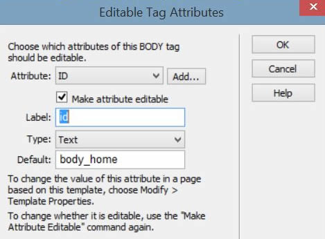
- Add IDs to each page in body tag to target menu item for those pages by opening the template page and then selecting Tools > Templates > Make Attributes Editable.... In the Editable Tag Attributes dialog box that appears, enter the following info:
- Attributes: Click the Add... button and in the dialog box that appears, type id into the text field.
- Make attribute editable: Check it.
- Label: id
- Type: Text
- Default: body_home
- Then, click the OK button.
NOTE: This dialog box allows you to make minor changes to a page that is based on a template without opening the template by defining a variable that can "vary" or change from page-to-page so that the contextual (or conditional) selector gets applied.
NOTE: This will add the following code highlighted in blue to the template page:
<!-- TemplateBeginEditable name="head" -->
<!-- TemplateEndEditable -->
<!-- TemplateParam name="id" type="text" value="body_home" -->
</head>
<body id="@@(id)@@">
- Open each page that is associated with the template and select Edit > Template Properties and change the id from body_home to match id of the page that was created earlier. (i.e., body_products).
Code View:
<body id="body_products">
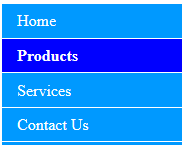
- CHECK POINT: Save the file and preview it in a browser. You should see the Products Menu highlights with a different color with its text in bold without having to hover over that menu.
- Test several times by changing the id attribute in the body tag from <body id="body_products"> to <body id="body_home"> then <body id="body_services"> and <body id="body_contact_us">. This is for testing purposes only, in real life, add these attributes to the corresponding pages (e.g., body.html, products.html, etc.)