Classical Adobe Illustrator Effects In A Few Steps
The goal of the tutorial is to showcase some of the most popular effects that have withstood the test of time. It assumed you are familiar with basic Illustrator techniques. For example, if you are told to resize (transform) an image, steps on how to do this will not be given (e.g., Press E, select one of the handle and scale the image). Below are some additional things you want to consider before getting started:
- To open multiple images at ONE time, select File Place, select the images you want to insert and with the "selection gun" shot the images one at a time onto the artboard.
- It is best practice to name each layer you create. However, to save time in this tutorial none of the layers are named.
After doing a few of these effects, you will begin to notice a pattern of similar steps are taken for most effects. Most effects require only several techniques below:
- A background layer with an image or a fill color is created
- An object is created or placed into another layer as a foreground image.
- A transformation is done - usually to scale or rotate
- A mask is applied (e.g., clipping mask, opacity mask)
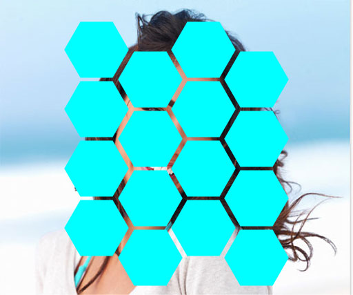
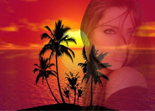
Clipping An Image Into Text
Clipping an image in a text is one of the first effect that most users learn to do in Ilustrator and Photoshop.
BEFORE:

AFTER:
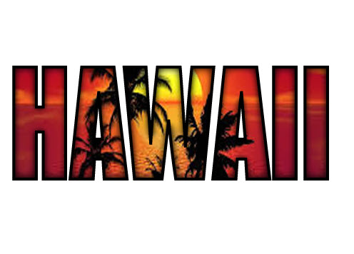
STEPS:
- Create a new file and place a background image that you want to use to clip into some text.
- With the Type Tool, type some text (e.g., HAWAII) using a large bold font (e.g., Impact) and position it within the center of the artboard.
- Select BOTH the background AND text and then right-click or control-click and select Make Clipping Mask.
CHECK POINT: You should see the background image "clipped" into ALL of the letters of the text.
- Optionally, add whatever effects you like (e.g, stroke, inner glow, etc.)
NOTE: You may have to add some effects (e.g., Inner glow) from the Appearance panel and not the Effects menu.
Clipping An Image Into A Single Shape
Clipping Mask in Illustrator is similar to Photoshop Clipping Mask.
BEFORE:
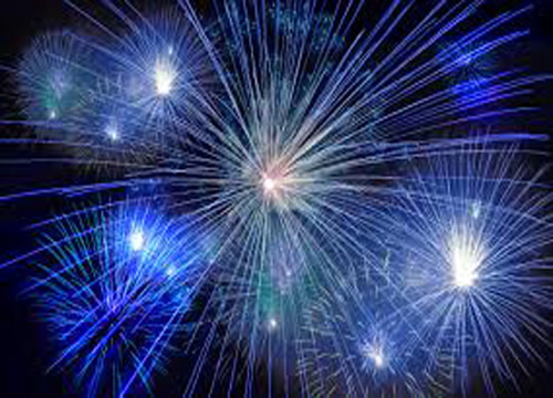
AFTER:
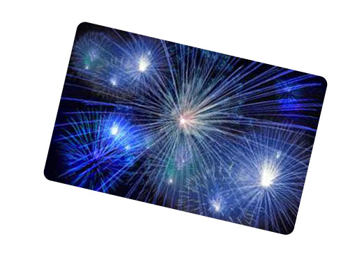
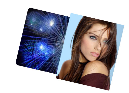
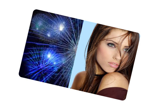
STEPS:
- Create a new file and place a background image that you want to use to clip into a shape(e.g., fieworks - See BEFORE example).
- Create a shape (e.g., a rounded rectangle that represents credit card) that you would like to clip an image into.
- If necessary, scale the background image to be slightly larger that the shape you just created.
- Select BOTH the background image AND the shape and then select Object > Clipping Mask > Make.
- If necessary, rotate the clipped artwork.
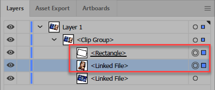
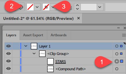
- CHECK POINT: Notice in the Layers panel, the image and shape has been placed in a sublayer named <Clip Group>. Also notice that the layer that is doing the "CLIPPING" has a underline on it.
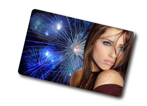
BONUS 1:
To add additional images that you want to be "clipped" into a shape, you can create them and then drag the layer into the <Clip Group> and they will become a part of the Clipping Mask.
- Open another image (e.g., model) and resize and reposition it so that it fits where you want it to be clipped.
- Drag the image into the <Clip Group> in the Layers panel BELOW the layer doing the "clipping" (e.g., the layer with the underline).
NOTE: You can place the image anywhere in the <Clip Group>; however, it is a preference to place it under the mask. - CHECK POINT: You should see that the image is clipped like the other image.
BONUS 2:
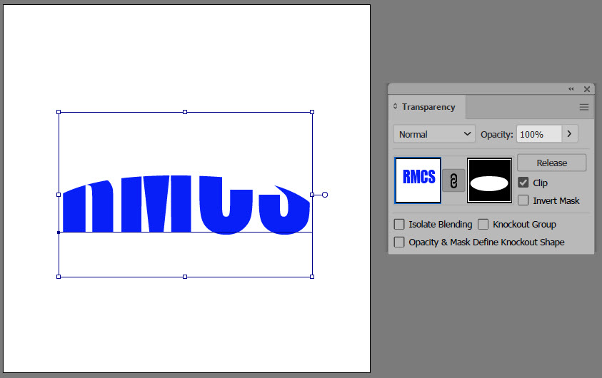
If the image that you clipped has a background that you would like to remove, you can add an Opacity Mask to remove it. In the example below the CLIPPING MASKS DOUBLES AS AN OPACITY MASK.
- Ensure that the clipping layer (layer with underline) is ABOVE the image you want to apply an Opacity Mask to. Highlighted with the red border in the screenshot below.
NOTE: The clipping layer will double as an opacity layer.
- Select both the clipping layer and the image that you want to apply an opacity mask to and then open the Transparency panel and click the Make Mask button.
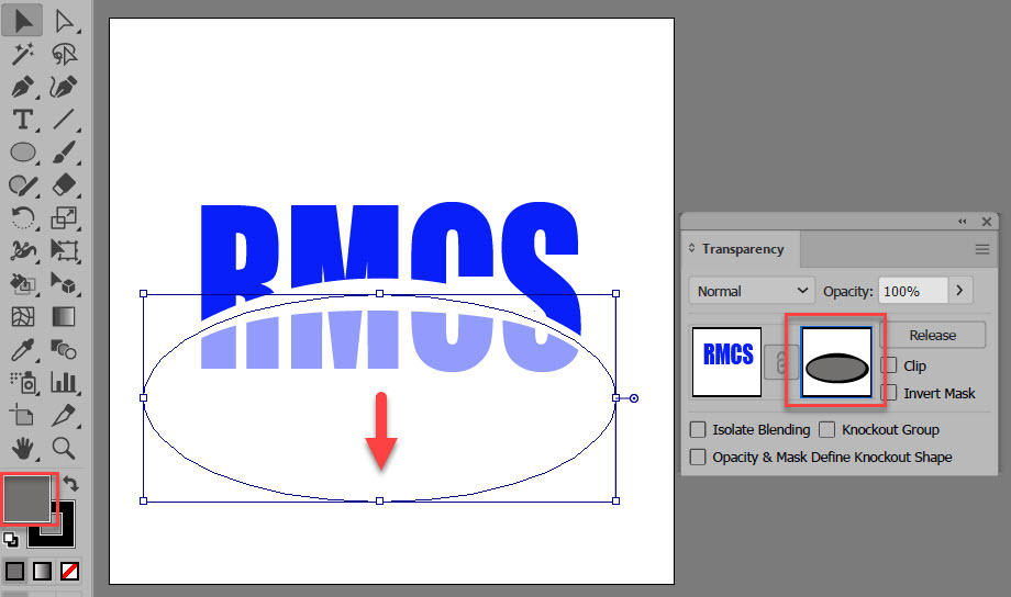
- CHECK POINT: Notice that the image disappears on the artboard and the thumbnail mask turns black. Remember the golden rule for masking: BLACK CONCEALS and WHITE REVEIEWS. So, since the entire thumbnail is BLACK the entire image is CONCEALED on the artboard.
- In the Transparency dialog box, DESELECT the Clip checkbox and SELECT the Invert Mask checkbox so that the image can be seen.
- CHECK POINT: Notice that the image reappears on the artboard and the thumbnail mask turns white. Remember, the golden rule for masking: BLACK CONCEALS and WHITE REVEIEWS. So, since the entire thumbnail is WHITE the entire image is REVEALED on the artboard.
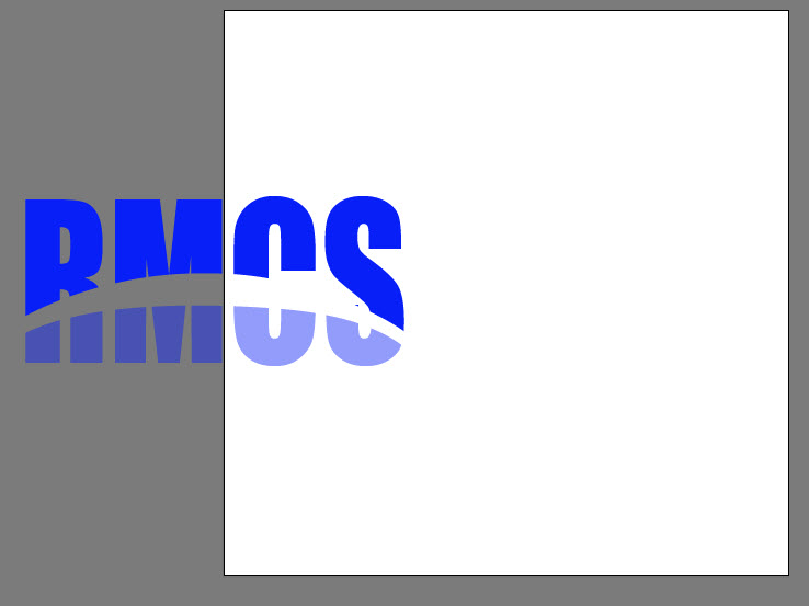
- Click the mask thumbnail (not the image thumbnail) in the Transparency panel and then with the Fill color set to black, use the Blob Brush Tool and paint away area of the image that you don't want to see..
BONUS 3:
- Add layer effects (drop shadow etc.) if your desire.
Clipping An Image Into Multiple Shapes
Clipping an image in multiple shapes requires an additional step of converting the multipel shapes into a compound path.
BEFORE:

AFTER:

STEPS:
- Create a new file and place a background image that you want to use to clip into multiple shapes (e.g., polygons - See BEFORE example).
- Create more than one shape in the SAME layer as the background image - See BEFORE example.
- Select BOTH the background AND shape(s) and then right-click and select Make Clipping Mask.
- CHECK POINT: Notice only the LAST SHAPE (e.g., polygon) that you created was clipped. The reason for this is because only one shape can be clipped unless you convert all of the shapes into a Compound Path.
- Undo the last step, select all of the SHAPES but NOT the background image and and then right-click and select Make Compound Path.
TIP: To select all of the shapes except the background image, select every thing first and the hold down the SHIFT key and click the background image to deselect it from the group. - Select BOTH the background AND shapes again and then right-click again and select Make Clipping Mask.
- CHECK POINT: You should see the background image "clipped" into ALL of the shapes.
BONUS:
- Add other effects (stroke, etc.) if your desire.
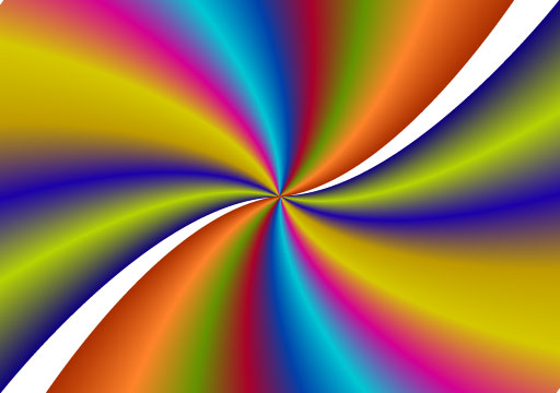
Vignette Effect
In order to create a vignette effect, we cannot use the Clipping Mask as it will not work. Instead, we need to use a Opacity Mask. An Opacity Mask is similar to a Layer Mask in Photoshop but you can use a vector or a grayscale bitmap image.
BEFORE:

AFTER:

STEPS:
- Open an image that you would like to add a vignette effect.
- With the Ellipse Tool, draw a white oval shape without a stroke about the area you want the vignette to be displayed.
- Select Effect > Blur > Gaussian Blur... and set a radius of about 5 pixels and then click the OK button -- See BEFORE image above.
- Select both the image and the oval and then select Object > Clipping Mask > Make.
NOTE: This step was done only to show that the Clipping Mask option will not because a clipping mask will only recognize the vector and not the blur. - Undo the previous step (CMD/CTRL+Z), select both the image and shape again and then Window > Transparency.
- In the Transparency dialog box, click the Make Mask button.
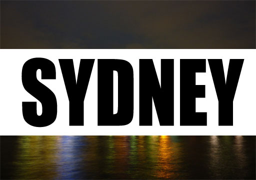
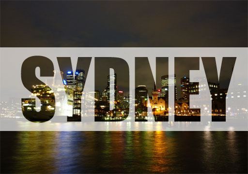
Knock Out Text
The Opacity Mask is used to show/hide a portion of a layer so that another layer beneath it can be shown or hidden.
BEFORE:
AFTER
STEPS:
- Import (place) an image that you would like to use as a background (e.g., skyline).
- With the Rectangle Tool, draw a white rectangle without a stroke in the middle of the canvas that is about a third of the canvas height and the full width of the canvas.
- Add a large bold font text (e.g., SYDNEY) on top of the white rectangle.
- Lock the background layer, select both the text and the rectangle, and then open the Transparency panel and click the Make Mask button.
- Deselect the Clip checkbox in the Transparency panel and reduce the opacity to about 35%.
BONUS:
Change the text.
- Click the Release button in the Transparency panel.
- Repeat steps 3-5 above; however, you don't need to change the opacity.
NOTE: Lowering the opacity to about 50% helps so that you can see the image below so you know where to paint on the Layer Mask. Remember, black will conceal pixel in an image and white will reveal pixels in an image.
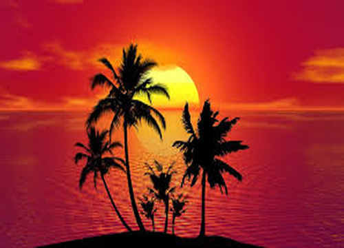
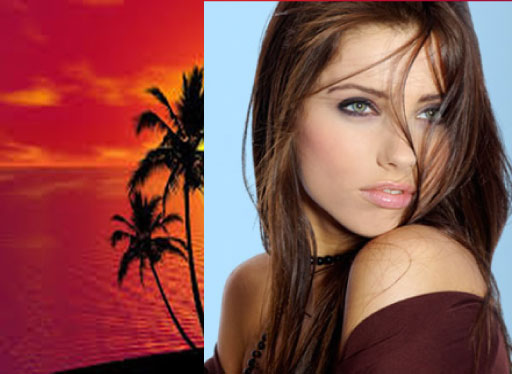
Fade One Image Into Another
Like Photoshop, a Gradient Mask is an Opacity Mask with a gradient applied to it.
BEFORE:
AFTER:
STEPS:
- Open a background image and an image you would like to apply a gradient mask.
- With the Rectangle Tool, draw a white rectangle without a stroke the same size as the canvas.
- With the Rectangle and the Image layers selected and with the Transparency panel opened, click the Make Mask button.
- Click the Mask thumbnail (not the Image thumbnail) in the Transparency panel and then with the Gradient panel opened, adjust the black and white gradient stops to get the desired effect you want.
- If necessary, click outside of the canvas to deselect the current selection and then switch from the gradient swatch to the color swatch.
- If necessary, use the Blob Paint Brush and paint with black or white to add or remove other areas as needed.
NOTE: Gradient masks are typically used to create montage and collage images.
Custom Text
BEFORE:
AFTER:
STEPS:
- Create the text you want to convert to an outline so that you can create your own text.
- Select the text and then right-click and select Create Outlines.
- With the Direct Selection Tool, adjust the anchor points on the individual letters to your liking.
TIP: You can also use the small circles to adjust the points as was done in the example above.
BONUS:
- Add whatever other effects you desire.
Image In Text
This is one of the first effect that most Photoshop user learn when they start.
BEFORE:

AFTER:


STEPS:
- Import a background image that you would like to "clip" into some text.
- Using the Type Tool, type the desired text in a large bold font (e.g., HAWAII)
- Select both the background and the outline text layer and then select Object > Clipping Mask > Make.
BONUS:
Add a Drop Shadow effect, etc. to your liking.
- Select the <Clip Group> sublayer in the Layers panel.
- Select Effect > Stylize > Drop Shadow... to add a drop shadow.
TIP: Since the Text Layer was not converted to an Outline, it can be changes while still maintaining the clipping mask effect. - Optionally, duplicate the background layer outside of the <Clip Group>.
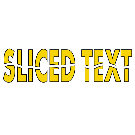
Slice Text
This text effect is flexible becasue it used a Smart Object.
BEFORE:
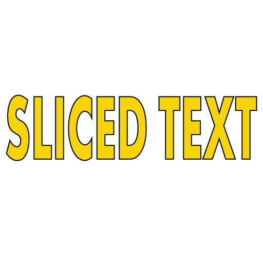
AFTER:
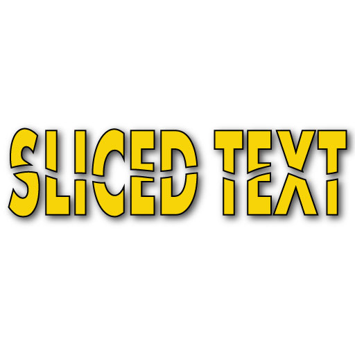
STEPS:
- Using the Type Tool, type the desired text in a large bold font (e.g., SLICED TEXT) and a thin stroke.
- Select Text > Create Outlines.
- With the Eraser Tool draw a rough line through the middle of the text from one end to the other.
BONUS:
- To add a drop shadow, select the text and then select, Effect > Stylize > Drop Shadow...
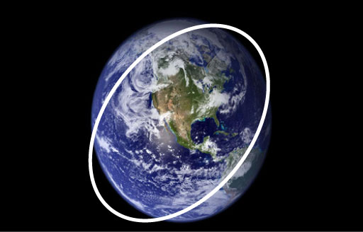
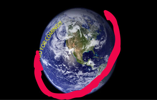
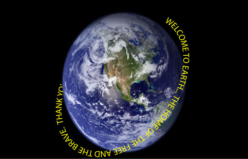
Wrap Text Around A 3D Object
BEFORE:
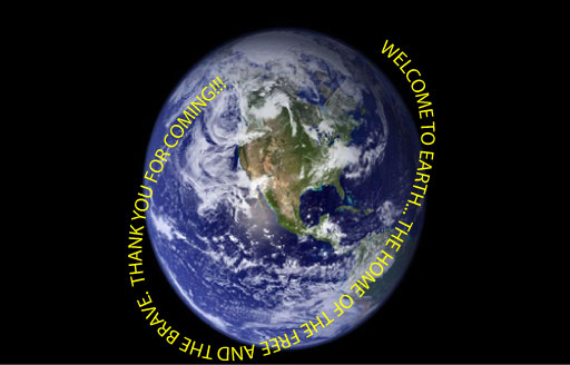
AFTER:
STEPS:
- Open an image that you like to use as a background for this effect (e.g., earth)
- Use the Ellipse Tool and draw an ellipse with no fill that is slightly larger that the object (e.g., earth), position, and rotate it so that it "wraps" around the object except for the back side -- See BEFORE image above.
- With the Type on Path Tool, click on the path and type some text in all caps. Notice the stroke is removed automatically,-- See BEFORE image above.
- With the Blob Brush Tool (not the regular Brush Tool), with any color draw a rough outline along the path where you want the text to show. -- See BEFORE image above.
- Select the Brush Stroke <Path> and the Text Layer in the Layers panel.
- Select Object > Clipping Mask > Make and then deselect the image to see the finish result.
Warp An Image
BEFORE:
AFTER:

STEPS:
- Place an image that you would like to add a Envelope Effect.
- Select the image, open the Properties panel, and click the Embed button.
- Select Object > Envelope Distort > Make with Warp... and select a Style (e.g., Flag) and adjust the other settings to your liking and then click the OK button.
- With the Direct Selection Tool, click and drag some of the anchor points to your liking.
BONUS:
- Optionally, add any other object to complete your image (e.g., flag pole).
Text INSIDE A Shape
The Arae Type Tool can be used to add text to an CLOSED path.
BEFORE:
AFTER:
STEPS:
- Import or create a shape that you want to add text too. You can also use a text letter and convert it to an outline.
- Select the Area Type Tool and click the shape path to insert text within the shape.
- If possible, you may want to center the text and hyphenate some of the words to make it fit the shape better.
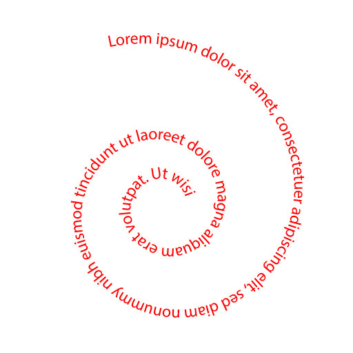
Text ON A Path
The Type of a Path Tool can be used to add text to an OPEN path.
BEFORE:
AFTER:
STEPS:
- Import an opened or closed path shape or use the Pen Tool to draw a path that you would like to add text.
NOTE: The stroke color and size does not matter because they will be replaced by the text. - Select the Type of a Path Tool and click the path to apply Lorem ipsum text to the path.
- Edit the text world, size, color, etc to your liking.
TIP: You can use the lines at the beginning and end of the text to move the text along the path. Use the line in the middle of the text to "flip" the text on the other side of the path.
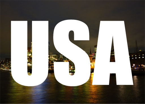
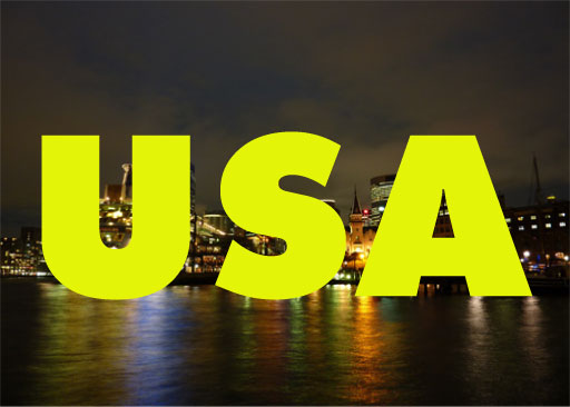
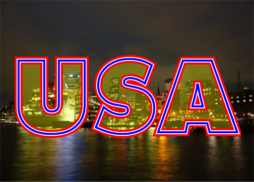
Multiple Images in Multiple Text/Shape
This is one of the first effect that most Illustrator user learn when they start.
BEFORE:
AFTER:
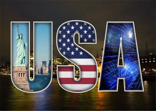
STEPS:
- Optionally, import an image that you like to use as a background.
- Use existing shapes, create new shapes, or type large bold text (e.g., USA with IMPACT font).
NOTE: If you are using the Text Tool and you want to have a differenct stroke color on each shape than you will have to convert the text to an outline for each letter as a separate sublayer. - Select File > Place... and navigate to the first image you would like to place into the first text/shape and drag the selection gun to create the image larger then the first shape/text.
- Move the image below all of the shapes/text so that you can see the first shape/text.
- Select the placed image and the first layer in the Layers panel and then right-click and select Making Clipping Mask.
- If necessary, select the placed image in the Layers panel and move it if you need to better fit the shape/text.
- Select File > Place... and navigate to the second image you would like to place into the second text/shape and drag the selection gun to create the image larger then the second shape/text.
- Move the second image instead of the <Clip Group> in the Layers panel to have it "clipped" as well.
- Repeat the previous two steps for the other text/shape.
BONUS:
- Select just the text laye and add a stroke.
NOTE: Repeat for each letter if you convert the stroke to an outline to have different colors. - Click the <Clip Mask> layer in the Layers panel and then add a black Inner Glow effect to give an inset look to the text.
Multiple Shapes in Multiple Text/Shape
Typically, when you use a shape or text as a mask, the mask's stroke and fill disappears. However, you can add them back if you need to.
BEFORE:

AFTER:
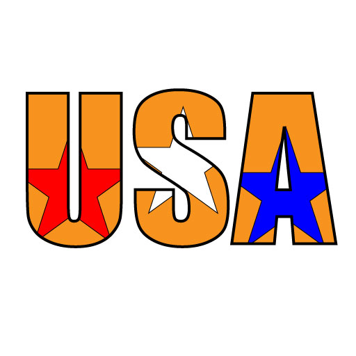
STEPS:
- Create some shapes or text (e.g., USA) that you want to use as a mask.
- Draw some shapes (e.g., three stars) on top of the shapes or text you just created.
- Bring the shapes in step 1 to the front by right-clicking and select Arrange > Bring To Front.
- Select both layers and then right-click and select Make Clipping Path.
- CHECK POINT: You should only be seeing the Compount Path (e.g., stars) because when you apply a mask, the mask itself disappears.
- In the Layers panel, click on the target icon next to the Clipping mask denoted with an underline in it and then add to stroke and/or fill.
BONUS:
- Add any other effects that you desire.
- Since this effects is non-destructive, you can change the text and reposition the shape as needed.
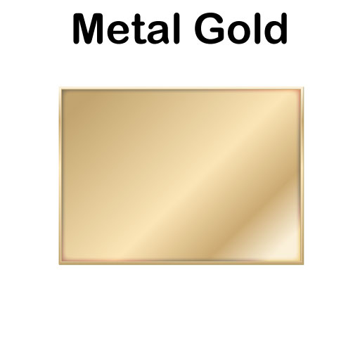
Gold Effect
The Gold Effect is a specialize effect that has been use in movie posters, etc.
BEFORE:
AFTER:

STEPS:
- Create some text that you would like to apply the Gold Effect.
TIP: it is best to use a serif font so that you can see the highlights better. - Select Window > Gradient Style Libraries > Image Effects and click the Metal Gold effect.
BONUS:
- Select the text and then open the Appearance panel.
- In the Appearance panel, turn off any effect you don't want, change the Opacity of an effect, or click on an effedt that has an f/x next to it to edit its properties to your liking.
Multiple Strokes
This is an easy effect to create.
BEFORE:
AFTER:
STEPS:
- Optionally, import an image that you would like to use as a background.
- Type some large bold text that you would like to add multiple strokes to.
- With the text selected, open the Appearance panel and click the Add New Stroke icon at the bottom of the panel.
- Change the stroke color (e.g., blue) and the stroke size (e.g., 4)
- Click the Add New Stroke icon AGAIN and change the stroke color (e.g., red) and DOUBLE the previous stroke size (e.g., 8) so that it can be seen.
- Click the Add New Stroke icon AGAIN and change the stroke color (e.g., white) and DOUBLE the previous stroke size (e.g., 16) so that it can be seen.
- Repeat previous steps if you want to add more strokes.
NOTE: Notice that the stroke size was double each time so that the stroke can be seen. Also, the order the stroke are created is opposite the order they will appear. For example, to get the red, white, and blue in that order, they were created blue, white, and then red.
BONUS:
- With the text selected, open the Appearance panel again if you need to.
- Change the Fill's Opacity (not the Stroke's Opacity) to another value (e.g., 30).
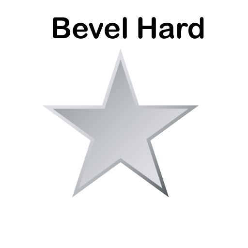
Graphic Style Effects
Instead of creating your own graphic styles, you can use a host of useful graphic styles that is included with Adobe Illustrator.
BEFORE:
AFTER:


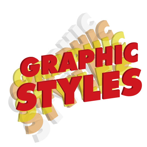
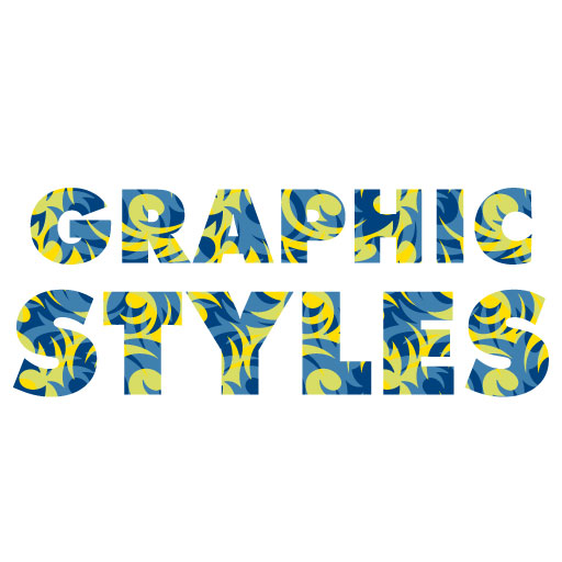
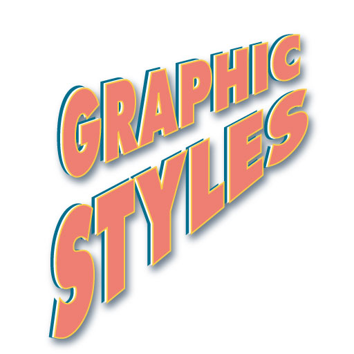
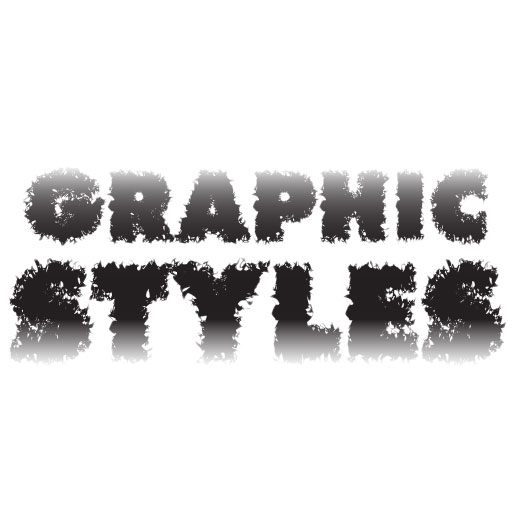
STEPS:
- Create a shape or text that you want to add a graphic style.
- With the shape/text selected, open the Graphic Styles panel and click one of the many styles that you can apply to the selection.
TIPS:
- Experiment with different styles. Also, click the Graphic Styles Libraries icon at the bottom of the panel to add to the main list.
- Right-click on a graphic style thumbnail to get a larger preview image.
- With an shape/text selected, you can open the Appearance panel to see what effects were added to the shape/text. You can learn how to tweak these effects and create your own custom effects. Click on one of the "fx" link to open its property panel.
BONUS:
By default, if you click on multiple graphic style thumbnails on a single shape/text, it will replace the current graphic style. However, if you hold down the ALT/OPTION key, you can add MULTIPLE styles to a single shape/text.
- Hold down the ALT/OPTION key and then add an additional style (e.g., drop shadow) to the current shape/text (e.g., Metal Gold style applied to star first).

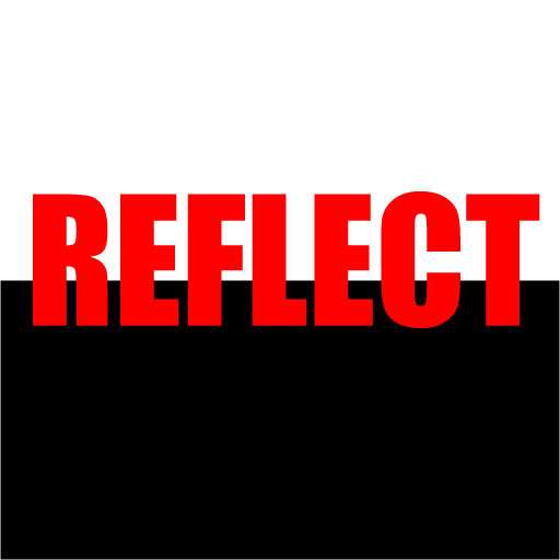
Reflection With Fade
Reflecting an image that is on a shiny surface is the hallmark of all reflections. It is best practice that the reflective surface be black or a very dark color.
BEFORE:
AFTER:
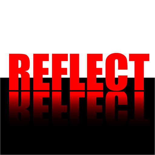
STEPS:
- With the Rectangle Tool, create a black rectangle to cover about one half of the canvas.
- Create or import an image or type some text (e.g., REFLECT) that you want to reflect on the surface of the black rectangle.
- Select the object and then right-click and select Reflect.
- In the Reflect dialog box that appears, ensure the Horizontal axis checkbox is selected, the angle is zero, and then click the Copy button to copy a "reflected" version below the original version.
- Click off the canvas to deselect the object and then with the Rectangle Tool, draw a solid color box without a stroke around the reflected object.
- Select both the box and the object, open the Transparency panel, and then click the Make Mask icon.
- Click the Mask thumbnail in the Transparency panel and then using the Gradient Tool, add a black and white gradient to represent the reflection. Adjust the black and what gradient stops and angle as needed. Optionally, reduce the Opacity in the Transparency panel if necessary.
- Move the reflected object down a few pixels if necessary.
Cast Shadow
Unlike a drop shadow which is usually shown against a "wall" type surface, a cast shadow is shown usually against a "floor" type surface.
BEFORE:

AFTER:

STEPS:
- Create a 2D or 3D shape (not an image) that you would like to cast a shadow. If you use a 3D shape duplicate the 2D shape before you convert it to a 3D object.
- Make a copy of the shape and then select Effect > Distort and Transform > Free Distort...
- In the Free Transform dialog box that appears, adjust the handles on the shape to create the cast shadow and then click the OK button.
- Select the drop shadow and add a black and white gradient and adjust the gradient stops to your liking.
- Optionally, select the shadow and move it if necessary and change the Opacity to your liking.
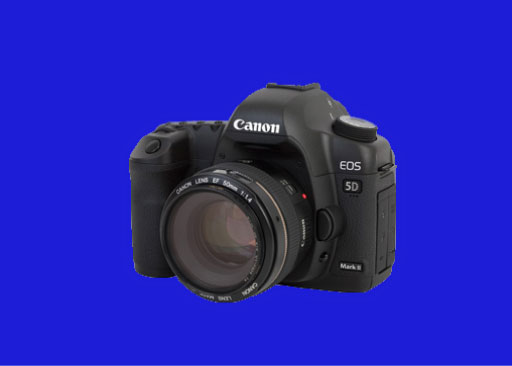
Spot Light
Any lighting effects works best against a dark background
BEFORE:
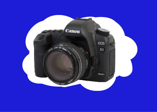
AFTER:
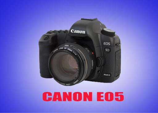
STEPS:
- Create a dark color (dark blue) background.
- Open any image with of an object with a transparent background (e.g., camera) that you would like to apply a spot light effect to.
TIP: PNG-24 supports transparency. - Using the Blob Brush Tool, paint a rough cloud-like shape and move it behind the object.
- With the shape selected, select Effect > Rasterize..., set the Radius to your liking and then click the OK button to rasterize the shape. If necessary, scale the image larger than the canvas.
- With the shape still selected, select Effect > Blur Gaussian Blur... and then click the OK button to create the spot light effect.
BONUS:
- Add text if desired.
NOTE: Filters have been around for a long time. However, what new is the fact that you can add a Convert a Layer for Smart Filters so that the result is non-destructive.
Blending Lines and Colors
This is a common effect that has been about since the "dawn" of Adobe Illustrator.
BEFORE:
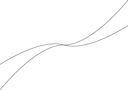
AFTER:
STEPS:
- Use the Pen Tool to draw a black curvy line from the top-right corner to the bottom-left corner of the canvas.
- Select the Rotate Tool and the drag the top-left corner of the line bounding box to rotate the line about -15 degrees and then hold the ALT/OPTION and then let go the mouse and then the ALT/OPTION key to create a copy of the line at the -15 degrees.
- Press CMD/CTRL + D about 10 times to step-and-repeat the line around the canvas.
- Select each line except the first one and change them to a different color.
- Select all of the shapes (CMD/CTRL + A) and then select Object > Blend > Blend Options...
- In the Blend Option dialog box that appears, change the Speciified Steps to 100 and then click the OK button.
- Select Object > Blend > Make to blend all of the color lines together.
- Select the Rectangle Tool and draw a rectangle of any color but no stroke the same size as the canvas.
- Select all of the canvas content (CMD/CTRL + A) and then right-click and select Make Mask.
- CHECK POINT: The shape will be clipped to the rectangle mask.
BONUS:
- Experiment with using diferent number of lines.
Geometric Shapes
Geometric Line Art Tutorial | Adobe Illustrator
BEFORE:
AFTER:
STEPS:
- Set the Fill color to None and the Stroke to Black, use one of the Shape Tools (e.g., Rectangle, Ellipse, Polygon, etc.) and draw its shape on the artboard.
- Select Effect > Distort & Transform > Transform... and in the dialog box that appears, make the following changes and then click the OK button:
- Copies to about 30
- Scale to about 95%
- Angle to about 5
TIP: Use the UP/DOWN keys to increment values. - Optionally, with the artwork selected, pull one of the curve points (highlighted with a circle) to curve ALL of the lines.
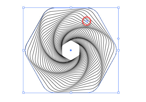
- With the artwork still selected, select the STROKE and not the Filll, and then applied a two or more gradient colors to the artwork. Optionally, add a black background in the back of the artwork to make the artwork "pop."
BONUS:
- Experiment with using diferent number of lines, stroke thickness and style (e.g., dash instead of solid) and different settings in the Transform dialog box.
The key to great logo design is to make sure the following factors are taking in considerations.
- Scalable Vector Format (from web header to billboard)
- Proper Color / Contrast ratio
- Simple minimalistic design
- Correct Font
- Icon that represent the business (BurgerKing icon need to have a crown)
- Distintive but memorable
The goal of this tutorial is not so much about creating logo since each logo is unique, but more important, various techniques on HOW to create shapes, etc. for a great logo design.
In additional to logo, you may want to have a memorable tagline to go with it. For my company, I have several taglines that I use:
- You dream it, we make it a reality
- Creating richer web experience
- Define by you design
- Automatic | Delegate | Eliminate
The 3 Rules of Good Logo Design
Linked Letters Logo (L3)
BEFORE:


AFTER:

STEPS:
- Using a serif font (e.g., Century Schoolbook Bold), type two letters (e.g., TS) that you would like to interlock together and make them large and bold.
- Select Type > Create Outlines... make one letter larger than the other with the Direct Selection Tool and place it on top.
- Select both shapes, click on the Fill color swatch and change the color (e.g. red) and with the ShapeBuilder Tool, select areas that you want to change the color to create the interlocking effect and then add a stroke.
Black and White
BEFORE:
AFTER:
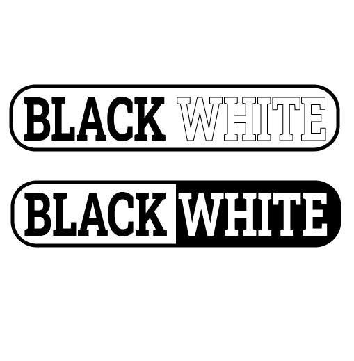
STEPS:
- Type two words that you would like to have the black and white effect applied.
- Select the second word and switch the stroke/fill.
- Optionally, add a rounded or regular rectangle around both text.
- Alternatively, add a black background to the second word that matches the rectangle and remove the black stroke.
Bold and Unbold
BEFORE:
AFTER:
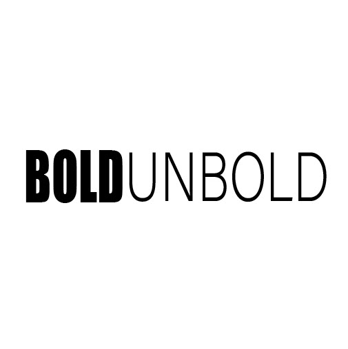
STEPS:
- Type two words using two different types of fonts.
- Select the first word and make it bold and make the second word normal.
Multi-gradient Logo
BEFORE:
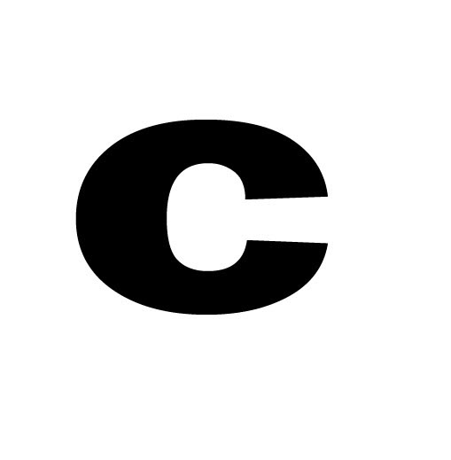
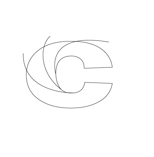
AFTER:

STEPS:
- Type a letter that you would like to add a muluti-gradient effect and remove the Fill.
- Right-click on the shape and select Type > Convert to Outlines.
- With the Pen Tool, draw lines on the letter and extend it outside the letter where you want to "cut" the letter to apply multiple gradients.
- With everything selected, use the ShapeBuilder Tool to see if each "piece" gets highlighted when hovered over.
NOTE: If there is an issue, ensure the the start of a line intersect with original shape (e.g. C). - Hold down the ALT/OPTION key and then click on the lines "outside" of the letter to remove them.
- Double-click each shape and apply a gradient to each shape. Adjust the gradient accordingly and then remove the stroke.
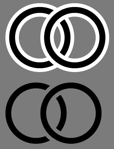
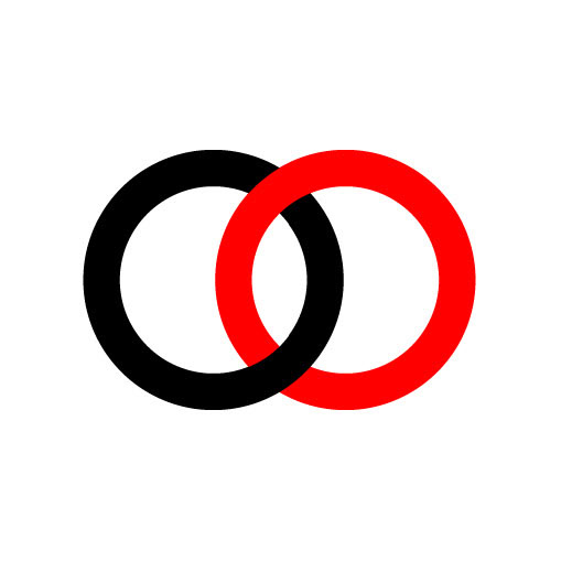
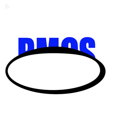
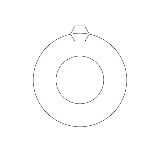
Circular Logo
BEFORE:
![]()
AFTER:
STEPS:
- Create three or more 8 pixel stroke concentric cicles with the two inner circular about the same size.
- With the Text on a Path Tool, click the top inner circle and add the text your want (e.g., RICHMEDIA CREATIVE SERVICES). Adjust the font size, color, and stroke to your liking.
- Select the text and use the small lines to rotate the text as needed.
- Add color or content to the other two circles to your liking,.
Warp Text Logo
BEFORE:
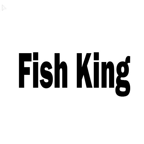
AFTER:
STEPS:
- Type some text that you want to apply a warp.
- Click the Warp option in the Options Bar, select the style of Warp you want (e.g., Fish), adjust the settings to your liking and then click the OK button.
- Optionally, further modify the shape using the Direct Selection Tool and any other style (e.g., color) to your liking.
NOTE: Since the text was not converted to an outline, you can change it to something else (e.g., Shark King)
Merge Letters Logo
BEFORE:

AFTER:

STEPS:
- Type several letters and add a thick white stroke.
- Select Type > Create Outlines and then ungroup the outlines.
- Except the first one, overlap all of the letters on top of each other.
TIP: If you want the shape to be on the same plane, hold down the SHIFT key while moving them. - Select all of the letters and regroup them (CMD/CTRL + G) and move the group to where you want.
- Optionally, add a color background.
Gradient Text
BEFORE:

AFTER:

STEPS:
- Type some bold letters and select Type > Convert to Outlines.
- With all of the letters selected, apply the same gradient style to each letter.
- Optionally, add any other style of your liking (e.g, drop shadow, stroke, etc.)
Outline Path
BEFORE:
AFTER:
STEPS:
- Create two shapes that overlapses (e.g., two circles).
- With both shapes selected, select Object > Path > Outline Stroke.
NOTE: This will convert the circles to outlines instead of simple vector circles. - With both shapes still selected, select Object > Path > Offset Path.... In the dialog box that appears, use the UP/DOWN keys to increase or decrease the amount of offset.
NOTE: If you hold down the SHIFT key while pressing the UP/DOWN keys the values will change by a value of ten pixels instead of one. - With both shapes still selected, change the stroke color (e.g., white) so that you can better see the offset strokes.
- Optionally, with both shapes still selected, use the ShapeBuilder Tool to remove the outline (e.g., white outline in this case) so that the logo can be place on any background. Hold down the ALT/OPTION key and click the outline segments (white strokes and with fill color) to remove them.
- Alternatively, with both shapes still selected, instead of using the ShapeBuilder Tool, you could use the Live PaintTool to create INTERLOCKING shapes without the "gaps."
PathFinder Logo
BEFORE:
AFTER:

STEPS:
- Create several shapes and select all of them.
- Open the PathFinder Tool and click the Divide option.
- Right-click the shapes and then select Ungroup.
- Move the pieces of the shapes apart to get the look you want and delete the rest.
- Optionally, remove the strokes, etc.
Multi-color with Transparency Logo
BEFORE:
AFTER:
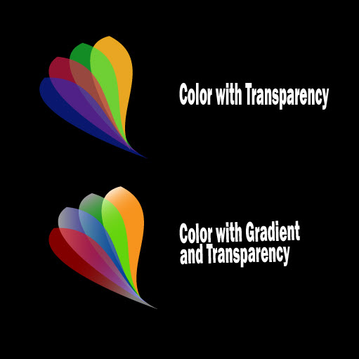
STEPS:
- Create a shape using the Pen, ShapeBuilder, or PathFinder Tool.
- Duplicate the shape several times and give each on a different color and then position them to your liking.
- Change the Opacity of each shape to about 50%.
- Optionally, give each shape a gradient and add whatever other effects you want.
CNN-like Logo
BEFORE:
![]()
AFTER:
STEPS:
- Type some text (e.g., CNN) to use as a logo that has a double-stroke font (e.g., Amboy Inline)
- Select the text and select Type > Convert to Outlines.
- With the Direct Selection Tool, manipulated the anchors points to get the line to look correctly.
Wing Logo
BEFORE:
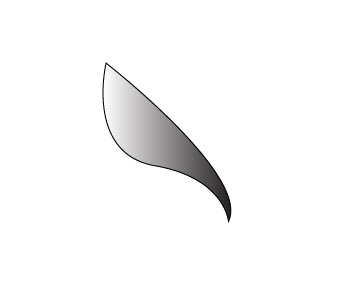

AFTER:
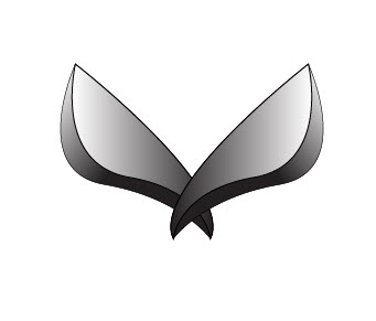
STEPS:
- Use the Pen Tool to draw a shape that you want to make as a 3D object. Add a color or gradient if needed.
- Duplicate the shape, change the color/gradient to be darker than the original shape, move it to back, and then offset it to look like a drop shadow.
- Use the Direct Selection Tool to move the top and bottom anchor points of the copied shape to the edges of the original shape and then group the two shape.
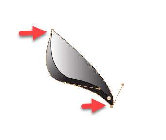
- Do whatever else you want to do the shape (e.g., move and duplicate it, remove stroke, change gradient angle,color, gradient stops, etc.)
Path Through Text
BEFORE:

AFTER:

STEPS:
- Type two or more large letters in the center of the canvas and then draw a black and white oval with a 20 pixels stroke. Optionally, use the Width Tool to taper the top of the oval.
- Select both the text and the oval and in the Transparency panel click the Make Mask.
CHECK POINT: Notice only the bottom half of the text is being displayed. This is because if you look at the Opacity thumbnail--the area that is white reveal the underlying image and the area that is black conceals or make pixels transparent in the image.
- In the Transparency panel, deselect the Clip check box.

CHECK POINT: Notice that the top half of the shape is now visible. This is because the whole area of the text is being used not just the area that is being masked. - Select the artwork on the artboard and click the Opacity Mask thumbnail again if necessary to select the Opacity Mask. Move the mask on the artboard down a bit and click the Fill swatch to change the color from white to a light gray.
CHECK POINT: Notice that the bottom half of the text has been dimmed (or made transparent). Also, notice that the Opacity Mask is black and gray instead of black and white. It is also important to note that the mask did not create a white stroke between the top and bottom of the text but rather that area is transparent. If you move the artwork off the artboard, you will see the transparency better.
Banner Logo
BEFORE:
![]()
AFTER:
![]()
STEPS:
- Create, import, or use one of the banner brushes or symbol to add a banner to the artboard.
- Type some text inside the banner, If it is a curve banner, use the Warp Tool to "bend" the text in shape to fix within the banner area.
- Add whatever, text or graphics of your liking.
Cafe Logo
BEFORE:
![]()
![]()
AFTER:

STEPS:
- Draw some simple shapes to will represent the cafe logo you want to create.
- Select all shapes and with the ShapeBuilder Tool merge the areas you want to from the simple shapes.
- Add whatever color stroke,, text or graphics of your liking.
Linking Objects
BEFORE:
AFTER:
STEPS:
- Open a new file and add three overlapping circles. In this example, a capital O was created, conveted to an outline and strengthed - See BEFORE example.
- Select the ShapeBuider Tool and drag across the two outer circles to create a li effect.
BONUS:
- Delete the text layers from the Layers panel.
- Select all shapes and use the Live Paint Bucket Tool to colorize each circle.
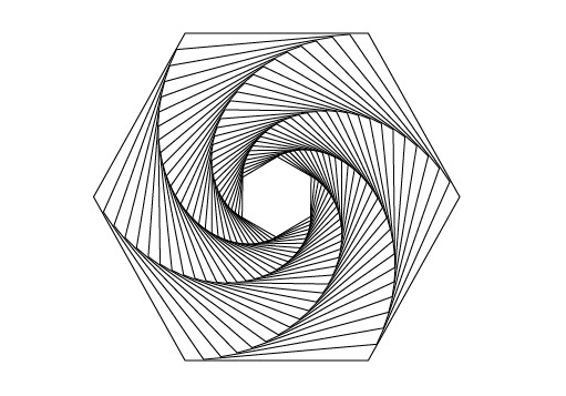
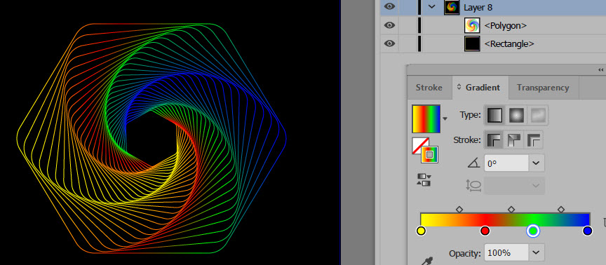
Step and Repeat Effect #1
This is a common effect that is use to create a shape with symetically cutouts
BEFORE:
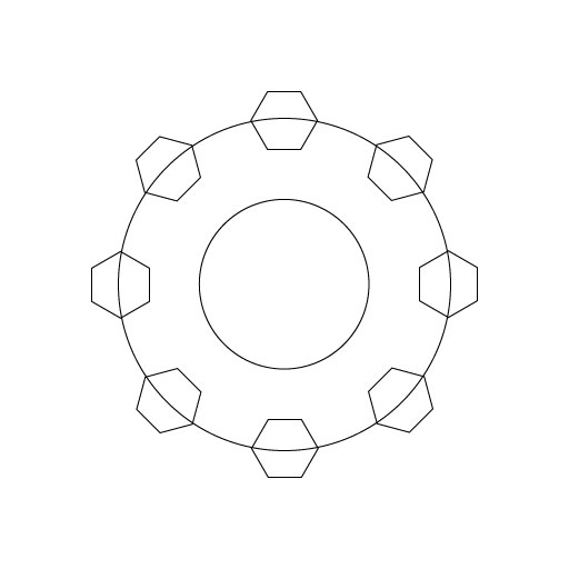
AFTER:


STEPS:
- Create a new file with two concentric circles and a smal polygon with no fill color and then align the polygon to the top center of the outer circle - See BEFORE image above.
- Select the Rotate Tool and click in the center of the two circles to set the anchor for the rotation.
- Begin moving the polygon clockwise and then down the SHIFT key until you see -45 degree tooltip and then hold down the ALT/OPTION key to duplicate the polygon at that -45 degree angle and then release the mouse and then release the SHIFT and ALT/OPION keys.
- Press CMD/CTRL+D six times to step-and-repeat the duplicated polygon around the outer circle - See BEFORE image above.
- Select all shapes and with the PathFinder Tool, select the Minus Front icon.
- Remove the stroke and add a light Fill color.
BONUS:
Create shape to a 3D object.
- Select Effect > 3D > Extrude & Bevel....
- Set the 3D options to your liking, and then click the OK button - See AFTER image above.
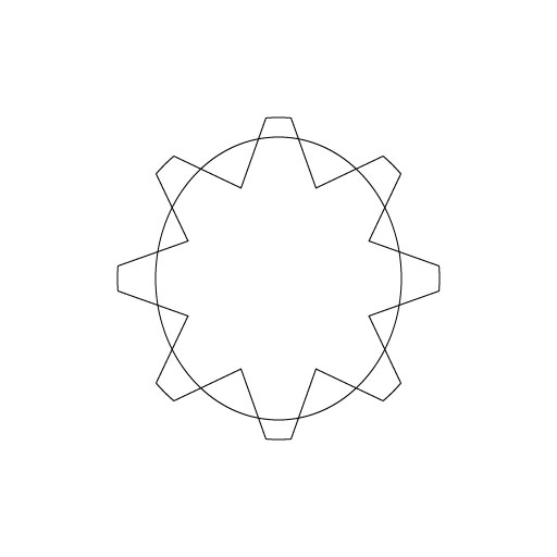
ALTERNATIVE
This is another way to create the gear above.
BEFORE:
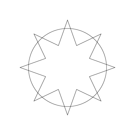
AFTER:


STEPS:
- Select the Star Tool and click without dragging on the center of the canvas to open the Star dialog box and then enter 8 as the number of points and then click the OK button. Scale the Star larger, if necessary.
- Create a circle from the center of the star so that the points can be cut off in the next step - See BEFORE image above.
- Select both shapes and with the PathFinder Tool, select the Interset option - See BEFORE image above.
- Create another circle from the center of the star so that the two shapes can be merged in the next step - See BEFORE image above.
- Select both shapes and with the PathFinder Tool, select the Unite option - See BEFORE image above.
- Create another circle from the center of the star so that the a hole can be cut in the shape in the next step - See BEFORE image above.
- Select both shapes and with the PathFinder Tool, select the Minus Front option - See BEFORE image above.
- Remove the Stroke and add a light Fill color.
BONUS:
- Select Effect > 3D > Extrude & Bevel....
- Set the 3D option to your liking, and then click the OK button - See AFTER image above.
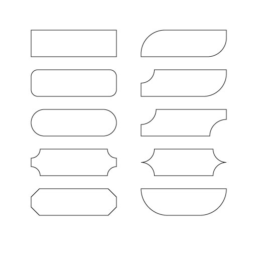
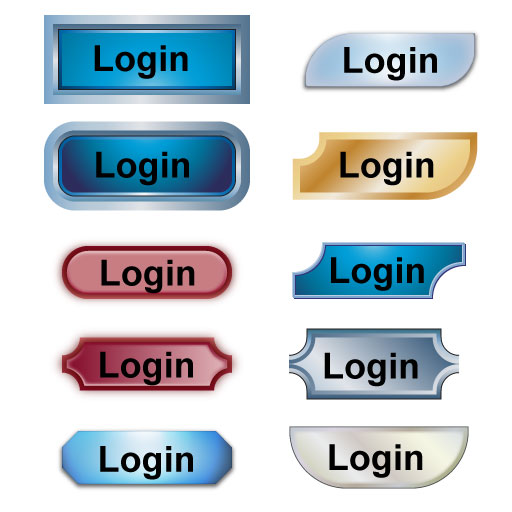
Button Effect
The button effect is particularily useful for web and mobile apps. However, is can be used for other graphic elements (e.g., Lower Thirds, etc.)
BEFORE:
AFTER:
STEPS:
- Create one or more button using the Rectangle Tool.
TIP: You can use the small circles inside of a rectangle shape to adjust the edges of a rectangle. All of the example above were created from the first rectangle.
- If you DRAG any one of the circle, all of the edges will change to create button 2 and 3 (eg.,a rounded or pill shape button.
- If you hold down the ALT/OPTION key and then DRAG any one of the circle, all of the edges will change to create button 4 and 5
- If you CLICK and then DRAG any of the circle, only that edge will change to create the other buttons. - Select Window > Graphic Style Libraries > Button and Rollover Effects.
- With a button selected, click one of the Styles to apply it.
- Repeat the previous step for all of the other buttons.
- Add the necessary text on top of the buttons.
Image Effect
This is another common effect that is used often.
BEFORE:
AFTER:
STEPS:
- Create a shape or text to add a special effect
- Open the Graphic Style panel and select the Image Effects from the Graphic Libraries Style Menu at the bottom of the panel.
- With a shape or text selected, click one of the Styles to apply it.
Texture Effects
BEFORE:

AFTER:
STEPS:
- Create one or more retangular or pill shape to use as buttons.
- Open the Graphic Style panel and select a library (e.g, Texture, Artistic, etc.) from the Graphic Libraries Style Menu at the bottom of the panel.
- With a shape or text selected, click one of the Styles to apply it.
BEFORE:
AFTER:
STEPS:
- Create a rectangle shape to use as the start of your frame effect.
TIP: A square image works better than a rectangle image if you want equal number of rows and columns in the grid. - Open the Graphic Style panel and select a library (e.g, Texture, Artistic, etc.) from the Graphic Libraries Style Menu at the bottom of the panel.
- With a shape or text selected, click one of the Styles that as a rectangle outline as its icon.
Grid Effect
BEFORE:

AFTER:
STEPS:
- Open (import) a background image that you would like to add a grid effect.
- With the Rectangle Grid Tool, select the stroke color you want the grid to be, and while drawing a rectangle the same size as the canvas, use the UP and DOWN keys to increase or decease the number of rows or columns in the grid.
TIP: You could also double-click on the Rectangle Grid Tool and then enter the number of rows and columns - With the grid selected, change the grid's stroke color to your liking.
BONUS #1: Change the grid to a chain-linked fence.
- Select the Grid and change the stroke to 8 and add a black and white gradient to it.
- Rotate the Grid to a 45 degree angle, change the width and height to be larger than the canvas, and then move the Grid to better accomodate the image (e.g., eyes of the tiger through the fence).
- Deselect the Grid and with the Rectangle Tool draw a rectangle the same size as the canvas of any color but no stroke.
- Select the rectangle and the Grid and then right-click on it and select Make Clipping Mask.
BONUS #2: Add a shadow to cast on the object (e.g., tiger) behind the fence.
Page Curl
BEFORE:
AFTER:
STEPS:
- Open a background image or create a shape you would like to apply a page curl effect.
- With the Pen Tool, draw a page curl at one of the corner of the image/shape and then add a gradient.
- With the Pent Tool, draw a triangle belot the page curl and fill it with a color.
- Optionally, add txt or graphic below the page curl.
BONUS #1:
Add drop shadow to page curl.
- Duplicate the page curl shape
- Reposition it and adjust it shape to make a drop shadow and then send it behind the original page curl.
BONUS #2:
Add another page curl.
- Select all of the shapes except the image/shape and group them.
- Move the copy to another corner of the image/shape and rotate/reflect it to match that corner.
BONUS #3:
Add a drop shadow to entire artwork and rotate.
- Select all of the layers and group them.
- Add a drop shadow effect.
- Rotate the entire group as desired.
Add Effect
This is one of the first effect that most Photoshop user learn when they start.
BEFORE:
AFTER:
STEPS:
Torn Edge Effect
This is an old effect that is still occasionally used.
BEFORE:
AFTER:
STEPS:
- Select File > Place... and load the background and foreground image you want to have the torn effect and draw them to cover the size of the canvas.
- With the Rectangle Tool, draw a color rectangle in the middle of the canvas with the width the same as the canvas and the height about half of the canvas.
- Access the Wrinkle Tool and double-click on it and set the height and width to 50 and then press the OK button.
- Drag the Wrinkle Tool several times across the top and bottom of the rectangle to roughen the edges.
- Select the rectangle and the foreground image and right click and select Make Mask.
- Select the Layer 1 in the Layers panel and select Effect > Sytlize > Inner Glow and add a black inner glow effect
- Add text/graphic inside or outside of the edges.
Image Trace Effects
BEFORE:

AFTER:
STEPS:
- Open an image you want to apply a sketch effect.
- With the layer select, select one of the Image Trace option.
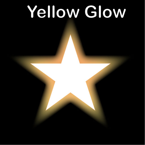
Glow Effect
Because the glow effect is light-based, it works best if you have a dark background and a dark object that will be glowing.
BEFORE:
AFTER:
STEPS:
- Create a dark background and a dark shape/text that you want to apply a glow.
- Select Effect > Stylized > Outer Glow... and adjust the settings to your liking and then click the OK button.
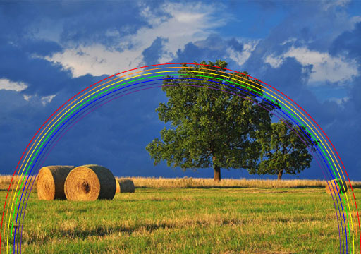
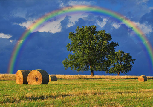
Rainbow Effect
This is one of the first effect that most Photoshop user learn when they start.
BEFORE:
AFTER:
STEPS:
- Open an image you want to apply a rainbow effect.
NOTE: An image with a stormy background works best. - With the Pen Tool draw a 1 pixel red arc from one end of the canvas to the other end.
- With the red arc selected, select Object > Transform > Scale and in the dialog box that appears, change the Uniform Scale value to 98% and then click the Copy button (not the OK button).
- Press CMD/CTRL + D five times to represent all of the color in the rainbow.
- With the Direct Selection Tool, lazzo all of the anchor points at the bottom of the shapes and the press the Vertical Align Bottom at the top of the menu to align all points to the bottom.
- Change the color of each arc to represent the colors of the rainbow. Remember from school the acronym ROY G BIV.
- Lock the background and then select all of the shapes.
- Select Object > Blend > Blend Options... and change the Specified Steps to 50 and then press the OK button.
- Select Object > Blend > Make to blend all of the colors to make a rainbow.
BONUS: Enhance the rainbox with a blur, etc.
- Select the rainbox and, select Effect > Blur > Guassian Blur... and in the dialog box that appears, change the Radius to about 5-6 pixels and then click the OK button.
- Change the Opacity to about 30 and move the rainbow as necessary to better fit the scene.
- Draw a solid color no stroke rectangle around the area of the rainbow that you want to keep.
- Select both the rectangle and the rainbow and then right-click and select Make Mask.
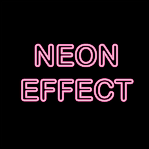
Neon Effect
This is one of the first effect that most Photoshop user learn when they start.
BEFORE:
AFTER:
STEPS:
- Open an image with dark background to use with the neon effect.
NOTE: Since we want a light effect, a dark background works best. - Create a text layer and type the text you want to applied the neon effect.
NOTE: Use a font that has rounded edges (e.g., Arial Rounded MT Bold)
- Open the Graphic Style panel and select the Neon Effects from the Graphic Libraries Style Menu at the bottom of the panel.
- Select the any one of the Neon Style and then click the OK button.
Wireframe Effect
BEFORE:
AFTER:
STEPS:
- Open any photo that you would like to convert to a Polaroid picture.
- Duplicate the Background Layer and turn off the bottom layer. Then, create a landscape or portrait selection of a portion of the picture and apply a Layer Mask to it.
- Apply several effects (a drop shadow, a white stroke of about 15px with a Position of Inside) and then press the OK button to apply these styles to that layer.
- Press CTRL/CMD+T to ROTATE or MOVE the frame and then double-click the frame to commit the transformation.
- Unlink the mask from the image by clicking on the link icon between the image and the Layer Mask.
- Select the image thumbnail (not the Layer Mask thumbnail). Now, press CTRL/CMD+T AGAIN, but this time hold down the SHIFT key and drag one of the transformation handle to scale the image within the frame. Double-click on the frame to commit the transformation.
- Turn on the Background layer and then apply a Black/White Adjustment Layer to it.
- BONUS: If you would like to add another Polaroid picture frame, do the following: