Creating Various Types of Layouts
In order to appreciate and create various types of layouts effectively, you need a firm understanding of positioning, floating, clearing, padding and margin. (See CSS Training Manual)
There are several ways to create CSS Layouts (absolute positioning, negative margin, and floating). Floating is a popular technique; however, because floated elements are taken out of the normal flow of the document like Absolute Positioning (AP) elements, they are not easily "seen" by other elements. To resolve this dilemma, they have to be cleared throughout the layout. It is best practice to float most elements and clear only once usually in the footer since a single float can clear all of the columns ABOVE it. It is important to remember to set the width of any floated div.
All of the layouts that we will discuss will increase their vertical height auomatically based on the content within them. You could however specify a height to limit the vertical size and add a scroll bar to a container to accomodate text content that is larger than container. However, the horizonal width should always be set using various types of measurements (pixels, percentages, or ems)
You can use Dreamweaver to create various layouts ranging from 1-3 columns (with or without header and footer) and in a variety of layout styles (i.e., fixed, liquid, elastic, hybrid (elastic/liquid) and absolute). What some developers/designers may not know is the advantages and disadvantages of the various types:
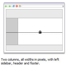 FIXED – The overall width and any internal columns are specified in PIXELS which allows the layout to be centered in user’s browser window. The columns do not resize based on browser size or the site user’s text settings.
Pros: It is the most common of all fixed layouts; give designer/developer more control over layout and positioning. The size is always fixed (e.g., 960px).
Cons: The size is always the same size regardless of monitor's size or resolution—Hence, on a high screen resolution (1440x900), an 800x600 layout will appear tiny in the center of the screen. Conversely, on a low screen resolution (800x600), a 1024x768 layout will cause horizontal scroling bars to appear.
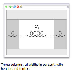 LIQUID – The overall container width and any internal columns are specified in PERCENTAGES which is calculated from the current size of user’s browser window. The page changes if the site user makes the browser window smaller or larger, but does not change based on the user’s text settings.
Pros: The layout will SCALE in relation to the browser window—If the browser window gets bigger, the columns get wider. Conversely, if the browser window gets smaller, the columns get narrower; they make effective use of space.
Cons: At a small window size, line lengths can be difficult to read especially in multi-column layouts. However, adding a min-width property in pixels or ems can be used to prevent the layout from becoming to small. Conversely, if the window is too large, line length becomes to long and more difficutly to read as well. To prevent this from happening, you can constrain the container div to a percentage (e.g., 85%) or set the padding and margin as percentage as well to that they will increase in width in relaion to the browser window size preventing the columns from getting to wide. You can set the max-width property in pixels to prevent the content from getting excessively wide on large monitors.
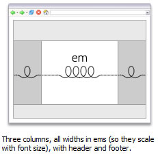 ELASTIC – The overall width and any internal columns are specified in EMS relative to the font size instead of the browser width which allows the layout to scale with the browser’s designated base font size.
Pros: By setting the widths in ems, the font size will increase as the entire layout scales which help keeps the line length to a readable size—all of the HTML elements will stay in the same place relative to one another. However, they just increase in size.
Cons: Because the entire layout increases when the text size is increased, the layout can become larger and cause horizontal scroll bars to appear. To prevent this from happening on standards compliant browsers, you could add a max-width of 100% to the body tag.
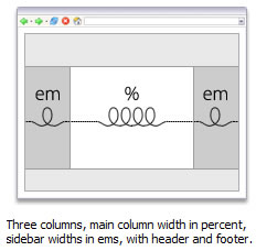 ELASTIC-LIQUID HYBRID – [Best of both worlds] Columns are a combination of the elastic and liquid layout. The overall page width is 100% but the side column(s) values are in ems. For example, in a two-column hybrid, the main liquid column scales based on the browser size and the elastic column scales based on the size of the user’s text settings.
Pros: The elastic-liquid layout never scales larger than the browser window.
Cons: The prblem with elastic-liquid hybrid is not with text or columns, but with images—If the width of the layout is reduced, fixed-width imagees will shift and may interact wih other images. Conversely, Increasing the width of the layout can create unwanted gaps. However, there are several solutions to resolve these problems. SEE PAGE 147-148.
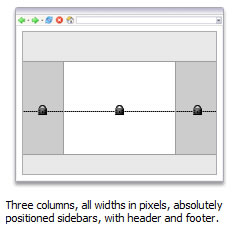 ABSOLUTE POSITIONED – all the other layouts use floats for columns, the absolutely positioned layout use AP elements (formerly calledd layers) for columns.
Pros: Easy to create using absolute position (AP) elements.
Cons: Don't work well in all browsers.
Create a Two Column Fixed Width Centerred Layout
The reason you want to create layouts with columns is because long lines are more difficult to read. (SHOW ONE COLUMN vs. TWO COLUMNS)
Creating Div Containers
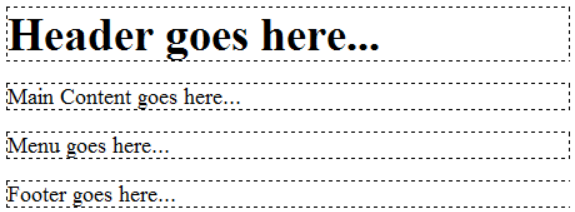
- Create a new blank page and then in Code View create a set of containers for the various logical divisions (divs) for our layout between the body tags.
- Add some placeholder text (e.g., <h1>Header goes here...</h1>) so that the layout can have a basic structure.
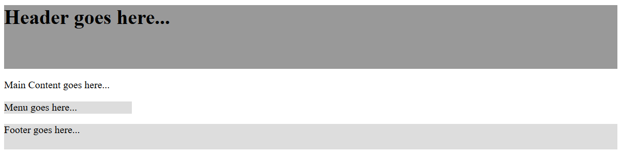
<body>

<div id="header">
  <h1>Header goes here...</h1>
</div>

<div id="main_content">
  <p>Main Content goes here...</p>
</div>

<div id="menu">
  <p>Menu goes here...</p>
</div>

<div id="footer">
  <p>Footer goes here...</p>
</div>

</body>
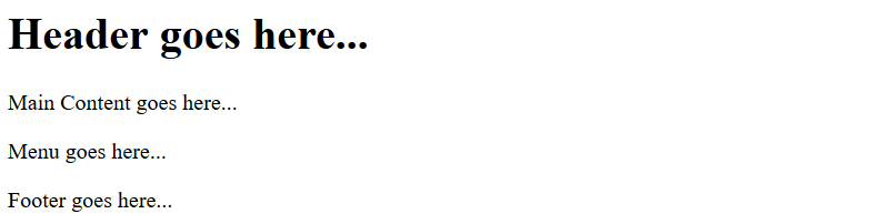
- CHECK POINT: You should see four div containers denoted by dashed lines with default text stacks on top of one another AND they take up one hundred percent of their parent container (body tag) because they are block level elements. Save the file and preview it in a browser. Now, you should see the second screen shot.
Browser's preview:
- Add a set of style tags with the following highlighted properties above the closing </head> tag:
<style>
/*Styling containers =================*/
#header {width:960px; height:100px;background:#999}
#main_content {width:740px;}
#menu {width:200px; background:#DDD;}
#footer {width:960px; height:40px; background:#DDD;}
</style>
</head>
NOTE: Notice that there is no height property to the main_content and menu id. That's because we would not content to expand based on the content that is in it.
- CHECK POINT: You should see that each of the containers are styled based on the CSS rules that were created. However, they are not positioned correctly to create the right layout. This will be resolved in the upcoming steps. Save the file and preview it in a browser.
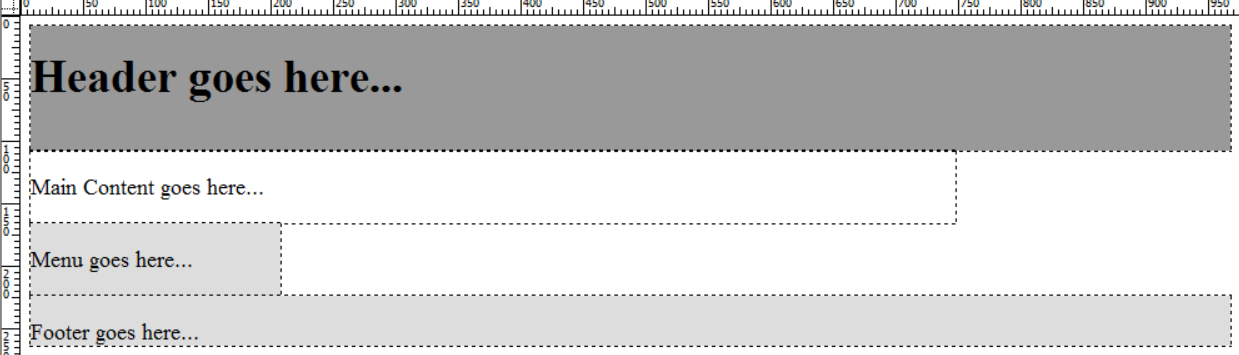
Browser preview:
- Add the following highlighted float rules to the main_content and menu ids in the CSS styles:
#main_content {width:740px;float:right;}
#menu {width:200px; background:#DDD; float:left;}
- CHECK PONT: You should see the because the main_content and menu containers were told to float, they are "taken out of the normal document order" in which they were written and "floats" above the page. As a result, the footer container, take is rightful place below the header container since the other two containers are floating. Also note that since the main_content container was told to float right, it is floating pass the end of the header width. This problem will be resolved later. Save the file and preview it in a browser.
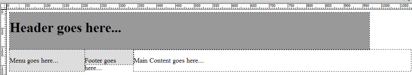
NOTE: Since these div tags will be floated and floated elements are taken out the the normal flow of the document, the main_content div has been placed ahead of the sidebar div in the HTML code. This is an advantage for screen readers so that they don't have to read a long list of links before it has to get to the main content.
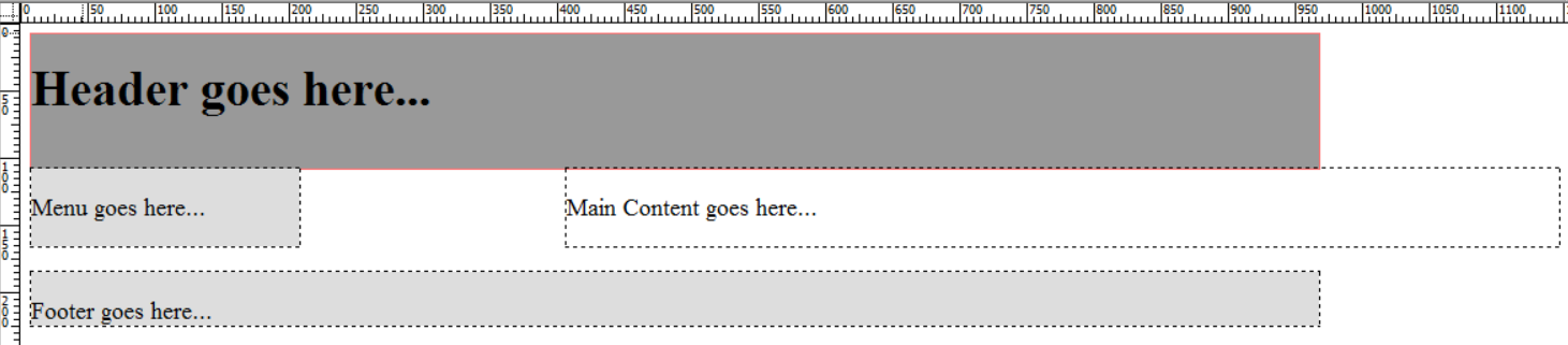
- Add the following highlighted clear rule to the footer id in the CSS style:
#footer {width:960px; height:40px; background:#DDD; clear:both;}
- CHECK PONT: You should see that the footer container "clears" both of the columns above it so that it displays below them. Save the file and preview it in a browser.
- Wrap a div tag with an id of container around all of the other four div containers in the body of the document.
<body>

<div id="container">
<div id="header">
  <h1>Header goes here...</h1>
</div>

<div id="main_content">
  <p>Main Content goes here...</p>
</div>

<div id="menu">
  <p>Menu goes here...</p>
</div>

<div id="footer">
  <p>Footer goes here...</p>
</div>
</div>

</body>
- Add the following highlighted CSS rules:
<style>
/*Styling containers =================*/
#container{width:960px; height:640px; border:1px solid black;}
h1, p, div{padding:0; margin:0;}
#header {width:960px; height:100px; background:#999}
#main_content {width:740px;float:right; height:500px;}
#menu {width:200px; background:#DDD; float:left; height:500px;}
#footer {width:960px; height:40px; background:#DDD; clear:both;}
</style>
- CHECK POINT: Save the file and preview it in a browser. You should see that the page has a thin border about it and the it has been given larger height. You should also note that the main_content area now sits neatly under the header container. The h1, p, div{padding:0; margin:0} group selector is used to zero out the margin in the h1, p and div tags so that the page render correclty.
NOTE: For more information about Resetting CSS, go to http5doctor.com/html-5-reset-stylesheet/ or https://necolas.github.io/normalize.css/
Notice, however, the page is "stuck" in the top/left corner of the browser. This will be resolved in the next step: - Add the following highlighted CSS rule to the container div:
#container{width:960px; height:640px; border:1px solid black; margin: 0 auto;}
- CHECK POINT: Save the file and preview it in a browser. You should see that the page previewed in the center of the browser. If you were to resize the browser, you would see that the page will always be centered in the browser if the screen is larger that the page width.
NOTES:
- Since the layout overall width is 960 pixels and we have floated the main_content container to the right and the menu to the left, by adding the two (740px+240px) will have in essential created a 20 pixels VIRTUAL GUTTER. The advantage of this approach is that if one of the two containers increase slightly in size it will reduce the size of the virtual gutter instead of causing the main_content container that is floated to drop beneath the sidebar container.
- Notice that the main-content container was floated right, the menu container was floated left and both of them were cleared in the footer. The clear:both property ensures the footer always clears (or sit below) the longest of the two columns.
- Background colors have been added to several containers so that the layout structure can be readily seen. They can be changed or deleted.
- To center the page layout in most browsers the rule margin: 0 auto was used. To accomodate some older IE browsers, you have to add an additional properties to the #container div and a new rule to the body tag (See CSS Manual for reasons why):
#container {width:960px; margin: 0 auto; text-align:left; }
body {text-align: center;}
(Optional) Finishing Touches
You may have noticed that the text in the header, sidebar and footer is hugging the left-edge of their respective containers. To avoid IE 5.x proprietary box model and to resolve this problem will we write some rules to add HORIZONTAL padding NOT to the CONTAINERS but to the CONTENT of the containers using descendant selectors.
- Write some horizontal padding rules at the end of the other style rules but before the closing </style> tag:
/*Styling text in containers ============*/
#header h1, #menu p, #footer p {margin-left:20px;}
- CHECK POINT: Save the file and preview it in a browser. You should see that the text in the header, footer and sidebar is now pushed off of the edges of their respective containers. Also, if you scale the browser window, you will see that the size of the layout does not change. However, if you scale the browser window smaller than the #container width (in this case, 960 pixels), scroll bars will appear so that you can access the rest of the page's layout. The main_content container was not included because it has the virtual gutter that acts as a margin for any text inside of it.
Converting a Two Column Fixed-Width to a Three Column Fixed-Width Layout
Converting a two column fixed-width centered layout to a three-column layout is similar to a two column but with a few modifications and adding some additional containers.
- Open the TwoColumnFixedWidth.html file and save it as ThreeColumnFixedWidth.html.
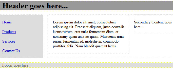
- Copy the main_container div container and paste it below the copy. Then, rename the text from main to secondary in the copy:
<div id="main_content">
<p>Main Content goes here...</p>
</div>
<div id="secondary_content">
<p>Secondary Content goes here...</p>
</div>
- Wrap the main_content and secondary_content div containers with a div tag that has an id of contents:
<div id="contents">
<div id="main_content">
<p>Main Content goes here...</p>
</div>
<div id="secondary_content">
<p>Secondary Content goes here...</p>
</div>
</div>
- Update the code in the <style> tag to read:
/*Styling containers =================*/
#container{width:960px;height:640px; border:1px solid black; margin: 0 auto;}
#header {width:960px; height:100px;background:#999}
#main_content {width:420px;float:left; height:500px;}
#secondary_content {width:320px;float:right; height:500px;background:#6B6B6B;}
#contents {width:740px; float:right;}
#menu {width:200px; background:#DDD;float:left; height:500px;}
#footer {width:960px; height:40px; background:#DDD; clear:both;}
h1, p, div {padding:0; margin:0;}
/*Styling text in containers ============*/
#header h1, #menu p, #footer p {margin-left:20px;}
</style>
NOTE: Notice that the width of the #main_content (e.g., 420px) and #secondary_content (e.g., 320px) adds up to the width of #contents (e.g., 740px).
- CHECK POINT: Save the file and preview it in a browser. You should see a three column fixed width centered layout. Similar to the two column layout, if you scale the browser window, you will see that the size of the layout does not change. However, if you scale the browser window smaller than the #container width (in this case, 960 pixels), scroll bars will appear so that you can access the rest of the page's layout.
Converting a Three Column Fixed-Width To a Three Column Liquid Layout
Creating a liquid layout is the next easiest layout to create after creating a fixed-width layout. In fact, you can easily convert a two-colomn fixed layout to a three-column liquid layout by converting f the width measurements from pixels to percentages:
- Open, if necessary, and save the ThreeColumnFixedWidth.html to a ThreeColumnLiquid.html.
- Change all of the width measurements (in bold) to percentages:
<style>
/*Styling containers =================*/
#container{width:85%;height:640px; border:1px solid black; margin: 0 auto;}
#header {width:100%; height:100px;background:#999}
#main_content {width:66%;float:left; height:500px;}
#secondary_content {width:31%;float:right; height:500px;background:#6B6B6B;}
#contents{width:75%; float:right;}
#menu {width:23%; background:#DDD;float:left; height:500px;}
#footer {width:100%; height:40px; background:#DDD; clear:both;}
h1, p, div {padding:0; margin:0;}
/*Styling text in containers ============*/
#header h1, #menu p, #footer p {margin-left:20px;}
</style>
- CHECK POINT: Save the file and preview it in a browser. In the elastic layout, if you scale the browser window, you will see that the LAYOUT COLUMNS will scale. The text does not scale but does wrap to the next line if the columns get too small.
NOTES:
- After adding a #menu size (23%) and the #contents size (75%), we are left with 2% VIRTUAL GUTTER.
- The container div has been set to 85% so that it can behave like a fixed-width center layout. You could also set the padding and margin to percentages. The container width could have been deleted altogether in which case, the layout div is a block level element it would take up 100% of its parent container—the <body> tag and the margin: 0 auto can be removed because they would no longer be needed.
- These percentages are great for larger screen resolutions. However, to compensate for really small size, you could set a min-width instead of a regular width of about 960px on the container div. Conversely, you could set the max-width in pixels to prevent content from getting to big on larger monitors.
Converting a Three Column Liquid Layout to a Three Column Elastic Layout (Need Reviewing)
Initially, the elastic layout looks similar to the fixed-width layout at the default text sizes. However, once you start to scale it, the text will resize accordingly.
Converting a three-column liquid to a three-column elastic layout is a matter of changing the width measurements from percentages to EMS. The key is to set a base font-size as a PERCENTAGE and then set the widths to EMS. Since the base font size on most browsers is 16 pixels. The goal is to set the font size so that 1 em is equivalent to 10 pixels—This turns out to be about 62.5%.
- Open, if necessary, and save the ThreeColumnLiquid.html and save it as ThreeColumnElastic.html.
- Set the base font to 62.5% in the body tag so that all of the other text tags will inherit this base font as a reference point and convert the width units of measurments into ems.
- Except for the header and footer, update thd existing CSS widths with em values:
<style>
/*Styling containers =================*/
body{font-size:85.2%;}
#container{width:96em; height:640px; border:1px solid black; margin: 0 auto;}
#header {height:100px;background:#999}
#main_content {width:54em; float:left; height:500px;}
#secondary_content {width:20em; float:right; height:500px;background:#6B6B6B;}
#contents{width:74em; float:right;}
#menu {width:20em; background:#DDD; float:left; height:500px;}
#footer {height:40px; background:#DDD; clear:both;}
h1, p, div {padding:0; margin:0;}
/*Styling text in containers ============*/
#header h1, #menu p, #footer p {margin-left:20px;}
</style>
- CHECK POINT: Save the file and preview it in a browser. You should see that the page scale based on the base-font size
NOTE: Since 1 em is equivalent to 10 pixels, then 96 ems is equal to 960 pixels (96x10) and 20 ems is equivalent to 200 pixels (20x10). To constraint the layout to a minimum and maximum size, we could add a max-width and a min-width property to the container div. With these properties set, when the layout reaches a maximum width it will then centered itself in the browser. Conversely, when the layout reaches a minimum width the layout will not become any smaller and the browser windwo will overlay the layout. .
Converting a Three Column Elastic Layout to a Three Column Elastice Liquid Hybrid Layout (Need Reviewing)
To convert a three-column elastic layout ot a three-column elastic-liquid hybrid layout
- Open, if necessary, and save the ThreeColumnElastic.htmll and save it as ThreeColumnElasticLiquid.html.
- Keep the "regular" widths as ems and set the maximum widths as percentages for each of the containers.
.
<style>
/*Styling containers =================*/
body{font-size:85.2%;}
#container{width:96em; max-width:100%; height:640px; border:1px solid black; margin: 0 auto;}
#header {height:100px; background:#999}
#main_content {width:54em; max-width:66%; float:left; height:500px;}
#secondary_content {width:20em; float:right; height:500px;background:#6B6B6B;}
#contents{width:74em; max-width:75%; float:right;}
#menu {width:20em; max-width:23%; background:#DDD; float:left; height:500px;}
#footer {height:40px; background:#DDD; clear:both;}
h1, p, div {padding:0; margin:0;}
/*Styling text in containers ============*/
#header h1, #menu p, #footer p {margin-left:20px;}
</style>
- CHECK POINT: Save the file and preview it in a browser.