How To Dissect A Web Site or App
After reverse engineering a web site you may want to dissect it for several reasons:
- Learn how it was created and structured
- Change or add content as needed based on what you learned about its structure
The basic methodology for doing this is:
- Create a blank file to use to copy content it to
- Copy the structure of the original file into this blank file in logical blocks
- Examine the content and classes
- Duplicate and then comment out the classes and then then add the classes back one at a time
- Test in a browser at a large and mobile size to see how the classes affect the page.
- Repeat previous steps as needed
- Add additional components (e.g., accordion, slideshow) and your own content
We will be using one of the W3school.com template and dissect it.
- Create a new web site definition and then create a new folder in it called images.
- Go to https://www.w3schools.com/w3css/w3css_templates.asp, scroll down and select the Dark Portfolio Template.
- Click the Demo button for the Dark Portfolio Template. (e.g., https://www.w3schools.com/w3css/tryw3css_templates_dark_portfolio.htm) to be taken to its web page.
- Right-click on the page, select View Page Source, and then press CTRL/CMD+A to select all of the page content.
- Create a new page in Dreamweaver, delete all of its content, and save the file as index.html.
- Press CTRL/CMD+V to paste the content of the clipart into the page.
- Using the FIREFOX Browser, go back to the Dark Portfolio Template web site and right-click on the page and select View Page Info (not View Page Source).
- In the View Page Info dialog box that appears, click the Media button, select the Select All button, and then press the Save As... button.
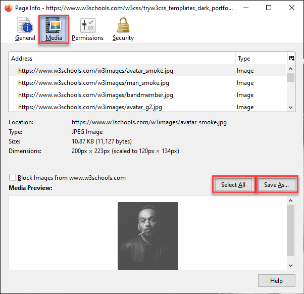
- Navigate to the images folder that was created earlier and select the Select Folder button to save all of the images in that folder and then close the dialog box.
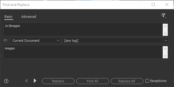
- Click the first image in Design View to highlight the element in Code View and then select /w3images in the img element for that image.
-
With /w3images still selected, select Find > Find and Replace in Files, type images in the Replace text field, and then click the Replace All button.
- CHECK POINT: Save the file and preview it in a browser. You should see the page appears to display the same as the remote version. In Firefox, press CTRL+SHIFT+M and select a mobile device (Galaxy or iPhone) from the list to see how the page change on a mobile device.
- Click each of the nav buttons in both the large view and mobile view to see how they navigate to the page's bookmark using named anchors (#home, #about, etc.)
It is helpful to delete content from the template that you don't need before you start to dissect the page so that they will not be a distraction. In this case, we will delete only the My Price section.
- Click the triangle next to line 109 to collapse all of the code in that div element.
- Select line 107 to 109 (which includes all of the code from line 109 to 144) and then press the Delete key to delete them. You can optionally delete add blank lines in the Code View.
- CHECK POINT: Save the file and preview it in a browser. You should see the My Price section has been deleted.
Before changing the content (e.g., text and images), it is best to first dissect the page to see how it works and how to modify it to meet your particular needs.
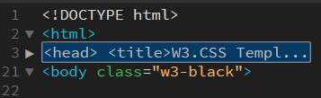
NOTE: For some unknown reason, this page does not have a
head
element like most web pages. We will wrap a
head
element about elements that are normally in the
head
element.
- Select all of the content BELOW the opening
html
tag and ABOVE the opening
body
tag:
<html>
<title>W3.CSS Template</title>
<meta charset="UTF-8">
<meta name="viewport" content="width=device-width, initial-scale=1">
<link rel="stylesheet" href="https://www.w3schools.com/w3css/4/w3.css">
<link rel="stylesheet" href="https://fonts.googleapis.com/css?family=Montserrat">
<link rel="stylesheet" href="https://cdnjs.cloudflare.com/ajax/libs/font-awesome/4.7.0/css/font-awesome.min.css">
<style>
body, h1,h2,h3,h4,h5,h6 {font-family: "Montserrat", sans-serif}
.w3-row-padding img {margin-bottom: 12px}
/* Set the width of the sidebar to 120px */
.w3-sidebar {width: 120px;background: #222;}
/* Add a left margin to the "page content" that matches the width of the sidebar (120px) */
#main {margin-left: 120px}
/* Remove margins from "page content" on small screens */
@media only screen and (max-width: 600px) {#main {margin-left: 0}}
</style>
<body class="w3-black"> - Press CTRL/CMD+T and then type head to wrap head tags around the selection.
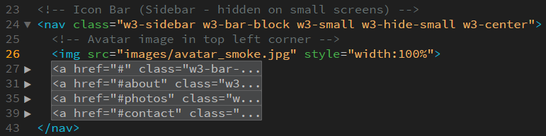
- Click the triangle next to the newly created head element to collapse the code in the head element.
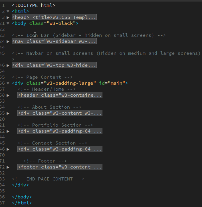
- Click the triangle next to each of the main sections to COLLAPSE the code so that you can see the structure of this Single Page Application (SPA) design. (See screenshot below)
CAUTION: DO NOT SELECT the content under the Page Content comment as it will close the other elements we need.
Now that we can see all of the structures of the page, now we need to review each one of this sections to see how they are being used and how the classes work.
- With the
head
element content still collapsed, click on the <head> tag in the Code view to select all of the code in the head even though they are not seen (e.g., lines 3 to 20)
- Right-click the selected code and select Copy from the menu.
- Create a new file and save it as index2.html.
- Select the complete
head
element and its content in the newly create file and press CTRL/CMD+V to paste the content of the clipboard to replace it. (See highlighted code below)
<!doctype html>
<html>
<head>
<title>W3.CSS Template</title>
<meta charset="UTF-8">
<meta name="viewport" content="width=device-width, initial-scale=1">
<link rel="stylesheet" href="https://www.w3schools.com/w3css/4/w3.css">
<link rel="stylesheet" href="https://fonts.googleapis.com/css?family=Montserrat">
<link rel="stylesheet" href="https://cdnjs.cloudflare.com/ajax/libs/font-awesome/4.7.0/css/font-awesome.min.css">
<style>
body, h1,h2,h3,h4,h5,h6 {font-family: "Montserrat", sans-serif}
.w3-row-padding img {margin-bottom: 12px}
/* Set the width of the sidebar to 120px */
.w3-sidebar {width: 120px;background: #222;}
/* Add a left margin to the "page content" that matches the width of the sidebar (120px) */
#main {margin-left: 120px}
/* Remove margins from "page content" on small screens */
@media only screen and (max-width: 600px) {#main {margin-left: 0}}
</style>
</head>
<body>
</body>
</html> - Review each HTML element to see what you are or are not familiar with. Below is a list that we used:
- This meta element (<meta name="viewport" content="width=device-width, initial-scale=1">) is used so that the code is mobile friendly
- The three link elements are from an outside source. You may want to download them if you are planning to make a mobile app.
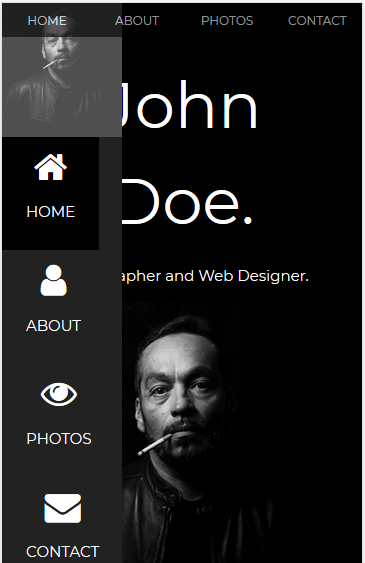
- Notice that the .w3-sidebar width and #main margin-left properties are both set to 120px so that the main content can neatly "sit" next to the sidebar
- Notice that the media query (@media only screen and (max-width: 600px) {#main {margin-left: 0}}) is used to zero out the left margin on any small device up to a maximum width of 600px because the icon bar is not used on the side (See below for detail on the icon side bar).
- Click the
nav
element below the Icon Bar comment to select all of its content and and then right-click and select Copy from the menu.
- Return to the index2.html page, click in between the body tags, and then press CTRL/CMD+V to paste the content into the file expanded. Also, add the .w3-black class to the opening body tag.
- Click the triangle next to the head tag to COLLAPSE it and then click the triangle below the Icon Bar comment to EXPAND it, and then click each of the anchor element (a) to collapse them.
- Click anywhere inside of the nav element and then press CTRL/CMD+D to duplicate that line and then press CTRL/CMD+/ to comment it out.
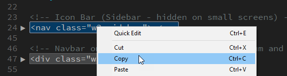
<nav class="w3-sidebar w3-bar-block w3-small w3-hide-small w3-center">
<!--<nav class="w3-sidebar w3-bar-block w3-small w3-hide-small w3-center">--> - Delete all of the classes in the uncommented nav element:
<nav class="">
<!--<nav class="w3-sidebar w3-bar-block w3-small w3-hide-small w3-center">--> - Add each class back to the nav element one at a time and preview the result in a browser to see the effect of each class. Here are a few notes:
- On a small device, without the .w3-sidebar class, the Icon Bar "sits" BELOW the image.
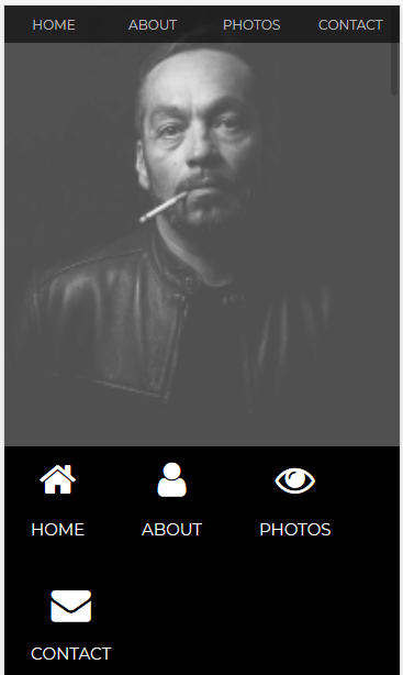
- When the .w3-side bar added, the Icon Menu "sits" to the left side.
- When the .w3-hide class is added, the Icon Menu is hidden from view.
- On a small device, without the .w3-sidebar class, the Icon Bar "sits" BELOW the image.
- Repeat steps 6-11 for the other collapsed code but with the correct data below the previous code in the
body
element.
Below are some comment for each section:
Navbar on small screens
- The classes (w3-hide-larger and w3-hide-medium) are used to hide the small nav bar on a large screen because the Icon Bar is used instead (See previous section)
Header/Home
- The w3-Jumbo class makes the heading extra large
- The w3-hide-small class hide the "I'm" on small screens
About Section
- The w3-content class adds a large margin on both sides
- The w3-padding-64 class is used to add a padding at the top of the content so that when the page navigate to it it will not be hidden behind the nav bar.
Portfolio Section
- The w3-half class is used to force the images to fit half of the page for both set of images.
Contact Section
- Same as About Section
Footer
- The fa fa-[social media icon name] is use to display social media icons..
Once you get the web site looking the way you want, it's time to make your own changes:
- Replace the text, images, or color scheme with your own as needed.
- Make edits as needed.
- Add additional components from the framework website (e.g., W3Schools W3.CSS or Bootstrap)