USING SASS PRE-PROCESSOR IN DREAMWEAVER
Video: Enhance your CSS with preprocessors
Resource: Sass Official Web Site
Final Exercise: View Completed File
IMPORTANT NOTE: You have to define a web site and it has to be the active site in order for the CSS preprocessor to work.
Sass is the most mature, stable, and powerful professional grade CSS extension language in the world. (According to their official web site)
Sass stands for Syntactically Awesome Stylesheet. It is open-source CSS extension called CSS pre-processor and is compatible with all versions of CSS.
Sass is:
- based on Ruby
- platform independent
- works with most browsers
Sass is a stylesheet language that gets compiled to fully CSS-compatible CSS which keeps large stylesheets well-organized. Advantages of using Sass pre-processor in Dreamweaver:
- Create cleaner CSS code
- Maintain CSS code easier
- Reduce redundancy of CSS code
- Make CSS code easier to update
- Improve work flow of writing CSS code
If you are using large, complex style sheets, then Sass may be exactly what you need. Like traditional CSS, Sass extend the functionalities of CSS by adding new "programmatic" features:
- Variables (similar to a variable in programming)
- b (Similar to nested object in OOP)
- b (similar to a function)
- Mixins with Parameters (similar to a function with a argument)
- Imports (similar to an import in OOP)
- Inheritance (similar to an inheritance in OOP)
Like traditional programming languages, there are two types of comments that can be used:
- The slash asterisk and asterisk slash: (/* Comment goes here */)
- The double slash: (// Comment goes here) This type of comment will not be compiles in the CSS file.
Also, like traditional programming, the preprocessor files have to be converted or compiled into CSS files using a compiler. The good new is that Dreamweaver has built-in compilers so there is no need to download and install them. Simply press CTRL+S to auto-compile the CSS or select Tools > Compile (or press F9) to manually compile individual CSS files.
A browser does not understand Sass, so it has to be converted (transpiling) into standard CSS before it can be used.
NOTE: Transpiling is taking a source code written in one language (*.scss) and using a pre-processor (e.g., Sass, Less, or Stylus) to convert it (or translate it) into another language (standard CSS).
Before we get started, we need to ensure that Sass is setup correctly within Dreamweaver so that when we save the Sass file it will first automatically CREATE a standard CSS file and every time there after when the Sass file is save, it will UPDATE the CSS file.
- Open Dreamweaver and define a site (Site > New Site), give site a file name and point it to a local folder.
- In the Site Setup dialog box, select Source & Output, select the "In the same folder as source for the CSS Output" radio button, and then click the Save button.
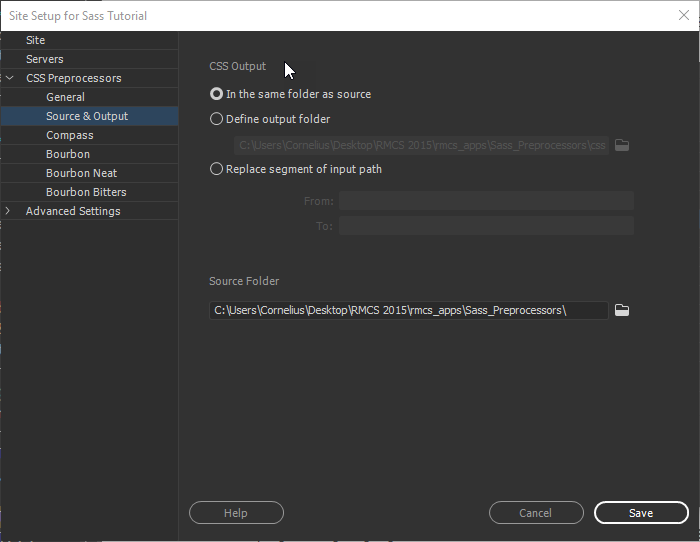
- Select File > New, select Sass as the document type, and then click the Create button.
- Save the file as my_custom_styles.scss (not *.sass).
The easiest concept to understand for most beginners especially if they don't have any programming background is the concept of variables in Sass (or any other preprocessor or program).
ADVANTAGE: Like all programming languages, a variable is used to STORE A REFERENCE of longer code so that it can be used later in the code as a shortcut code that refers to the longer code but with a more meaningful name. For example, instead of having to remember a hexadecimal value for a color, that value could be stored into a variable for easier use and recognition.
Another advantage of using a variable is that if a value needs to be changed that has been declared in multiple places throughout the code, only the variable declaration needs to be updated and all instances in the code will reflect that change when the CSS is re-compiled.
For example, if a web site/app has three main theme colors, instead of defining these colors over and over again throughout the web site or app, you can use Sass variables. So, if you need to change any of the colors, you just change the variable value in ONE PLACE and ALL of the color values that matches that variable will change automatically. This is how themes in most applications work. See upcoming examples in the Sass Variables section.
It is important to note that variable declarations do not get compiled only the CSS instances of the variables. Variables are defined (assigned or declared) at the top of the code so that they can be loaded into memory and used later.
Variables are PLACEHOLERS for STORING different types of DATA so that they can be RE-USED later. Below is a list of data type that Sass supports:
- strings
- numbers
- colors
- booleans (true/false or 0/1)
- lists
- nulls
NOTE: The first three data types are the ones that you will used the most.
Like many programming languages (e.g., jQuery and JavaScript), Sass variables always start with a dollar sign ($) and end with a variable name (e.g., $primary_color).
However, unlike all programming languages because this is CSS the variable uses the colon (:) like CSS rules instead of an equal sign (=) to ASSIGN a value to the variable (e.g., $primary_color:red instead of $primary_color = red).
Let's look at an example that creates thee variables that will be used.
- Type (or copy and paste) the following code in the my_custom_styles.scss file:
/* define variables at top of code */
NOTE: Sass supports standard comment (e.g., /* comment */) or in-line comment (e.g., //single line comment).
$mainFont: Helvetica, sans-serif;
$mainFontColor: blue;
$mainFontSize: 18px;
/* use variables throughout code */
body {
font-family: $mainFont;
color: $mainFontColor; //Must use this color
font-size: $mainFontSize;
}
- CHECK POINT: Save the Sass file and open the my_custom_styles.css file that it CREATED AUTOMATICALLY and preview it.
/* define variables at top of code */
NOTE: When the Sass file was saved, it converted the variables ($mainFont, $maintFontColor, and $mainFontSize) and outputed standard CSS with the variable values in the CSS.
/* use variables throughout code */
body {
font-family: Helvetica, sans-serif;
color: blue;
font-size: 18px; } - Create a new file and save it as my_custom_page.html and type or copy the following HTML code:
<!doctype html>
<html>
<head> <meta charset="utf-8">
<title>Sass Training</title>
<link rel="stylesheet" href="my_custom_styles.css">
</head>
<body>
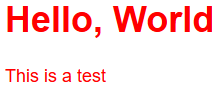
<h1>Hello, World</h1>
</body>
</html> - CHECK POINT: Preview the my_custom_page.html in a browser. You should see "Hello, World" in blue with the Helvetica font and 18 pixels.

Sass Variable Scope
By default, Sass variables are only available at the level of nesting where they are defined. Let's see how this works:
- Add the following tag selector to the my_custom_styles.scss file:
/* define variables at top of code */
NOTE: Notice the the variable ($mainFontColor) is DEFINED as blue at the top of the code and then AGAIN REDEFINED as red in the p selector.
$mainFont: Helvetica, sans-serif;
$mainFontColor: blue;
$mainFontSize: 18px;
/* use variables throughout code */
p{$mainFontColor:red;
color:$mainFontColor;}
body {
font-family: $mainFont;
color: $mainFontColor; //Must use this color
font-size: $mainFontSize;
} - CHECK POINT: Save the Sass file and open the my_custom_styles.css file that it UPDATED AUTOMATICALLY and preview it. You should see that the
p
tag selector was added to the CSS file.
/* define variables at top of code */
/* use variables throughout code */

p {
  color: red; }

body {
  font-family: Helvetica, sans-serif;
  color: blue;
font-size: 18px; } - CHECK POINT: Save the file and preview it in a browser. You should see "Hello, World" did not change but the paragraph that was added is red instead of blue. This is because the variable is DEFINED INSIDE the selector LOCALLY and will trump the external variable with the SAME NAME.

Sass Global Scope
The default behavior for variable scope can be overridden by using the !global switch with makes the variable global and accessible on all levels.
TIP: Global variables should be defined OUTSIDE of any rules. It is best practice to define all global variables in its own file, named "_globals.scss", and include the file with the @include keyword.
- Add the !global switch to the current scss file.
/* define variables at top of code */
$mainFont: Helvetica, sans-serif;
$mainFontColor: blue;
$mainFontSize: 18px;
/* use variables throughout code */

p{$mainFontColor:red !global;
  color:$mainFontColor;}

body {
  font-family: $mainFont;
  color: $mainFontColor; //Must use this color
  font-size: $mainFontSize;
} - CHECK POINT: Save the Sass file and open the my_custom_styles.css file that it UPDATED AUTOMATICALLY and preview it. You should see that the
body
tag selector color property is now red instead of blue:
/* define variables at top of code */
/* use variables throughout code */

p {
  color: red; }

body {
  font-family: Helvetica, sans-serif;
  color: red;
font-size: 18px; } - CHECK POINT: Preview the my_custom_page.html in a browser. You should see "Hello, World" and the paragraph are BOTH in red. This is because the variable is DEFINED AS GLOBAL and can be access from any level.
IMPORTANT NOTE: It is important to note that the global switch has to be defined FIRST. if you move the "p" selector BELOW the "body" selector, the code will not work.
Sass allows you to nest CSS selectors that follows the same visual HTML hierarchy. Sass allows you to nest rules and properties.
Sass Nested Selectors
Sass allows you to nest CSS selectors in the same way as HTML. Let's look at how to create a horizontal menu using Sass nesting.
ADVANTAGE: It makes more sense to group together (nest) elements that are related to reduce that amount of code that you have to write. For example, most web site header will have a header, logo and navigation bar in it so it makes sense to have that as one group of code instead of three.
CAUTION: Avoid nesting more than four levels deep which may makes it harder to read and may affect speed.
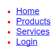
- Add the following HTML code to the my_custom_page.html below the opening
body
tag:
<body>
<nav>
  <ul>
    <li><a href="#">Home</a></li>
    <li><a href="#">Products</a></li>
    <li><a href="#">Services</a></li>
    <li><a href="#">Login</a></li>
  </ul>
</nav> - CHECK POINT: Save the file and preview it in a browser. You should see a regular bullet list being displayed
- Write the following "nested shell" for the CSS properties in the scss file that will be added to it in the upcoming steps:
body {NOTE: Notice how the ul , li , and a elements are ALL NESTED inside of the nav element just like it would be in HTML syntax. Note also that the a element is nested inside of the li element which is nested inside of the ul element which is nested inside of the nav element.
font-family: $mainFont;
color: $mainFontColor;
font-size: $mainFontSize;
}
nav {
ul{
li{
a{ }
}
}
}
<nav>
      <ul>
           <li>
             <a></a>
          </li>
     </ul>
</nav> - Add the following highlighted properties to the
ul
selector after its opening curly brace.
-
nav{
  ul{list-style-type: none;
        margin: 0;
        padding: 0;
        overflow: hidden;
        background-color:#333;
  li{
       a{}
     }
  }
} - CHECK POINT: Save the Sass file and open the my_custom_styles.css file that it UPDATED AUTOMATICALLY and preview it. Notice the
nav ul
selector that was created.
nav ul {
  list-style-type: none;
  margin: 0;
  padding: 0;
  overflow: hidden;
background-color: #333; } - CHECK POINT: Open the my_custom_styles.html file and preview it in a browser. You should see
ul
element styled with the properties that we gave it. Not quite what we wanted yet.

- Add the following highlighted property to the
li
selector after its opening curly brace.
nav{
  ul{list-style-type: none;
    margin: 0;
    padding: 0;
    overflow: hidden;
    background-color:#333;
  li{float:left;
          a{ }
        }
   }
} - CHECK POINT: Save the Sass file and open the my_custom_styles.css file that it UPDATED AUTOMATICALLY and preview it. Notice the
nav li
selector that was created.
nav ul {
  list-style-type: none;
  margin: 0;
  padding: 0;
  overflow: hidden;
  background-color: #333; }
nav li {
float: left; } - CHECK POINT: Open the my_custom_styles.html file and preview it in a browser. You should see
ul
element styled with the properties that we gave it. Still not quite what we want yet.

NOTE: Since the li elements were told to float, they will also wrap on a single line. - Add the following highlighted properties to the
a
selector after its opening curly brace.
nav{
  ul{list-style-type: none;
    margin: 0;
    padding: 0;
    overflow: hidden;
    background-color:#333;}
  li{float:left;
   a{display: block;
         color: white;
         text-align: center;
         padding: 14px 16px;
         text-decoration: none;
        font-family: Arial;}
    }
} - CHECK POINT: Save the Sass file and open the my_custom_styles.css file that it UPDATED AUTOMATICALLY and preview it. Notice the
nav li a
selector that was created.
nav ul {
  list-style-type: none;
  margin: 0;
  padding: 0;
  overflow: hidden;
  background-color: #333; }
nav li {
  float: left; }
nav li a {
  display: block;
  color: white;
  text-align: center;
  padding: 14px 16px;
  text-decoration: none;
font-family: Arial; } - CHECK POINT: Open the my_custom_styles.html file and preview it in a browser. You should see
a
element styled with the properties that we gave it. Now it looks more like a menu.

- Add the following highlighted
li a:hover
selector BELOW the
li
selector
nav{
  ul{list-style-type: none;
    margin: 0;
    padding: 0;
    overflow: hidden;
    background-color:#333;}
  li{float:left;
   a{display: block;
     color: white;
     text-align: center;
     padding: 14px 16px;
     text-decoration: none;
     font-family: Arial;
       }
     }
     li a:hover {background-color: red;}
} - CHECK POINT: Save the Sass file and open the my_custom_styles.css file that it UPDATED AUTOMATICALLY and preview it. Notice the
nav li a:hover
selector that was created.
nav ul {
  list-style-type: none;
  margin: 0;
  padding: 0;
  overflow: hidden;
  background-color: #333; }
nav li {
  float: left; }
nav li a {
  display: block;
  color: white;
  text-align: center;
  padding: 14px 16px;
  text-decoration: none;
  font-family: Arial; }
nav li a:hover {
background-color: green; } - CHECK POINT: Open the my_custom_styles.html file and preview it in a browser. If you hover over a menu, you will see it gets highlighted in green.

- Add the following two classes to the two
li
elements below:
<nav>
  <ul>
    <li><a href="#">Home</a></li>
    <li><a href="#">Products</a></li>
    <li class="active"><a href="#">Services</a></li>
    <li class="right"><a href="#">Login</a></li>
  </ul>
</nav>
- Add the following highlighted properties BELOW the
li a:hover
selector.
nav{
  ul{list-style-type: none;
    margin: 0;
    padding: 0;
    overflow: hidden;
    background-color:#333;}
  li{float:left;
   a{display: block;
     color: white;
     text-align: center;
     padding: 14px 16px;
     text-decoration: none;
     font-family: Arial;
      }
     }
     li a:hover {background-color: red;}
    .active { background-color: red; font-weight: bold;}
        li.right{float:right;}
        li {border-right: 1px solid white;}
        li:last-child {border-right: none;}
} - CHECK POINT: Save the Sass file and open the my_custom_styles.css file that it UPDATED AUTOMATICALLY and preview it.
nav ul {
  list-style-type: none;
  margin: 0;
  padding: 0;
  overflow: hidden;
  background-color: #333; }
nav li {
  float: left; }
nav a {
  display: block;
  color: white;
  text-align: center;
  padding: 14px 16px;
  text-decoration: none;
  font-family: Arial; }
nav li a:hover {
  background-color: red; }
nav .active {
  background-color: red;
  font-weight: bold; }
nav li.right {
  float: right; }
nav li {
  border-right: 1px solid white; }
nav li:last-child {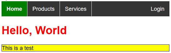
border-right: none; } - CHECK POINT: Open the my_custom_styles.html file and preview it in a browser. You should see the Login menu moved to the right and the Services menu is highlighted in green with the label in bold. You should also see thin white dividing lines to the right of each menu items except for the last one.

Sass Nested Properties (NOT WORKING)
Several CSS properties have the same prefix, (font.* or text.*). Sass allows you to nest them properties. Let's look at an example:
- Write the following Sass code:
font: {
  family: Helvetica, sans-serif;
  size: 18px;
  weight: bold;
}

text: {
  align: center;
  transform: uppercase;
  overflow: hidden;
} - CHECK POINT: Save the file and preview it in a browser and then open the CSS file. You should see that the PROPERTIES has been EXPANDED in the CSS file:
font-family: Helvetica, sans-serif;
NOTE: This compiled to standard CSS syntax where the the main selector will compile to a tag selector and the others will compile to contextual selectors based off of the first selector:
font-size: 18px;
font-weight: bold;
text-align: center;
text-transform: lowercase;
text-overflow: hidden;
ADVANTAGE: Like traditional programming where variables hold a SINGLE value, arrays can hold multiple values in a single variable (container). Using mixins allow for multiple CSS declarations to be used.
The @mixin directive is used to create CSS code can be reused throughout the website.
The @include directive is used to "(include" the mixin.
- Add the following class to a
p
element with some text:
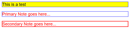
<p class="highlight">This is a test</p>
- Define the following mixin at the bottom of the *.scss file:
@mixin highlighted-text {
  color: black;
  font-weight: bold;
border: 1px solid blue;} - Include the mixin in another selector:
.highlight {
  @include highlighted-text;
background-color: yellow;} - CHECK POINT: Save the Sass file and open the my_custom_styles.css file that it UPDATED AUTOMATICALLY and preview it.
.highlight {NOTE: Notice that the three rules from the mixin was include the highlight selector.
color: black;
font-weight: bold;
border: 1px solid blue;
background-color: yellow; } - CHECK POINT: Preview the my_custom_page.html in a browser. You should see the paragraph got highlighted with a yellow background, black and bold text, and a thin border.
Passing Variables to a Mixin
Like a function, a mixin can accept arguments that can be passed into the mixin as variable.
- Add the following two
p
elements with the primaryNote and secondaryNote classes at the bottom of the
body
element:
<p class="primaryNote">Primary Note  goes here... </p>
<p class="secondaryNote">Secondary Note goes here...</p>
</body> - Add the following mixin with two arguments at the bottom of the
style
element:
@mixin custom_border ($color, $width) {NOTE: Notice that the border property has two variables ($width and $color) and one static property (solid)
border:$width solid $color;}
.primaryNote {
@include custom_border(blue, 1px);}
.secondaryNote {
@include custom_border(red, 2px);}
ANALOGY: A function with arguments is like a recipe maker. Whatever you "pass" into the recipe maker become ingredients (variables) within the function. For example, lets create a backCake funtion:
function backCake (flour, sugar, vanilla, eggs, milk, butter)
{ Add flour(white flour)
Add sugar(white sugar)
Add vanilla (vanilla extract)
Add eggs (number of eggs)
Add Milk(milk type)
Add Butter(cup of butter)
}
NOTE: Notice that for each task in baking a cake, you can have a separate function inside of the main function.
- CHECK POINT: Save the Sass file and open the my_custom_styles.css file that it UPDATED AUTOMATICALLY and preview it.
.primaryNote {
border: 1px solid blue; }

.secondaryNote {
border: 2px solid red; } - CHECK POINT: Preview the my_custom_page.html in a browser. You should see the second paragraph got highlighted with a blue border and the third paragraph go highlighted with a thicker red border.
Default Values for a Mixin
It is also possible to define default values for mixin variables:
- Add the following
p
element with the regularNote class at the bottom of the
body
element:
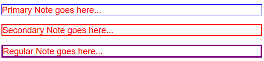
<p class="custom_border">Primary Note goes here.../p>
<p class="custom_border">Secondary Note goes here...</p>
<p class="regularNote">Regular Note goes here...</p>
</body> - Add the following mixin with argument at the bottom of the
style
element:
@mixin custom_border ($color, $width) {NOTE: Notice that the border property has two variables ($width and $color) WITH THEIR DEFAULT VALUES and one static property (solid)
border:$width solid $color;}
.primaryNote {
@include custom_border(blue, 1px);}
.secondaryNote {
@include custom_border(red, 2px);}
@mixin standard_border ($color:black, $width:3px) {
border:$width solid $color;}
.regularNote{
@include standard_border($color:purple); } - CHECK POINT: Save the Sass file and open the my_custom_styles.css file that it UPDATED AUTOMATICALLY and preview it.
.primaryNote {
border: 1px solid blue; }

.secondaryNote {
border: 2px solid red; }

.regularNote {
border: 3px solid purple; } - CHECK POINT: Preview the my_custom_page.html in a browser. You should see the paragraph got highlighted with a 3px purple border.
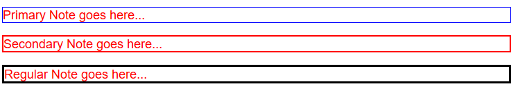
- Delete the argument from the regularNote class (Denoted by strikethrough so that you can see what deleted.; however, you need to delete it)
@mixin standard_border ($color:black, $width:3px) {
border:$width solid $color;}

.regularNote{
@include standard_border($color:purple); } - Save the my_custom_styles.scss file and then open the my_custom_styles.css file. You should see standard CSS created.
.primaryNote {
border: 1px solid blue; }

.secondaryNote {
border: 2px solid red; }

.regularNote {
border: 3px solid black; } - CHECK POINT: Open the my_custom_page.html file and preview it in a browser. You should see
that the default color is black because NO argument was used.
Use Mixin For Vendor Prefixes
Until vendor prefixes become standard CSS, you can use Mixin to create them:
- Add the following mixin to the scss file.
@mixin transform($property) {
  -webkit-transform: $property;
  -ms-transform: $property;
  transform: $property;
}

.myBox {
  @include transform(rotate(45deg));
} - CHECK POINT: Save the Sass file and open the my_custom_styles.css file that it UPDATED AUTOMATICALLY and preview it.
.myBox {
  -webkit-transform: rotate(45deg);
  -ms-transform: rotate(45deg);
  transform: rotate(45deg);
}
The @extend directive allows you share a common CSS properties from one selector with several selectors. This is similar to using the concept of inheritance in Object Oriented Programming (OOP). It is useful if you have almost identically styled elements that only differ in some small details.
The goal is to create a class that use properties that are common to all of the other objects you want to create and then use this class as a basis for the all of the objects you create through inheritance using the @extend directive.
- Add the following two button elements to the bottom of the
body
element:
<button class="button_basic">More Info...</button>
<button class="button_basic">Login In</button>
</body> - Add the following .button_basic class at the bottom of the
style
element:
.button_basic {
border-radius: 16px;
padding: 5px;
background-color:red;
color: white;
font-weight: bold;
-webkit-box-shadow: 5px 5px 5px black;
box-shadow: 5px 5px 5px black;
cursor:pointer;
} - CHECK POINT: Save the Sass file and open the my_custom_styles.css file that it UPDATED AUTOMATICALLY and preview it.
.button_basic {
border-radius: 16px;
padding: 5px;
background-color: red;
text-shadow: 0px 0px;
color: white;
font-weight: bold;
-webkit-box-shadow: 5px 5px 5px black;
box-shadow: 5px 5px 5px black;
cursor: pointer; } - Open my_custom_page.html file to see the result:

NOTE: Notice that both of the button are styled the same because they have the SAME button_basic class applied to them.
- Add the following two classes with the @extend directive in the my_custom_styles.scss file.
.button_moreInfo {
@extend .button_basic;
background-color: green;
}

.button_Login {
@extend .button_basic;
background-color:lightgray;
color:black;
} - Open the my_custom_styles.css file to see the result:
.button_basic, .button_moreInfo, .button_Login {NOTE: Notice the pre-processor created a group selector (e.g., .button_basic, .button_moreInfo, .button_Login) and individual class for what is DIFFERENT about each button.
border-radius: 16px;
padding: 5px;
background-color: red;
color: white;
font-weight: bold;
-webkit-box-shadow: 5px 5px 5px black;
box-shadow: 5px 5px 5px white;
cursor: pointer; }
.button_moreInfo {
background-color: green; }
.button_Login {
background-color: lightgray;
color: black;} - Change the two classes in the my_custome_styles.html file to reflect teh new classes that were just created:
<button class="button_moreInfo">More Info...</button>
<button class="button_Login">Login In</button> - CHECK POINT: Preview the my_custom_page.html in a browser. You should see the two buttons with common styles and unique styles (color and background).

NOTE: By using the @extend directive, several classes for an HTML element do not need to be written for a single button (e.g., <button class="button_basic button_moreInfo">More Info...</button>). Only one need to be specified for each button. (e.g., .button_moreInfo and button_Login).
It is best practice to keep related code in separate files (e.g., navigation, reset, tables, font, color, etc.). Sass @import directive allow you do this.
Sass @use
The @use rule loads mixins, functions, and variables from other Sass stylesheets, and combines CSS from multiple stylesheets together. Stylesheets loaded by @use are called "modules". Sass also provides built-in modules full of useful functions.
IMPORTANT NOTES:
A stylesheet’s @use rules must come before any rules other than @forward,
including style rules. However, you can declare variables before
@use rules to use when configuring modules.

The Sass team discourages the continued use of the @import rule.
Sass will gradually phase it out over the next few years, and
eventually remove it from the language entirely.
Use the @use rule instead.

How Do I Migrate? Use the Sass migration tool that will
automatically converts most @import-based code to @use-based code.
EXAMPLE:
_code.scss file:
mycode {
padding: .25em;
line-height: 0;
}
_custom_list.scss file:
ul, ol {
text-align: left;
& & {
padding: {
bottom: 0;
left: 0;
     }
  }
}
standard_styles.scss file:
@use  "code";
@ use "custom_list ;
standard_styles.css file:
code {
padding: .25em;
line-height: 0;
}

ul, ol {
text-align: left;
}

ul ul, ol ol {
padding-bottom: 0;
padding-left: 0;
}
NOTES:
- You can include as many files as you need.
- It is best practice to add the @import directives at the top of a file so that its content will have a global scope.
- You do not need to specify a file extension. Sass automatically assumes a .sass or .scss file extension. Moreover, CSS files can also be imported.
- The @import directive imports the file and any variables or mixins defined in the imported file can then be used in the main file.
So, when the standard_styles.css file is created, it will yield:
html, body, ul, ol { margin: 0; padding: 0;}


body {
  font-family: Helvetica, sans-serif;
  font-size: 18px;
  color: red;
}
Sass Partials
Sass files that are only meant to be imported but not compiled on their own should starts with and underscore ( _ ) (e.g., _mycode.scss) are called Partials. You can leave off the _ when importing a partial.
EXAMPLE:
_colors.scss file:
$primaryColor: blue;
$secondaryColor: red;
NOTE: This file will not be converted to "colors.css."
If the partial file is imported (underscore omitted), Sass know to import the "_colors.scss."
@import "colors";

body {
  font-family: Helvetica, sans-serif;
  font-size: 18px;
  color: red;}
There are a host of functions that can be used with Sass. This is an advanced concept beyond the scope of this training. However, below is a list of resources:
W3School:
Sass Web Site: