Creating A Simple jQueryMobile App
Creating a simple jQueryMobile app is not much different than creating a web site using Dreamweaver. There are only a few differences. All of the options except the last one below can be used to create a web-based jQueryMobile app. However, to create a real mobile app that can be sent to Google Play or Apple Store, the last option is needed:
- Use jQueryMobile framework
- Create jQueryMobile theme
- Add Home and Back button
- Add jQueryMobile attributes, roles, and CSS styles
- Zip web site and upload it to Adobe PhoneGap Build
While optional, creating a theme first has several advantages. Besides allowing you to create multiple themes and their necessary files and images, it also allows you to create an index.html page that has the necessary links to the jQueryMobile Framework that you can use as a starting point.
- Go to jQueryMobile.com and click the ThemeRoller for jQueryMobile button or simply goto: http://themeroller.jquerymobile.com/.
- On the ThemeRoller for jQueryMobile page in the dialog box that appear, click the Get Rolling button.
NOTE: You can create up to 26 themes or upgrade to the latest version by clicking the Import button later. - (Optional) Click the Global tab on the left to set global settings for all themes. They are self-explanatory that include:
- Font family
- Corner Radii
- Icon
- Box shadow
- Select a theme (A-Z) and then drag-n-drop a color from the color palette to an element you desire to change (heading, link list elements, etc.).
NOTE: Create as many themes as you like. - (Optional) Click the Show alternative icons in preview checkbox to see alternative icons.
- Click the Download theme zip file button and in the dialog box that appears give the theme a name (e.g., myTheme) in the Theme Name text field and read the instruction on what it will create.
- Unzip the file in a convenience place (e.g., desktop) and rename the folder with a more descriptive name (e.g., Adobe Apps). You can now delete the zip file.
- Inside the folder that was just renamed, create another folder and give it an name of images. Move any images in the folder that you need for your app. In this case, the four Adobe app icons that you can download: AdobeApps_Icons.zip
- (Optional) Go back to www.jQueryMobile.com and download a local copy of the jQuery framework and place it in a folder named jQuery. Otherwise, you can use the CDN version that was created for you in the index.html when the theme was downloaded.
NOTE: This is necessary if you want to make an official mobile app that you would like to upload to an app store. - Open Dreamweaver and select Site > New Site.... from the menu and give the site a name (e.g., Adobe Apps) and then click the folder icon, navigate to the folder that you renamed earlier, and then click the Select Folder button to add it to the Local Site folder text field. Then, click the Save button to create the site and close the dialog box.
- Double-click the index.html file in the Files panel to open it. Click the Split View button to see both the Design and Code views.
- Add a HTML5 doctype tag to the first line in Code view (e.g., <!doctype html>).
- Delete all of the HTML elements between the body element by selecting the body in the Tag Chooser at the bottom of the screen and then press the Delete key.
- Save the file.
- Open the Insert Panel by selecting Windows > Insert (or press CTRL/CMD+F2) and select the jQuery Mobile option from the drop down list.
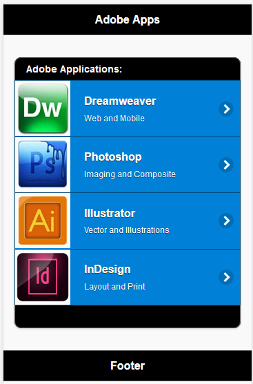
- Drag and drop the Page icon to the page in Design View and in the dialog that appears ensure that the Header and Footer checkboxes are selected. Change the page id to "home_page" and then click the OK button.
- Change the default Header text to meet your application needs (e.g., Adobe Apps).
- CHECK POINT: Save the file and preview it in a browser. You should see the Header, Content, and Footer being displayed with the jQueryMobile framework theme.
TIP: In Firefox, press CTRL+SHIFT+M to view to app in a phone view.
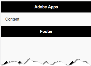
- Press the ENTER/RETURN key after the word Content in Design View.
- Drag and drop the ListView icon to the Content area in Design View after the word Content and in the dialog box that appears add the following options:
- List type: Unordered
- Items: 4
- Inset checkbox checked
- Text Description checkbox checked
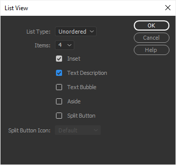
- Click the OK button to accept the changes and then delete the word Content.
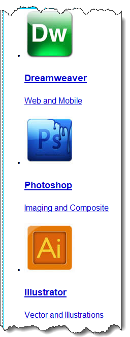
- Change the <h3> Page text to whatever you want your menu items to be (e.g., Dreamweaver, Photoshop, Illustrator, and InDesign).
Change the <p> text to whatever you want the menu descriptions to be (e.g., Web and Mobile, Imaging and Composite, Vector and Illustrations, Layout and Print).
<div data-role="content">
<ul data-role="listview" data-inset="true">
    <li><a href="#">
            <h3>Dreamweaver</h3>
            <p>Web and Mobile</p>
    </a></li>
    <li><a href="#">
            <h3>Photoshop</h3>
            <p>Imaging and Composite</p>
    </a></li>
    <li><a href="#">
            <h3>Illustrator</h3>
            <p>Vector and Illustrations</p>
    </a></li>
    <li><a href="#">
            <h3>InDesign</h3>
            <p>Layout and Print</p>
    </a></li>
</ul>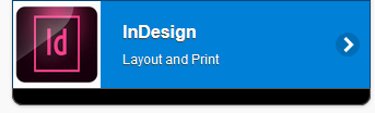
</div> - From the Files panel, drag and drop an image icon DIRECTLY in front of the ListView name (e.g, Dreamweaver) in Design View for EACH list item. Make sure the icons are at least 80x80 pixels.
NOTE: This will place each list item within the a element but before the h3 element.
<ul data-role="listview" data-inset="true">
NOTE: In Dreamweaver's Design view, it should look like this:
<li><a href="#"><img src="../images/dw.jpg" width="99" height="99" alt=""/>
<h3>Dreamweaver</h3>
<p>Web and Mobile</p>
</a></li>
<li><a href="#"><img src="../images/ps.jpg" width="100" height="99" alt=""/>
<h3>Photoshop</h3>
<p>Imaging and Composite</p>
</a></li>
<li><a href="#"><img src="../images/ai.jpg" width="100" height="99" alt=""/>
<h3>Illustrator</h3>
<p>Vector and Illustrations</p>
</a></li>
<li><a href="#"><img src="../images/id.jpg" width="100" height="99" alt=""/>
<h3>InDesign</h3>
<p>Layout and Print</p>
</a></li>
</ul>
- Replace the hash sign (#) with a relative link for EACH of the
a
element (e.g., dw.html, ps.html. ai.html, and id.html). These HTML files will be created later.
<ul data-role="listview" data-inset="true">
    <li><a href="dw.html"><img src="../images/dw.jpg" width="99" height="99" alt=""/>
            <h3>Dreamweaver</h3>
            <p>Web and Mobile</p>
    </a></li>
    <li><a href="ps.html"><img src="../images/ps.jpg" width="100" height="99" alt=""/>
            <h3>Photoshop</h3>
            <p>Imaging and Composite</p>
    </a></li>
    <li><a href="ai.html"><img src="../images/ai.jpg" width="100" height="99" alt=""/>
            <h3>Illustrator</h3>
            <p>Vector and Illustrations</p>
    </a></li>
    <li><a href="id.html"><img src="../images/id.jpg" width="100" height="99" alt=""/>
            <h3>InDesign</h3>
            <p>Layout and Print</p>
    </a></li>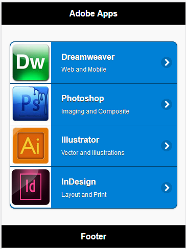
</ul> - CHECK POINT: Save the file and preview it in a browser. You should see the bullet list is displayed as a nice List View and looks more like an app than a web site. Hover over the list items to see them highlighted.
TIP: In Firefox, press CTRL+SHIFT+M to view to app in a phone view.
- Add either one of the following AJAX attribute to EACH of the link (rel="external" or data-ajax="false").
<ul data-role="listview" data-inset="true">
    <li><a href="dw.html" data-ajax="false"><img src="../images/dw.jpg" width="99" height="99" alt=""/>
            <h3>Dreamweaver</h3>
            <p>Web and Mobile</p>
    </a></li>
    <li><a href="ps.html" data-ajax="false"><img src="../images/ps.jpg" width="100" height="99" alt=""/>
            <h3>Photoshop</h3>
            <p>Imaging and Composite</p>
    </a></li>
    <li><a href="ai.html" data-ajax="false"><img src="../images/ai.jpg" width="100" height="99" alt=""/>
            <h3>Illustrator</h3>
            <p>Vector and Illustrations</p>
    </a></li>
    <li><a href="id.html" data-ajax="false"><img src="../images/id.jpg" width="100" height="99" alt=""/>
            <h3>InDesign</h3>
            <p>Layout and Print</p>
    </a></li>
</ul>
Linking within a multi-page document
A single HTML document can contain one or many 'page' containers simply by stacking multiple divs with a data-role of "page".
This allows you to build a small site or application within a single HTML document; jQuery Mobile will simply display
the first 'page' it finds in the source order when the page loads.
If a link in a multi-page document points to an anchor (#foo), the framework will look for a page wrapper with that ID (id="foo").
If it finds a page in the HTML document, it will transition the new page into view. You can seamlessly navigate between
local, internal "pages" and external pages in jQuery Mobile. Both will look the same to the end user except that external
pages will display the Ajax spinner while loading. In either situation, jQuery Mobile updates the page's URL hash to enable
Back button support, deep-linking and bookmarking.
It's important to note that if you are linking from a mobile page that was loaded via Ajax to a page that contains multiple
internal pages, you need to add a rel="external" or data-ajax="false" to the link. This tells the framework to do a full page
reload to clear out the Ajax hash in the URL. This is critical because Ajax pages use the hash (#) to track the Ajax
history, while multiple internal pages use the hash to indicate internal pages so there will be conflicts in the hash
between these two modes.
For example, a link to a page containing multiple internal pages would look like this: <a href="multipage.html" rel="external">Multi-page link</a> - (Optional) Add a top and bottom list divider to the ListView by adding a data-role = "list-divider" to a
li
element above and below the existing
li
elements. Then, add text (e.g., Adobe CC Applications) to the top
li
element and a non-breaking space ( ) to the bottom
li
element.
<ul data-role="listview" data-inset="true">
NOTE: Besides the data-theme, you can also add a data-divider-theme within the ul element.
<li data-role="list-divider">Adobe Applications:</li>
<li>...</li>
<li>...</li>
<li>...</li>
<li>...</li>
<li data-role="list-divider"> </li>
</ul> - CHECK POINT: Save the file and preview it in a browser. You should see the list dividers at the top and bottom of the ListView that is more appealing.
TIP: In Firefox, press CTRL+SHIFT+M to view to app in a phone view.
NOTE: If you leave out the non-breaking space entity ( ) (<li data-role="list-divider"></li>), he bottom list divider will be displayed smaller.
While we can create a Dreamweaver template for the other pages, for simplicity sake, we will create them using the index.html page created earlier since there are only five pages total.
- Save the index.html file as a new page. (e.g., dw.html).
- Delete all of the ul element content by selecting the ul in the Tag Chooser at the bottom of the screen and then press the Delete key.
- Rename the page id (e.g., dw_page), give the page a title by creating an
h2
element in the empty <div data-role="content"> container, and then add a copyright notice in the footer within an
h4
element.
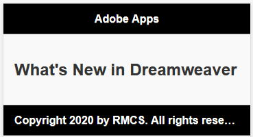
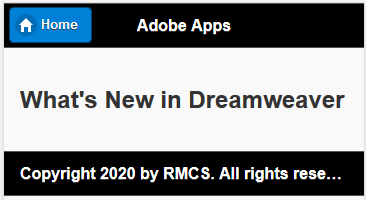
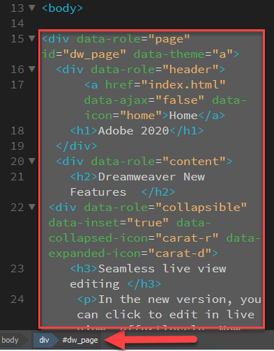
<div data-role="page" id="dw_page">
<div data-role="header">
  <h1>Adobe Apps</h1>
</div>
<div data-role="content">
  <h2>What's New in Dreamweaver </h2>
</div>
<div data-role="footer">
  <h4>Copyright 2020 by RMCS. All rights reserved.</h4>
</div>
</div> - CHECK POINT: Save the file and preview it in a browser. You should see the the Page Title (What's New in Dreamweaver) and the copyright notice displayed in the footer. Additional content will be added later.
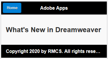
Currently, you will have to use the Back button on the browser to go back to the home page. This problem will be fixed in the steps below. A Home button needs to be created in the header so that a user can navigate back to the home page.
When you add one or more anchor element (e.g., <a>) to a header, they will automatically be converted to buttons and positioned to the far left of that header. It does not matter if you place the anchor element above or below the h3 element, they will still render to the left of the heading's text. However, for a screen reader user, it is best to have it above the h3 so that it can be read first.
- In the second page that was created (e.g., dw.html), add a link element (<a>) with a name of "Home" to in the <div data-role="header"> container with a data-ajax attribute.
<div data-role="header">
  <a href="index.html" data-ajax="false">Home</a>
  <h1>Adobe Apps</h1>
</div> - CHECK POINT: Save the file and preview it in a browser. You should see the Home button displayed to the left of the header. Click the Home button to go to the index.html (Home) page.
- (Optional) Add a home icon to the button by adding the following data-icon attribute to the
a
element.
<div data-role="header">
  <a href="index.html" data-ajax="false" data-icon="home">Home</a>
  <h1>Adobe Apps</h1>
</div> - CHECK POINT: Save the file and preview it in a browser. You should see the Home Button now has a home icon on the left side of the button
Since the other pages are similar the second page that was created, we can use it as a starting point.
- Repeat the steps in the section "Second Page" for the other pages (e.g., ps.html, ai.html, and id.html), but change the page's heading name accordingly. Also, change the <div id="dw_page"> to another id (e.g., ps_page).
- CHECK POINT: Save all of files and preview them in a browser. Test all of the menu items to see if they go to their corresponding page. Click the home button to go back to the Home page as needed.
- Add additional content to all pages as you want and save the changes.
A Control Group can be created so that a user can navigate to open another other page or a dialog.
Unlike when you add buttons to a header, when you add one or more anchor elements (<a>) to a footer, they will not automatically be converted to buttons. They will be links placed adjacent to each other and above or below the h4 element in the footer depending if they are placed above or below the h4 element.
Control group is as the name implies "a group of control elements" usually buttons. The advantage of "wrapping" a group of control element is to allow the group to have rounded corners at the top and bottom if they are vertical or right and left sides of the group if they are horizontal.
- Go back to the index.html page, replace the
h4
element (e.g., <h4>Footer</h4>) with an About... and Summary links in the footer
<div data-role="footer">
NOTE: Notice in Design View that they are to the left and adjacent to each other as stated earlier.
<a href="about.html" data-ajax="false">About...</a>
<a href="summary.html" data-ajax="false">Summary</a>
</div>
- CHECK POINT: Save the file and preview it in a browser. You should see the two buttons wth no rounded corners and separated by a space between them.

- Add the following class to both buttons so that the
a
elements can behave like buttons:
<a href="about.html"  data-ajax="false" class="ui-btn">About...</a>
<a href="summary.html" data-ajax="false" class="ui-btn">Summary</a> - Wrap the two
a
elements within a set of
div
elements and give them the following data-role and data-type attributes:
<div data-role="controlgroup" data-type="horizontal">
<a href="about.html" data-ajax="false" class="ui-btn">About...</a>
<a href="summary.html" data-ajax="false" class="ui-btn">Summary</a>
</div> - Add an align attribute to center the control group.
<div data-role="controlgroup" data-type="horizontal" align="center">
- CHECK POINT: Save the file and preview it in a browser. You should see the two buttons "meshed" together with rounded corners on each side and centered in the footer.

Optional, you can create dialog boxes with transition effect applied to them.
- Create two additional pages using the same techniques above and save them as about.html and summary.html to correspond to the
a
element in the control group that was created earlier. Add some dummy text to give the pages some height. Delete the home button link
about.html:
<div data-role="page" id="about_page">
summary.html:
<div data-role="header">
<a href="index.html" data-ajax="false" data-icon="home">Home</a>
<h1>Adobe Apps</h1>
</div>
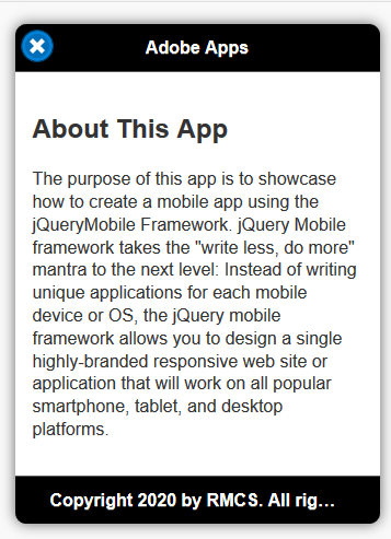
<div data-role="content">
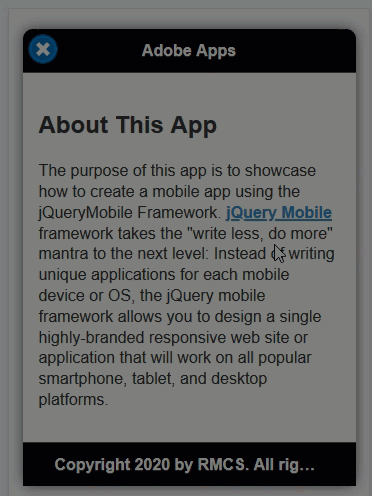
<h2>About This App</h2>
<p>The purpose of this app is to showcase how to create a mobile app using the
jQueryMobile Framework. jQuery Mobile framework takes the "write less, do more"
mantra to the next level: Instead of writing unique applications for each mobile
device or OS, the jQuery mobile framework allows you to design a single
highly-branded responsive web site or application that will work on all popular
smartphone, tablet, and desktop platforms.</p>
</div>
<div data-role="footer">
<h4>Copyright 2020 by RMCS. All rights reserved.</h4>
</div>
</div>
Add later
- CHECK POINT: Save the files and then open the index.html file to preview it in a browser. Click on both of the buttons in the footer. You should see that the pages open as a regular page with no Back or Close button. Click the Home Button as needed to return to the Home page.
- Add the following data-dialog attribute to the about.html page.
<div data-role="page" id="about_page" data-dialog="true">
<div data-role="header"> - Comment out the anchor element in the header in the about.html page:
<div data-role="header">
<!-- <a href="index.html" data-ajax="false" data-icon="home">Home</a>--> - CHECK POINT: Save the file and then open the index.html file and preview it in a browser. Click the About button. This time you should see that the About page
opens as a dialog box inside of the page with a Close button automatically injected into the page. How cool is that!!! Click on the Close icon (X) to return to the original page.
.
- Optionally, return to the index.html page and add a data-transition attribute to the About and Summary buttons in the footer.
<div data-role="controlgroup" data-type="horizontal" align="center">
<a href="about.html" class="ui-btn" data-transition="slidedown">About...</a>
<a href="summary.html" class="ui-btn"data-transition="slidedown">Summary</a>
</div> - CHECK POINT: Save the file and preview it in a browser. Test the page again in a browser by clicking both buttons in the footer.
NOTE: You should see that the the dialog box now transition from the top to the bottom. Also, when you close the dialog box that it will transition from the bottom to the top or in the reverse transition if you change the transition type.
- On any page (in this case, about.html) select a word or phrase in one of the sentences (in this case, jQueryMobile Framework) and type #popupjQueryMobile in the Link text field in the Properties panel and then press the TAB key to commit.
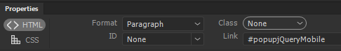
- In Code View, add the following attributes to the same link:
<a href="#popupjQueryMobile" data-rel="popup" data-transition="flow">jQueryMobile Framework</a>
- Create a tooltip popup with the following three tags ABOVE the closing </body> tag but inside the last closing
div
tag (</div>). You don't need the space between the lines—it was added for clarity only.
<div data-role="popup" id="popupjQueryMobile" data-theme="a">
NOTE: The div element is a wrapper for the tooltip with a role of popup an id of popupjQueryMobile and a data-theme of a. The a element is the Close button with a host of attributes and the p element is the tooltip itself with no attribute. The data-role = "popup" will initially HIDE the paragraph tag until the popup link is clicked.
<a href="#" data-rel="back" data-role="button" data-icon="delete" class="ui-btn-right" data-iconpos="notext">Close</a>
<p>jQuery Mobile is a HTML5-based user interface system designed to make responsive web sites and apps
that are accessible on all smartphone, tablet and desktop devices.</p>
</div>
</div>
</body>
</html>
- CHECK POINT: Save the file and preview it in a browser by clicking the link. You should see the tooltip pop up with a transition. If you click the close button or click outside of the tooltip, the tooltip will animate off the screen with a transition. How cool is that!!!
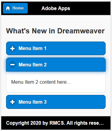
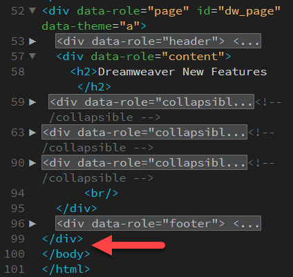
- Open the dw.html file and add the following three collapsible sets:
<div data-role="content">
<h2>What's New in Dreamweaver</h2>
<div data-role="collapsible" data-inset="true">
  <h3>Menu Item 1</h3>
  <p>Menu Item 1 content here...</p>
</div>
<div data-role="collapsible" data-inset="true">
  <h3>Menu Item 2</h3>
  <p>Menu Item 2 content here...</p>
</div>
<div data-role="collapsible" data-inset="true">
  <h3>Menu Item 3</h3>
  <p>Menu Item 3 content here...</p>
</div>
</div> - CHECK POINT: Save the file and preview it in a browser. You should see the three collapsible sets displayed. Click on each one of them to see how they expand and collapse..
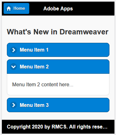
- (Optional) Replace the plus (+) and minus (-) expand and collapse icons with two arrow icons by adding the following highlighted attributes.
<div data-role="content">
<h2>What's New in Dreamweaver</h2>
<div data-role="collapsible" data-inset="true" data-collapsed-icon="carat-r" data-expanded-icon="carat-d">
  <h3>Menu Item 1</h3>
  <p>Menu Item 1 content here...</p>
</div>
<div data-role="collapsible" data-inset="true" data-collapsed-icon="carat-r" data-expanded-icon="carat-d">
  <h3>Menu Item 2</h3>
  <p>Menu Item 2 content here...</p>
</div>
<div data-role="collapsible" data-inset="true" data-collapsed-icon="carat-r" data-expanded-icon="carat-d">
  <h3>Menu Item 3</h3>
  <p>Menu Item 3 content here...</p>
</div>
</div> - CHECK POINT: Save the file and preview it in a browser. You should see the three collapsible sets displayed again but this time is has a different set of expand and collapse icons.
- Repeat the code from step 2 or 3 and paste it in the other pages (ps.html, ai.html, and id.html) and save them.
- Replace the "Menu Item X" and the "...Menu Item X content here..." text with information from the adobe.com
- Add the following
style
element to the
head
element of any of the files (e.g., ps.html) to make all images responses.
<style>
img{width:100%;height:auto;}
</style> - CHECK POINT: Save the files and preview them in a browser and test the pages. See Finished Version.
- (Optional) Count the number of new features for each Adobe app and write them down. Then, open the index.html file and add a span element before the
h3
element for each app and include the number of new features for each app.
<ul data-inset="true" data-role="listview" >
<li data-role="list-divider">Adobe Apps</li>
<li><a href="dw.html" data-ajax="false">
<img src="images/dw.jpg" width="99" height="99" alt=""/>
<span class="ui-li-count">3</span>
<h3>Dreamweaver</h3>
<p>Web and Mobile</p>
</a></li>
<li><a href="ps.html" data-ajax="false">
<img src="images/ps.jpg" width="100" height="99" alt=""/>
<span class="ui-li-count">7</span>
<h3>Photoshop</h3>
<p>Imaging and Composite</p>
</a></li>
<li><a href="ai.html" data-ajax="false">
<img src="images/ai.jpg" width="100" height="99" alt=""/>
<span class="ui-li-count">8</span>
<h3>Illustrator</h3>
<p>Vector and Illustration</p>
</a></li>
<li><a href="id.html" data-ajax="false">
<img src="images/id.jpg" width="100" height="99" alt=""/>
<span class="ui-li-count">13</span>
<h3>InDesign</h3>
<p>Layout and Print</p>
</a></li>
<li data-role="list-divider"> </li>
</ul>
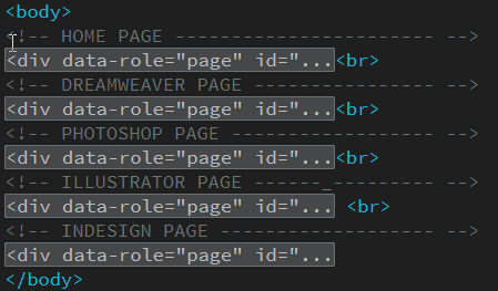
Another way to create a mobile app is to use a Single Page Application (SPA) method. In this method ALL of the pages are within a SINGLE PAGE. It is important to note that all href references are INTERNAL (e.g., # home_page, #dw_page, etc) instead of EXTERNAL (e.g., index.html, dw.html, etc.)
- Create a new folder (e.g., Adobe Apps 2) and copy the following file and folders into it:
- index.html
- themes folder
- images folder
- Open the dw.html file and using the Tag Chooser at the bottom of the page,select the div tag with the page id, and then right click in the Code View and select Copy from the menu.
- Go back to the index.html file and paste the code ABOVE the closing </body> tag:
- Change the external reference (dw.html) to an internal reference (#dw_page) for the first ListView
li
element.
<li><a href="#dw_page" data-ajax="false">
<img src="images/dw.jpg" width="99" height="99" alt=""/>
<span class="ui-li-count">3</span>
<h3>Dreamweaver</h3>
<p>Web and Mobile</p>
</a></li>
- Change the external reference (index.html) to an internal reference (#home_page) for the first ListView
li
element.
<div data-role="header">
      <a href="#home_page" data-ajax="false" data-icon="home">Home</a>
    <h1>Adobe 2020</h1>
</div> - Save the file and preview it in a browser. Click the Dreamweaver list view item. The page should go to the #dw_page bookmark within the SAME PAGE (not an external page). Click the Home Page to return to the home page bookmark (#home_page).
IMPORTANT NOTE: Even though additional content was was added to the index.html page, it is NOT DISPLAYED because it is in SEPARATE PAGE with a SINGLE PAGE that gets hidden when the page loads. - Repeat steps 2-6 for the other pages (e.g., ps.html, ai.html, and id.html) with the correct page references (e.g., ps_page, ai_page, and id_page).
- (Optional) Add a comment ABOVE each page code to make them easier to find.
NOTE: Code has been collapsed to see the comments better.
- (Optional) Delete the four data-ajax="false" attributes as they were only needed for the external pages.
- Minimize Dreamweaver and navigate to folder where the site files are.
- Zip all of the site's content.
- Log into PhoneGap Built (https://build.phonegap.com/apps).
- Click the new app button and then upload the zip file to convert the zip file to an apk file.
- Using a QR reader, scan the QR code on the phoneGap Built website to load app onto a phone or tablet.
RESOURCES:
Download Example: CompletedApp
View Demo: Adobe CC App
Download Adobe Apps Icons: AdobeApps_Icons.zip
Download Example: CompletedApp2
View Demo: ForeignWordsInEnglish App
Download Example: IdiomsDictionary/CompletedApp3
View Demo: IdiomsDictionary