Setup Main Menu
Create A Responsive Grid (Theory)
The Grid system is the "heart and soul" of a responsive design. Bootstrap uses a 12 column grid that are typically created in any combination of multiple of twelve (e.g., 12 columns, six two columns, four three columns, eight column and four columns, etc.). Columns will AUTOMATICALLY re-arrange themselves depending on the screen size. If more than 12 columns are used, they will stack no matter what the viewport size is.
Bootstrap's uses four classes for its grid system:
- xs (phones)
- sm (tablets)
- md (desktops)
- lg (large desktops)
IMPORTANT NOTE: These values represent the SIZE where the columns will start STACKING VERTICALLY. Columns always stack on small device by design. Also, it is important to note that class scales up, so if you want to set the same widths for xs and sm, you only need to set xs class.
Bootstrap uses two classes when creating columns:
- row (to create horizontal groups of columns)
- column (to add content to page)
Typically, multiple columns with a specific class (e.g., col-md-3) are nested inside of a single row with a class of row. The numbers in the .col-sm-* classes indicates how many columns the div should span. For example, .col-sm-1 spans 1 column, .col-sm-4 spans 4 columns, etc. The column numbers in all of the rows should typically add up to 12:
<div class="row">
<div class="col-md-4">Column 1</div>
<div class="col-md-4">Column 2</div>
<div class="col-md-4">Column 3</div>
</div>
Bootstrap grid system specifications:
| Phones (<768px) | Tablets (>=768px) | Desktops (>=992px) | Large Desktops (>=1200px) | |
|---|---|---|---|---|
| Grid behavior | Horizontal at all times | Collapsed to start, horizontal above breakpoints | Collapsed to start, horizontal above breakpoints | Collapsed to start, horizontal above breakpoints |
| Container width | None (auto) | 750px | 970px | 1170px |
| Class prefix | .col-xs- | .col-sm- | .col-md- | .col-lg- |
| Column width | Auto | ~62px | ~81px | ~97px |
They all have the following characteristics in common:
- Can have up to 12 columns
- Have a gutter width of 30 pixels (15 pixels on each column side)
- Can be nested
- Can have offsets
- Can have columns ordered
Examples:
For small devices (e.g., tablet and below), you may want to use a ratio of 25% (3 columns span) and 75% (9 columns span):
<div class="col-sm-3">....</div><div class="col-sm-9">....</div>
For medium devices with 992 pixels to 1199 pixels (e.g., desktop and above), you may want to use a ratio of 50% (6 columns span) and 50% (6 columns span):
<div class="col-sm-3 col-md-6">....</div>
<div class="col-sm-9 col-md-6">....</div>
The example above will result in a 25%/75% ratio on small devices and a 50%/50% ratio on medium devices.
On very large devices, you may want to use a ratio of 33% (4 columns span) and 66% (8 columns span)
<div class="col-sm-3 col-md-6 col-lg-4">....</div>
<div class="col-sm-9 col-md-6 col-lg-8">....</div>
Notice that the first example has sm, the second has sm and md and the third has sm, md and lg.
SUMMARY: Using any .col-sm-* class on an element will affect its styling on small devices (e.g., screen size greater than or equal to 768px) as well as medium and large devices if .col-md-* and .col-lg-* class is not used. Likewise, the .col-md-* class will affect the styling of elements on medium devices as well as on large devices if a .col-lg-* class is not used. If more than 12 grid columns are placed within a single row, then each group of extra columns, as a whole, will wrap onto a new line.
Create Row 1 with 4 columns
The first row in the grid will have four columns of equal length. Each taking up about 25% of the width of the row each.
- Write the following nested
<div>
tags with classes below the jumbotron code:
</div>
<!-- Grid with 4 columns -->
<div class="container-fluid">
  <div class="row">
    <div class="col-md-3">
      <h2>HTML Training</h2>
    </div>
    <div class="col-md-3">
     <h2>CSS Training</h2>
    </div>
    <div class="col-md-3">
     <h2> JS Training</h2>
    </div>
    <div class="col-md-3">
      <h2>Side Menu</h2>
    </div>
  </div>
</div>
CODE EXPLANATION:
- The "row" class establishes a row within the "container" class.
- The "col-md-3" class basically means set up four columns based on a medium device or above.NOTE: Bootstrap requires most of its content to be wrapped in one of two types of container class:
- The .container class provides a responsive fixed width container that centers the content in the view port with padding on both sides.
- The .container-fluid class provides a responsive full width container that expands 100% the width of the view port.
- Copy some Lorem Ipsum from ipsum.com or have the editor create some for you. In the newer version of Dreamweaver, type p>lorem and then press the Tab key to create a paragraph and some lorem ipsum dummy text.
- CHECK POINT: Save the file and preview it in a browser. You should see four columns with each column taking up 25% of the page (3/12 = 1/4 or .25).
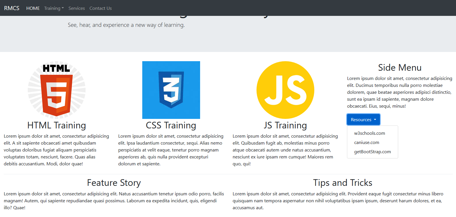
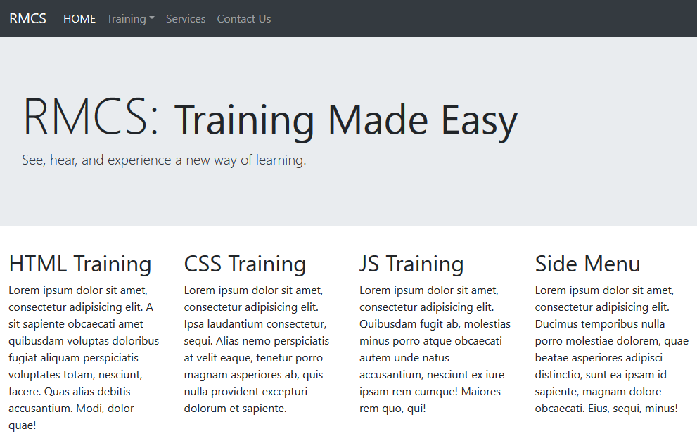
On a large device (laptop in landscape or desktop), the page will look like this:
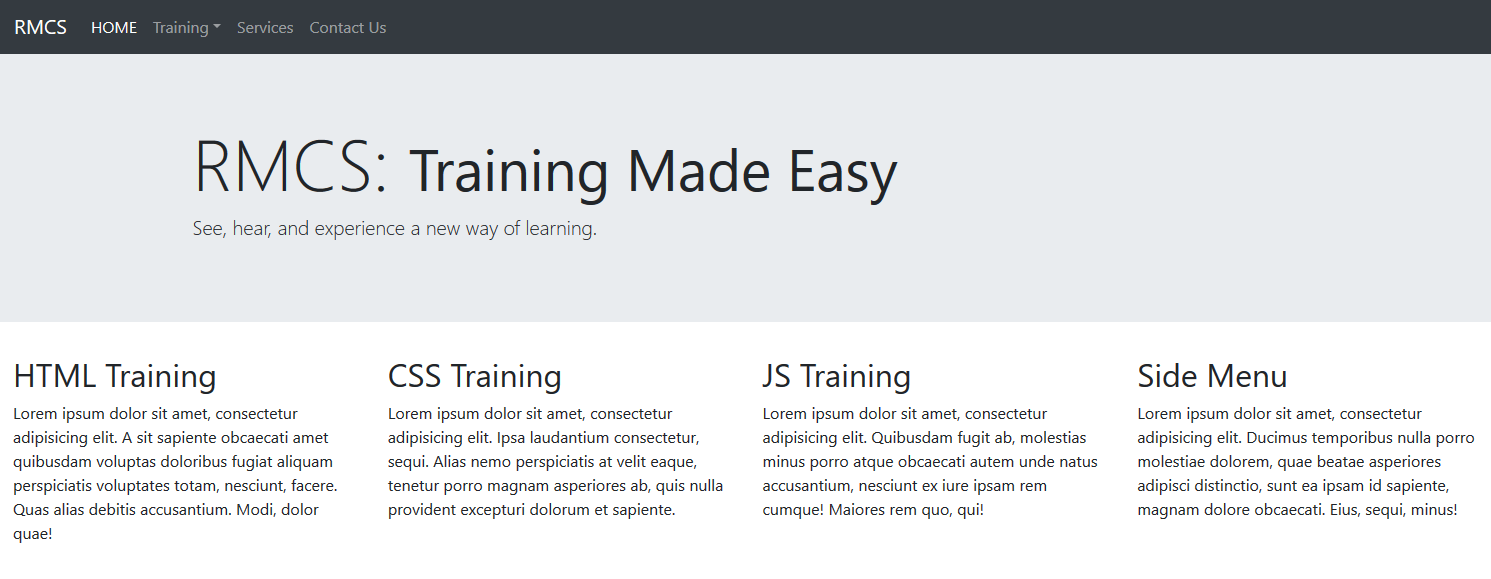
On medium devices (e.g., tablets), the page will look like this.
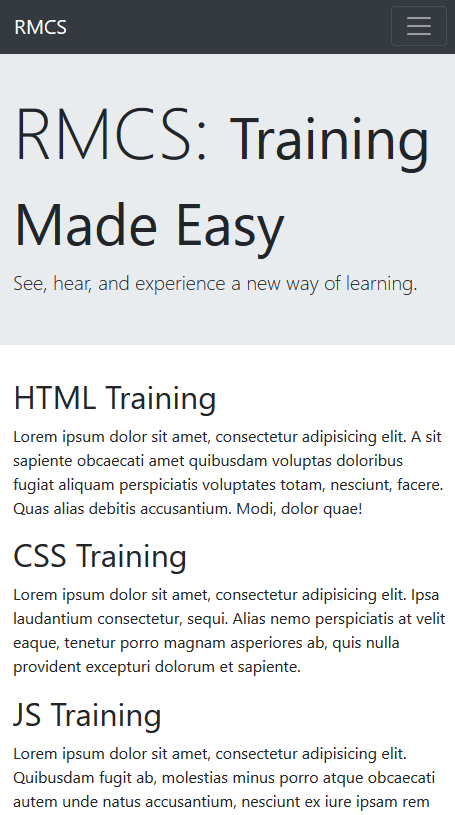
On a small device (e.g., phone), the page will look like this:
- Add the following images from the images folder above the first three
<h2>
tags in the first three columns. Only a portion of each paragraph text is shown.
<div class="col-md-3">
<img src="images/HTML5_logo.png" width="200" height="200" alt=""/>
<h2>HTML Training</h2>
<p>Lorem ipsum dolor sit amet, consectetur adipisicing elit...</p>
</div>
<div class="col-md-3">
<img src="images/CSS3_logo.jpg" width="200" height="200" alt=""/>
<h2>CSS Training</h2>
<p>Lorem ipsum dolor sit amet, consectetur adipisicing elit...</p>
</div>
<div class="col-md-3">
<img src="images/JAVASCRIPT_logo.svg" alt="" width="200" height="200"/>
<h2>JS Training</h2>
<p>Lorem ipsum dolor sit amet, consectetur adipisicing elit...</p>
</div>
CODE EXPLANATION:
- The "img-responsive" class makes the image scale to the size of its parent div regardless of its own size
- The "img-circle" class "mask" the image into a circle (There is also rounded and thumbnail).
- The "text-center" class does as the name implies.
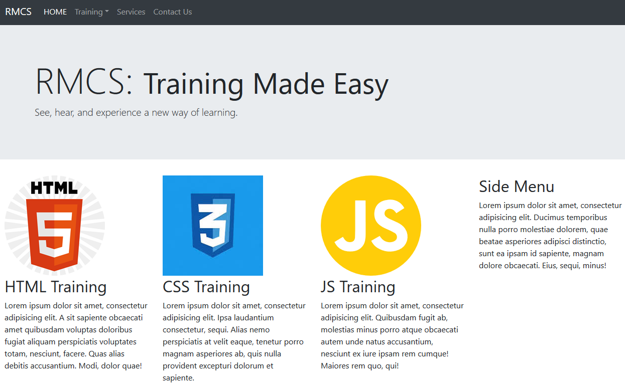
- Notice that three image formats has been used for the images (e.g., *.jpg, *.png, and *.svg). - CHECK POINT: Save the file and preview it in a browser. You should see four columns on a large screen. If you scale to the medium break point, the column will stack vertically.
On a large screen, the page will look like this:
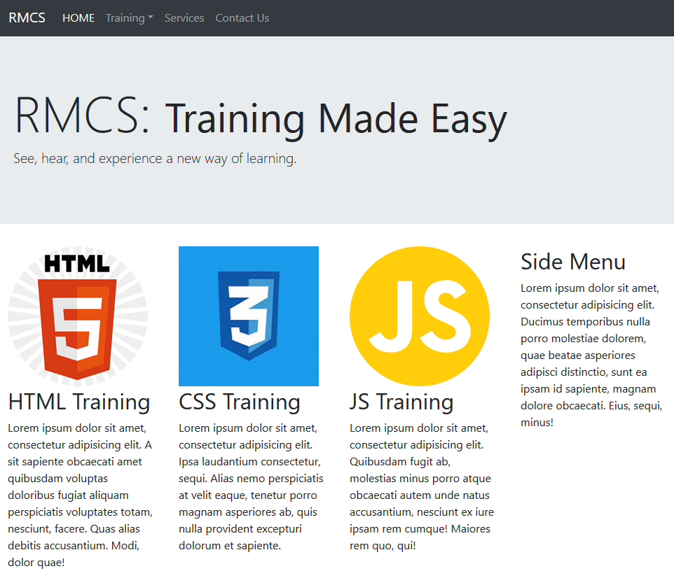
On a medium screen, the page will look like this:
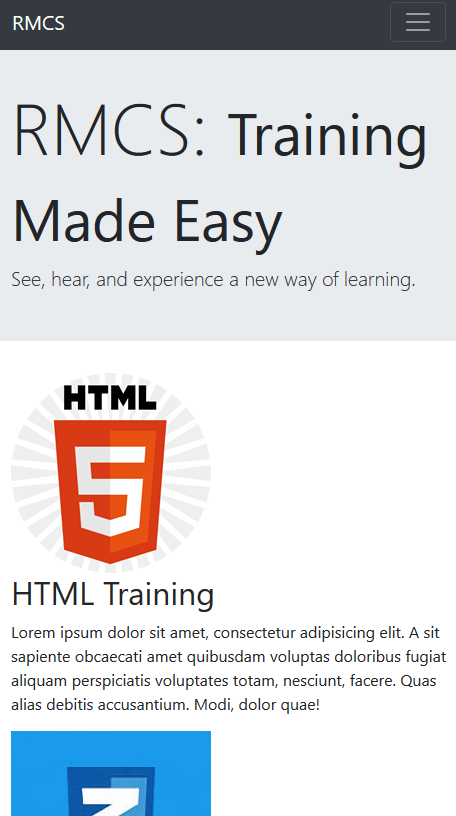
On a small screen, the page will look like this:
Center Images and Headings (Optional)
To make the columns more appealing, we will center all of the headings and images.
- Add the following CSS rule to a
<style>
tag to the custom_styles.css file to center the titles within each of the columns.
<style>
.col-md-3 h2{text-align: center;}
}
</style> - Update the image tags to include the following classes and styles:
<div class="col-md-3">
<img class="img-fluid img-circle mx-auto" style="display:block"
src="images/HTML5_logo.png" width="200" height="200" alt=""/>
<h2>HTML Training</h2>
<p>Lorem ipsum dolor sit amet, consectetur adipisicing elit...</p>
</div>

<div class="col-md-3">
<img class="img-fluid img-circle mx-auto" style="display:block"
src="images/CSS3_logo.jpg" width="200" height="200" alt=""/>
<h2>CSS Training</h2>
<p>Lorem ipsum dolor sit amet, consectetur adipisicing elit...</p>
</div>

<div class="col-md-3">
<img class="img-fluid img-circle mx-auto" style="display:block"
src="images/JAVASCRIPT_logo.svg" width="200" height="200" alt=""/>
<h2>JS Training</h2>
<p>Lorem ipsum dolor sit amet, consectetur adipisicing elit...</p>
</div>
CODE EXPLANATION:
- The mx-auto class is used to auto center the images.
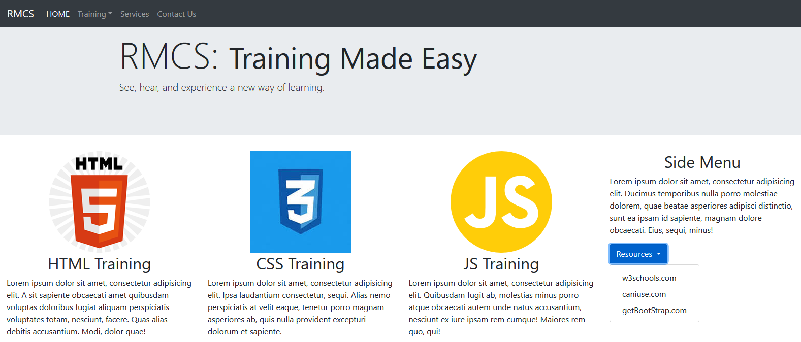
- In order for the mx-auto class to work properly, it requires the element to be block level element. Hence, the style="display:block" attribute will convert the inline image elements to block level elements. - CHECK POINT: Save the file and preview it in a browser. You should see the images and title are now centered within each column (see screen shots below)
Create Secondary Menu (OPTIONAL)
- Add the following tags below the closing
</p>
tag in column four:
</p>
  <button type="button" class="btn btn-primary dropdown-toggle" data-toggle="dropdown">
    Resources
  </button>
  <div class="dropdown-menu">
    <a class="dropdown-item" href="http://www.w3schools.com" target="new">w3schools.com</a>
    <a class="dropdown-item" href="http://www.caniuse.com" target="new">caniuse.com</a>
    <a class="dropdown-item" href="http://www.getBootstrap.com" target="new">getBootStrap.com</a>
</div> - CHECK POINT: Save the file and preview it in a browser. You should see the menu in the fourth column on a medium or large screen and in a single column on a small screen.
Create Row 2 with 2 columns
The second row in the grid will have two columns of equal length. Each taking up about 50% of the width of the row each.
- Write the following three nested
<div>
tags with classes below the first row closing
</div>
tag. Comment is optional. Only portion of the paragraphs text is shown.
</div>
<!-- Grid with 2 columns -->
<div class="container-fluid">
  <div class="row">
    <div class="col-md-6">
      <h2>Feature Story</h2>
    </div>
    <div class="col-md-6">
     <h2>Tips and Tricks</h2>
    </div>
  </div>
</div> - Update the CSS rule to include the headings for these two columns. Don't forget to include the comma to create a group selector instead of a contextual selector that would not work:
<style>
.col-md-3 h2, .col-md-6 h2{text-align: center;}
body{margin-bottom:80px;}
</style> - Copy some Lorem Ipsum from ipsum.com or have the Dreamweaver create some for you by typing p>Lorem and then press the Tab key below the
<h2>
tags. Optionally, add a divider class to separate the 4 columns content from the 2 columns content. Comment is optional as well.
<!-- Grid with 2 columns -->
<div class="container-fluid">
<div class="dropdown-divider"></div>
  <div class="row">
    <div class="col-md-6">
      <h2>Feature Story</h2>
      <p>Lorem ipsum dolor sit amet, consectetur adipisicing elit....</p>
    </div>
    <div class="col-md-6">
     <h2>Tips and Tricks</h2>
     <p>Lorem ipsum dolor sit amet, consectetur adipisicing elit....</p>
    </div>
  </div>
</div> - CHECK POINT: Save the file and preview it in a browser. You should see two columns span about 50% each below four columns on a medium or large screen and in a single column on a small screen: