Setup Navbar
Create Fixed Top Navbar with a Brand
We will create a top Navbar with a menu that collapse when is is scaled to a mobile device.
- Below the opening
<body>
tag, replace the
<h1>
tag with a
<nav>
tag with the following class names to create a Navbar container:
<body>
<nav class="navbar fixed-top navbar-expand-lg navbar-dark bg-dark">

</nav>
CODE EXPLANATION:
- The navbar class establishes the <nav> tag as a "wrapper" for the Navbar.
- The navbar-expand-lg class establishes the theme with a black background.
- The fixed-top class locks the NavBar to the top of the screen viewport even if the page is scrolled.
- The navbar-dark bg-dark classes will
NOTES:
- A Navbar requires a navbar class with a navbar-expand{-sm|-md|-lg|-xl} class for responsive collapsing and color scheme classes.
- A Navbar and its contents is fluid by default. You can use optional containers to limit its horizontal width.
- You can use spacing and flex utility classes for controlling spacing and alignment within a Navbar.
- A Navbar is responsive by default, but can be easily modify to change its responsive behavior based on the Collapse Java-script plugging.
- A Navbar is hidden by default when printing. To force it to be printed add the d-print class to the Navbar. See the display utility class for details
- Ensure accessibility by using a <nav> element or, if using a more generic element such as a <div>, add a role="navigation" to every navbar to explicitly identify it as a landmark region for users of assistive technologies.
- Although not required, th navbar can be wrapped within a container class to center it on a page or add one within to only center the contents of a fixed or static top navbar.
- When the container is within a navbar, its horizontal padding is removed at breakpoints lower than your specified .navbar-expand{-sm|-md|-lg|-xl} class. This ensures we’re not doubling up on padding unnecessarily on lower viewports when the Navbar is collapsed.
A Navbar has additional built-in support classes for a sub-components as will be seen later:
- .navbar-brand for your company, product, or project name.
- .navbar-nav for a full-height and lightweight navigation including support for dropdowns.
- .navbar-toggler for use with our collapse plugin and other navigation toggling behaviors.
- .form-inline for any form controls and actions.
- .navbar-text for adding vertically centered strings of text.
- .collapse.navbar-collapse for grouping and hiding navbar contents by a parent breakpoint.
- CHECK POINT: Save the file and preview it in a browser. You should see a small black nav bar with nothing in it now.

- Inside of the
<nav>
tag, write the
<a>
tag and the
<button>
tag with the following classes:
<nav class="navbar fixed-top navbar-expand-lg navbar-dark bg-dark">
<a class="navbar-brand" href="index.html">RMCS</a>
<button class="navbar-toggler" type="button" data-toggle="collapse" data-target="#navbarSupportedContent"
aria-controls="navbarSupportedContent" aria-expanded="false" aria-label="Toggle navigation">
<span class="navbar-toggler-icon"></span></button> </nav> - CHECK POINT: Save the file and preview it in a browser. You should see the brand (the text in this case, RMCS) at all times.

- However, when you scale to a smaller device size, the "hamburger" menu button will be displayed for mobile devices.

CODE EXPLANTION:
- The .navbar-brand can be applied to most elements, but an anchor works best as some elements might require utility classes or custom styles. For example, if you use a link, you could use: <a class="navbar-brand" href="#">Navbar</a>. If use you a heading, you would use: <span class="navbar-brand mb-0 h1">Navbar</span>. You can also add an image to the brand but it will require custom styles or utilities to size properly (e.g., <img src="bootstrap-solid.svg" width="30" height="30" class="d-inline-block align-top" alt="">)
- The navbar-header class is used to group content for better display on mobile devices.
- The navbar-brand class establishes the link as brand (site name). It is best practice to always set the href attribute back to the home page from here (typically, index.html).
- The navbar-toggle class allows the button to "toggle" its visibility on and off.
- The data-toggle attribute tells which class will be toggle (collapse).
- The data-target attribute specifies which custom class to target (.navbarSupportedContent).
Create Top Level Menus For Navbar
Now that we have create the brand (e.g., RMCS) and the Hamburger Menu icon, we will now create the top level menu items that will be positioned to the left of the Navbar.
- ABOVE the closing
</nav>
tag, add the following tags with their corresponding classes:
<div class="collapse navbar-collapse" id="navbarSupportedContent">
  <ul class="navbar-nav mr-auto">
      <li class="nav-item active"><a class="nav-link" href="#">HOME <span class="sr-only">(current)</span></a></li>
      <li class="nav-item"><a class="nav-link" href="#">Training</a></li>
      <li class="nav-item"><a class="nav-link" href="#">Services</a></li>
      <li class="nav-item"><a class="nav-link" href="#">Contact Us</a></li>
  </ul>
</div>
</nav>
CODE EXPLANATION:
- The collapse and navbar-collapes classes will create a collapsible menu structure.
- The active class value is assigned to the Home <li> tag and is used to highlight the menu button for the current page. You will need to change its location based on the page itself for each page. The active class indicate the current page can be applied directly to .nav-links or their immediate parent .nav-items.
- The nav-item and nav-link classes are used to style the <li> tags are menu items that are linkable.
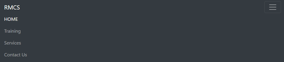
- CHECK POINT: Save the file and preview it in a browser. You should see that all four menu items (e.g., Home, Training, Services, and Contact Us.) when the screen is large. You should also see the Home menu button highlights different from the other menu items.

However, if you scale down to a smaller device size, the four menus items disappears and the hamburger menu is displayed instead:
When you click on the hamburger menu button, the menu list animates showing all four top-level menu items. If you click on it again, it collapses back up.
Create Drop Down For A Top Level Menu
Now that we have the "main" top-level menus, we will now replace one of them with a sub-menu.
- Below the closing
</li>
tag for Home menu, replace the complete
<li>
tag for the Training menu with another
<li>
tag that has an
<a>
tag and a
<div>
tag with its own set of
<a>
tags nested in it to create a drop down menu:
</nav>
<div class="collapse navbar-collapse" id="navbarSupportedContent">
  <ul class="navbar-nav mr-auto">
      <li class="nav-item active"><a class="nav-link" href="#">HOME <span class="sr-only">(current)</span></a></li>
      <li class="nav-item dropdown">
        <a class="nav-link dropdown-toggle" href="#" id="navbarDropdown" role="button"
         data-toggle="dropdown" aria-haspopup="true" aria-expanded="false">Training</a>
        <div class="dropdown-menu" aria-labelledby="navbarDropdown">
          <a class="dropdown-item" href="#">Dreamweaver</a>
          <a class="dropdown-item" href="#">Photoshop</a>
          <a class="dropdown-item" href="#">Illustrator</a>
          <div class="dropdown-divider"></div>
          <a class="dropdown-item" href="#">jQuery</a>
          <a class="dropdown-item" href="#">JavaScript</a>
        </div>
      </li>
      <li class="nav-item"><a class="nav-link" href="#">Services</a></li>
      <li class="nav-item"><a class="nav-link" href="#">Contact Us</a></li>
   </ul>
</div>
CODE EXPLANATION:
- The nav-item dropdown class tells the <li> tag to behave like a drop down menu.
- The dropdown-item classes define each <li> tags as a dropdown menu it.
- The dropdown-divide class create a horizontal divider in the drop dmenu at that location.
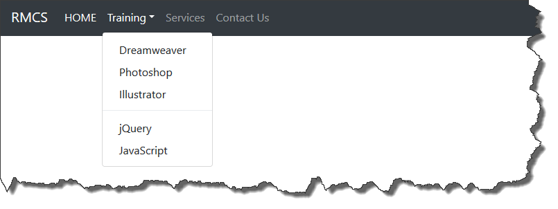
- CHECK POINT: Save the file and preview it in a browser. Click on the Training menu and you should see the following menu structure on a large screen:
And if you scale to a smaller device, you should see the following menu structure below when the Training menu button is pressed:
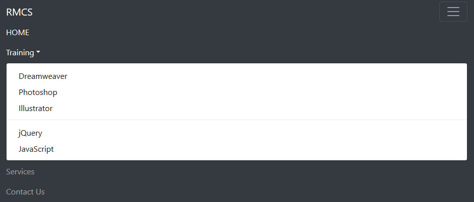
If you click on the Training menu again, it will collapse.
CODE EXPLANATION:
- This is no difference than a regular nested list with the exception of the classes on the <li>, <a> and <ul> tags.
- The dropdown class on the highlighted code of the first <li> tag is used to define this <li> tag as a dropdown.
The href="#" for the drop down menu should ALWAYS use a hash sign ("#") because you don't want it to go anywhere when it is clicked on. Only its sub-menus will have URLs assigned to them later.
- The dropdown-toggle class is is used to as the name implies to toggle the dropdown (sub-menus).
- The data-toggle attribute is used to target the the dropdown class as the data provider for the menu.
- The role="button" is used to give the <a> tag a "role" of button.
- The aria-expanded="false" prevents the menu from expanding on load.
- The <span>class="caret"></span> create a small graphic icon (triangle) next to the word Training.
- The dropdown-menu class, like the the snowdrop class, create a dropdown menu for the sub-menu (not the main top-level menu (Training).
- The role="menu" is used to give the <ul> tag a "role" of menu.
- The <li class="divider"></li> is used to create a "dividing line" between menu items.
Adding Color Icons To Top Level Menus (OPTIONAL)
Icons will be added to the top-level menus to make them more attractive.
- Add the following
<link>
tag below the last
<link>
tag:
<link href="css/custom_styles.css" rel="stylesheet" type="text/css">
<link rel="stylesheet" href="https://cdnjs.cloudflare.com/ajax/libs/font-awesome/4.7.0/css/font-awesome.min.css"> - Add the following
<span>
tag to each of the top-level menu items with a space before the menu names (HOME, Training, Services, and Contact Us).
TIP: Once you create the first icon and test it, copy the <span> tag to the other menu items and simply change the icon name and/or its color.
    <ul class="navbar-nav mr-auto">
      <li class="nav-item active">
        <a class="nav-link" href="#">
        <span class="fa fa-home text-danger"></span> HOME
        <span class="sr-only">(current)</span></a>
      </li>
      <li class="nav-item dropdown">
        <a class="nav-link dropdown-toggle" href="#" id="navbarDropdown" role="button"
         data-toggle="dropdown" aria-haspopup="true" aria-expanded="false">
         <span class="fa fa-graduation-cap text-info"></span> Training</a>
        <div class="dropdown-menu" aria-labelledby="navbarDropdown">
          <a class="dropdown-item" href="#">Dreamweaver</a>
          <a class="dropdown-item" href="#">Photoshop</a>
          <a class="dropdown-item" href="#">Illustrator</a>
          <div class="dropdown-divider"></div>
          <a class="dropdown-item" href="#">jQuery</a>
          <a class="dropdown-item" href="#">JavaScript</a>
        </div>
      </li>
      <li class="nav-item">
        <a class="nav-link" href="#">
        <span class="fa fa-gear text-success"></span> Services</a>
      </li>
       <li class="nav-item">
        <a class="nav-link" href="#">
        <span class="fa fa-envelope text-warning"></span> Contact Us</a>
      </li>
    </ul>
CODE EXPLANATION:
- The fa fa-icon_name class is used to source the font from the font awesome web site.
- The style attribute is used to set the font size and color. - CHECK POINT: Save the file and preview it in a browser. You should see the menu items with color icons next to them.

- OPTIONAL: You can add icons to the sub-menus if you want to using the same method above.