CSS User Manual
- CSS PUNS (Just For Fun)
- Don't Fear The Internet
- HTML Dog
- A List Apart
As will be apparent later, CSS is used to SEPARATE the page STYLE from the page STRUCTURE (S3). Another phrase that is commonly used is to SEPARATE HTML CONTENT from CSS DESIGN. Overall, CSS is used for styling, formatting page appearance, and positioning page elements (layout).
NOTE: As with many rules, there are always exceptions. For example, while HTML is primarily concerned with CONTENT rather than DESIGN, there are a few tags that specify design or style (e.g., <code>).
CSS has several major advantages when creating HTML pages:
- More flexible, accessible, and portability for other media types
- Easier to make pages look consistent
- Easier to update pages
- Reduce pages weight (size) which results in pages loading faster
Before you get started with CSS, you need to understand several key concepts about a page's elements (or tags) (See HTML Basics for details).
While there are many ways to style a page as will be discussed later, they all follow a same syntax (how code is written) that defines the rule(s) within them that control STYLE or POSITION of page elements:
selector_type {property:value; property:value;}
NOTES:
- Declaration block begin and ends with curly braces.
- Selector name cannot have spaces but can have underscore (e.g., my_selector_name)
- Selector will target specific page element(s)
- Colon (:) are used to separate property's name/value pairs. Unlike HTML that uses an equal sign and quotes to separate attribute's name/value pairs (e.g., width = "100px")
Properties values come in a variety of forms:
- Keyword (e.g., font-weight:bold)
- Number (e.g., font-size:16px, width:200px) used when a unit of measurement is needed
CAUTION: Do not add a space between the numeric value and its unit of measurement; otherwise, that property will not be rendered.
Unit of measurements include:
- Absolute (e.g., in, pt, px, etc.) – represent absolute measurement and is best served for fixed-size unit of measurements (e.g., width:200px)
- Pixels – a standard SCREEN measurement. One pixel is equal to one physical pixel (PICture ELement) on a screen that can vary with screen resolution.
NOTE: Pixels are mainly used of computers based projects. You should always use 72 ppi (pixels per inch) for computers. - Points / Picas – a standard PRINT measurement. One point is equal to 1/72 of an inch and can vary based on font face. One pica is equal to 12 points. Projects for printer should use 300 dpi (dots per inches)
NOTE: Points and pica are mainly used for print projects. - Inches – a standard ENGLISH measurement. One inch is equal to 2.54 cm
- Centimeter / Millimeter – a standard METRIC measurement
- Pixels – a standard SCREEN measurement. One pixel is equal to one physical pixel (PICture ELement) on a screen that can vary with screen resolution.
- Relative (e.g., em, ex, and %) – represent a measurement "relative" to other elements.
- Percentage is useful for setting the width of container elements to a percentage of the browser width so that can be responsive.
- EM is based from a capital M of a font which vary from font to font. Hence, an em unit of measurement is relative. Relative means it is relative to its parent container. It is best practice to use ems for fonts so that they can scales proportionally if the Text Size menu option is selected in a browser for the visually impaired users:
- EX is the height of the letter "x".
TIP: It is best practice to use smaller font sizes to prevent less scrolling with most users. If a visually impaired user need to scale the font, they can do so easily by changing the user style (See User Style).
Other values:
- URL (e.g., URL(myimage.jpg) – is used when a URL value is needed for a background image.
CAUTION: Do not add a space between between the url and the left parenthesis; otherwise the image will not be rendered. - Color (e.g., color:#FF0000) Typically expressed as a hexadecimal value. Colors can also be expressed as one many named color (e.g., red) that are supported by most browsers (See Named Colors). While not used often, colors can also be expressed as percentages of Red, Green and Blue (e.g., 100%, 0%, 0% for a pure red).
CSS code can be written from one or more lines of code. There is no penalty for white space as show below:
EXAMPLE 1 (1 line of code):
h1 {color:red;
font-size:24px;}
EXAMPLE 2 (2 lines of code): While not necessary, declaration block and rule(s) can be placed on separate lines for better clarity and readability especially if there are many rules.
h1 {color:red;
font-size:24px;}
EXAMPLE 3 (3 lines of code):
h1 {
color:red;
font-size:24px;}
EXAMPLE 4 (5 lines of code): You can also have the curly braces or separate lines by themselves:
h1
{
  color:red;
  font-size:24px;
}
CAUTION: While not necessary, it is best practice to include a semicolon (;) on the LAST rule particularly if you are manually editing the rules so that you don't inadvertently break the code.
For any of these examples above, the following heading would be rendered as follow:
<h1>This is a h1 heading element with a red font and a font-size of 24 pixels</h1>
This is a h1 heading element with a red font and a font-size of 24 pixels
While many designers use the words font and text interchangeable, there is a subtle but distinct different between the two. Hence, there are font properties and text properties.
Text properties are used for POSITIONING or CHANGES to existing text:
text-align
text-decoration
text-indent
text-justify
text-outline
text-overflow
text-shadow
text-transform
text-wrap
Font properties are all used for how the characters are DISPLAYED on the screen:
font
font-family
font-size
font-style
font-variant
font-weight
@font-face
font-size-adjust
font-stretch
Fonts falls into four main categories:
- Serif – Details serifs on characters:
- Times New Roman
- Cambria
- Sans-serif – NO detail serif on characters (The word sans means "without"):
- Arial
- Verdana
- Monospace – characters has equal spacing between them (The word mono means "one"):
- Courier
- Monotype
- Fancy –
decorative fonts (Should be used sparingly)
- Comic San MS
- Cursive
To ensure a set of fonts is available on the user's computer, it is best practice to provide a family of fonts.
body {font-family: Arial, Helvetica, sans-serif;}
If the first font does exist, it will select the second in the list, and so on until it reaches the end of the list. If no font is available, it will substitute it with a generic font type.
NOTES:
- Most computers will have Times New Roman, Arial, Verdana and Courier so these are a good set of fonts to choose.
- If a font has more the one word, it is included in double quotes (e.g., "Times New Roman").
EXAMPLE: body {font-family: "Times New Roman", Arial, sans-serif;}
There are five types of styles that can be used when viewing a web site:
| Style type | How is it created | Where is it created | |
|---|---|---|---|
| 1. BROWSER | Not Applicable | Part of browser code | |
| 2. USER | User defined external style sheet | External file (*.css) | |
A |
3. INTERNAL or EMBEDDED | Style element | Inside <style> element in <head> tags: <style> p {color:blue;} </style> |
| 4. EXTERNAL or LINK | Style sheet (link or import) | External file (*.css) | |
| 5. INLINE | Style attribute | Inline attribute with tag: |
1. BROWSER
Browser – different browsers use different built-in browser style sheet that defines minimal design styles (e.g., headings, font color, margins between paragraphs, list indents, etc.). Many user agents (devices) looks for their specific style sheet type. For example, a smart phone looks for a hand-held style sheet. Firefox default browser style sheet is saved in a file called html.css.
TIP: Because browsers have different style sheet settings, as will be discussed later, it is best practice, to zero out margins, paddings, and borders on HTML elements in order to override various browsers default settings to create a "level playing field" to work from. Then, these properties can be set so they will be the same for all browsers. This process is called CSS reset and it is used, as the name implies, to reset the stylesheet to reduce browser inconsistencies default line heights, margins, heading font size, etc. An alternative to CSS reset is to use Normal.css for modern HTML5 browsers.
2. USER
User – the user (typically visual impaired) can override the default browser style sheet that is in their browser preferences but not the author style sheets (explained next). For IE, select Tools > Internet Option and the click the Accessibility button and browser to a CSS file. For example, a visually impaired user could create a style sheet with a simply rule of body {font-size:200%;} to double the font size for readability. This is why it is important to specify text in relative sizes (e.g., em) instead of fixed sizes (e.g., points)
AUTHOR – created by web page authors and comes in three types
3. INTERNAL
Internal (or embedded) – placed within the <head> element within the <style> element. The advantage of an internal style sheet is that it can be used only by that SINGLE page and what is commonly known as "page-specific" or "local" styling and will override any external style sheet rules (as will be discussed in more detail next) if it is written below an external style sheet <link> tag. You can either type an external style manually or in the CSS Designer panel by click the plus sign and select Define in Page to add an internal style sheet.
<head>TIP: Normally, styles are embedded locally during the initial stage of development to establish the overall "look-and-feel" of the web site and then exported as an external style sheet so that it can be used by multiple pages.
<style type = "text/css">
.warning {
color:red; font-weight:bold;}
</style>
</head>
4. EXTERNAL
External (or linked) – a separate file (e.g., mystyle.css) used OUTSIDE of the page but LINKED or IMPORTED (e.g., @import directive) to the page with a <link> tag in the <head> tag. External style sheets are written the same way as internal styles but without the <style> tags. You can create a new external style sheet or link to an existing style sheet in the CSS Designer Panel by clicking on the plus sign and selecting Create New CSS File or Attach Existing File, respectively.
EXAMPLE OF EXTERNAL STYLE SHEET OUTSIDE OF PAGE (e.g., mystyle.css):
.warning {color:red;
   font-weight:bold;
}
EXAMPLE OF SAME STYLE SHEET LINKED INSIDE PAGE:
<link href="mystyle.css" rel="stylesheet" type="text/css">The major advantage of an external style sheet is that it can be used across MULTIPLE pages or what is commonly known as "site-specific" or "global" styling.
NOTES:
- The power of using an external style sheet becomes apparent when a change is needed. Changing a single rule in a single style sheet in a single place a single time will update all styles in all pages all at once if there are no competing styles.
- You can create MULTIPLE style sheets for a SINGLE page for DIFFERENT devices (printer, TV, etc.).
- Because CSS is not HTML, it uses a different format to make comments (similar to C) for both internal and external styles (e.g., /* Comment goes here */).
LINKING AND IMPORTING EXTERNAL STYLE SHEETS
There are two ways to link external style sheets:
- The most common way is to use the <link> tag to link to style sheet (e.g., <link ref="mystyle.css" rel="stylesheet" type="text/css">)
- Use the import directive to import the style sheet. (e.g., @import url("mystyle.css"))
NOTE: It is important to note that an external style sheet (*.css) is CREATED OUTSIDE the page but LINKED INSIDE the page with a <link> tag at the <link> location in code.
NOTE: Older browsers do not recognize the import directive, so it can be used to hide newer standards from older browsers. The import directive appear at the beginning of the style element and can have other markup or style rules in it. (A/I).
TIP: External style sheets can be validated at: http://jigsaw.w3.org/css-validator/
TIP: One stylesheet can be used to import other stylesheets. The advantage of this is that the basic style sheet can be "linked" and the newer standard style sheet rules or different style sheet based on type, layout or color can be "imported" from the linked style sheet. You can extend this concept by creating "color themes" style sheets.
Add diagram similar to Fig. 1-4 on pg 20 of CSS Mastery.
NOTE: Import rules need to be the first rules in a stylesheet in order for the style rules to work properly.
5. INLINE
Inline (or local) – (not to be confused with inline elements) are applied directly to an element as a style attribute (not a tag); whereas, internal (embedded) style is applied to the WHOLE document and an external style CAN BE APPLIED to MULTIPLE documents. However, in-line styles are NOT recommended based on newer web standards because it violate the rule of separating style from structure. However, they are good to use when creating HTML e-mails or creating training material:
<p style="color:red; font-weight:bold;">Inline style text</p>
NOTE: Notice that the syntax for the rules are the SAME (color:red; font-weigth:bold) regardless of the style type (internal, external, or inline). What is different is how they are wrapped:
- An internal style is wrapped in a <style> tag in the <head> tag
- An external style is wrapped in a separate page.
- An inline style is wrapped in quotes as an attribute of a tag.
Not to be confused with CSS style types mentioned earlier, there are four major CSS selector types. Most selectors will target something in the HTML markup (tag, class, ID, attribute, or an attribute value). However, some selectors (e.g., pseudo-class) will style an element based on an event (mouse event).
NOTE: It is important to note the SELECTOR TYPES (e.g., Internal, External, and Inline) goes INSIDE the SELECTOR TYPES (e.g., ID, Class, Element) that was learned earlier.
[SHOW CODE INSPECTOR TO SHOW HOW TAGS GET OVER WRITTEN.]
1. TAG SELECTORS
Tag Selector (sometimes called type or element selector) – redefine or target every instance of an specific existing HTML or XML tag globally of that type AUTOMATICALLY.
MEMORY TIP: A tag selector will Target every Tag of That Type Totally (T5) unless there is another overriding selector (e.g., class)
EXAMPLE: The code below will render every h1 element as red instead of the default black.
h1 {color:red;}
2. CLASS SELECTORS
Class Selector – can be applied to multiple HTML elements per page as needed as a "class" attribute and should be used sparingly. They are used to identify SIMILAR elements on a page. Also, class name should describe the purpose (e.g., PageTitle) or its content (e.g., thumbNailImage) of a class (e.g., .warning) and not its appearance (e.g., .redboldtext).
Unlike tag selectors that get APPLIED AUTOMATICALLY, class selectors have to be:
- Prefixed with a dot (.) in front of it
- Given a descriptive class name
NOTE: Name cannot have spaces but can have underscores (e.g., my_class_name) or use camel case (e.g., myClassName). - Applied as a class attribute to an element(s)
EXAMPLE:
RULE CREATED: .warning {color:red; font-weight:bold;}
RULE APPLIED: <p class= "warning"> Do not delete this sentence.</p>
DESIGN VIEW: Do not delete this sentence.
MEMORY TIP: It is helpful to think of a class selector as a paragraph or character style used in a word processing program.
CAUTION: The style has a period (.) in front of the selector (e.g., .warning). However, when the style is applied it does not. Instead it is applied as a class attribute within the element using double quotes. (e.g., class = "warning")
NOTE: Classes can be applied to a PORTION of an element (inline) using the <span> tag, but more often, they are used to override the default or CSS styling of the ENTIRE tag (e.g., p, div, etc.)
NOTE: An element can have multiple classes that are separated by commas (e.g., <p class="class1" class="class2" class="class3">Text goes here...</p>).
3. ID SELECTORS
Identifier (ID) selector – can be applied to any HTML element once per page as an "id" attribute and should also be used sparingly. They are used to identify UNIQUE elements on a page. They are usually used to create various sections (e.g., sidebar, custom_ content) of a page. Also, ID name should a identify a page "container" (e.g., sidebar).
Unlike tag selectors that get APPLIED AUTOMATICALLY, ID selectors have to be:
- Prefixed with a hash sign (#) in front of it
- Given a description ID name
NOTE: Name cannot have spaces but can have underscores (e.g., my_id_name) or use camel case (e.g., myIdName). - Applied as a ID attribute to an element
NOTE: You can have multiple IDs on a page but each ID must have a unique name and can only be used once. An element can be assigned an ID, class or both.
EXAMPLE:
RULE CREATED: #heading {width:760px; height:100px;}
RULE APPLIED: <div id = "heading">This is a heading</p>
IDs are similar to classes; however, they have the following differences:
- IDs carry more weight than classes. (Discussed later)
- Only a single instance can be used on a page
- Can be used with JavaScript and CSS to target element(s) on a page
TIP: It is not necessary to assign an ID to an element (e.g., a table) if there is more than one instance on a page that will be "styled" the same—used a class selector instead. However, if you have more than one element (e.g., table), a unique ID can be assigned to each and they each can be styled differently.
NOTE: Do not include spaces in an ID or class name (e.g., mainContent and not main Content.)
SUMMARY: You ALWAYS target a SINGLE tag whether implicit or explicit. The IDs and classes are used to provide more specific hooks to a target tag. Implicit tags are tags that are "implied" or that are open-ended (e.g., .myclass). Explicit tags are tags that are "actually" linked to the class or ID (e.g., p.myclass).
NOTE: You can ONLY have A SINGLE ID on an element along with multiple classes (e.g., <p id="myID" class = "myclass1 myclass2 myclass3">Text goes here...,</p>.
Combining Tag Selector with a Class or ID Selector (best of both worlds)
A tag selector can be COMBINED with a class selector or other selector to create various types of contextual selectors:
p.specialclass {color:red;} This basically says, "target all <p> tags that have a class named specialclass ATTACHED to it. By using a tag and a class selector, you can limit the class to a specific tag (in this case, the <p> tag). If you were to apply the p.specialclass to a <div> tag, it would not work.
- This is a <p> tag with the p.specialclass applied to it.
- This is a <div> tag with the p.specialclass applied to it. (Notice the class does not work on a <div> tag.)
By adding another selection (e.g., span), you can get even more specific:
p.specialclass span {color:red;} This basically says, "target all <span> tags that is INSIDE a <p> tag with a ID name of specialclass."
- CODE VIEW: <p>This is a span tag <span>INSIDE</span> of a p tag with an ID name of specialclass. Notice a span tag is wrapped around the word "INSIDE."</p>
- RESULT IN DESIGN VIEW: This is a span tag INSIDE of a p tag with an ID name of specialclass. A <span> tag is wrapped around the word "INSIDE." (Notice only the with INSIDE has changed)
If you remove the "p" in front of the selector above (e.g., .specialclass span), the tag will still be specific, but it is more flexible. It says, "target ANY tag that has a <span> tag with a ID name of specialclass.
TIP: It is helpful to think of a selector with a period (.) or hash sign (#) in front of it as any open-ended selector—or a selector that can be ATTACHED to ANY tag.
The downside to the open-ended approach (because it is less specific) is that you may inadvertently add another tag to the element which will cause the open-end selector not to work. For example, let's say you added a <span> tag inside of another tag, that tag will be affected as well because of the rule of inheritance (Children will inherit properties of its parents.) See CSS Rules and Their Exceptions.
.specialclass span {color:red;} This basically says, "target all <span> tags that is INSIDE ANY tag with a class name of specialclass."
- CODE VIEW: <div>This is a span tag <span>INSIDE</span> of a div tag with an class name of specialclass. Notice a span tag is wrapped around the word "INSIDE."</div>
- RESULT IN DESIGN VIEW: This is a span tag INSIDE of a div tag with an ID name of specialclass. A <span> tag is wrapped around the word "INSIDE." (Notice all of the text has changed)
To avoid this problem, you could create a group selector that has more specific rules for EACH element you want to style:
-
p.specialclass span, h1.specialclass span, div.specialclass span {color:red;}
The same concept applies to ID selectors.
Combining a Class Selector with an ID Selector (best of both worlds)
A class selector can be COMBINED with a ID selector to create a more specific selector than a class or ID only.
.special#Title
GIVE EXAMPLE HERE.
4. CONTEXTUAL SELECTORS
Contextual selector (Simple) – What if you did not wanted to target every instance of a specific element type. You can use a descendant or contextual selector to target more "selectively." For example, if you want to only target <p> tags inside of ANY <div> tag you can write a rule like this:
div p {color:red;}
NOTE: Contextual selector (simple) (used to be called descendant selector) – use to target the descendants of a particular element or group of elements. Contextual selectors are indicated by a space between two or more selectors. Notice a contextual selector used two or more elements. The element closest to the declaration block is the element that will be targeted (in above example the <p> tag). The other element(s) give a path to the containing ancestor element(s).
The two selector examples above are used to apply a generic style to every instance of those elements. To be even more specific, you have to use classes and IDs.
Because the span tag is an inline neutral container, a declaration block of p em {color:green;} would render all text inside an <em> tag as green even though the text is wrapped with a <span> tag. In essence, because the span tag is a neutral container, it it skipped over when read backward.
To be more specific, include the span element in the selector name. A declaration block of p span em {color:green;} will ONLY target or affect text inside an em tag inside a span tag inside a p tag.
EXAMPLE: Code view:
<p>This is some text with an <em>em</em> tag only</p>
<p>This is some text WITH a span tag wrapped around an <span> <em>em</em> </span> tag</p>
EXAMPLE: Design view:
- This is some text with an em tag only
- This is some text WITH a span tag wrapped around an em tag
If the declaration block were changed from p em to p span em, you would get:
- This is some text with an em tag only
- This is some text WITH a span tag wrapped around an em tag
You can also use a child selector to target a direct descendant of its parent tag.
p > em {color:green;}
Notice the greater-than sign (>) between the two tags can be interpret as "child of." Child selector is not support by IE 6 and below and as a result is it best to use classes and IDs to target any tag, as will be seen next.
MEMORY TIP: It is helpful to read a contextual selector backward to ascertain what it is targeting. In this case, all links in the #sidebar. Think of a contextual selector similar to the forward slash (/) to a "path" of a file; however, in this case a path to the selector.
MEMORY TIP: Since it is helpful to think of every tag as a container, it is useful to think of contextual selectors as targeting container inside of other container(s).
SHOW GRAPHICS
COMPOUND / ADVANCED SELECTORS (Need clean-up)
Compound / Advanced – Compound selectors COMBINES styles WITHIN styles that will only display when they are CONTAINED within other styles. These styles are sometimes called conditional formatting because all of the conditions of the selector have to be met in order for the rule(s) to be applied.
EXAMPLE:
If you write a compound selector that read #mainContent ul li {color:blue;}, it will only be applied if the <li> is inside a <ul> that is inside a container with an ID name of mainContent.
Pseudo classes – The most common pseudo selectors are the anchor/link pseudo class selectors (a:link; a:visited; a:hover and a:active) that should be created in that order that represents the STATE (not the STRUCTURE of an element) of a link element based on mouse events.
MEMORY TIP: LOVE / HATE – Linked, Visited, Hover, Active. You don't have to define all four—link and hover are sufficient.
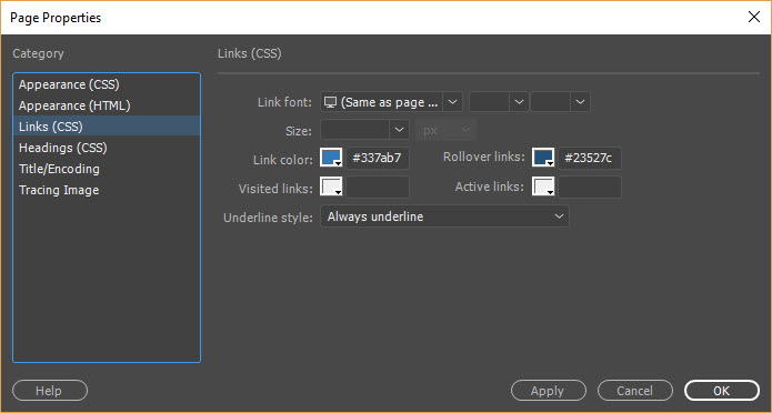
TIP: You can select the Page Properties... button in the Properties panel and then choose Links(CSS) from the category list. You can now SET SOME or ALL of the pseudo link options including the font style (strong/em), font family, font size and text-decoration properties at one time. Dreamweaver will add all of the links in CSS (e.g., (a:link; a:visited; a:hover and a:active).
TIP: You are not limited to just the <a> tag when using pseudo classes, you could use:
- p:hover {background-color:gray;} to highlight a paragraph on a page
- tr:hover {background-color:gray;} to highlight a table row
- img:hover {border: solid thin red;} to highlight an image
- input:focus {background-color:yellow;} to highlight input field when focus is set
There is also the a:focus that is similar to the a:hover but is based on a keyboard (not mouse) events for those with disabilities.
NOTE: If an a selector is used WITHOUT an a pseudo class, it will be applied and cascaded to all other a pseudo-classes. Hence, it is best practice to define the common properties with a simple a selector (e.g., a {font-weight:bold;} then define the other selectors that will have different properties (e.g., a:link {color:blue;}, a:visited {color:green;} and a:hover, a:active, a:focus {color:yellow; text-decoration:none;}
Other pseudo-classes include:
- x:first-child – selects the first-child element with the name x within a set of tags (SEE EXAMPLE PG 51)
- x:focus – highlight a field when clicked or tabbed to. (e.g., input:focus {border: 1px solid blue;}) will add a blue border around an input field.
Pseudo elements – add extra markup element to a PORTION of an element (e.g.,, first letter or first line):
- x:first-letter – p:first-letter {font-size:300%; float:left;} will create a drop-cap in a paragraph
- x:first-line – p:first-line {font-variant:small-caps;} will create the first line in a paragraph in small caps
- x:before and x:after – cause specified text to be added before or after an element.
EXAMPLES:
Write <h1 class ="age">25</h1> and then style it:
h1.age:before {content:"Age: "}
h1.age:after {content: " year old."}
Will result in: Age: 25 years old
TIP: These two classes are useful when tag content is generated by database query or XML (Give example pg 53).
NOTES:
- Because search engine cannot recognize these pseudo-element content because it does not appear in the markup, don't use them for important content.
- Unlike class selectors that start with periods (.) and id selectors that starts with pound signs(#), pseudo classes start with colons (:) but must have a tags associated with them (e.g., a:link, a:hover)
Child selector – to target a direct descendant of an element. Notice the right angle bracket (>) symbol that is used.
p > em {color: green;}
will target only the first child <em> tag inside of a <p> tag.
Specialize selectors – See page 46-47 Styling book
- Universal selector – * {color:green;} or p*em {font-weight:bold;} Make all elements red. The universal selector applies its style to all elements of a page. The selector is not often useful????
- Adjacent sibling selector – h1 + p { font-variant:small-caps;} based on preceding markup tag with both nested at same level
- Attribute selector – img[title] {border: 2px solid blue;} target the attribute of a tag
TIP: Dreamweaver with create a selector based on the focus selection and will allow you to change it to a more or less specific selector. It is best practice to create the simplest selector that still target the effected tag. This will allow more specific selectors to be created if subsequent selectors are needed.
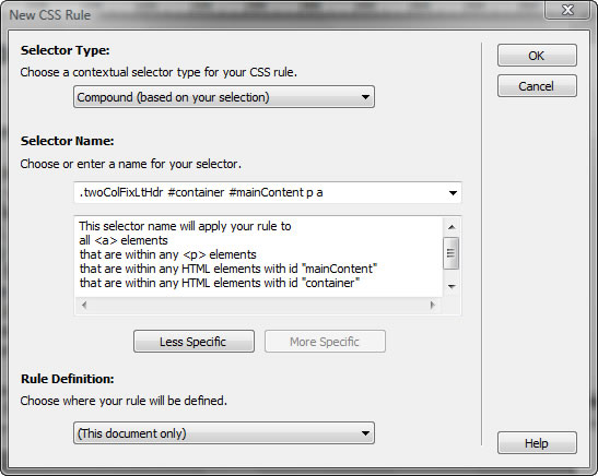
So instead of using .twocolFixLtHdr #container #mainContent p a you can get by with #mainContent p a
Order of writing CSS selectors:
With so many ways to create CSS with Dreamweaver, it is best to DEFINE the rules in this order:
- Tag / Element selectors (e.g., h1-h6, p, ol, ul, etc.) because they will cascade down the CSS tree. For example, by adding rules to the <body> tag for the overall font, color and size, the other tags will inherit those styles (e.g., p).
- ID selectors because they provide "hooks" for contextual selectors that can be created later.
- Contextual selectors because they can be used to specifically target tags within a page division (div tag) with their own styles. They can be used to override tag selectors properties because they are more specific.
- Your class selectors should be defined last because they should be used sparingly (avoiding classitis) and should only target elements that will be used multiple times.
TIP: Remember acronym: TIDY – keep it tidy (neat, orderly, or trim) – Tag, ID, Descendant, and Your class.
Ways to apply CSS selectors
First select the tag and then:
- Code View: Manually write class or ID in Code View
- Menu: Select Format > CSS Styles > SelectorName
- Content menu: Right-click and select CSS Styles > SelectorName.
- Properties panel: Select Class or ID from menu.
- Tag Selector Right-click and select Set ID or Set Class and select from list.
Some of the above techniques can be combined by using multiple declarations, selectors, rules or classes.
Multiple RULES can be contained within a single selector separated by semi-colons:
h1 {color:blue; font-weight:bold;}
Multiple SELECTORS with the same rules can be grouped:
h1 {color:red; font-weight:bold;}
h2 {color:red; font-weight:bold;}
h3 {color:red; font-weight:bold;}
And can be consolidated into a group selector
h1, h2, h3 {color:blue; font-weight:bold;}
CAUTION: Group selectors are separated by commas. If you used spaces, it would be a contextual selector instead.
Multiple RULES can be applied to the same element:
h1, h2, h3 {color:red; font-weight:bold;}
h3 {color:blue; font-weight:bold;}
NOTE: h3 is listed in both rules but the second rule color only will OVERRIDE from the first rule because it conflict (not complement) with the first rule. Hence, the h3 element will be rendered as blue and bold. This is typically done when you want to use a group selector and then make an exception to one of the group member (in this case, h3) by overriding specific rule(s) while maintaining generic rule(s).
Multiple ELEMENTS can be used together (element and class/ID). This is an contextual selector.
div p {color:blue;}
To be more specific, you could use a class/ID ATTRIBUTES along with an element. The selector below will target ANY element:
.mystyle {font-size:12px;}
This rule; however, will target ONLY <p> tag that have a class attribute of mystyle (e.g., <p class="mystyle">...</p>) associated with it.
p.mystyle {font-size: 12px;}
MEMORY TIP: It is helpful to think that when you "see" the period (.) in front of a selector it can be applied to ANY element. However, when you "see" another element "attached" to it, it can only be applied to element with that element type. While you can target any element with the first option, you may inadvertently apply it to a element that you did not intend to:
NOTES:
- It is helpful to think of p.mystyle as element.style (for developers -- similar to object.property). This also applied for ID styles.
- It is best practice to move and group related styles to make it easier to locate them. The rules' order also affect each rule's importance in the cascade list.
- When conflict exist, the CSS panel will show a strike through on a selector name. Hovering over the strike-through will show a tool-tip that explains the conflict and may help to resolve problem.
To avoid this problem, you can be even more specific
Give example pg 52.
Multiple CLASSES can be used within a single element (note space and single set of quotes):
<div class="specialtext warningtext">...</div>
The box model is one of the key concept in understanding CSS. It is helpful to think that each element's content (e.g., text or graphics) creates an invisible rectangular box around it. Then, there are three optional areas that can be added to it.
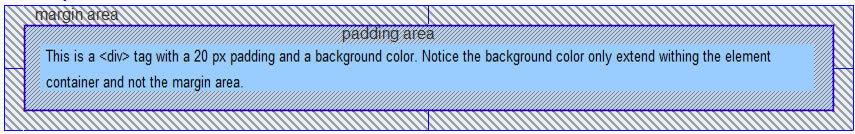
- Padding(s) which pushes or buffer the content away from the edges from within the box. It is the area "around" or "next to" the content that create a "gutter." Padding is the SPACE between the element content and its border whether the border is defined or not.
- Border(s) which surround the box with 1-4 borders with or without padding. It is the border around or next to the content if the content has padding.
- Margin(s) which pushes or buffer the content away from other page elements outside the box. It is the area around the content or around the padding and/or border. Margin is the SPACE between the element border (whether defined or not) and its parent container.
NOTE: To see the different when there is no border defined, add a background color to the element other than the default white. The background color will only extend to the "invisible" border.
NOTE: Paddings behave like margins on images without borders which is unlike a text or div element where you can "see" the padding. VSpace/HSpace add space to both side; whereas, CSS you can be selective where you would like to add space on an image.
NOTE: Margins (not paddings) can also have a negative value applied to it which will cause it to "hang" out of it parent container.
<div style="border:1px solid red;height:150px;margin-top:60px;margin-left:50px;">....</div>
This is a paragraph with a negative margin. This is a paragraph with a negative margin. This is a paragraph with a negative margin. This is a paragraph with a negative margin. This is a paragraph with a negative margin. This is a paragraph with a negative margin. This is a paragraph with a negative margin. This is a paragraph with a negative margin. This is a paragraph with a negative margin. This is a paragraph with a negative margin.
These optional regions can have values applied to any or all of the four sides with the same or various values.
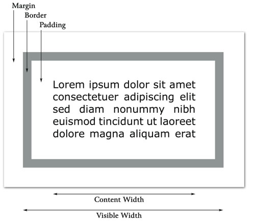
BOX WIDTH
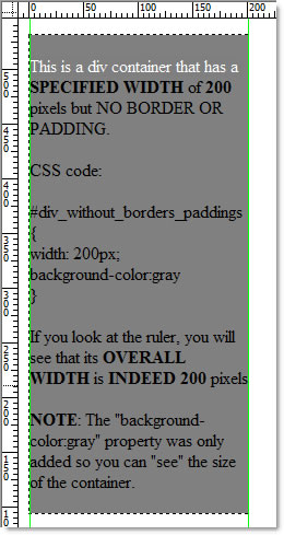
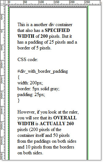
Unless a width is specified, the box width will be 100% of its parent container (e.g., div or body). Unless a height is specified, the box will expand vertically to contain its content–but no further. When a width is specified, in standard compliant browsers, the "overall" width of the box is the sum of the "specified" width of the element, its paddings, and border thickness (but not its margins) (e.g., 200+25+25+5+5 = 260 pixels).
However, in IE 5/5.5, the box model is nonstandard (e.g., 200 (25+25+5+5) = 200 pixels). The paddings and borders are not considered in the calculation but is considered part of the total. Margins are not computed in the equation but are treated as another value to "push" box away from other elements on the page. (VERIFY IF THIS STILL IS TRUE)
TIP: To make the box model work in both Internet Explorer and Standard Compliant Browser (SCB) like Firefox, it is best to NEVER add paddings or margins to an element with a DEFINED WIDTH. Instead, add the paddings or margins to the element's parent or children. Using this technique will allow you to add padding/border/margin without increasing the width of the container.
EXAMPLE: If you add another div inside an existing div WITHOUT any dimensions (width/height), and then add padding/border/margin to the inner div instead, the width of the container will not change because the inner div does not have any dimension to adjust. As a result, the context within the inner div will be made smaller.
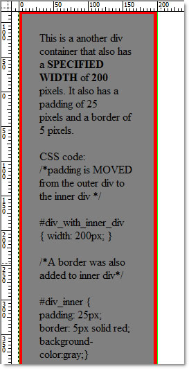
However, even with the addition of borders and paddings, the OVERALL WIDTH is STILL 200 pixels because the inner div does not have any dimension, so it can not be adjusted. However, notice the content of the inner div is squeezed in light of the borders and paddings.
MARGIN COLLAPSING
It is important to note that margins with VERTICAL MARGINS will collapse for several reasons:
SHOW EXAMPLES pg 31 of CSS Mastery
- When two block-level elements are stacked on top of one another, the margin will collapse to the larger of the two margins
- When one element is nested within another element that has no padding or border.
- "Empty" element with a margin but no border or padding.
NOTE: It is important to note that vertical margins collapses for block-level elements in the normal document flow. Margin between INLINE elements, floated or absolutely positioned (AP) elements never collapse.
TIP: You can mix units for text elements like a paragraph. This way, you can set the left and right margins in pixels so text can remain a fixed distance from navbar and set the top and bottom margins in ems so vertical spacing between paragraphs is relative to size of paragraph text. (e.g., p {font-size:1em; margin:.75em 30px;})
BOX MODEL AND SPAN TAG
Because the <span> tag is an inline element and is inside a block level element, it does not make since to add top or bottom margins or height/width properties to a span tag. So, the following examples will not work:
span {width:200px; height:200px;}
span {margin-top:10px; margin-bottom:10px;}
Also, border and padding will be observe graphically, but will not have any effect on layout. Hence, the block model works with block level elements.
Certain properties have shorthands associated with them. Shorthands allow a developer/designer to specify MULTIPLE values with a SINGLE property name. In most cases, the order in which the values are placed is important when using shorthands. By specifying a shorthand when using CSS, you can set ALL of the properties of an element's properties in a ONE WORD declaration. For example, instead of specifying all of the properties of an element border separately using MULTIPLE WORDS like this:
h1 {
  border-width: 1px;
  border-style: solid;
  border-color: red;
}
You could have easily wrote the following in one declaration instead of three:
h1 {border: 1px solid red;}
CAUTION: Notice there is NO SEMICOLON (;) between the values when using shorthands except at the end of the declaration block.
NOTES:
- Shorthands also make the code cleaner, faster and sometimes easier to read.
- Notice you don't have property names (e.g., border-width:1px; border-style:solid; border-color:red;)—only the property values (e.g., 1px solid red;)
- To turn on the shorthand feature in Dreamweaver, select Edit > Preferences... from the menu and choose the CSS Styles from the list of categories and then choose "When creating CSS rules: Use shorthand for: (Check all properties)" and "When editing CSS rules: Use shorthand: According to settings above" options.
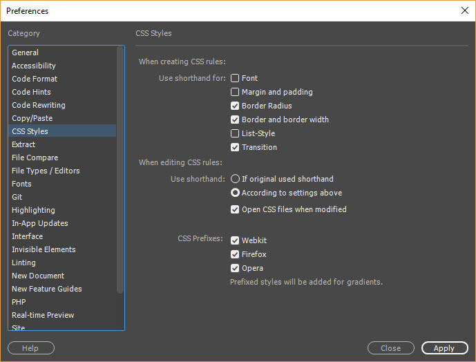
You can also choose some additional options in this Preferences panel like the Code Format category and then choose Advanced Formatting to select the CSS... button so you specify how to style the CSS code. If you need to convert an existing file to shorthand, use the Command > Apply Formatting to the page.
The following is a list of elements that can use shorthand:
BACKGROUND
There are five values for backgrounds
LONG HAND EXAMPLE (without the selector type and declaration block):
background-color: #F00
background-image: url(images/myimage.jpg);
background-repeat: repeat-y
background-attachment: scroll
background-position: top left
SHORT HAND EXAMPLE (without the selector type and declaration block):
background: #F00 url(images/myimage.jpg) repeat-y scroll left top;
FONT
There are six values for fonts. If any of these values are not declared, the default value will be used. Notice that line-height is the only property that does not start with the prefix "font-."
LONG HAND EXAMPLE (without the selector type and declaration block):
font-style: normal; font-variant: normal;NOTE: These properties can be combined into a shorthand with the following rules:
font-weight: normal;
font-size: 16px;
line-height: 1.2
font-family: Helvetical, Arial, sans-serif;
- Values for font-size and font-family must always be declared
- Font-weight, font-style, font-variant in any order then font-size and then font-family
SHORT HAND EXAMPLE (without the selector type and declaration block):
font: 16px/1.2 Helvetical, Arial, sans-serif
NOTE: Notice the forward slash (" / ") between the font size and the line height.
Notice also that the first three properties are not included and hence will be given default values
LIST
There are three values for lists
LONG HAND EXAMPLE (without the selector type and declaration block):
list-style-type:disc
list-style-position:inside
list-style-image:url(image/myimage.jpg)
SHORT HAND EXAMPLE (without the selector type and declaration block):
list: list-style:disc url(images/myimage.jpg) inside
PADDING, MARGIN AND BORDER
IMPORTANT NOTE: PADDING, MARGIN AND BORDER behave the same way and you can have control all of the sides individually or collectively.
- Margin (margin-top, margin-right, margin-bottom, margin-left)
- Padding (padding-top, padding-right, padding-bottom, padding-left)
- Border (border-top, border-right, border-bottom, border-left)
FOUR VALUES:
h1 {margin: 10px 12px 10px 15px;}
MEMORY TIP: If you do have to specify values for ALL sides, remember the acronym TRouBLe – Top, Right, Bottom, and Left (e.g., {margin: 10px 5px 12px 5px;}) or a clockwise direction from the top.
NOTE: Sometimes it is helpful to MIX the units when setting margins for text elements (e.g. <p>). For example, if the left and right margins is set to pixels the text can remain a fixed distance from sidebar. If the top and bottom margins are in ems the vertical spacing between the paragraphs will be relative to the paragraph text size.
p {font-size:1em; margin: .75em 30px;}. Hence, the space will always be 3/4 the text height
THREE VALUES:
When the top and bottom sides are different values but have the right and left has the same values, a three values approach can be used:
margin: 0 20px 15px;
NOTE: The above rule still follows the TRBL rule; however, since there is no Left value it is assume to be the same as the Right side. Hence, the top is 0 pixel, the right is 20 pixels, the bottom is 15 pixels and the left is an implied 20 pixels like the right side.
TWO VALUES:
When using paddings, margins, or borders for two adjacent sides, you only need to specify TWO values in this order: Top/Bottom represents the first value and Right/Left represent the second value.
EXAMPLE:
div {padding: 0px 15px;}
EXAMPLE:
div {margin: 0px 15px;}
NOTE: You do not have to specify a unit of measurement if the value is zero (e.g., border: 0 0 2px 4px;). Also, notice the values are separated by spaces and not commas.
ONE VALUE:
When using paddings, margins or borders, if the property value refer to all sides (top, right, bottom and left) and is the same, simply use the ONE WORD property name:
EXAMPLE:
Instead of:
div {padding-top:5px; padding-right:5px; padding-bottom:5px; padding-left:5px;}
You can simply do:
div {padding:5px;}
EXAMPLE:
Instead of:
div {margin-top:5px; margin-right:5px; margion-bottom:5px; margin-left:5px;}
You can simply do:
div {margin:5px;}
TIP: The default border width is medium and the default color is black but the default style is none. So to quickly create a border all you need is to set a style. (e.g., p {border:solid;}. This is useful because sometimes it is helpful to temporarily display the border during development to readily see the effects of padding and margin. However, remember that the border property add dimension to an element. To avoid this problem, set the background color of the element instead which will not add to the dimension of the element.
NOTE: Using border shorthands does not allow for different sides for all four sides. To work around this problem, you can declare separate rules:
- First, specify a rule that is COMMON to all four sides (h1 {border: 1px solid red})
- Then, add another rule to override the side(s) you want to change (h1 {border-left: 6px solid red;})
Border shorthand with difference sides
NOTE: A ONE word shorthand (border) was used on the first rule and a THREE words shorthand (border-left-width) was used on the second rule.
NOTE: The border-left-width overrides the first declared width of 1px because of the rule of order. (See CSS Rules and Exceptions)
TIP: It is helpful to temporarily display the border of a element box to see the effect of styling like margin and padding. By default, element border is set with a medium width, border black and a style of none. To quickly display an element's box, you only need to set the style property.
EXAMPLE:
p {border:solid;}
NOTE: Adding borders to this element can effect the layout because the borders will add dimension to the element.
COLOR
In addition to the properties above, you can use two different types of shorthand to specify a color value:
Shorthand Hexadecimal Colors
When using color that have the same value for Red, Blue and Green channels, you can specify it by using just a single value for each channel:
EXAMPLE:
Instead of:
p {color:#00FFFF;}
You can do this:
p {color:#0FF;}
Named Colors
TIP: You can also use a "named" color for the common colors (Only a few examples are shown below).
| Color | Hexadecimal | Shorthand |
|---|---|---|
| aqua | #00FFFF | #0FF |
| black | #000000 | #000 |
| blue | #0000FF | #00F |
| fuchsia | #FF00FF | #F0F |
| lime | #00FF00 | #0F0 |
| red | #FF0000 | #F00 |
| white | #FFFFFF | #FFF |
| yellow | #FFFF00 | #FF0 |
Center Object
Completed Examles: CenteringTextAndObject
There are two major approaches to centering a web page layout: using auto margin or negative margin. We will discuss the first one.
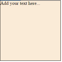
- Write a div and p element inside of the body element with a class attribute of myBox
WHY: Create a CSS object that you want to center.
<div class="myBox"><p>Add your text here...</p></div>
</body> - Reveiw result in Design view. You should see that a div element was created (denoted by a dash line in Dreamweaver).
NOTE: However, because a div element is a block level element, it will take up 100% of its parent container (the body element). So in order to center it, it has to be smaller than its parent container in order to see how it can be center better. This will be resolved in the next step. - Add a following highlighted code in the head element:
WHY: To define the image with a dimension and color.
<style>
.myBox{height:200px; width:200px; background-color:antiquewhite;
border:1px solid black;}
</style> </head> - Reveiw result in Design view. You should see that a div element was create with a color and border.
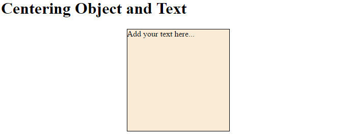
- Add a margin property to the existing myBox declaration:
<style>
  .myBox{height:200px; width:200px; background-color:antiquewhite;
  border:1px solid black; margin: 0 auto;}
</style> - Reveiw result in a browser. You should the the div element gets centered in the browser. Resize the browser to see how the margin adjust to allow allow equal margin on both side of the div element because of the auto value
Centering Text
There is a host of ways to center text. We will look at a few of them. We will use the div element above with the text already in it.
Center Text or an Object Horizontally
First, we show how to center text horizontally. There are two options:
- When the element to be centered is a block level element, the width needs to be set and the left and right margins to a value of auto. (See example above).
- When the element to be centered is an inline element, the text-align center is used on its parent element.
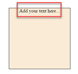
- Add the text-align property to the existing myBox declaration:
<style>
.myBox{height:200px; width:200px; background-color:antiquewhite;
border: 1px solid black;margin: 0 auto; text-align:center;}

</style>
- Reveiw result in a browser. You should the the text gets centered HORIZONTALLY in the browser.
Center Text Vertically
Now, let's see the text vertically. Three are several methods:
Line Height Method with Text
The line height method is use for a SINGLE LINE of text. The line-height value is an arbitrary value that must be larger than the font-size.
HTML:
<h1>Line Height Method with Text</h1>
<div class="myBox"><p>Text In Center</p></div>
CSS:
<style>
/* -----Line Height Method  with Text--------------- */
.myBox{height:200px; width:200px;background-color:antiquewhite;
border: 1px solid black; text-align:center;margin:0 auto;}
div p{line-height: 160px;}
</style>
Line Height Method with an Image
After adding an image that is smaller that the container, all you need to do is one more thing: Add a vertical-align property to center.
HTML:
<h1>Line Height Method with Image</h1>
<div class="myBox2"><img src="HTML5_logo.jpg" width="100" height="100" alt=""/></div>
CSS:
/* -----Line Height Method with an Image --------------- */
.myBox2{height:200px; width:200px;background-color:antiquewhite;
border: 1px solid black; text-align:center;margin:0 auto;line-height: 200px;}
div img{vertical-align: middle;}
CSS Table Method
NOTE: CSS table is not the same as an HTML table.
HTML:
<div class="myBox3"><p>Add your text here...</p></div>
CSS:
/* -----CSS Table Method ------------------------------ */NOTE: The parent div is set to display as a table and the child div is set to display as a table-cell. Then, the vertical-align is set on the child div with a value if middle. Any element inside this child div will be vertically centered.
.myBox3{height:200px; width:200px;background-color:antiquewhite; border: 1px solid black; text-align:center;margin:0 auto;display:table}
div.myBox3 p{display: table-cell; vertical-align: middle;}
Absolute Positioning and Negative Margin Method
This method works for block level elements and works in all browsers. However, It requires the height to be set on the element being center.
HTML:
<h1>Absolute Positioning and Negative Margin Method</h1>
<div class="myBox4"><p>Text In Center</p></div>
CSS:
/* Absolute Position and Negative Margin --------------*/NOTE: See 6 Methods For Vertical Centering With CSS for more techniques.
.myBox4{height:200px; width:200px; background-color:antiquewhite;
border: 1px solid black; margin: 0 auto;text-align: center; position: relative;}
div.myBox4 p{position:absolute; top:5%; left:10%; width: 80%}
There are two methods for ARRANGING elements on a page—positioning and floating. Let's talk about positioning first and we will talk about floating in the next section.
Positional techniques allow the author to manipulate the natural order of the document elements. There are four positional types:
- Static
- Relative
- Absolute
- Fixed
STATIC POSITIONING
STATIC – is the page default when no positioning properties are set and is the same as the natural order of the document's elements listed in the HTML code. It is used to reset elements that have other positioning techniques applied to them.
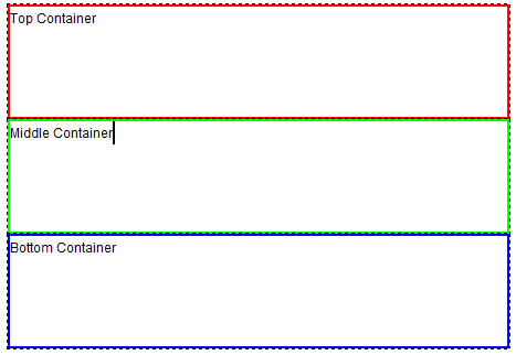
First, let's start with regular div tags with ids and classes in the body element:
- Write the following highlighted code between the body element:
<body>
<div class="container_size" id="top_container">Top Container</div>
<div class="container_size" id="middle_container">Middle Container</div>
<div class="container_size" id="bottom_container">Bottom Container</div>
</body> - Add the following highlighted CSS code above the closing head tag (</head>) to style the three containers:
<style>
.container_size {
width: 400px;
height: 100px;
}
#top_container{border:2px solid red;}
#middle_container{border:2px solid green;}
#bottom_container{border:2px solid blue;}
</style>
</head>
- Review the Design view. Notice the .container_size class selector was used to set the SIZE of ALL containers; whereas, the other ID selectors was used to set the border for EACH container INDIVIDUALLY.
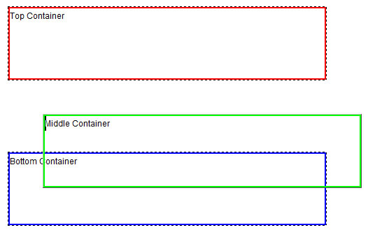
RELATIVE POSITIONING
RELATIVE – the element will be reposition, if it is given an offset – to a new set of coordinates from its current default position within its parent container without affecting other elements around it AND without losing its previous space that it occupied.
Relative positioning is consider part of the natural document flow as it is positioned relative to its position in the natural flow.
- Add a position property of relative and a top and left properties of 50 pixels each within the #middle_container ID declaration:
.container_size {width: 400px; height: 100px;}
#top_container{border: 2px solid red;}
#middle_container{ border: 2px solid green; position:relative; top:50px; left:50px;}
#bottom_container{border: 2px solid blue;} - Review the Design view. Notice that the middle container MOVED 50 pixels from TOP and 50 pixels from the LEFT of its ORIGIN TOP/LEFT location:
ABSOLUTE POSITIONING
ABSOLUTE (used to be called Layers) – the element is placed in a precise x (horizontal) and y (vertical) coordinates from the last positioned parent element.
NOTE: If the AP element's parent uses static positioning, it is not considered positioned, so it looks further up the document tree for a positioned ancestor or until is reaches the body element which is considered positioned. AP elements determine their position from its parent.
Absolute positioning is useful to create animations, drag-n-drop functions, and side notes on a large page. See strangenative.com for example.
- Change the position property from RELATIVE to ABSOLUTE:
.container_size {width: 400px; height: 100px;}
#top_container{border: 2px solid red;}
#middle_container{ border: 2px solid green; position:absolute; top:50px; left:50px;}
#bottom_container{border: 2px solid blue;}
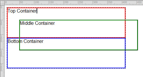
- Review the Design view. Notice that the middle container MOVED 50 pixels from TOP and 50 pixels from the LEFT of its PARENT CONTAINER, not not its ORIGIN TOP/LEFT location like the relative position did. Also notice that the space between the Top Container and the Bottom Container has collapsed. Absolute Positioning (AP) remove it from the natural flow of the document and the other elements REFLOWS as it it was never there.
NOTE: Absolute positioned elements will position itself based on the FIRST parent element that has its position set to RELATIVE. If there is none, it will position itself to the browser window.
MOVING ABSOLUTE POSITIONING ELEMENT
Since an absolute positioning element is "taken out" of the normal flow of the document, it can be easily moved by dragging it wherever you want.
- Click the Middle Container to highlight it in blue.
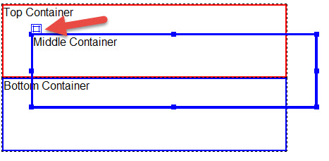
- Grab the square icon at the top-left corner and move the container where you want. In this case, it was moved below and to the right of the other two containers.
- Review the code. You will see that the top and left properties in the CSS code will be updated from a top and left of 50px each to whatever position you move it. In this case, 150px and 50px instead of 50px each.
NOTE: Like relative positioning, Absolute position elements can overlap one another. The z-index property can be set to control stacking order.
NESTING POSITIONED ELEMENTS
Positioned elements can be nested within each other. However, attention need to be paid on how to set their position property.
To set an AP element container WITHIN a specific parent element, the parent element's position need to be set to relative.
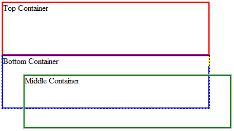
- Move the middle_container div element INSIDE of the bottom_container div element.
FROM:
<div class="container_size" id="top_container">Top Container</div>
TO:<div class="container_size" id="middle_container">Middle Container</div>
<div class="container_size" id="bottom_container">Bottom Container</div>
<div class="container_size" id="top_container">Top Container</div>
<div class="container_size" id="bottom_container">Bottom Container <div class="container_size" id="middle_container">Middle Container</div> </div> - Review Design view. Notice nothing happen because the middle_container is STILL set to absolute positioning so it can be move wherever you want it.
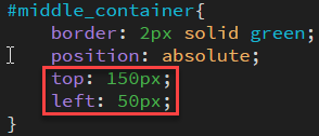
- Change the middle_container position property from absolute to relative and ADD a position property of absolute to the bottom_container:
#top_container{border: 2px solid red;}
#middle_container{
    border: 2px solid green;
    position: relative;
    top: 150px;
    left: 75px;
}
#bottom_container{border:2px solid blue; position: absolute} - Click the bottom_container to select it and then click the small box icon in the top left corner and drag the container to another location of your liking.
Notice that the middle container moved along with the bottom container because:
- the middle container is nested inside of the bottom container.
- the middle container has a position of relative so it "position" is relative to its parent container (the bottom container) even though it is OUTSIDE of its parent container.
- Press CTRL/CMD + Z to undo the move.
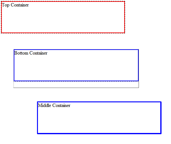
- Add or modify the following highlighted code to the CSS rules:
<style>
.container_size {width: 400px; height: 100px;}
.container_size_custom {width: 300px; height: 50px;}
#top_container{border: 2px solid red;}
#middle_container{
    border: 2px solid green;
    position: relative;
    top: 10px;
    left:50px;
}
#bottom_container{
    border: 2px solid blue;
    position: absolute;
    left: 49px;
    top: 165px;
}
</style> - Modify the container_size ID to the container_size_custom:
<div class="container_size" id="bottom_container">Bottom Container
   <div class="container_size_custom" id="middle_container">Middle Container</div>
</div> - Review Design View. You should see that the middle container is nicely nested inside of the bottom container.
- Click the bottom_container to select it and then click the small box icon in the top left corner and drag the container to another location of your liking.

Notice the middle container moves along with the bottom container.
NOTE: AP elements are taken out of the natural order of the document and is placed at a precise coordinate and is made invisible to other elements unless they are floated. In other words, the AP element container will not hold its original content, unless it is floated (explained in next session). Because an absolute position element is usually position relative to the body, the element will moves when the page is scrolled to retain its relationship to the body element. For example, if a footer is used with two side columns, it is invisible to them and will overlap them if the main content is smaller than the side columns.
One advantage of absolutely positioned DIV is that it can be placed anywhere in the HTML source code allowing better accessibility for screen readers.
This disadvantage of absolutely positioned DIV is that it can be rigid. If the viewer increases the text size, the contents might fall outside of the box. For designers, any change in size can break a well-designed layout. Hence, layouts are usually done with <div> elements, floating, margins, and clearing.
FIXED POSTIONING
FIXED – similar to absolute position with x/y coordinates, fixed position is always set relation to the view port (visible area of the browser). When the page is scrolled, the fixed content remain in an exact location in the view port
Also like absolute positioning, fixed positioning removes an element from the natural flow of the document and position it relative to the browser window. The different between the two is that a fixed position ALWAYS "fix" an element to the browser window. So when you scroll, it will NOT scroll with the other content.
Fixed position is useful for site navigation menus and controls that you want to "fix" so that it does not scroll.
However, IE 6 and below does not support fixed positioning. A workaround is to use JavaScript which is beyond the scope of this manual. (DELETE IF NO LONGER NEEDED)
NOTE: Except for static positioning, all of the other positioning techniques have a point of reference and can have their coordinates set usually from top/left or bottom/right.
Floating
Like positioning, another way to manipulate the natural order of elements on the page is to float or clear them.
Normally, an image in "inline" with a block level element like the paragraph tag:
<p><img src="ScreenSaver.jpg" width="120" height="120" alt=""/>Lorem ipsum dolor
sit amet, consectetur adipisicing elit. Nihil non dolores sunt neque ... </p>
 Lorem ipsum dolor sit amet, consectetur adipisicing elit. Nihil non dolores sunt neque error, laborum eaque harum aspernatur minima quod rerum, itaque laboriosam, culpa dolore possimus placeat dolorum tenetur laudantium. Lorem ipsum dolor sit amet, consectetur adipisicing elit. Voluptate quas atque, veniam facere dolore est ratione minus quidem quos at perferendis beatae rerum voluptatibus. Aliquam nihil reiciendis, atque assumenda perferendis. Lorem ipsum dolor sit amet, consectetur adipisicing elit. Quia optio dolorum voluptate harum dignissimos, architecto quod culpa, deleniti consequuntur unde qui consectetur inventore veniam animi est, minus, quae vero laudantium!
If you add a float property of right to the image tag with CSS,
img {float:right;}
The image will reposition itself to the right and the text will flow to the left:
Lorem ipsum dolor sit amet, consectetur adipisicing elit. Nihil non dolores sunt neque error, laborum eaque harum aspernatur minima quod rerum, itaque laboriosam, culpa dolore possimus placeat dolorum tenetur laudantium. Lorem ipsum dolor sit amet, consectetur adipisicing elit. Voluptate quas atque, veniam facere dolore est ratione minus quidem quos at perferendis beatae rerum voluptatibus. Aliquam nihil reiciendis, atque assumenda perferendis. Lorem ipsum dolor sit amet, consectetur adipisicing elit. Quia optio dolorum voluptate harum dignissimos, architecto quod culpa, deleniti consequuntur unde qui consectetur inventore veniam animi est, minus, quae vero laudantium!
The float property has three options:
- right
- left
- none
The float property moves an element to the right or left of its parent container or another float (usually a <div> element, image or table). In the case of an image, the text will "wraps" around the image. While there are float:left and float:right, there is no float:up or float:down (unless you are in a swimming pool).
RULE: Elements that follow a floated element will float or wrap around it if there is room.
CAUTION: It is best to set the overflow property to auto when an image is floated so the container can EXPAND to encapsulate the whole image and text. Otherwise, the image may overlap the bottom of the container. For example:
If you write the following in the body tag:
<div class="calloutBox">
<p><img src="../_LIBRARY_ITEMS/Background Images/ScreenSaver.jpg" width="165" height="162" alt="" style="float:right"/>If you insert a large image in the calloutBox div and float it, it will "bleed" out of the container if there is not enough text in it.</p>
</div>
And style it with some CSS:
.calloutBox {
width: 450px;
padding: 20px 20px;
border: 1px solid black;
background-color:antiquewhite;
}
You will get this:
If you insert a large image in the calloutBox div and float it, it will "bleed" out of the container if there is not enough text in it.
The reason for this is that when a child elements inside of a parent element is floated, the parent element will COLLAPSE like a two dollar suitcase. Remember, like Absolute Positioning (AP) elements, floats are taken out of the normal document order. However, they can be FORCED to SEE where the float element ends.
To resolve this, you have three options:
1. Create an empty element (e.g., div br) and give it a clear:both property style
If you add a tag below the contain with a style attribute set to clear:both:
<div style="clear:both"></div>NOTE: This is consider bad because you are adding content to control style.
You will get this:
ADD HERE....
2. Set parent container overflow property to hidden or auto.
If you add an overflow property to hidden or auto:
<style>
.calloutBox{
width: 450px;
padding: 20px 20px;
border: 1px solid black;
background-color:antiquewhite;
overflow:auto;
</style>
You will get this:
If you insert a large image in the calloutBox div and float it, it will "bleed" out of the container if there is not enough text in it.
CAUTION: If you inadvertently set a width or height property on the parent element, you may chop off content or have unwanted scroll bar if the content is taller or wider than then the height or width you set.
3. Use the after pseudo class
If you create a CSS with the parent element and include the after pseudo class and these other properties
<style>
.calloutBox{
width: 450px;
padding: 20px 20px;
border: 1px solid black;
background-color:antiquewhite;}

.calloutBox:after{
display:block;
clear: both;
content: " ";
height: 0;
overflow: hidden;}
</style>
NOTE: This code will inject CSS using the after pseudo class into the parent container to make it behave correctly.
You will get this:
If you insert a large image in the calloutBox div and float it, it will "bleed" out of the container if there is not enough text in it.
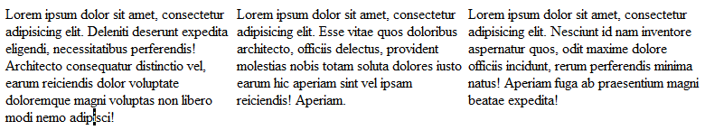
Floats are typically used to create side-by-side columns with either column longer then the other. For example:
If you write three paragraphs in the body tag:
<body>
<p>Lorem ipsum dolor sit amet, consectetur adipisicing elit. Deleniti deserunt expedita eligendi,
necessitatibus perferendis! Architecto consequatur distinctio vel, earum reiciendis dolor voluptate
doloremque magni voluptas non libero modi nemo adipisci! </p><p>Lorem ipsum dolor sit amet,
consectetur adipisicing elit. Esse vitae quos doloribus architecto, officiis delectus,
provident molestias nobis totam soluta dolores iusto earum hic aperiam sint vel ipsam reiciendis!
Aperiam.</p>
</body>
Then, write the following CSS in the style tag:
<style>This will yield a three columns layout:
p{width:33.3333%; float:left;}
</style>
Clearing
The clear property prevents elements from moving up next to a floated element. So if an element is floated right, it moves to the right and other content wrap or float around it to the left.
Also, in order for a float to work correctly, the clearing element must come AFTER the element that is floated in order to force the container div to contain ALL floats.
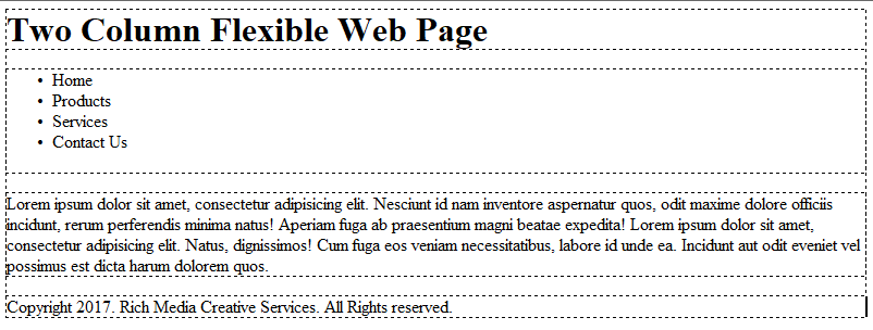
Here is a almost complete two column flexible page with the clear property being used:
First create the HTML with IDs for the page:
<body>
<div id="container">
<header>
<h1>Two Column Flexible Web Page</h1></header>
<div id="menu">
<ul>
<li>Home</li>
<li>Products</li>
<li>Services</li>
<li>Contact Us</li>
</ul>
</div>
<div id="main_body">
<p>Lorem ipsum dolor sit amet, consectetur adipisicing elit. Nesciunt id nam inventore aspernatur quos,
odit maxime dolore officiis incidunt, rerum perferendis minima natus! Aperiam fuga ab praesentium magni
beatae expedita! Lorem ipsum dolor sit amet, consectetur adipisicing elit. Natus, dignissimos! Cum
fuga eos veniam necessitatibus, labore id unde ea. Incidunt aut odit eveniet vel possimus est dicta
harum dolorem quos.</p>
</div>
<footer>Copyright 2017. Rich Media Creative Services. All Rights reserved.</footer>
</div>
</body>
You should see the following layout:
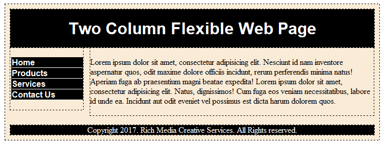
Then, add the following styles to "style" the various components:
<style>You should see the following:
#container{
margin: 0 auto;
padding: 10px;
width: 90%;
background-color:antiquewhite;}
header{width:100%;background-color:black; color:white;}
header h1{text-align: center;font-family:Arial}
#menu{width:20%; float:left;}
#main_body{width:78%; margin-left:2%; float:left;}
footer{width:100%; text-align:center; clear:both; background-color:black; color:white;}
ul li {list-style: none;
font-weight: bold;
font-family:Arial;
margin-left:-40px;
border: 1px solid black;
background-color:black;
color:white;
border-bottom: 1px solid white;}
ul li:hover{background-color:white;
color:black; cursor:pointer;}
</style>
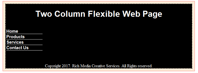
If you delete the clear:both property from the header tag selection, you would have a mess on your hand:
---- REVIEW NOTES BELOW AND UPDATE ACCORDINGLY -----
ADDDITIONAL NOTES:
- Elements wrap around floats unless they are cleared.
- When a div is floated, content inside will not be influence with content outside of it.???
- Typically, when an image is floated, paragraphs will wrap around it. To have only the first paragraph "sit" next to the image even though the other may also, you can add a clear property so the other paragraphs will not float (but sink) below the image. If a <p> element is given a "width", the text will float (not wrap) like the other floated image (if it has room) because the width property have created a "solid column" of text. Images have width by default, unlike text which you have to give it a width to convert it to a column.(VERIFY)
- The float property basically replaces the align attribute for images.
- MEMORY TIP: TEXT will WRAP, an OBJECT will FLOAT (A text is given an object status when it is given a width)
- MEMORY TIP: It is helpful to think that just as the < br /> tag is a "break" for paragraphs, the clear property is a "break" for objects (elements).
- TIP: It is best to set the clear property to both instead of right of left, so that the same class can be used for right or left floated images. By defining clear:both; all elements that follow will not float above this point.
- To ensure that subsequent page elements will not attempt to "wrap" around the floated element it is best practice to set the height, font size and line height to minimal values to avoid adding unwanted spacing to the page's layout:
.clearfloat
{
  clear:both;
  height:0;
    font-size: 1px;
    line-height: 0px;
} - The clearfloat is usually placed on a div or break element and is usually the last element before the close of a container that fully contain a float.
- TIP: To insert the clear property, select an element, typically a <div> or <br> tag, and apply the clear rule to it. Be careful where the clearfloat is applied or unexpected result may occur. For example, if you apply the clearfloat to a heading tag in the main_content area it will cause the heading to clear the adjacent sidebar.
- Clearing an element will clears a vertical space for ALL PRECEDING FLOATED elements. (See page 39-42 of CSS Mastery for more info). Clearing is determine by CLEARINING the cleared element's TOP MARGIN.
- Floats are similar to AP elements in that they are taken out of the normal order of the document. However, unlike AP elements, other elements can interact with them and the float container can "see" where the float ends if a clearing element is used.
- It is best practice to place a clear float on the break element as the last element before the footer or inside of another container. It is important to remember that if you clear within a non-floated div, it will clear all floats.
- There are times when text (or other images) my float to high once an element is floated. In this case, it can be "cleared" to break to the bottom of the floated element. Remember, when you use the clear property, it will clear the longer column as determined by its content.
THE RULES OF FLOATING:
- A float must be given a width and a direction (left or right only)
- If a float is to appear on side of another element, it must come before that element in the document source order
- Text and inline images will wrap around a float if given space
- Avoid using a width on a block element following a float. Use a margin on the same side of the float instead.
- Since a float is taken “out of the natural document flow” like an AP element, a float inside another container must be cleared in order for the parent container to properly enclose it.
[ADD SCREENSHOTS OF INSPECTOR SHOWING HOW RULES ARE OVERWRITTING WITH STRIKETHROUGHS]
There are several important CSS RULES that you must know. Otherwise, it will cause you to be confused about how to use CSS. However, as in real life, there are usually exceptions to these rules. This is the case with CSS as well.
GENERAL RULE OF THUMB OF RULE AND EXCEPTION: You usually start with a general rule that cover most of what you need and then trump it with another rule.
For example, let say that you want all <h1> tags to be blue with a blue border, you could write a RULE like this
h1 {color:blue; border:1px solid blue;}
Then, you want only the main page heading to be red but still have a border, you could write an EXCEPTION to this rule like this to trump the blue text:
.heading h1 {color:red;}
CONFLICT RESOLUTION
When there are two different values for the same property on the same element, a conflict will result. To resolve this conflict, the following SORT ORDERS (sometimes called cascades) has to be implemented.
- RULE OF CASCADING
- RULE OF INHERITANCE
- RULE OF ORDER
- RULE OF SPECIFICITY
See Demystifying Cascading Rules: Resolving Conflicts When Using Cascading Rules for complete detail on each of these rules.
See replacement at CSS Style Properties in Dreamweaver