Create New Project
In this tutorial, we will create an app that will showcase some of the Adobe CC apps using a ListView component and an XML file. A ListView component is ViewGroup that displays a "list" of scrollable items when needed. Each list item is generated by an Adapter that translate the data from a data source (e.g., Array, XML, JSON, SQLite).
- Open Android Studio and from the Quick Start panel, select Start A New Android Studio Project.
- In the New Project dialog box that appears, type Adobe Apps V3 for the Application name.
- Type example.com as the Company Domain and accept the other defaults and then click the Next button.
- In the Target Android Devices dialog box that appears, select only the Phone and Tablet checkbox, its default Minimum SDK and then click the Next button.
- In the Add an activity to Mobile dialog box that appears, select the Empty Activity option and then click the Next button.
- In the Customize the activity dialog box that appears, accept defaults and then click the Finish button.
As in many objects that are created, we will:
- Create objects (with elements and styles)
- Give objects names (with ids and resource strings)
- Tell objects to do something (with Java code)
Even within the Java code, you still do the same thing:- Create objects
- Give objects names
- Tell objects to do something
NOTE: While you can do most of these items in any combination, we will do it in the order above to start with the simple concepts (creating and naming objects) and then move to the more advanced concept (adding code).
Create Object with Element
In this second version of the Adobe Apps, we will drag-and-drop a ListView component onto the screen and the use an Adapter and an array to populate the ListView.
- In the activity_main.xml file that opens, in Design view, right-click on the Hello World text and select Delete from the menu.
- From the Palette panel, drag-and-drop a ListView component to the top-center of the screen.
- CHECK POINT: In the preview panel, you should see the default ListView with items and subitems. They are generated by the framework. If you were to preview it in an emulator, you would not see the ListView.
- (Optional) In the Text View, add a background property to the Relative Layout element to a color that goes well with black text:
android:background="#5151fe">
- (Optional) In the ListView component, you can add the divider color and divider height properties if you want to:
<ListView
    android:layout_width="wrap_content"
    android:layout_height="wrap_content"
    android:id="@+id/ListView"
    android:layout_alignParentTop="true"
    android:layout_centerHorizontal="true"
    android:divider="#cccccc"
    android:dividerHeight="1dp"/>
Give Object Name with ID
While you could have done this at the SAME time you created the ListView component above, we wanted to do it in a systematic approach. However, in real production, it would be best to create the components and give them names at the same time they are created.
IMPORTANT CONCEPT TO REMEMBER: It is important to name every component that will be used by Java code with an id. The id is used to store a reference of the element in a Java object as you will see later.
- Give the ListView component a more descrptive id property of appsListView.
<ListView
    android:layout_width="wrap_content"
    android:layout_height="wrap_content"
    android:id="@+id/appsListView"
    android:layout_alignParentTop="true"
    android:layout_centerHorizontal="true"
    android:divider="#cccccc"
    android:dividerHeight="1dp"
    />
Tell Object To Do Something with Code
- In the MainActivity.java file, add the following highlighted code:
public class MainActivity extends AppCompatActivity {
private ListView myListView;
@Override
protected void onCreate(Bundle savedInstanceState) {
super.onCreate(savedInstanceState);
setContentView(R.layout.activity_main);
myListView = (ListView) findViewById(R.id.appsListView);
// Create a String Array to hold ListView items
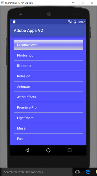
final String[] appsStringArray = new String []{"Dreamweaver", "Photoshop", "Illustrator",
"InDesign", "Animate", "After Effects", "Premiere Pro", "LightRoom", "Muse", "Fuse",
"Acrobat Pro", "Audition", "PhoneGap Build"};
// Define Adaptor to "adapt" Array elements to List items
ArrayAdapter<String> appsAdapter = new ArrayAdapter<String>(getApplicationContext(),
android.R.layout.simple_list_item_1,android.R.id.text1, appsStringArray);
// Assign Adaptor to ListView
myListView.setAdapter(appsAdapter);
}
}CODE EXPLANATION:
- Notice that a LISTVIEW is CREATED, an ARRAY is used to POPULATE it and an ADAPTOR is used to CONVERT it so that it can be used by the ListView.
- There are four arguments that are used in the ArrayAdapter (Content, XML Layout, Text View and ArrayName).
- The Content (e.g., getApplicationContext()) can be replaced by the word this.
- The XML Layout and the Text View are being called from the Android framework by prefixing the argument with android.R.layout and android.R.id.
- The ArrayName is the name you created earlier. You will see later how to create a custom layout for the ListView.
- You may see an array in some apps written in the longhand approach. However, the result in the same.
ArrayList<String> appsStringArray = new ArrayList<String>();
- You may also see the data coming from a string resource and a _____ attribute used to call it.
appsStringArray.add("Dreamweaver");
appsStringArray.add("Photoshop");
appsStringArray.add("Illustrator");
appsStringArray.add("InDesign");
appsStringArray.add("Animate");
appsStringArray.add("After Effects");
appsStringArray.add("Premiere Pro");
appsStringArray.add("LightRoom");
appsStringArray.add("Muse");
appsStringArray.add("Fuse");
appsStringArray.add("Acrobat Pro");
appsStringArray.add("Audition");
appsStringArray.add("PhoneGap Build");
- CHECK POINT: Preview the app using the emulator. You should now see the ListView displays with the elements from the array. While it may not be obvious, you can also scroll the list to see addtional list items.
Add a ItemClick Event Listener
Similar to an onClickListener that are typically used for buttons and images, a ListView has the setOnItemClickListener.
- Write the following highlighted code below the previous code that was added to create a onItemClick Event Listener.
// Assign Adaptor to ListView
NOTE: DO NOT COMPLETE THE CODE
myListView.setAdapter(appsAdapter);
//Set onItemClick Event Listener
myListView.setOnItemClickListener(new OnItemClick
- After typing OnItemClick, press the the ENTER key.
- CHECK POINT: The following highlighted code will be AUTOMATICALLY written for you and the cursor will be placed within the code block where you will add additional code. How cool is that!!!
myListView.setOnItemClickListener(new AdapterView.OnItemClickListener() {
    @Override
    public void onItemClick(AdapterView<?> parent, View view, int position, long id) {

    }
})
CODE EXPLANATION:
- There are five arguments that are used in the onItemClickAdapter (GenericView, parent, view, position, id).
- GenericView represents a generic view as the name implies.
- parent is alias for the name of the list view name (e.g., myListViwe()).
- view represents list item row that was clicked.
- position represents row number (zero-based)
- id is same as position but in other cases may be different. - Add the following highlighted code:
myListView.setOnItemClickListener(new AdapterView.OnItemClickListener() {
    @Override
    public void onItemClick(AdapterView<?> parent, View view, int position, long id) {
    String clickedValue = myListView.getItemAtPosition(position).toString();
    Toast.makeText(getApplicationContext(),clickedValue,Toast.LENGTH_SHORT).show();
    }
});
CODE EXPLANATION:
- The clickedValue variable is a ListView so it needed to be CASTED to a string on the right side of the equal sign with the toString() method.
- The clickedValue variable represents the CURRENT item that was clicked based on the position argument in the onItemClick method. - CHECK POINT: Preview the app using the emulator. You should now see that if you click on any of the list's item a Toast will appear showing the name of the list item that was clicked on.
Create Custom Layout for ListView
As with most View components, you can customize them by creating a separate XML file as a template and then inflate it.
- Right-click on the layout folder (not the drawable folder) and select New > Layout Resource File to create the actually list row.
- In the New Resource File dialog box that appears, in the File name text field enter custom_listview_row
- In the Root element text file, enter RelativeLayout, accept the other defaults and then click the OK button.
- In the Text view, add the following highlighted elements:
<?xml version="1.0" encoding="utf-8"?>
<RelativeLayout xmlns:android="http://schemas.android.com/apk/res/android"
    android:layout_width="match_parent"
    android:layout_height="wrap_content"
    android:background="@drawable/custom_listview_selector"
    android:orientation="horizontal"
    android:padding="5dp">

    <LinearLayout
        android:id="@+id/thumbnail"
        android:layout_width="wrap_content"
        android:layout_height="wrap_content"
        android:layout_alignParentLeft="true"
        android:layout_marginRight="5dp"
        android:orientation="vertical">

        <ImageView
            android:id="@+id/list_icon"
            android:layout_width="50dp"
            android:layout_height="50dp"
            android:src="@mipmap/ic_launcher" />
    </LinearLayout>

    <TextView
        android:id="@+id/title"
        android:layout_width="wrap_content"
        android:layout_height="wrap_content"
        android:layout_alignTop="@id/thumbnail"
        android:layout_toRightOf="@id/thumbnail"
        android:text="Adobe Dreamweaver"
        android:textColor="#000000"
        android:textSize="18sp"
        android:textStyle="bold" />

    <TextView
        android:id="@+id/sub_title"
        android:layout_width="wrap_content"
        android:layout_height="wrap_content"
        android:layout_below="@+id/title"
        android:layout_toRightOf="@id/thumbnail"
        android:text="Web and Mobile"
        android:textColor="#ffffff"
        android:textSize="14sp"
        android:textStyle="bold" />

    <ImageView
        android:id="@+id/arrow"
        android:layout_width="wrap_content"
        android:layout_height="wrap_content"
        android:src="@android:drawable/ic_media_play"
        android:layout_alignParentRight="true"
        android:layout_centerVertical="true"/>
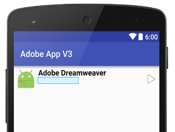
</RelativeLayout> - CHECK POINT: You should see the following screenshot. Notice that the second text field is highlighted by not visible because the font color is white against a white background. It will look better later once it is placed against the color background in the activity_main.xml file.
Inflate Custom ListView With Java
- In the MainActivity.java file, comment out or delete the adapter that was created earlier.
NOTE: In the upcoming steps, we will create a custom adapter that will be used.
// ArrayAdapter<String> appsAdapter = new ArrayAdapter<String>(getApplicationContext(),
// android.R.layout.simple_list_item_1,android.R.id.text1, appsStringArray);
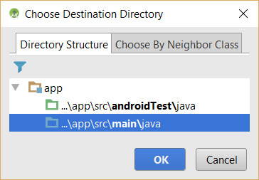
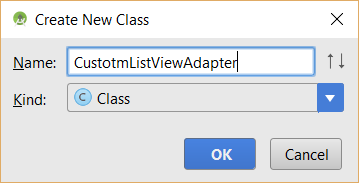
- Right-click on the java folder and select File > New > Java Class from the menu or from the package folder (e.g., com.example.adobeapps3) and in the Choose Destination Directory dialog box that appears, choose the directory ...\app\src\main\java and then click the OK button.
- In the Create New Class dialog box that appears in the Name text field, enter CustomListViewAdapter and then click the OK button.
- In the CustomListViewAdapter.java file that opens, type the following highlighted code:
public class CustomListViewAdapter extends BaseAdapter {
}
CODE EXPLANATION:
- By adding extends BaseAdapter to the CustomListViewAdapter class will allow this new class to inherit all of the methods of the BaseAdapter. However, alll of these methods will be overwritten in the next step. - Click inside of the class and press ALT+ENTER and then select Implement methods (of the parent BaseAdapter) from the menu.
- In the Select Methods to Implement dialog box that appears, select ALL of the methods, ensure @Override checkbox is selected and then click the OK button.
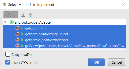
- CHECK POINT: You should see the the four methods of the BaseAdapter were added to the code AUTOMATICALLY:
public class CustomListViewAdapter extends BaseAdapter {
    @Override
    public int getCount() {
        return 0;
    }

    @Override
    public Object getItem(int position) {
        return null;
    }

    @Override
    public long getItemId(int position) {
        return 0;
    }

    @Override
    public View getView(int position, View convertView, ViewGroup parent) {
        return null;
    }
}
CODE EXPLANATION:
- The getCount() method is used to get the COUNT of how many items are created in the list view.
- The getItem() and getItemId method is be used to get the POSITION of the item.
- The getView() method is used to get the customized VIEW. - Write or modify the following highlighted code of this class:
public class CustomListViewAdapter extends BaseAdapter {

    private Context mContext;
    private ArrayList<HashMap<String,String>> topics;
    private static LayoutInflater inflater = null;

    public CustomListViewAdapter(Context context,ArrayList<HashMap<String ,String>> data){
        mContext = context;
        topics = data;
        inflater = (LayoutInflater)context.getSystemService(context.LAYOUT_INFLATER_SERVICE);
    }
    @Override
    public int getCount() {
        return topics.size();
    }
    @Override
    public Object getItem(int position) {
        return position;
    }
    @Override
    public long getItemId(int position) {
        return position;
    }
    @Override
    public View getView(int position, View convertView, ViewGroup parent) {
        View view = convertView;
        if (convertView == null){
            view = inflater.inflate(R.layout.custom_listview_row, null);
        }

        TextView title = (TextView) view.findViewById(R.id.title);
        TextView sub_title = (TextView) view.findViewById(R.id.sub_title);

        HashMap<String, String> mTopic = new HashMap<>();

        mTopic = topics.get(position);

        title.setText(mTopic.get("title"));
        sub_title.setText(mTopic.get("sub_title"));

        return view;
    }
}
CODE EXPLANATION:
- IMPORTANT NOTE: While this is a lot of code to process, the good news is that once it is created, you can REUSE this custom adapter code in any other app with little to no change in the code.
- Instead of starting from scratch, this custom adapter is created from the BaseAdapter class which means that it will inherit all of the methods of that class and then they will be overridden with custom code.
- The three private instance variables are created so they can be used in the constructor method.
- The constructor method has to have the same name as the class name with no return type.
- The HashMap (<HashMap<String ,String>>) uses a key/value pair so both the key and the value will be a string. - Write the following code in the MainActivity.java file:
public class MainActivity extends AppCompatActivity {

    private ListView myListView;
    private CustomListViewAdapter customListViewAdapter;

    @Override
    protected void onCreate(Bundle savedInstanceState) {
        super.onCreate(savedInstanceState);
        setContentView(R.layout.activity_main);

        myListView = (ListView) findViewById(R.id.appsListView);

        // Create a String Array to hold ListView items
        final String[] appsStringArray = new String []{"Dreamweaver", "Photoshop", "Illustrator",
                "InDesign", "Animate", "After Effects", "Premiere Pro", "LightRoom", "Muse", "Fuse",
                "Acrobat Pro", "Audition", "PhoneGap Build"};

        // Create a String Array to hold ListView items for sub_titles
        final String[] descriptionArray = new String []{"Web and mobile design", "Image editing and compositing",
                "Vector graphics and illustration", "Page design and layout", "Animation, video and games", "Visual effects and motion graphics", "Video production and editing",
                "Photo processing and editing", "Website design without coding", "Custom 3D characters for Photoshop","Create and edit PDF and forms", "Audio recording and restoration", "Package mobile apps"};
        // Define Adaptor to "adapt" Array elements to List items
        //  ArrayAdapter<String> appsAdapter = new ArrayAdapter<String>(getApplicationContext(),
        //       android.R.layout.simple_list_item_1,android.R.id.text1, appsStringArray);

        final ArrayList<HashMap<String,String>> titleList = new ArrayList<>();

        for (int i=0; i<13; i++){
            HashMap<String,String> data = new HashMap<>();
            data.put("title",appsStringArray[i]);
            data.put("sub_title",descriptionArray[i]);

            titleList.add(data);
        }

        // Assign Adaptor to ListView
        customListViewAdapter = new CustomListViewAdapter(getApplicationContext(),titleList);
        myListView.setAdapter(customListViewAdapter);

        myListView.setOnItemClickListener(new AdapterView.OnItemClickListener() {
            @Override
            public void onItemClick(AdapterView<?> parent, View view, int position, long id) {
               String myItem = appsStringArray[position];
               Toast.makeText(getApplicationContext(), myItem, Toast.LENGTH_SHORT).show();
            }
        });
    }
}
CODE EXPLANATION:
- The second array (descriptionArray) that is created is used to provide descriptions for each app.
- The "for" loop is used to loop around the two arrays to POPULATE the titleList object.
- The event listener (setOnItemClickListener) is used to register the list items events.
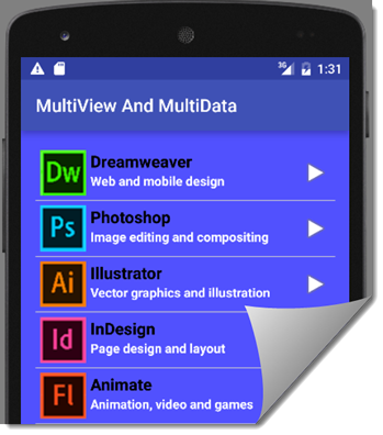
- CHECK POINT: Run the app in an emulator. You should see the custom view layout inflated in the app. If you click on a list item, you should see a Toast message with the name of the app displayed. Also, notice that the icon is the same for each list item. This will be resolved in the upcoming steps:
- Copy and paste the thirteen app icons into the drawable folder.
- Add the following highlighted code in the getView() method:
    @Override
    public View getView(int position, View convertView, ViewGroup parent) {
        View view = convertView;
        if (convertView == null){
            view = inflater.inflate(R.layout.custom_listview_row, null);
        }

        TextView title = (TextView) view.findViewById(R.id.title);
        TextView sub_title = (TextView) view.findViewById(R.id.sub_title);
        ImageView image = (ImageView) view.findViewById(R.id.list_icon);

        HashMap<String, String> mTopic = new HashMap<>();

        mTopic = topics.get(position);

        title.setText(mTopic.get("title"));
        sub_title.setText(mTopic.get("sub_title"));

        if(position==0) {
            image.setImageResource(R.drawable.dreamweaver);
        }
        if(position==1) {
            image.setImageResource(R.drawable.photoshop);
        }
        if(position==2) {
            image.setImageResource(R.drawable.illustrator);
        }
        if(position==3) {
            image.setImageResource(R.drawable.indesign);
        }
        if(position==4) {
            image.setImageResource(R.drawable.animate);
        }
        if(position==5) {
            image.setImageResource(R.drawable.after_effects);
        }
        if(position==6) {
            image.setImageResource(R.drawable.premiere_pro);
        }
        if(position==7) {
            image.setImageResource(R.drawable.lightroom);
        }
        if(position==8) {
            image.setImageResource(R.drawable.muse);
        }
        if(position==9) {
            image.setImageResource(R.drawable.fuse);
        }
        if(position==10) {
            image.setImageResource(R.drawable.acrobat_pro_dc);
        }
        if(position==11) {
            image.setImageResource(R.drawable.audition);
        }
        if(position==12) {
            image.setImageResource(R.drawable.photoshop);
        }
        return view;
    }
}
CODE EXPLANATION:
- The image variable (ImageView image = (ImageView) view.findViewById(R.id.list_icon);) is used to get references to the images.
- Each "if" statement is used to check for the specific position so that the correct image is displayed.
- CHECK POINT: Run the app in an emulator. This time you should see a different icon for each list item.

(Optional) Add Custom Selector
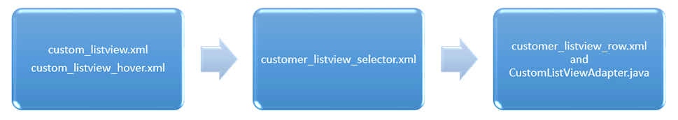
It is important to note how these components will be knitted together. The listview state xml files are nested inside of the selector xml file which is inside of the row xml which is pulled inside (inflated) in the java file (e.g., CustomListViewAdapter.java):
Not only do you have to create a custom layout, you have to create a custom adaptor as well. In order to show the custom ListView, we will have to inflate it with Java.
- Right-click on the drawable folder and select New > Drawable Resource File.
- In the Drawable Resource File dialog box that appears, in the File name text field enter custom_listview_normal, accept the other defaults and then click the OK button.
- In the custom_listview_normal file that opens, replace the text in the first <selector> element with <shape>.
NOTE: Notice the the closing tag (</shape>) AUTOMATICALLY get updated. How cool is that! The <shape> elements are used because we will be creating a rectangular shape and adding a gradient to it.
- Enter the following highlighted code to create the NORMAL state of the listview item:
<?xml version="1.0" encoding="utf-8"?>
<shape xmlns:android="http://schemas.android.com/apk/res/android" android:shape="rectangle">
    <gradient
        android:angle="270"
        android:startColor="#f1f1f2"
        android:centerColor="#7878fa"
        android:endColor="#cfcfcf">
   </gradient>
</shape>
CODE EXPLANATION:
- The <selector> element was replaced by a <shape> with an attribute to create a rectangular shape.
- A <gradient> element was addded with the start, center and end gradient colors.
- Copy the custom_listview_normal file and paste it in the same folder but with the name of custom_listview_hover and change only the CENTER color values.
NOTE: This file will be used to create the HOVER state. If you want to you can change one, two or all three colors.
<?xml version="1.0" encoding="utf-8"?>
<shape xmlns:android="http://schemas.android.com/apk/res/android" android:shape="rectangle">
    <gradient
        android:angle="270"
        android:centerColor="#5454f5"
        android:endColor="#cfcfcf"
        android:startColor="#f1f1f2">
   </gradient>
</shape> - Right-click on the drawable folder again and select New > Drawable Resource File to create a list selector.
- In the Drawable Resource File dialog box that appears, in the File name text field enter custom_listview_selector, accept the other defaults and then click the OK button.
- Add the following highlighted <item> elements:
<?xml version="1.0" encoding="utf-8"?>
NOTE: The first <item> element is used if the list item has not been selected and have not been pressed--show the default background (e.g., custom_listview. The second <item> element is used if the list item is presses but not selected. The third <item> element is used if the list item is pressed and selected (user has press and then removed finger from selection).
<selector xmlns:android="http://schemas.android.com/apk/res/android">
<item android:drawable="@drawable/custom_listview_normal"
android:state_pressed="false"
android:state_selected="false">
</item>
<item android:drawable="@drawable/custom_listview_hover"
android:state_pressed="true">
</item>
<item android:drawable="@drawable/custom_listview_hover"
android:state_pressed="true"
android:state_selected="true">
</item>
</selector>
- Add custom_listview_selector as an background attribute to the opening RelativeLayout element in the custom_listview_row.xml file.
<?xml version="1.0" encoding="utf-8"?>
<RelativeLayout xmlns:android="http://schemas.android.com/apk/res/android"
    android:layout_width="match_parent"
    android:layout_height="wrap_content"
    android:orientation="horizontal"
    android:padding="5dp"
    android:background="@drawable/custom_listview_selector">
- CHECK POINT: Preview the app in the emulator. You should see the normal state that as added to all list item. If you click on a list item it will change color to reflect the pressed or hover state.