Create A Responsive Grid (Theory)
The Grid system is the "heart and soul" of a responsive design. Bootstrap uses a 12 column grid that are typically created in any combination of multiple of twelve (e.g., 12 columns, six two columns, four three columns, eight column and four columns, etc.). Columns will AUTOMATICALLY re-arrange themselves depending on the screen size. If more than 12 columns are used, they will stack no matter what the viewport size is.
Bootstrap's uses four classes for its grid system:
- xs (phones)
- sm (tablets)
- md (desktops)
- lg (large desktops)
IMPORTANT NOTE: These values represent the SIZE where the columns will start STACKING VERTICALLY. Columns always stack on small device by design. Also, it is important to note that class scales up, so if you want to set the same widths for xs and sm, you only need to set xs class.
Bootstrap uses two classes when creating columns:
- row (to create horizontal groups of columns)
- column (to add content to page)
Typically, multiple columns with a specific class (e.g., col-md-3) are nested inside of a single row with a class of row. The numbers in the .col-sm-* classes indicates how many columns the div should span. For example, .col-sm-1 spans 1 column, .col-sm-4 spans 4 columns, etc. The column numbers in all of the rows should typically add up to 12:
<div class="row">
<div class="col-md-4">Column 1</div>
<div class="col-md-4">Column 2</div>
<div class="col-md-4">Column 3</div>
</div>
Bootstrap grid system specifications:
| Phones (<768px) | Tablets (>=768px) | Desktops (>=992px) | Large Desktops (>=1200px) | |
|---|---|---|---|---|
| Grid behavior | Horizontal at all times | Collapsed to start, horizontal above breakpoints | Collapsed to start, horizontal above breakpoints | Collapsed to start, horizontal above breakpoints |
| Container width | None (auto) | 750px | 970px | 1170px |
| Class prefix | .col-xs- | .col-sm- | .col-md- | .col-lg- |
| Column width | Auto | ~62px | ~81px | ~97px |
They all have the following characteristics in common:
- Can have up to 12 columns
- Have a gutter width of 30 pixels (15 pixels on each column side)
- Can be nested
- Can have offsets
- Can have columns ordered
Examples:
For small devices (e.g., tablet and below), you may want to use a ratio of 25% (3 columns span) and 75% (9 columns span):
<div class="col-sm-3">....</div><div class="col-sm-9">....</div>
For medium devices with 992 pixels to 1199 pixels (e.g., desktop and above), you may want to use a ratio of 50% (6 columns span) and 50% (6 columns span):
<div class="col-sm-3 col-md-6">....</div>
<div class="col-sm-9 col-md-6">....</div>
The example above will result in a 25%/75% ratio on small devices and a 50%/50% ratio on medium devices.
On very large devices, you may want to use a ratio of 33% (4 columns span) and 66% (8 columns span)
<div class="col-sm-3 col-md-6 col-lg-4">....</div>
<div class="col-sm-9 col-md-6 col-lg-8">....</div>
Notice that the first example has sm, the second has sm and md and the third has sm, md and lg.
SUMMARY: Using any .col-sm-* class on an element will affect its styling on small devices (e.g., screen size greater than or equal to 768px) as well as medium and large devices if .col-md-* and .col-lg-* class is not used. Likewise, the .col-md-* class will affect the styling of elements on medium devices as well as on large devices if a .col-lg-* class is not used. If more than 12 grid columns are placed within a single row, then each group of extra columns, as a whole, will wrap onto a new line.
Create Row 1 with 4 columns
The first row in the grid will have four columns of equal length. Each taking up about 25% of the width of the row each.
- Write the following three nested
<div>
tags with classes and other HTML elements (e.g.,
<img>
,
<h1>
,
<p>
and
<a>
tags) nested in the third
<div>
tag below the jumbotron code:
TIP: Copy some Lorem Ipsum from ipsum.com or have the editor create some for you. In a newer version of Dreamweaver, type p>lorem and then press the Tab key to create a paragraph and some lorem ipsum dummy text.
<div class="container"> <div class="jumbotron text-center"> <h1>RMCS:<small>Training Made Easy</small></h1> <p>See, hear and experience a new way of learning.</p> <a href="#" class="btn btn-danger">Watch Demo</a> <a href="#" class="btn btn-info">Schedule Class</a> </div> </div>
<!-- Main Content Row 1 ----------------------------- -->
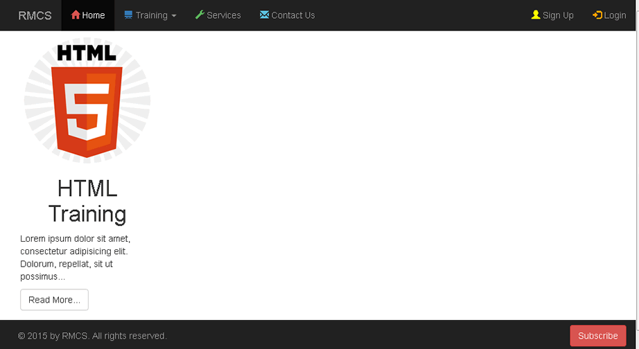
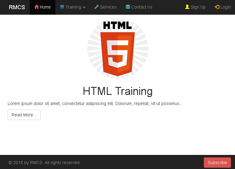
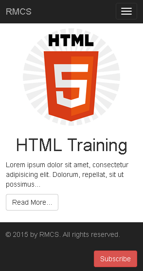
<div class="container"> <div class="row"> <div class="col-md-3"> <img class="img-responsive img-circle" src="images/HTML5_logo.png" width="200" height="200" alt=""/> <h1 class="text-center">HTML Training</h1> <p>Lorem ipsum dolor sit amet, consectetur adipisicing elit. Dolorum, repellat, sit ut possimus...</p> <a href="#" class="btn btn-default">Read More...</a> </div> </div>
</div>
CODE EXPLANATION:
- The "row" class establishes a row within the "container" class.
- img-responsive and img-circle classes, make the image responsive and "clips" the image to a circle.
- The class="text-center" as the name implies will center the text within its parent container.
- The "col-md-3" basically means set up three columns based on a medium device or above. In essence, the medium break point is the LOWEST setting before the column break to vertical stacking. If you change the class to "col-lg-3", the column will break when it enters the medium break point. - CHECK POINT: Save the file and preview it in a browser. You should see one column to the left that span 25% of the page (3/12 = 1/4 or .25).
On a large device (laptop in landscape or desktop), the page will look like this. The content takes up about 1/4 of the page.
On medium devices (e.g., tablets), the page will look like this. Since this is currently one column, it hard to see that the content is stacked.
On a small device (e.g., phone), the page will look like this:
- Copy the
<div>
tag with the "col-md-3" class and paste it three copies below the original one and rename the other
<h1>
tags in each to CSS Training, JS Training and jQuery Training. Delete the
<img>
tag in the last copy. Then, update the image references to the other two to their correct names (e.g., CSS3_logo.jpg and JAVASCRIPT_logo.svg).
<div class="container">
   <div class="row">
      <div class="col-md-3">
        <img class="img-responsive img-circle" src="images/HTML5_logo.png" width="200" height="200" alt=""/>
         <h1 class="text-center">HTML Training</h1>
         <p>Lorem ipsum dolor sit amet, consectetur adipisicing elit. Dolorum, repellat, sit ut possimus...</p>
         <a href="#" class="btn btn-default">Read More...</a>
      </div>

      <div class="col-md-3">
         <img class="img-responsive img-circle" src="images/CSS3_logo.jpg" width="200" height="200" alt=""/>
         <h1 class="text-center">CSS Training</h1>
         <p>Lorem ipsum dolor sit amet, consectetur adipisicing elit. Dolorum, repellat, sit ut possimus...</p>
         <a href="#" class="btn btn-default">Read More...</a>
      </div>

       <div class="col-md-3">
	       <img class="img-responsive img-circle" src="images/JAVASCRIPT_logo.svg" width="200" height="200" alt=""/>
         <h1 class="text-center">JS Training</h1>
         <p>Lorem ipsum dolor sit amet, consectetur adipisicing elit. Dolorum, repellat, sit ut possimus...</p>
         <a href="#" class="btn btn-default">Read More...</a>
      </div>

      <div class="col-md-3">
         <h1 class="text-center">jQuery Training</h1>
         <p>Lorem ipsum dolor sit amet, consectetur adipisicing elit. Dolorum, repellat, sit ut possimus...</p>
         <a href="#" class="btn btn-default">Read More...</a>
       </div>

   </div>
</div>
</div>
CODE EXPLANATION:
- The "img-responsive" class makes the image scale to the size of its parent div regardless of its own size
- The "img-circle" class "clip" the image into a circle (There is also rounded and thumbnail).
- The "text-center" class does as the name implies.
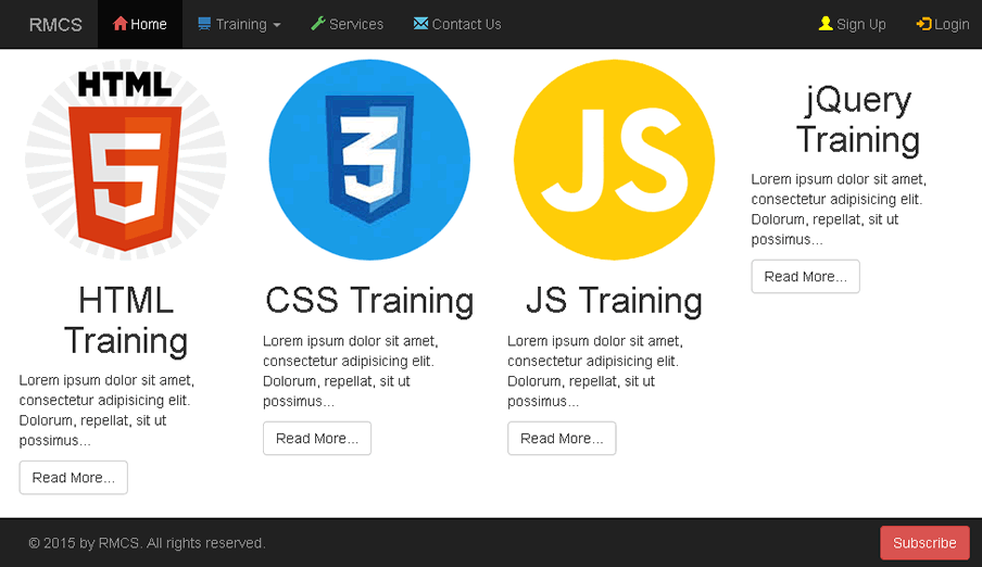
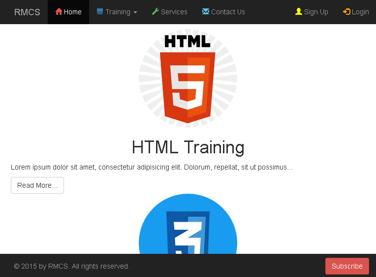
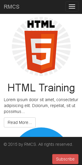
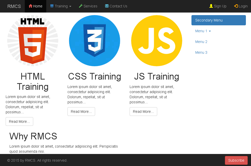
- Notice that three image formats has been used for the images (e.g., *.jpg, *.png and *.svg). - CHECK POINT: Save the file and preview it in a browser. You should see four columns on a large screen. If you scale to the medium break point, the column will stack vertically.
On a large screen, the page will look like this:
On a medium screen, the page will look like this:
On a small screen, the page will look like this:
- OPTIONAL: Add the following CSS rule to center the image within each column.
.col-md-3 .img-responsive.img-circle { margin: 0 auto; } - CHECK POINT: Save the file and preview it in a browser. You should see the images now centered within each column.
Create Secondary Menu (OPTIONAL)
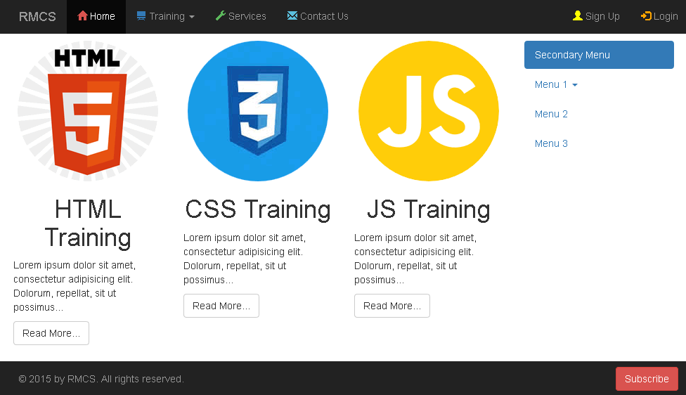
- Replace ALL of the content of col-md-3 of the last column for jQuery Training with the following code to create a secondary menu. See details on NavBar menu for information about menu structure and classes that were already discussed.
<div class="col-md-3">
  <ul class="nav nav-pills nav-stacked">
    <li class="active"><a href="#">Secondary Menu</a></li>
    <li class="dropdown">
    <a class="dropdown-toggle" data-toggle="dropdown" href="#">Menu 1 <span class="caret"></span></a>
      <ul class="dropdown-menu">
        <li><a href="#">Sub-menu 1-1</a></li>
        <li><a href="#">Sub-menu 1-2</a></li>
        <li><a href="#">Sub-menu 1-3</a></li>
     </ul>
  </li>
  <li><a href="#">Menu 2</a></li>
  <li><a href="#">Menu 3</a></li>
  </ul>
</div>
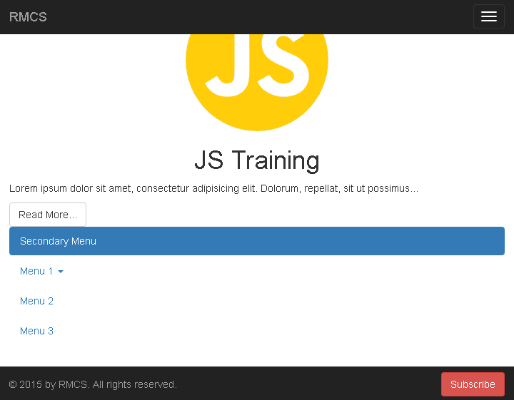
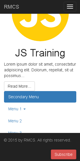
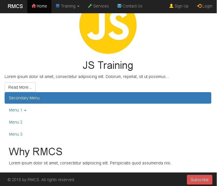
- CHECK POINT: Save the file and preview it in a browser. You should see the menu in the fourth column of the first row.
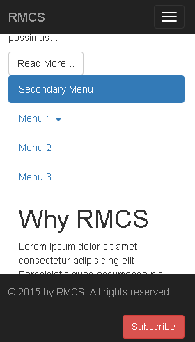
On a large screen:
On a medium screen:
On a small screen:
Create Row 2 with 2 columns
The second row in the grid will have two columns of equal length. Each taking up about 50% of the width of the row each.
- Write the following three nested
<div>
tags with classes below the first row closing
</div>
tag. Comment is optional.
TIP: Copy some Lorem Ipsum from ipsum.com or have the editor (e.g., Dreamweaver) create some for you.
</div>
<!-- Row 2 with 2 columns  ------------- -->
<div class="container">
  <div class="row">
    <div class="col-md-6">
      <h1>Why RMCS</h1>
      <p>Lorem ipsum dolor sit amet, consectetur adipisicing elit. Perspiciatis quod assumenda nisi.</p>
   </div>
  </div>
</div>
- CHECK POINT: Save the file and preview it in a browser. You should see the column span about 50% of the page.
- Copy the
<div>
tag with the "col-md-6" class and paste again below the original one and rename the other
<h1>
tag content (e.g., Objective).
<!-- Main Content Row 2 ----------------------------- -->
<div class="container">
  <div class="row">
     <div class="col-md-6">
        <h1>Why RMCS</h1>
        <p>Lorem ipsum dolor sit amet, consectetur adipisicing elit. Perspiciatis quod assumenda nisi.</p>
     </div>
     <div class="col-md-6">
        <h1>Objective</h1>
        <p>Lorem ipsum dolor sit amet, consectetur adipisicing elit. Perspiciatis quod assumenda nisi.</p>
     </div>
  </div>
</div>
- CHECK POINT: Save the file and preview it in a browser. You should see two columns span about 50% of the page each.
On large:
On medium:
On small: