Create Modal Dialog Box
A Modal plugin is used to create a dialog box that is displayed on top of the current page with or without an overlay. There are several classes that are associated with a modal:
| Class | Description |
|---|---|
| .modal | Creates a modal |
| .modal-content | Creates the content area for the header, body, and footer |
| .modal-header | Defines the header style |
| .modal-body | Defines the body style |
| .modal-footer | Defines the footer style |
| .modal-sm | Creates a small modal |
| .modal-lg | Creates a large modal |
| .fade | Adds a fade transition effect |
- Open the index.html page and add the following two highlighted classes to the
<a>
tag for the Login menu:
<li><a href="#" data-toggle="modal" data-target="#loginModal">
<span id="login_menu_icon_color" class="glyphicon glyphicon-log-in"></span> Login</a></li>
- At the bottom of the page before the jQuery comment add the following three nested <div> tags:
<!-- Modal Dialog Box for Login ---------- -->
<div id="loginModal" class="modal fade" role="dialog">
<div class="modal-dialog">
<div class="modal-content">
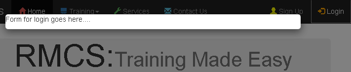
<p> Form for login goes here....</p>
</div>
</div>
</div> <!-- end of modal dialog box -->
<!-- jQuery (necessary for Bootstrap's JavaScript plug-ins) -->
CODE EXPLANATION:
- The class="modal" establish the <div> tag as a modal.
- The fade class causes the dialog box and overlay to fade in and out.
- The class modal-dialog make the<div> a dialog box. - CHECK POINT: Save the file and preview it in a browser. You should see that when you click on the Login button that a dialog box with an overlap fades onto the screen with the text "Form for login goes here...."
- Replace the
<p>
tag withe the following three
<div>
tags that are NOT nested that represent the model content's header, body, and footer:
<!-- Modal Dialog Box for Login ---------- -->
<div id="loginModal" class="modal fade" role="dialog">
<div class="modal-dialog">
<div class="modal-content">
<div class="modal-header">
<button type="button" class="close" data-dismiss="modal">×</button>
<h4 class="modal-title">Login</h4>
</div>
<div class="modal-body">
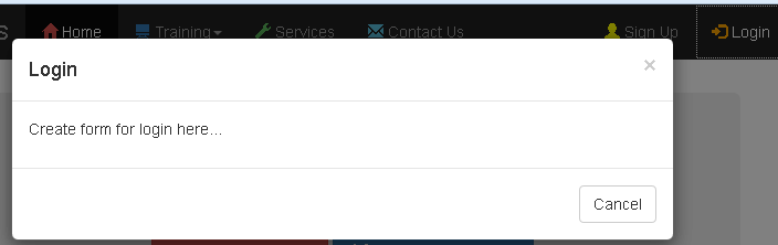
<p>Create form for login here...</p>
</div>
<div class="modal-footer">
<button type="button" class="btn btn-default" data-dismiss="modal">Cancel</button>
</div>
</div>
</div>
</div> <!-- end of modal dialog box -->
<!-- jQuery (necessary for Bootstrap's JavaScript plug-ins) -->
CODE EXPLANATION:
- The three classes (e.g., modal-header, modal-body and modal-footer) defines each area and is akin to a web site structure.
- The class close enables the device to be closed.
- The data-dismiss attribute defines what to close.
- CHECK POINT: Save the file and preview it in a browser. You should now see the three sections of the modal dialog box (header, body and footer). If you click on the X or the Cancel button the modal will fade off the screen.
NOTE: While creating a modal in the same page is OK, it is best practice to create an external file and link to it. This will be done in the next step.
CAUTION: Using an external file CURRENTLY only works with Firefox. - Replace the hash (#) in the login link with the page that will be displayed (e.g., login.html) as a modal dialog box:
<li><a href="login.html" data-toggle="modal" data-target="#loginModal">
<span id="login_menu_icon_color" class="glyphicon glyphicon-log-in"></span> Login</a></li>
- Create an entirely new page named login.html with a
<head>
and
<body>
tag but no
<link>
,
<script>
or
<meta>
tags:
<!doctype html>
<html lang="en">
<head>
<title>Login</title>
</head>
<body>
<!-- Modal -->
<div class="modal-content">
<div class="modal-header">
<button type="button" class="close" data-dismiss="modal">×</button>
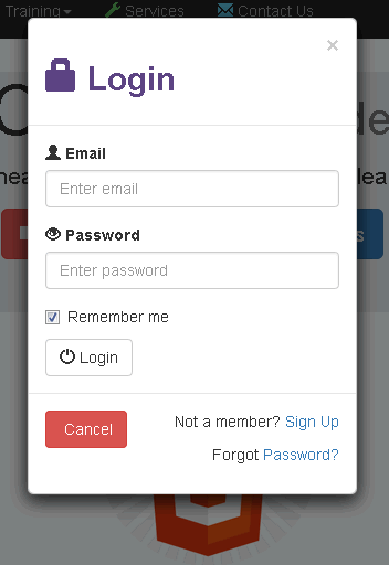
<h2><span class="glyphicon glyphicon-lock"></span> Login</h2>
</div>
<div class="modal-body">
<form role="form">
<div class="form-group">
<label for="email"><span class="glyphicon glyphicon-user"></span> Email</label>
<input type="email" class="form-control" id="email" placeholder="Enter email" required>
</div>
<div class="form-group">
<label for="password"><span class="glyphicon glyphicon-eye-open"></span> Password</label>
<input type="password" class="form-control" id="password" placeholder="Enter password" required>
</div>
<div class="checkbox">
<label><input type="checkbox" value="" checked>Remember me</label>
</div>
<button type="submit" class="btn btn-default">
<span class="glyphicon glyphicon-off"></span> Login</button>
</form>
</div>
<div class="modal-footer">
<button type="submit" class="btn btn-danger btn-default pull-left" data-dismiss="modal">
<span class="glyphicon glyphicon-cancel"></span> Cancel</button>
<p>Not a member? <a href="#">Sign Up</a></p>
<p>Forgot <a href="#">Password?</a></p>
</div>
</div>
</body>
</html>
- CHECK POINT: Save the file and preview the page in a browser. You should see the complete login dialog box when the login button is pressed.
You can close the dialog box one of three ways:- Click on the close button at the top of the dialog box.
- Click the Cancel button at the bottom of the dialog box.
- Click outside of the dialog box.