Create Fixed Top NavBar
We will create a top NavBar with a menu that collapse when is is scaled to a mobile device.
- Below the opening
<body>
tag, replace the
<h1>
tag with a
<nav>
tag with the following class names:
<body>
<nav class="navbar-wrapper navbar-inverse navbar-fixed-top">

</nav>
CODE EXPLANATION:
- The navbar-wrapper class establishes the <nav> tag as a "wrapper" for the NavBar.
- The navbar-inverse class establishes the theme with a black background (navbar-default is another option with a gray background).
- The navbar-fixed-top class locks the NavBar to the top of the screen viewport even if the page is scrolled (navbar-static-top is another option).
- You could have just as easily used a <div> tag instead of a <nav> tag as the parent tag. - Inside of the
<nav>
tag, write another
<div>
tag with a class of container-fluid:
<nav class="navbar-wrapper navbar-inverse navbar-fixed-top">
  <div class="container-fluid">

  </div>
</nav>
NOTE: Bootstrap requires most of its content to be wrapped in one of two types of container class:
- The .container class provides a responsive fixed width container that centers the content in the view port with padding on both sides.
- The .container-fluid class provides a responsive full width container that expands 100% the width of the view port.
CAUTION: A container cannot be inside another container.
Create Brand and Button For NavBar
Create header with brand / button in the NavBar.
- Inside of the
<div>
tag that was created earlier, create the following link and button inside a
<div>
tag with the class of navbar-header to create a menu button that is viewable when shown at a small device size. Comments are optional.
<div class="container-fluid">
<!-- Brand and toggle button get grouped with a navbar-header class for better mobile display -->
 <div class="navbar-header">
  <a href="index.html" class="navbar-brand">RMCS</a>
  <button class="navbar-toggle" data-toggle="collapse" data-target=".navHeaderCollapse">Menu</button>
</div><!--end of navbar-header -->
</div>
CAUTION: Be careful to INCLUDE a dot (.) as part of the data-target attribute (e.g., data-target =".navHeaderCollapse").CODE EXPLANATION:
- The navbar-header class is used to group content for better display on mobile devices.
- The navbar-brand class establishes the link as brand (site name). It is best practice to always set the href attribute back to the home page from here (typically, index.html).
- The navbar-toggle class allows the button to "toggle" its visibility on and off.
- The data-toggle class tells which class will be toggle (collapse).
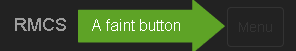
- The data-target class specifies which custom class to target (.navHeaderCollapse). - CHECK POINT: Save the file and preview it in a browser. You should see the brand (the text in this case, RMCS) at all times. However, when you scale to a smaller device size, the Menu button (a faint button with the label of Menu) will be displayed.
- Move the word Menu and the closing
<button>
tag (e.g.,
</button>
) onto the next line and add four blank lines between the opening and and closing
<button>
tags. Delete the word Menu and then in the four blank lines add the following four
<span>
tags to create a graphic icon (commonly known as a hamburger because of the way it looks) for the menu instead of faint text:
<button class="navbar-toggle" data-toggle="collapse" data-target=".navHeaderCollapse">
  <span class="sr-only">Toggle navigation</span>
  <span class="icon-bar"></span>
  <span class="icon-bar"></span>
  <span class="icon-bar"></span>
</button>
CODE EXPLANATION:
- The <span class="sr-only">Toggle navigation</span> tag is used only by screen readers (sr) and will announce the word Toggle navigation. It is not visible to anyone.
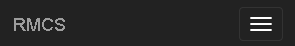
- Each of the <span class="icon-bar"></span> will create a separate piece of the "hamburger" icon: - CHECK POINT: Save the file and preview it in a browser. You should see the "hamburger" icon instead of text when you resize the page for a small device.
Create Top Level Menus
Now that we have create the brand (e.g., RMCS) and the Menu icon, we will now create two sets of <ul> tags that will represent the top level menu items that will be positioned to the left and right of the NavBar.
- Below the closing
</div>
tag with the class of navbar-header but WITHIN the
<div>
tag with the class of container-fluid, add the following two menus. Comments are optional but highly recommended.
</div><!--end of navbar-header -->
<!-- Collect elements for toggling -->
<div class="collapse navbar-collapse navHeaderCollapse">
<!-- Left NavBar -------------------------- -->
<ul class="nav navbar-nav">
  <li class="active"><a href="#">Home</a></li>
  <li><a href="#">Training</a></li>
  <li><a href="#">Services</a></li>
  <li><a href="#">Contact Us</a></li>
</ul>
<!-- Right NavBar ------------------------- -->
<ul class="nav navbar-nav navbar-right">
  <li><a href="#">Sign Up</a></li>
  <li><a href="#">Login</a></li>
</ul>
</div>
</div>
CODE EXPLANATION:
- The collapse and navbar-collapes classes will create a collapsible menu structure.
- The navHeaderCollapse is a custom class that is connecte to the button.
- The active class value is assign to the Home <li> tag and is used to highlight the menu button for the current page. You will need to change its location based on the page itself for each page.
- The navbar-right class will "float" the menu items to the right inside the NavBar. Since the default is left, there was no need to assign a navbar-left to the left menu items.
- Notice the left and right menus are represented by two separate <ul> tags with their corresponding <li> tags nested in them.
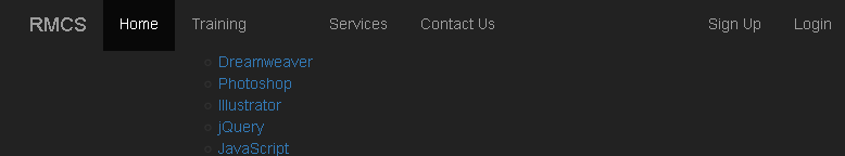
- CHECK POINT: Save the file and preview it in a browser. You should see that all six menu items (e.g., Home, Training, Services, etc.) when the screen is large. The first four menu items are "floated" to the left and the last two menu items are "floated" to the right. You should also see the Home menu button highlights different from the other menu items.

However, if you scale down to a smaller device size, the four menus items change to simply a menu button.
When you click on the menu button, the menu list expands showing all top-level menu items. If you click on it again, it collapses back up.
Create Drop Down For Menu
Now that we have the "main" top-level menus, we will now replace one of them with a sub-menu.
- Below the <li> tag for Home, replace the complete
<li>
tag for the Training button (e.g.,
<li><a href="#">Training</a></li>
) with another
<li>
tag that has an
<a>
tag and another
<ul>
tags with its own set of
<li>
nested in it to create a drop down menu:
<li class="active"><a href="#">Home</a></li>
<li>
<a href="#">Training</a>
<ul>
   <li><a href="#">Dreamweaver</a></li>
   <li><a href="#">Photoshop</a></li>
   <li><a href="#">Illustrator</a></li>
   <li><a href="#">jQuery</a></li>
   <li><a href="#">JavaScript</a></li>
 </ul>
</li>
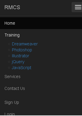
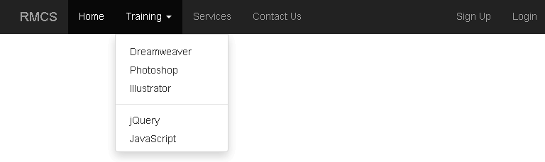
- CHECK POINT: Save the file and preview it in a browser. You should see the following STATIC menu structure on a large screen:
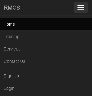
And if you scale to a small device, you should see the following STATIC menu structure when the menu button is pressed:
- It will be made DYNAMIC using classes in the next step.
- Add the following classes and tags to the menu structure that are highlighted in the code below to make the menu dynamic:
</div><!--end of navbar-header -->
<!-- Collect elements for toggling -->
<div class="collapse navbar-collapse navHeaderCollapse">
<!-- Left NavBar -------------------------- -->
<ul class="nav navbar-nav">
  <li class="active"><a href="#">Home</a></li>

  <li class="dropdown">
    <a href="#" class="dropdown-toggle" data-toggle="dropdown"
    role="button" aria-expanded="false">Training<span class="caret"></span></a>
    <ul class="dropdown-menu" role="menu">
      <li><a href="#">Dreamweaver</a></li>
      <li><a href="#">Photoshop</a></li>
      <li><a href="#">Illustrator</a></li>
      <li class="divider"></li>
    <li><a href="#">jQuery</a></li>
    <li><a href="#">JavaScript</a></li>
    </ul>
  </li>

  <li><a href="#">Services</a></li>
  <li><a href="#">Contact Us</a></li>
</ul>
<!-- Right NavBar ------------------------- -->
<ul class="nav navbar-nav navbar-right">
  <li><a href="#">Sign Up</a></li>
  <li><a href="#">Login</a></li>
</ul>
</div>
</div>
CODE EXPLANATION:
- This is no difference than a regular nested list with the exception of the classes on the <li>, <a> and <ul> tags.
- The dropdown class on the highlighted code of the first <li> tag is used to define this <li> tag as a dropdown.
The href="#" for the drop down menu should ALWAYS use a hash sign ("#") because you don't want it to go anywhere when it is clicked on. Only its sub-menus will have URLs assigned to them later.
- The dropdown-toggle class is is used to as the name implies to toggle the dropdown (sub-menus).
- The data-toggle attribute is used to target the the dropdown class as the data provider for the menu.
- The role="button" is used to give the <a> tag a "role" of button.
- The aria-expanded="false" prevents the menu from expanding on load.
- The <span>class="caret"></span> create a small graphic icon (triangle) next to the word Training.
- The dropdown-menu class, like the the snowdrop class, create a dropdown menu for the sub-menu (not the main top-level menu (Training).
- The role="menu" is used to give the <ul> tag a "role" of menu.
- The <li class="divider"></li> is used to create a "dividing line" between menu items.
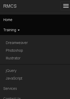
- CHECK POINT: Save the file and preview it in a browser. You should see that if you click on the Training menu on a large screen that the sub-menu items will expand or collapse if you click again
Likewise, on a small screen:
Adding Icons To Menus (OPTIONAL)
Icons will be added to the top-level menus to make them more attractive.
- Add this
<span>
tag (
<span class="glyphicon glyphicon-home"></span>
) to each of the top-level menu items to the left of the text in the
<li>
tags and then add a space before the text. Then, replace the word home in each or the other
<a>
tags with a suitable icon name (e.g., blackboard, wrench, envelope, user and log-in)
</div><!--end of navbar-header -->
<!-- Collect elements for toggling -->
<div class="collapse navbar-collapse navHeaderCollapse">
<!-- Left NavBar -------------------------- -->
<ul class="nav navbar-nav">
  <li class="active"><a href="#"><span class="glyphicon glyphicon-home"></span> Home</a></li>

  <li class="dropdown">
  <a href="#" class="dropdown-toggle" data-toggle="dropdown" role="button" aria-expanded="false">
  <span class="glyphicon glyphicon-blackboard"></span> Training<span class="caret"></span></a>
  <ul class="dropdown-menu" role="menu">
    <li><a href="#">Dreamweaver</a></li>
    <li><a href="#">Photoshop</a></li>
    <li><a href="#">Illustrator</a></li>
    <li class="divider"></li>
    <li><a href="#">jQuery</a></li>
    <li><a href="#">JavaScript</a></li>
  </ul>
  </li>

  <li><a href="#"><span class="glyphicon glyphicon-wrench"></span> Services</a></li>
  <li><a href="#"><span class="glyphicon glyphicon-envelope"></span> Contact Us</a></li>
</ul>
<!-- Right NavBar ------------------------- -->
<ul class="nav navbar-nav navbar-right">
  <li><a href="#"><span class="glyphicon glyphicon-user"></span> Sign Up</a></li>
  <li><a href="#"><span class="glyphicon glyphicon-log-in"></span> Login</a></li>
</ul>
</div>
</div>
CODE EXPLANATION:
- The tag with the glyphicon classes will create icons for the menus. Glyphicons (font icons) take less bandwidth are more responsive and can be resized easily and styled with CSS. - CHECK POINT: Save the file and preview it in a browser. You should see the menu items with icons next to them.

- OPTIONAL: You can add icons to the sub-menus if you want to using the same method above.
Adding Color To Icons (OPTIONAL)
Color will be added to the menu icons to make them stand out better.
- Add an id selector to each of the top-level menu
<span>
tags with a space on each side of them:
- The menu names are highlighted so that you can see the code lines that need to be changed. The ellipses (...) represents code that have been omitted for clarity:
- Open the custom_styles.css file and add the following ids that correspond to each menu icon. Comments are optional.
#home_menu_icon_color {color:#D9534F;} /* danger */
#training_menu_icon_color{color:#337AB7;} /* primary */
#services_menu_icon_color{color:#5CB85C} /* success */
#contact_us_menu_icon_color{color:#5BC0DE;} /* info */
#sign_up_menu_icon_color{color:yellow;}
#login_menu_icon_color{color:orange;}
- CHECK POINT: Save the file and preview it in a browser. You should now see the icons with color.

...<a href="#"><span id="home_menu_icon_color" class="glyphicon glyphicon-home"></span> Home</a></li>
...<span id="training_menu_icon_color" class="glyphicon glyphicon-blackboard"></span> Training<span class="caret"></span></a>...
...<span id="services_menu_icon_color" class="glyphicon glyphicon-wrench"></span> Services</a></li>
...<span id="contact_us_menu_icon_color" class="glyphicon glyphicon-envelope"></span> Contact Us</a></li>
...<span id="sign_up_menu_icon_color" class="glyphicon glyphicon-user"></span> Sign Up</a></li>
...<span id="login_menu_icon_color" class="glyphicon glyphicon-log-in"></span> Login</a></li>