jQueryMobile App
Creating a simple mobile app using HTML5, CSS3 and jQueryMobile is not much different than creating a web site using Dreamweaver. However, there are only a few differences. You have to create or use jQueryMobile:
- framework
- themes
- buttons and other components
- attributes and data-roles
Create Themes
While optional, creating themes first has several advantages. It allows you to create:
- multiple themes and their necessary files and images
- an index.html page that has all of the necessary links to the jQueryMobile Framework that you can use as a starting point
- Go to jQueryMobile.com and click on the ThemeRoller for jQueryMobile button
ALTERNATE: Go to: http://themeroller.jquerymobile.com/.
- On the ThemeRoller for jQueryMobile page in the dialog box that appears, click on the Get Rolling button.
- (OPTIONAL) Click on the Global tab on the left of the screen to set the global settings for all elements of all themes. They are self-explanatory that include:
- Font Family
- Corner Radii
- Icon
- Box shadow
- Click on Add Swatches... link if necessary to create a new theme and then drag and drop color swatches from the color palette at the top of the screen to elements (e.g., headings, links, list elements) you desire to change on a theme below.
NOTE: You can create up to 26 themes or upgrade to the latest version by clicking on the Import or upgrade button.
- (OPTIONAL) Click on the Show alternative icons in preview checkbox to see alternative icons for each theme.
- Click on the Download theme zip file button and in the dialog box that appears give the theme a name (e.g., myTheme) in the Theme Name text field and read the instruction on what it will create.
NOTE: To edit theme later, Click on the Import or upgrade button, select a upgrade version from the drop down menu and then paste an uncompressed theme into the text field and click the Import button.
- Unzip the file in a convenience place (e.g., desktop) and give the folder a more descriptive name (e.g., Adobe CC Apps).
NOTE: You can double-click on the index.html file in the folder that you unzipped to preview the theme in a browser. You can also copy and paste the <link> and <script> tags from this file to another app if you wish.
Create App Definition
Because the index.html file that you downloaded already has <link> and <script> tags to remote versions of the jQueryMobile framework along with its local versions of the CSS files, you don't have to worry about implementing the jQueryMobile framework yourself manually.
However, you may want to download a local version once you complete your project. This is important if someone does not have a connection to the Internet while using your app (e.g., airplane mode turned on while flying).
- Inside the folder that you renamed, create another folder and name it images. Move any images in the folder that you need for your app. In this case, the four Adobe app icons from the tutorial exercise file.
- Open up Dreamweaver and select Site > New Site... from the menu and name the site (e.g., Adobe CC Apps) and then click on the folder icon and navigate to the folder that you renamed earlier and then click the Select Folder button to add it to the Local Site folder text field. Then, click the Save button to create the site and close the dialog box.
Create Template Page
- Double-click on the index.html file in the Files panel to open it.
- Click on the Split View button to see both the Design and Code views.
- Add the following
<meta>
tags below the opening
<head>
tag.
WHY: To make the app mobile-friendly:
<meta charset="utf-8">
CODE EXPLANATION:
<meta http-equiv="X-UA-Compatible" content="IE=edge">
<meta name="viewport" content="width=device-width, initial-scale=1">
<meta name="MobileOptimized" content="width" />
<meta name="HandheldFriendly" content="true" />
<meta name="apple-mobile-web-app-capable" content="yes" />
- The meta tag (<meta name="viewport" content="width=device-width, initial-scale=1">) is used to defined the width of any device that it will be viewed on. The device-width value represent the specific width of a given device and the value of one for initial-scale represents 100%. You could use the name/vlaue pair (userscalable=no) to prevent zooming.when an end user tries to "pinch zoom" the screen on a device.
- It is important to note that all of the name/value pairs of the content attributes are within a single set of quotes and separated by comma(s) for all name/value pairs.
Correct code:
<meta name="viewport" content="width=device-width, initial-scale=1">
Incorrent code:
<meta name="viewport" content="width=device-width" initial-scale="1">
- Delete all tags between the <body> tags by selecting the <body> tag in the Tag Chooser at the bottom of the screen and then press the Delete key.
- Select File > Save As... and save the file as template.html.
WHY: To be used later to create the other pages.
- Open the Insert Panel (Windows > Insert or (CTRL + F2) and select the jQuery Mobile option from the drop down list.
- Click on the Page Icon or drag and drop the Page icon onto the page and in the Page dialog box that appears ensure that:
- ID is set to home_page
- Header and Footer checkboxes are selected
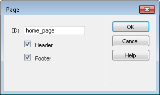
- Click the OK button.
WHY: To create the "page" wrapper with a header and footer for the app.
In Code View, this will create the following four <div> tags with their corresponding data-role (e.g., page, header, content, and footer) with an id name of home_page for the main <div> . The code that has been highlighted is formatted slightly so that you can see the structure better.
<div data-role="page" id="home_page">
  <div data-role="header">
    <h1>Header</h1>
  </div>
  <div data-role="content">
     Content
  </div>
  <div data-role="footer">
    <h4>Footer</h4>
  </div>
</div>
In Design View, you should see:

If you preview the page in a browser, you should see the jQuery framework styled the elements (e.g., header, content and footer).

In Design View, change the default Header and Footer text (e.g., Adobe CC Apps, Copyright 2015. All rights reserved.).
<div data-role="header">
  <h1>Adobe CC Apps</h1>
</div>
...
<div data-role="footer">
  <h4>Copyright 2015 All rights reserved.</h4>
</div>
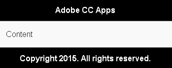
- CHECK POINT: Save the file and preview it in a browser. You should see the page with a header and footer with the word Content in the content area:
- Close the browser or switch back to the Design View and the delete the word Content.
- Save the file again.
Create Home Page
- Go back to the index.html file, if it is not already opened, and position the cursor in the middle of the
<div>
tags with an id of content:
- From the Insert panel (Windows > Insert or CTRL+F2), click on the List View icon. In the List View dialog box that appears, add the following options:
- List type: Unordered
- Items: 4
- Inset: checkbox checked
- Text Description: checkbox checked
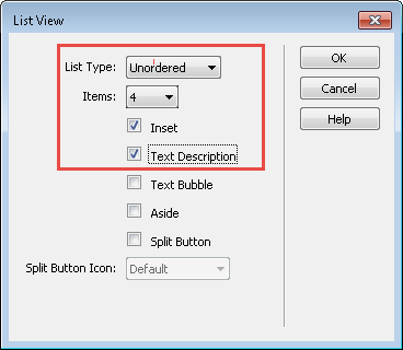
- Click the OK button.
WHY: To add a jQuery listview to the Content area.
In Code View, you should see the following bullet list created:
    <ul data-role="listview" data-inset="true">
      <li><a href="#">
        <h3>Page</h3>
        <p>Lorem ipsum</p>
      </a></li>
      <li><a href="#">
        <h3>Page</h3>
        <p>Lorem ipsum</p>
      </a></li>
      <li><a href="#">
        <h3>Page</h3>
        <p>Lorem ipsum</p>
      </a></li>
      <li><a href="#">
        <h3>Page</h3>
        <p>Lorem ipsum</p>
      </a></li>
    </ul>
In Design View, you should see:
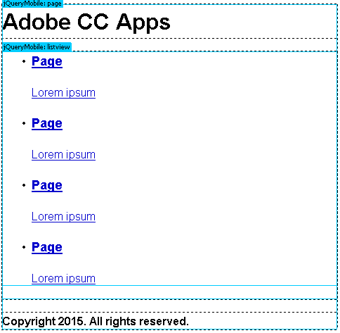
- CHECK POINT: Save the file and preview it in a browser. You should see the bullet list was converted to a jQueryMobile listview based on the data-role = "listview" attribute that was added to the opening
<ul>
tag of the list. You should also see the jQueryMobile INJECTED icons to the right into each of the list item. Also, if you hover over any of the list items, you will see that it will highlight:

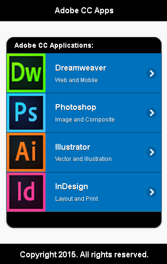
- Change the <h3> Page text to menu items (e.g., Dreamweaver, Photoshop, Illustrator, and InDesign).
- Change the
<p>
text to something descriptive (e.g., Web and Mobile, Image and Composite, Vector and Illustration, and Layout and Print).
    <ul data-role="listview" data-inset="true">
      <li><a href="#">
        <h3>Dreamweaver</h3>
        <p>Web and Mobile</p>
      </a></li>
      <li><a href="#">
        <h3>Photoshop</h3>
        <p>Image and Composite</p>
      </a></li>
      <li><a href="#">
        <h3>Illustrator</h3>
        <p>Vector and Illustration</p>
      </a></li>
      <li><a href="#">
        <h3>InDesign</h3>
        <p>Layout and Print</p>
      </a></li>
    </ul>
- From the Files panel (F8), drag and drop an image icon from the images folder for EACH list item AFTER the opening
<a>
tag in the Code View (not the Design View) and then change the image's height and width in the Properties panel to 80 pixels if necessary. The code should look as follow for EACH list item.
<li><a href="#">
  <img src="images/icon_dw.png" width="80" height="80" alt=""/><h3>Dreamweaver</h3>
  <p>Dreamweaver is an HTML editor</p>
</a></li>
- (OPTIONAL) Add a top and bottom list divider to the listview by adding a data-role = "list-divider" attribute to the
<li>
tag above and below the existing
<li>
tags. Then, add text to the top
<li>
tag (e.g., Adobe CC Applications:) and a non-breaking space (e.g., ) to the bottom
<li>
tag.
NOTE: Besides the data-theme on the opening <ul> tag, you can also add a data-divider-theme within the top and bottom <li> tags to change it to another theme, if necessary.
<ul data-inset="true" data-role="listview" data-divider-theme="a"> <li data-role="list-divider">Adobe CC Applications:</li> <li>...</li> <li>...</li> <li>...</li> <li>...</li> <li data-role="list-divider"> </li> </ul>
- In the Properties panel, add a link in the Link text field for EACH
<a>
tag in the
<ul>
list:
NOTE: The code has been formatted so that you can see the <a> tag is within an <li> tag and the <a> tag is wrapped around an <img> and <p> tag.
<li>
<a href="dreamweaver.html">
  <img src="images/icon_dw.png" width="90" height="90" alt=""/> <h3>Dreamweaver</h3>
  <p>Web and mobile</p>
</a>
</li>
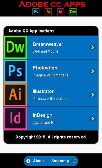
- CHECK POINT: Save the file and preview it in a browser. You should see an image, title and description for each list item:
Create First Page
While we can create a real Dreamweaver template for the other pages, for simplicity sake, we will create them using the template.html page created earlier since there are only four pages that will be create for this tutorial.
- Open the template.html file and save it as a new page (e.g., dreamweaver.html).
- Rename the page id (e.g., <div id="dreamweaver_page">).
- Rename the page title to match its content (Dreamweaver New Features).
- Add a page title by creating an
<h2>
tag in the empty <div data-role="content"> container.
<div data-role="content">
 <h2>What's New In Dreamweaver CC</h2>
</div>
- Save the file.
Create Home Button
Currently, you will have to use the Back button on the browser to go back to the home page. We will fix this problem in the next step. A Home button needs to created in the header so that a user can navigate back to the home page.
IMPORTANT NOTE: When you add one or two anchor tags ( <a> ) to a <div> tag that has a data-role of header, they will automatically be converted to buttons and positioned to the far left and then to the far right side of that header. It does not matter if you place the anchor tags above or below the <h12> tag, they will still render to the left or right of the heading's text. However, for a screen reader it is best to have it above the <h1> tag so that it can be read first.
- Add a link tag (
<a>
) with a name of "Home" within the <div data-role="header" data-theme="a"> container.
<div data-role="header" data-theme="a">
  <a href="index.html">Home</a>
  <h1>Adobe CC Apps</h1>
</div>
- (OPTIONAL) Add an icon to the home button by adding the following data-icon attribute to the
<a>
tag.
<div data-role="header" data-theme="a">
  <a href="index.html" data-icon="home">Home</a>
  <h1>Adobe CC Apps</h1>
</div>
- CHECK POINT: Save the file again and test it in a browser. You should see the Home button on the left side of the app:

ALTERNATIVE: You could have created the button using the Insert panel. However, it was just as easy to simply write the code for the button in Code View.
Create Other Pages
Since the other pages are similar the page that was created earlier with a home button (e.g., dreamweaver.html), it will used it as a starting point.
- Open the last page that was created (e.g., dreamweaver.html) and repeat the steps in the section "Create First Page" for the OTHER pages (e.g., photoshop.html, illustrator.html, and indesign.html), but change the page's:
- name (e.g., photoshop.html)
- heading (e.g., What's New in Photoshop CC)
- id (e.g., photoshop_page).
- CHECK POINT: Save the file and then open any of the files in a browser (F12) and test all of the menu items to see if they go to their corresponding page. Click the Home to take you back to the home page (e.g., index.html).
- Add content to all pages however and whatever you want.
(OPTIONAL) Create Control Group
Like the buttons in the header, when you add one or two anchor tags ( <a> ) to a <div> tag with a data-role of footer, they will not automatically be converted to buttons. However, instead of being positioned on the left and right, if you add two anchor tags, they will be placed next to each other and above or below the <h4> tag in the footer depending if they are placed above or below the <h4> tag.
A Control Group, as the name implies, is a group of controls (elements). In this case, two buttons will be used to open up two dialog boxes later. The advantage of "wrapping" a group of control elements is to allow the group to have rounded corners at the top and bottom if they are vertical or right and left sides of the group if they are horizontal and to have them "grouped" together instead of being separate control elements.
- Open the index.html page and place the insertion point above or below the
<h4>
tag in the <div> tag with the data-role of footer.
NOTE: It does not matter if you place the insertion point above or below the <h4> tag because it will be deleted later.
- Open the Insert Panel (Windows > Insert or CTRL+F2) and select the jQuery Mobile option from the drop down list.
- Click on the Button Icon or drag and drop the Button icon onto the page and in the Button dialog box that appears select:
- Buttons: 2
- Button Type: Link
- Input Type: N/A
- Position: Group
- Layout: Horizontal
- Icon: Star

- Click the OK button.
WHY: To create a button group in the footer.
- Add the following highlighted code.
NOTE: If the <a> tags were not given an data-role of button, they would appear as links instead of buttons. To prove this, temporary remove the data-role="button" attribute, save the file and preview it in a browser.
 <div data-role="footer">
    <h4>Copyright 2015. All rights reserved.</h4>
    <div data-role="controlgroup" data-type="horizontal">
	  <a href="about.html" data-role="button" data-icon="info" data-iconpos="left">About</a>
	  <a href="summary.html" data-role="button" data-icon="bullets" data-iconpos="right">Summary</a>
	</div>
  </div>
- (OPTIONAL) Add an align attribute to the following <div> tag:
WHY: To center the control group element within the footer.
<div data-role="controlgroup" data-type="horizontal" align="center">
- CHECK POINT: Save the file and preview it in a browser. You should see the the button centered in a group with rounded corner only on the end caps.

- (OPTIONAL) Cut the
<h4>
tag from the footer and paste it in the last
<li>
tag in the listview to replace the non-breaking space (e.g., ):
WHY: So the footer would not be so "fat."
<li data-role="list-divider">
  <h4>Copyright 2015. All rights reserved.</h4>
</li>
</ul>
- (OPTIONAL) Add an align="center" attribute to the <h4> tag:
<li data-role="list-divider">
  <h4 align="center">Copyright 2015. All rights reserved.</h4>
</li>
</ul>
- CHECK POINT: Save the file and preview it in a browser again. You should see the copyright notice now in the bottom of the listview instead of the footer.

(OPTIONAL) Create Dialog Box
Optionally, you can create dialog boxes with a transition effect applied to them.
- Create an additional page using the jQuery framework in the header and save it as about.html that correspond to the
<a>
tag in the control group that was created earlier. Below is an example page of the content BETWEEN the
<body>
tag:
NOTE: The code has been formatted slightly so that you can see the structure better. Notice the entities (e.g., ©) that will render a copyright symbol (©).
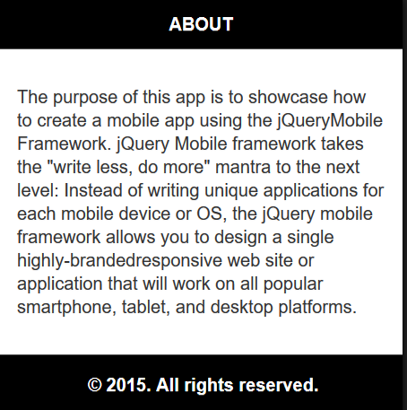
<body> <div data-role="page" id="about_page" data-theme="b"> <div data-role="header" data-theme="a"> <h4>ABOUT</h4> </div> <div data-role="content" data-theme="b"> <p>The purpose of this app is to showcase how to create a mobile app using the
jQueryMobile Framework. jQuery Mobile framework takes the "write less, do more"
mantra to the next level: Instead of writing unique applications for each mobile
device or OS, the jQuery mobile framework allows you to design a single
highly-branded responsive web site or application that will work on all popular smartphone, tablet,and desktop platforms.</p> </div> <div id="footer" data-role="footer" data-theme="a">
<p align="center">© 2015. All rights reserved.</p>
</div> </div>
</body>
- CHECK POINT: Save the file and test the page in a browser. You should see that the page opens up as a regular page with no Back or Close button.
- In the about.html page, add the following data-dialog attribute to opening <div>.
WHY: So that the page will be recognized as a dialog box instead of a regular page.
<div data-role="page"  id="about_page" data-theme="b" data-dialog="true">
<div data-role="header" data-theme="a">
- CHECK POINT: Save the file and test the page in a browser. This time you should see that the page opens up as a dialog box with a Close button automatically injected into the page. How cool is that!!!

- CHECK POINT: Return back to the index.html page and click on the About button. You should see the dialog box FADE onto the screen. In the next step, we will add another type of transition.
- Add a data-transition attribute to the About button in the footer.
<div data-role="controlgroup" data-type="horizontal" align="center">
  <a href="about.html" class="ui-btn" data-transition="slidedown">About...</a>
  <a href="summary.html" class="ui-btn">Summary</a>
</div>
- CHECK POINT: Save the file and test the page again in a browser by clicking on the About button in the footer. You should see that the dialog box now transition from the top to the bottom (e.g., slidedown transition). Also, when you close the dialog box that it will transition from the bottom to the top or in the reverse transition, if you change the transition type.
- Repeat steps 1-7 above for the Summary button and make the necessary changes accordingly.
(OPTIONAL) Create Tooltip
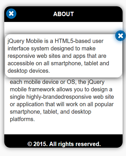
- On any page (in this case, about.html) select a word or phrase (in this case, jQueryMobile Framework) in one of the sentences and create a link within the page for the tooltip that will be created next (e.g., #popupjQueryMobile).
- In Code View, add the following highlighted two attributes to the link:
WHY: To tell the link to open and transition as a popup.
<a href="#popupjQueryMobile" data-rel="popup" data-transition="flow">jQueryMobile Framework</a>
- Create a tooltip popup with the following two tags below the other closing
</div>
tag:
NOTE: The <div> tag is a wrapper for the tooltip with:- a data-role of popup
- an id of popupjQueryMobile
- a data-theme of "a"
- a
<p>
tag that is the tooltip itself with no attributes
NOTE: Notice there is a data-rel="popup" on the link and a data-role="popup" on the tooltip's <div> tag. The code has been formatted for clarity.
<div data-role="popup" id="popupjQueryMobile" data-theme="a">
<p>jQuery Mobile is a HTML5-based user interface system designed to make responsive web sites and apps that are accessible on all smartphone, tablet and desktop devices.</p> </div> - (OPTIONAL) Add a link above the
<a>
tag that behaves like a button within the
<div>
tag:
<div data-role="popup" id="popupjQueryMobile" data-theme="a">
  <a href="#" data-rel="back" data-role="button" data-icon="delete"
  class="ui-btn-right" data-iconpos="notext">Close</a>
  <p>jQuery Mobile is a HTML5-based user interface system
  designed to make responsive web sites and apps
  that are accessible on all smartphone, tablet and desktop devices.</p>
</div>
NOTE: The <a> tag has a host of attributes and a class:
- data-rel="back" - go back to the page.
- data-role="button" - have the <a> tag behave like a button
- data-icon="delete" - show the delete icon (x)
- class="ui-btn-right" - position the button to the right of the tooltip
- data-iconpos="notext" - have the icon not show any text
NOTE: Notice the word Close is still used even though it was told to not be displayed. The reason for this is that it is still needed for blind users that use a screen reader so that the button text (Close) is announced to them.
- CHECK POINT: Save the file and test it in a browser by clicking on the link (e.g., jQueryMobile Framework). You should see the tooltip pop up with a transition. If you click the close button or click outside of the tooltip, the tooltip will animate off the screen with a transition.
(OPTIONAL) Create Fixed Header And Footer
While this step is optional, it is best practice to have the content scroll between the header and footer without the them scrolling themselves. To do this, we can add the attribute: data-position="fixed"
- CHECK POINT: Open up dreamweaver.html and ensure there is a lot of content that is more than the size of the viewport (in this case, 320 x240). You initially cannot see the footer and when you scroll the page, you will see the header scroll out of view as well so that the Home button cannot be seen unless you scroll down again. This will be resolved in the next step.

- Add the following highlighted code to the header and footer
<div>
tags:
WHY: To make the header and footer FIXED as you scroll a large page.
<div data-role="header" data-position="fixed">
<a href="index.html" data-icon="home">Home</a>
<h1>Adobe CC Apps</h1>
</div>
 .
 .
 .
<div data-role="footer" data-position="fixed">
<h4>Copyright 2015. All rights reserved.</h4>
</div>
- CHECK POINT: Save the file and test it again in a browser. You should see that if you scroll the content, the header and footer remain fixed.
- Add this same attribute to the other pages. Make sure there is enough content on each page so that it can be scrolled.
- photoshop.html
- illustrator.html
- indesign.html
- index.html (if you have a lot of menu items)
(OPTIONAL) Modify Header and Footer
This is an optional step; however, you will learn how jQuery INJECTS data into the DOM as well as how to target elements that are not visible in Code View. We will modify the header text to be a different color and smaller on a mobile device.
- With Live View enabled, click within the header tag.
WHY: To see that the header has a <h1> tag with an class of .ui-title in the Design View:
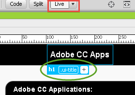
NOTE: However, if you look in the Code View, you don't see a class named .ui-title (e.g., <h1 class="ui-title>Adobe CC Apps</h1>).
<div data-role="header" data-position="fixed">
  <h1>Adobe CC Apps</h1>
</div>
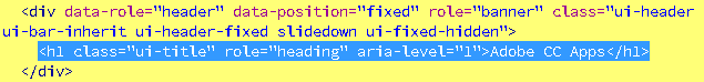
That's because, jQuery INJECTS additional classes into the code as needed. To see this, click the Shows the Live View source in code view button on the top of the page.
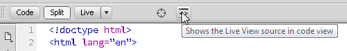
You will NOW see not only the class="ui-title" but a host of other attributes that was added as well for both the <div> tag and the <h1> tag.
Now that we know what selectors are applied to the header, we can target what we need.
- Open the myTheme.min.css file and write the following selector rule at the bottom of the file:
/* my own styles */
h1.ui-title{color:red;} /*header*/
- CHECK POINT: Save the CSS file and test the index.html file or any other page in a browser. You should see that the title changed to red. However, because this selector will target ANY <h1> tag with a class of ui-title, we want to LIMIT it to just the header.

- In the index.html file, add a TEMPORARY <h1> tag below the <div class="header"> tag:
WHY: To see that ALL <h1> tags with a class of ui-title will be affected by the selector.
<div data-role="header" data-position="fixed">
<h1>Adobe CC Apps</h1>
</div>
<h1 class="ui-title">Test</h1>
- CHECK POINT: Save the file and test it in a browser. You should see that both <h1> tags are red:

- Open the myTheme.min.css file and MODIFY the selector created earlier to read:
WHY: To create a contextual selector so that the rule will be more SPECIFIC to where it can target an element or elements. In this case, only an element with an class of ui-title that in nested inside of a <div> tag with a class of ui-header.
/* my own styles */
div.ui-header h1.ui-title{color:red;} /*header*/
- CHECK POINT: Save the the CSS file and test the index.html file in a browser again. You should see that ONLY the <h1> tag in the header is red. NOTE: You could delete the div in front of the rule but it would make it less specific (e.g., .ui-header h1.ui-title{color:red;}).

- Delete the temporary <h1> tag that you created earlier.
WHY: It was only used to illustrator the concept of the selector.
- (OPTIONAL) Add the following rule to the footer:
WHY: To reduce the size of the footer text on all pages.
/* my own styles */
div.ui-header h1.ui-title{color:red;} /*header*/
div.ui-footer h4.ui-title{font-size:0.7em;} /*footer*/
- Add the following media query below the other rules that was created earlier:
WHY: To have the header text change color and font size gets smaller when the device screen size is smaller than 320px. A small padding at the bottom is also added.
/* my own styles */
div.ui-header h1.ui-title{color:red;} /*header*/
div.ui-footer h4.ui-title{font-size:0.7em;} /*footer*/
@media (max-width:320px)
{
  div.ui-header h1.ui-title
  {
   color:orange;
   font-size:.8em;
   padding-bottom:15px;
  }
}
- CHECK POINT: Save the the CSS file and test the index.html file in a browser. You should see that the font-size is now smaller and has changed color if it is viewed on a device that has a screen size of 320 pixels or less.
(OPTIONAL) Modify Page Headers
-
In the myThemes.min.css file, add the following two rules:
WHY: To adjust the margin when a <h3> header tags is adjacent to a <p> tag.
/* my own styles */
div.ui-header h1.ui-title{color:red;} /*header*/
div.ui-footer h4.ui-title{font-size:.7em;} /*footer*/
h3 {margin-bottom:0px;}
h3 + p {margin-top:0px;} /*adjacent siblings*/
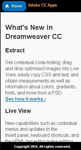
- CHECK POINT: Save the the CSS file and test one of the page other than the index.html file in a browser. You should see that the page titles (e.g., Extract, Live View) has moved closer to its adjacent paragraph tags.

(OPTIONAL) Replace Home Page Title With Logo
- In the index.html (home page), replace the <h1> tag in the header with an <img> tag:
From this:<div data-role="header" data-position="fixed">
To this:
<h1>Adobe CC Apps</h1>
</div>
<div data-role="header" data-position="fixed">
  <img class="logo" src="images/logo.png" width="960" height="150" alt="Adobe CC icons"/>
</div>
- In the myThemes.min.css file, add the following rule:
WHY: To center the logo's and make it scalable across devices.
h3 {margin-bottom:0px;}
h3 + p {margin-top:0px;} /*adjacent siblings*/
.logo {
 max-width:100%; height:auto;
 margin-left:auto; margin-right:auto;
 display:block;
 }
- CHECK POINT: Save the the CSS file and test the index.html file in a browser. You should see that the logo scales across device sizes.
Screenshot taken at 768 x 1024:

Screenshot taken at 768 x 1024: