Add Actual Content
Now, that you have created the structure for each page, you are ready to add pseudo or actual content which can include:
- Text and images
- Widgets (e.g., slideshow)
- Fonts (web fonts)
- Buttons and links
Add Text and Images
Add the necessary text and images to each page of your web site as needed.
TIP: Cut and paste an image in front of a large amount of text to create an in-line image. Then, select the image and then open the Wrap Panel and select the option to wrap the text to the right or left and to add offsets. However, Text Wrap is not currently responsive. This process is akin to creating a float:left and float:right for images with CSS.
TIP: You can navigate to a folder where your can select multiple images and then use the Place gun to "shoot" the images on the page where you need them. The Place gun will have the number of images in a set of parenthesis (e.g. (4)). Moreover, you can use the right/left or the up/down arrow to preview the image thumbnails. Also, you can press the ESC key to delete an image from the Place gun list.
TIP: It is best to insert an image inside of a rectangular box using the Fill... option than to use the Place tool that creates a Frame. That's because you have additional control over your image (e.g., Fitting and Position).
Add a Widget
You can add as many widgets that you need to your web site which range from slideshows to forms.
Add a Slideshow
NOTE: All of the slideshows in the Widget Library are basically the same but with different features turned on or off.
- Drag-and-drop a slideshow widget unto one of your pages (e.g., Portfolio).
- Click on the blue arrow icon to open the Options panel.
- Click on the browse button and navigate to your images.
- Select the images you want to use and then click the Open button.
- CHECK POINT: You should see ALL of the default images and thumbnails replaced with your images and Muse will AUTOMATICALLY create the thumbnails.
Add Fonts
Before you style elements on your site, you may want to install some additional fonts. If you click on the Text panel and select Add Web Fonts... from the drop-down menu, you see that there are three types of fonts:
- Web Fonts - web-based fonts
- Standard Fonts (with fallbacks)
- System Fonts (export as images) - these fonts should be avoided since they create images that cannot be used by search engines and they are not accessible.
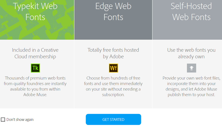
There are three types of WEB fonts:
- TypeKit Web Fonts
- Edge Web Fonts
- Self-Hosted Web Fonts
- From the Font drop-down menu, click on Add Web Fonts… option.
- In the dialog box that appears, click on the Get Started button.
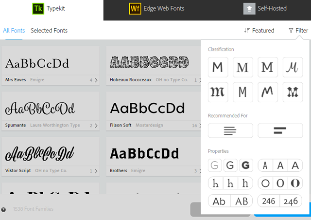
- Click the Typekit tab and ensure the All Fonts option is selected.
TIP: You can also SORT by the following features:- Featured
- Newest
- Name
- Number of Variants
NOTE: You can also FILTER by: - Classification (e.g., san serif, serif, script, decorative)
- Recommended For (e.g., Paragraphs or Headings)
- Properties (e.g., weight, width, x-height, contrast, uppercase/lowercase)
- Select the font you want from the list and then click the OK button.
- Select some text first and then go back to the font drop-down menu and select the newly installed font from the list to apply it to that selection.
- From the Font drop-down menu, click on the Add Web Fonts… option.
- In the dialog box that appears, click on the Get Started button.
- Click the Edge Web Fonts tab and ensure the All Fonts option is selected.
TIP: You can FILTER by:- Classification (e.g., san serif, serif, script, decorative)
- Recommended For (e.g., Paragraphs or Headings)
- Select the font you want from the list and then click the OK button.
- Select some text and then go back to the font drop-down menu and select the newly installed font from the list to apply it to that selection.
- From the Font drop-down menu, click on Add Web Fonts… option.
- In the dialog box that appears, click on the Get Started button.
- Click the Self-Hosted tab and then click on the + Add Fonts button.
- In the dialog box that appears, click on the Browse button and navigate to the fonts folder with a set of self-hosted fonts that you have on your computer. You may not see the fonts listed but click on the Select Folder button anyway.
NOTE: In the Prep section, we downloaded fontawesome to use as our self-hosted fonts.
- CHECK POINT: You should see three fonts in a list. Click on the checkbox to continue.
- Click on the Match button to match the font.
- Create a text box and type a single character and select it.
- Open the Glyphs panel and select the font from the grid. NOTE: You can also go to http://fontawesome.io/cheatsheet/ and look for the font icon you want to use.
- Resize or change the color of the font icon however you see fit.
Add Links
You can apply a link to a portion of text, an image or a rectangle and have it:
- Go to an external web site (e.g., http://www.anotherwebsite.com)
- Go to another page within your own site or a named anchor.
- Download a file (e.g., pdf)
- When necessary, create a named anchor in your pages where you want to link by:
- Clicking on the link anchor tool.
- With the Place gun loaded, click where you want to place an anchor.
- Repeat previous two steps for each anchor you want.
- Select the text, image or rectangle you want to convert to a link (sometimes called a hyperlink).
- Click on the Add or filter link drop-down menu at the top of the page and do ONE of the following:
- Enter a full qualified URL (e.g., http://www.anotherwebpage.com).
- Select one of the existing pages or a named anchor in your web site.
- Click on the Link To File... option to upload a file to the server that a user can download.
- CHECK POINT: If you are using text, you should see the text change to a default blue color with an underline. If you want to check to see if the link is working, select File > Preview Page in Browser or Preview Site in Browser instead of the Preview button.
TIP: To delete any one of the three types of links, select the link again and click on the small "x" next to the Add or filter link drop-down menu.
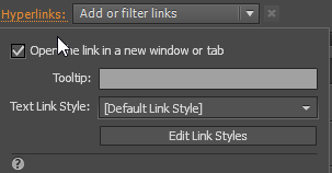
TIP: To open the link in a new window or tab or to add a tooltip, click on the Hyperlinks link next to the Add or filter link drop-down menu.
Add Named Anchor
Normally, a menu or button will take you to another page with the same web site or another page on another web site. Now, we see how to navigate WITHIN the SAME page or WITHIN another page using named anchors.
- Add anchor points to the left for the main anchors and right for the top anchor.
TIP: If you need to adjust all of the named anchors together, select all them and move them all at one time.
- Add the named anchors to a menu item, link or button.
- CHECK POINT: Click on the menu item, link or button and you should see that the page "animate" to that named anchor.
Add Buttons
There are a host of ways to create buttons. Then, you can use the same techniques for Links to create links for buttons:
- Use State Button widget for a single button
- Use Menu widget with Manual option selected for multiple buttons
- Use the File > Place Photoshop Button... menu option with a Photoshop file with four layers that represents the four states of a button
- Use a series of rectangles to create your own custom button
State Button
When you need to create a single button, the State Button widget will do the job. We will learn how to style buttons later.
- Open the Widgets Library panel and then open the Buttons folder.
- Drag-and-drop a State Button wherever you need it.
- Assigned a link to the button (See Add Links).
Menu Button
If you want to create a menu that is not based on the page names, drag and drop a Horizontal or Vertical menu widget onto your page and select the Manual option in the Menu Type. This type of menu (button) is useful if you have:
- A one page layout and need to use named anchors
- Items that are not based on pages in your site
When you need to create multiple buttons, the Horizontal or Vertical menu widget will do the job. We will learn how to style buttons later.
- Open the Widgets Library panel and then open the Menus folder.
- Drag-and-drop a Horizontal or Vertical menu wherever you need it.
- In the Options panel that opens, change the Menu Type to Manual.
- CHECK POINT: You will see the menu change to a single button with the text [Name] in it.
- Click on the text [Name] (not the button frame) and give it a button label name. (e.g., Download).
- Assign a link to the button (See Add Links).
- (Optional) You can move and space the button wherever you want.
- Click on the button again and then click on the plus sign (+) to the right or left of the button to add another button.
- Repeat steps 5-8 for any more buttons as you need.
Photoshop Button
If you know how to use Photoshop, you can create a custom graphic button.
- Open Photoshop and create four layers that represents the four button states (e.g., Normal, Roll Over, Mouse Down, and Active) and save it as a Photoshop file (e.g., my_custom_button.psd).
TIP: Here are the steps to create the four layers in Photoshop:
- Create a rounded rectangle that represent the size of a button and apply a style to it (Windows > Styles).
- Crop button as much as possible.
- Duplicate the layer three times (CTRL+J).
- Name the layers Normal, Roll Over, Mouse Down and Active.
- Change the color or other attributes of the F/X effects applied to each layer if necessary.
- Click on each layer and select Rasterize Layer Style. This step is very important.
- Add Text Layers for labels using the Text tool on TOP of each button's state and give it a contrasting color against the background
- Select the Text Layer and the button's state layer for EACH button and then right-click on the layer and select Merge Layers.
- Delete the Background layer so that the background become transparent.
- Save the file as a psd file (e.g., my_custom_button.psd).

- In Muse, select File > Place Photoshop Button... (CTRL+B) and select the Photoshop file created in step 1 and then click the Open button.
- In the Photoshop Import Options dialog box that appears, select the correct button states, if necessary and then click the OK button.
- Click and drag the Place gun to the size of the button you need.
Custom Button
You can also create a custom button INSIDE of Muse.
- Create four rectangles that represent the four button states:
- Normal—create a rectangular that represent the size of your button and then click on the Fill link and select the Gradient checkbox, then add:
- a color and a slightly darker version of the same color for the gradient
- no stroke
- direction vertical
- shadow (distance and blur of 4)
- corner radius of 4
- rounded corners
- Rollover—duplicate Normal state rectangle and remove shadow and add both color gradient slightly darker
- Visited—duplicate Rollover state rectangle and make both color slightly darker again with a black inner glow
- Active—duplicate the Normal state rectangle.
- Normal—create a rectangular that represent the size of your button and then click on the Fill link and select the Gradient checkbox, then add:
- Save each as a graphic style (e.g., normal, roll over, mouse down and active) then draw a rectangle and then open the States panel to apply these styles to the four button states by clicking on the corresponding state in the Graphic Style panel.
- Delete the four rectangles that were used to create the button states.