Style Graphics Properties
Once you create content, you may then want to style them to make it fit your design. There are a host of graphics elements that you can style. Many of the styles once they are created and save can be APPLIED to other graphic elements easily. This is akin to CSS classes that can be APPLIED to multiple elements. Also, a transition can be added to change the look-and-feel of the four states of a menu or button (e.g., Normal, Roll Over, Mouse Down, and Active or in HTML Linked, Hover, Visited, and Active).
Style Graphic Elements
- Style Menus / Buttons Properties
- Style Graphics
- Style Widgets
Style Menus / Buttons Properties
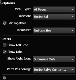
The menu widget has the default gray color which probably is not consistent with what you want on your site. You can change the properties of the menus by clicking on the blue arrow icon.
You can also change the states of the menu or menu buttons items by drilling into the menu to get to them. By default, if you edit ONE of the menu item, they will ALL be effected because the Edit Together checkbox is selected in the Options by default. See the screenshot below for additional self-explanatory properties.
NOTE: You will see later that the Edit Together technique is consistent with other widgets.
TIP: As long as the Edit together check box is selected in the menu properties you only have to do one menu item. This option is on by default. However, if you wanted, let’s say a different color for each button then you may want to turn this option off.
- Open the A-Master template and click on the menu to select it.
NOTE: You will see Menu: No States in the top/left corner of the screen.
- Click on the menu'S RECTANGLE (NOT LABEL) to select the Menu Item.
CAUTION: Be careful to select the Menu Item and not the Label.
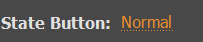
NOTE: You will see Menu Item: Normal in the top/left corner of the screen.
- Click on the Normal link in the top/left corner of the screen to open the States options and select the Normal state.
NOTE: You can also open the States panel and drag it where you need it.
- Change whatever properties you want (e.g., Fill color, text color, font size/type/weight). In this example, we will change:
- Fill color to black
- Text color to white
- Font to Arial
- Font weight to Bold
- Change the properties of the other three states as needed.
- Rollover and Active states (Fill color white, Text color white, Arial font and weight bold)
- Mouse Down (Fill color gray, Text color black, Arial font and weight bold)
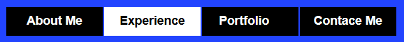
- CHECK POINT: Select File > Preview Page in Broswer or Preview Site in Browser to see the newly styled menu. If you navigate to another page, you will see the active page highlighted. In this case a white background with white text.
TIP: You could also create a transparent button by removing the Fill color on a menu item and then adding a solid color to the Rollover, Mouse Down and Active states.
Transition Style
Besides changing the color between states, you can also create a fade transition between them.
- Select a graphics, button, or menu with states (e.g., Normal, Roll Over, Mouse Down, and Active) assigned to it.
- Click on a state name (e.g., (e.g., Normal, Roll Over, Mouse Down, and Active) in the top/left corner of the screen OR open the States panel.
 or this
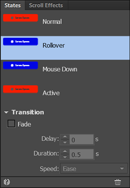
- Click on small triangle to expand the Transition option. Then, click the Fade checkbox and then set:
- Delay in seconds
- Duration in seconds
- Speed (Easing type)
- CHECK POINT: Preview the page and you should see the color "animate" from one color to the next based on your setttings.
Style Graphics
Like menus and menu buttons, other type of graphics (e.g., Photoshop buttons or custom buttons created in Muse) that have states can be styled.
Photoshop Buttons
- Open the Assets panel and click on the button layer that you want to open and edit in Photoshop.
NOTE: *.psd file can be edited, opened, and saved inside of Muse. This is called round-trip editing.
- Edit the layer in Photoshop and save the changes.
- CHECK POINT: You should see the changes reflected in the Photoshop button.
NOTE: You may need to preview the page if it is a state other than the Normal state.
Custom Buttons
- First, select the button that you want to restyle.
- Open the Graphic Styles panel and select the style layer you want to change.
- Change any properties of that style you want from the menus (e.g., color).
- Open the States panel and select the state that corresponds to the style that you want to change.
- Click on the Redefined Style button at the bottom of the panel.
- CHECK POINT: You should see the style redefined on button that that style was applied to.
Menu Buttons
- Select the menu buttons.
- Open BOTH the States and Graphics styles panels.
- In the States panel, select the state that you want to change.
- Make whatever changes you want to make to that state.
- In the Graphic Styles panel, click on the Redefine selected style icon at the bottom of the panel.
- CHECK POINT: Click on the Preview button to see changes.
Other Graphics
Any graphics that you create can be styled using the Graphic Styles panel.
EXAMPLE- Create three rectangles with the Rectangle tool and fill each with a different color.
- Select the first rectangle and add a opacity, bevel and drop shadow from the Effect menu and opacity slider.
- Open the Graphic Style panel and create a new Graphic Style from the selection.
- Double-click on the newly created style and give it a more descriptive name (e.g, BevelWithShadow) and then click the OK button.
- Click on the second rectangle and then click on the new style in the Graphic Styles panel.
- Repeat the previous steps for the second and third rectangles.
- CHECK POINT: Notice that all three rectangles have the SAME styles including color applied to them.
Now, to change the style:
- Make and change to any one of the three rectangles.
- In the Graphic Styles panel, click on the Redefine selected style icon at the bottom of the panel.
- CHECK POINT: You should see that all three rectangles got updated to match the style you changed.
Style Widgets
Like everything else in Muse, you can also style any widgets as you see fit.
- If you are using a slideshow widget, you can make any thumbnail around and it will AUTOMATICALLY rearrange the images.
- If you are using a slideshow widget, you can resize the "hero" element and you can drill down into it and resize the image inside.
- You can can the style the states of nav buttons, slideshows just like you can any button.
Style Slideshow
There are several things that you can do to style a slideshow widget:
When using the slideshow widget, it is common practice to “dim” the thumbnails (change opacity to about 60%) in the Normal state and then when a user hover over thumb make the opacity 100% again by changing the Rollover state. Another trick is to set the Active state’s opacity to 100% so the user will know what thumbnail is currently selected. You can also:
- Resize and move the “Hero” image and the thumbnails as you see fit.
- Remove the navigation button or style them as you see fit.
- Turn off Auto-play, etc.
- Change the states of the buttons using the States panel.
Style Form
There are several things you can do to style a form widget:
- Click on the blue arrow icon to open the Options panel.
- Add or remove any of the Options, Standard or Custom fields that you need by clicking on the form ITSELF.
- (Optional) Resize or move form controls as you see fit.
- Click on each of the form control individually to change the options and part as you see fit.