Basic Enhancements
Below is a list of basic enhancements that you can add to your Muse site as you see fit.
Tooltips
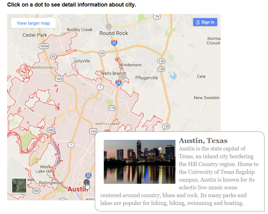
Tooltip widget can be used to simulate the old-fashion image map. This is useful for maps and items you want to show more information about.
- Place an image (e.g., a map) that you would like to insert some "hotspots" on.
- Add some instructional text (e.g., Click on a dot to see detail information about city) above the image.
- From the Widgets Library, drag a Tooltip widget and in the Options panel change the Show Target drop-down to On Click.
- Position and resize each trigger dots where you need them. Cick on the plus sign to add more dots and tips panels or press the delete key to delete a dot and its target panel.
- Click on each dot and then position its tip target panel as needed.
- Click on each target panel and add your own text or image.
- CHECK POINT: Preview page. You should see a tooltip show if you click on one of the dots.
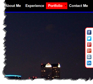
Floating Social Media Icons
Floating Social Media icons is a common practice that is used on many web sites.
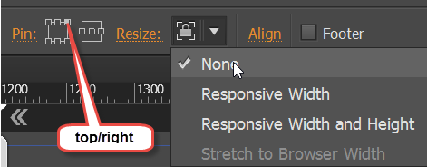
- Open the A-Master template.
NOTE: Placing the social media icons on a template will ensure that it appears on all pages. However, you have to be conscience of not including content on the pages that will interfer will the icons placement. This is because anything placed on a template later will appear at the bottom of the layer stack. - Use the Rectangle tool to create a tall but narow background with optional rounded corner on one or both sides for the number of icons you want to use to the top/right or top/left of the page.
- (Optional) Add a Fill color and give it a thin stroke of any color you like on the two sides away from the page edge.
- Add social media icons to background and position them as needed.
- Select the icons and background and then right-click and select Group from the menu to group them.
- Pin the group to the top/right or top/left side of the page and set the Resize option to None.
- Add the corresponding links to each social media icons.
- CHECK POINT: Preview page. You should see the social media icons "pinned" to the side of the page even when you scroll the page.
Page View
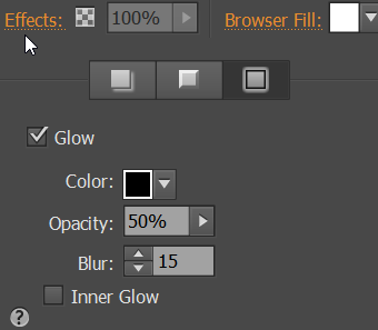
A common effect that you may see on the web that is easy to create is a "page effect." A page effect takes the browser page and give it a glow and rounded corners.
- Click on the Effects... link, click on the Glow option and then change the options to your liking:
- Change the four corner radii to your liking:
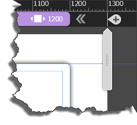
- Drag the slider to see the right and left edges of the page:
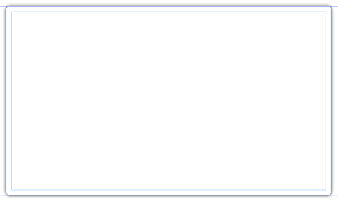
- CHECKPOINT: You should see something like the following:
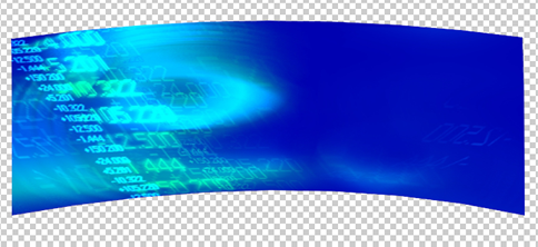
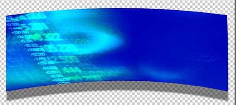
Curved Panel
Another common effect that you may see on the web that is easy to create is to have a curved panel with a drop shadow.
- Open Photoshop and create or import a panel that you would like to give a curved effect to.
- Double-click Background layer to convert it to a regular layer and then click the OK button.
- Press CTRL+T and to scale the panel smaller so that you can see the four edges with more of the bottom edge shown with transparency and then press the Enter key to commit the scale transformaton:
- Press CTRL+T again, right-click and select Warp from the menu and use the currsor to push on the top two edge points and the bottom two inner points to "warp" the panel into a curved panel and then click the Enter button to commit the warp transformation.
- Click on the "fx" icon at the bottom of the Layers panel and select the Drop Shadow... option and then with the cursor move the shadow on the canvas downwad slightly:
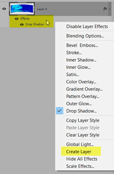
- Right-click on the Effect Layer (not the image layer) and select Create Layer from the menu and then click the OK button:
- Click on the newly created shadow layer, press CTRL+T, right-click and select Warp from the menu and use the currsor to push the bottom two inner points STRAIGHT UPWARD to "warp" the panel's shadow into a curved panel and then click the Enter button to commit the warp transformation:
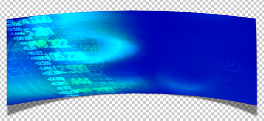
- Save the file as a *.png file so that it can have a transparent background and then use it in your Muse site.
Create Tile For Background
You can create your own custom tile to use as a background. The advantage of this approach is that you create a small file that loads fast and reduce bandwidth.
- Use an small image (e.g., 200 x 200) with a consistant texture (e.g., sand) as a good candidate to be tilable.
- Open the image in Photoshop and convert the background layer to a regular layer by double-clicking on it and giving it a name.
- With the Move tool, move the image to top/left quadrant of the canvas where only the bottom/right is displayed.
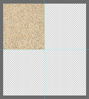
- Hold down the ALT key and click to drag a copy to the top/right quadrant of the screen.
- Repeat previous step for the bottom/right and bottom/left quadrant.
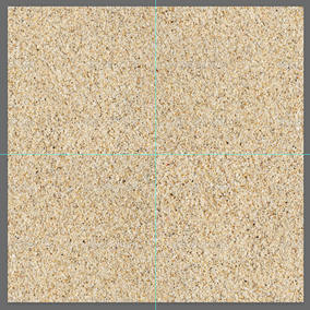
- If necessary, create a blank layer above the other layers and then use the Clone Tool with the All Layers option selected and then ALT+click and drag Clone Tool repeatedly to smooth out any lines between the quadrants.
- Select File > Save For Web and save it as a *.png image (e.g., my_custom_tile.png).
- In Muse, add the image using the File... command with the Tile option selected.
- If you have to refine the tile, double-click on it in the Assets panel and make the necessary changes and then save it and then in the Assets panel, right-click on it and select Relink from the menu.
Add HTML5 Animation
You can add HTML5 animation created with Adobe Animate CC.
Easily add HTML5 animation files created with Adobe Edge Animate. Simply place the file on the canvas, and preview the action in the Preview mode.
- Create an animation in Adobe Animate CC.
- Choose File > Publish Settings... and in its dialog box select the OAM Package checkbox.
- Select where you want to publish the file.
- Click the Publish button and then click the OK button.
- In Muse, select File > Place and navigate to the OAM file created earlier in Animate CC and then click the Open button.
- Use the Place gun to place and position the animation.
- Preview the animation in a browser.
Rotate Tab or Accordion Widget
You can rotate the tab or accordion widget to create a unique design.
- From the Wizards Library, drag-and-drop a tab or accordion widget to a page.
- Click on the tab or accordion wizard to select it.
- Hover the mouse over the right bottom corner until you see the rotate icon and rotate the widget clockwise until it is vertical.
TIP: Hold down the SHIFT key to constraint the rotate to 90 degrees.
NOTE: The panel should be on the left. You could rotate the widget to any angle you want.
- Double-click inside of the widget's content area until you see Text Frame shown in the top/left corner.
- Hover the mouse over the right bottom corner until you see the rotate icon and rotate the widget counter-clockwise until it is horizontal.
- Move the text box as needed.
- Repeat text rotation for EACH panel's content.
- (Optional) If you have any images in the widget's content area, rotate them like you did the text.
- (Optional) You can also give EACH of the panels a different background color with contrasting text color using the Fill... option or Text Objects.
- (Optional) Currently, you cannot set the text in the panels to vertical text. However, you can replace the content labels of the panels with images of vertical text on them.
Misc.
A common effect that you may see on the web that is easy to create