Make Content Responsive
After making the page responsive, you will then want to make other content (text, images, menus and widgets) responsive. Moreover, you will need to PIN DOWN some content to prevent them from moving in certain areas of the page.
Common To All
TIP: BEFORE MAKING ANY OF THE RESPONSIVE CHANGES, IT IS BEST TO SCALE THE PAGE TO SEE WHAT THE CURRENT STATUS IS FOR EACH CONTENT SO THAT YOU CAN SEE THE EFFECT BETTER.
Before making any responsive changes, you may need to:
- set ADDITIONAL breakpoints for EACH page when the design "breaks"
- add responsive features listed below as needed
NOTE: The examples below are scenarios and may differ from what you have. Notice the phrases, "In our case, we..."
Responsive Text
Typically, you want images to be set to responsive width and height; whereas, text you can set to responsive width since text automatically wraps anyway which will cause the height to increase and be responsive.
Responsive Header
In the header, you may want to go to the Master page and do the following to make content responsive:
- You may not want the logo to scale so pin it to the top/left and turn off resizing.
- Have the background rectangle of the header pinned to the top/center of the page so that it does not scroll off the page.
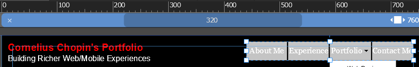
- To start, for desktop breakpoint (1280px) with the menu on the right side of the header you may want to turn off resizing and pin it to the top/right.
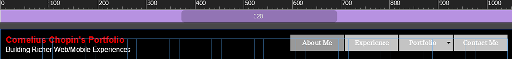
NOTE: In our case, as we scaled the page, the next design break (perhaps for a Tablet) occurs at 760px because the menu and the logo are about to collide together.
- So we clicked on the color bar at the place where we want to set another breakpoint. In our case, at 760px.
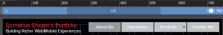
- To resolve this problem at this breakpoint, we clicked on the menu and change it Resize to Responsive Width and then scale the actual width of the menu:
Responsive Footer
In the footer, you may want to go to the Master page and do the following to make it responsive. There are times when you don’t want the text to wrap in the footer. For example, if you place a SINGLE line of text in the footer that is responsive, the text will wrap to two lines if the screen is resized. To prevent this from happening:
- To start, for a desktop breakpoint (1280px) with the copyright on the left side of the footer, we set the text Resize to None so that the copyright notice does not collapse onto two lines when the page get smaller.

NOTE: In our case, as we scaled the page, the next design break (perhaps for a Tablet) occurs at 760px because the copyright's text is still too big. We already have a breakpoint at 760px that we set when we did the header.
- We double-clicked on the copyright notice and changed the font color to gray and the font size to 9.

- CHECK POINT: If you look at the other breakpoints by clicking on them, you may see that the copyright notices are at the original size and white. We want the copyright notice to be the same across ALL breakpoints.
- To do this, we clicked on the Format text across Breakpoints tool or select CTRL+SHIFT+T.

Responsive Content Area
With the content area, you can do a host of things at the various breakpoints:
- Resize content
- Rearrange content
- Move content
- Stack content (e.g., 4 columns (desktop) to 2 columns (tablet) to 1 column (phone))
- Make content responsive (e.g., Responsive Width/Height)
- Hide content (Right click and select Hide In Breakpoint or Hide in Other Breakpoints)
- Swap out content with new content or smaller/larger content
For phones there are also some special considerations that you need to account for:
- Make text easier to read
- Click area large enough for touch
Responsive Images
Flexible images—instead of using the Place command to insert an image, create a rectangle and fill it with an image to make it more flexible and then select one of the options (e.g., Scale to Fill).
NOTE: You don’t have the Position and Fitting options when you Place an image. It is important to note; however, that image that is “placed” will come in responsive. To see this, click on the icon next to the Resize link at the top of the page and you will see that the image is checked to Responsive Width and Height; whereas, an image in a frame will scale only HORIZONTALLY to show more of the image within the rectangle frame because it is a background image.
- Scale the page and see if the images on the page need to be made responsive.
- Do one ore more of the following, when needed:
- Prevent the image from scaling
- Make the image responsive (Select Responsive Width or Responsive Width and Height)
- Resize the image
- Rearrange the image
- Hide the image
Responsive Menus For Mobile
While we have already seen how to make a menu responsive by pinning it to the top/right corner of the screen and making it height and width responsive, we need to take some additional step to make it responsive on a mobile device using what is sometimes referred to as a “hamburger menu.”
- In the Master template, set a breakpoint where the design breaks for mobile devices. In our case, it is at 640px.
- Select the menu, right-click on it and select Hide in Breakpoint.
- In the Widgets Library, drag-and-drop an accordion widget to the header and do the following:
- From the Options panel, select the Can Close All checkbox.
- Delete all but the first panel and their content.
- In the accordion panel's header, select the Fill... option and place a hamburger menu graphic in it and position it in the top/right corner using the Position property and remove the stroke and color so that the menu matches the background of the header and then delete the dummy text.
- In the accordion's content area, delete the stroke and color for each state.
- From the Widgets Library area, drag-and-drop a vertical menu INTO the accordion content area.
- Stretch the accordion content to fit the browser width.
- Stretch the vertical menu to fit the browser width as well.
- Use the States panel to customize the vertical menu buttons to match the look-and-feel of your site (e,g., Font bold, all caps, background color for each states).
NOTE: The rollover state does not exist on a mobile device.
- Click on the accordion to close it in the breakpoint you want to show the hamburger menu.
- Click on the accordion to hide it in breakpoints that you don't need it.
Responsive Widgets
If necessary, you may need to make the widget responsive as well.
- To make a widget responsive, do one of the following:
- Resize widget
- Resize elements in the widgets (e.g., thumbnails)
- Rearrange the widget somewhere else on the page
- Preview page to see results.
Responsive Images For Mobile
If you turn on the HiDPI setting in the Site Properties dialog box, Muse will AUTOMATICALLY create two sets of graphics (standard and HiDPI). However, it is up to you do provide the right size of graphics for this to work.
- Go to the File > Site Properties..., select the Layout tab, if necessary, and then set the Resolution from Standard to HiDPI.
- In the HiDPI dialog box that appears, read the warning and then click the Use HiDPI button.
Now, to take full advantage of HiDPI, you need to
- Create images that are at least twice (2x) the size they will appear on the site.
NOTE: When you upload or export a HiDPI site from Muse the code generated will include both standard and 2x images and will automatically detect which images to use when the site is viewed on a HiDPI or standard resolution display. When you place a HiDPI image, Muse will optimize the image by reducing the size to 50%. Muse preserves original data to serve higher pixel density when the asset is viewed on a HiDPI screen. Also, rasterized text and effects that output as images are automatically generated at 2x and standard size by Muse when published or exported.
To see if an image is HiDPI:
- Go to the Assets panel, and you will see "2X" displayed next to graphics that Muse has determined to be twice the size for Retina displays.
NOTE: When an image holds enough data, the 2x icon will appear next to it in the Assets panel. If the 2x icon is not shown, it will display at standard resolution.
NOTE: When an image use scale to fit or scale to fill, Muse will not export a high resolution image but standard version of an image:- 100% width
- Full screen slideshow
- Browser/page background
NOTE: Tiled background images are handled differently when compared to background images set to scale to fit/fill. Muse supplies both standard and high resolution images for standard and HiDPI screens respectively, when exporting the website. If you tile a high resolution image with 2x data, it is treated as any other image and placed on the web page canvas at 50% of the original size. On exporting, the half-dimensioned image (50%) is exported as the standard resolution image and the native image as high-resolution image with 2x data.
(Optional) Add a HiDPI button:
You can also give the user control of switching to HiDPI by using the HiDPI (on/off) widget which provides a button for a user to click to turn on or turn off HiDPI. By default, images will be in standard mode on startup.
TIP: Use SVG wherever and whenever you can because they are small and resolution independent so that when you scale them they will not distort.
Responsive Telephone For Mobile
It is best practice to make a phone number field responsive. You can do this by using the tel protocol.
EXAMPLE:
- Below the contact form on the Contact Me or Contact Us page, use the Text tool and type a phone number into it and format it (e.g., Large font, bold).
- Center the field by pinning it to the center of the screen.
- Select the number and in the Add or filter link drop-down menu at the top of the screen, type tel:555-123-4567 where 555-123-4567 is replaced with an actual number.
NOTE: The tel: protocol will cause a smart phone to display a phone pad.